Kabak: Proposal
Contents
Problem and Motivation
As a country with no natural resources, the government has always been vested in encouraging Singaporeans to reduce energy consumption and wastage in Singapore. For example, the National Environment Agency (NEA) has the energy label scheme which requires goods such as Air-conditioner, Refrigerator, Clothes Dryer and Television to be affixed with an energy label sticker depicting how much electricity they consume when used.
More recently in August 2016, Singapore Power (SP) has redesigned the utilities bill in a bid to help fellow Singaporeans track and take steps to reduce their energy and water consumption.
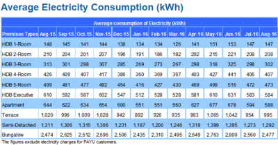
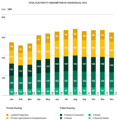
While there are data and statistics available on the Energy Market Authority with regards to the energy consumption by household, it is in quite a raw form with some visualization and basic interactivity to aid users in better understanding energy consumption in Singapore. The statistics or data provided also does not link to other factors such as the population demographics, which perhaps could provide interesting insights on the usage patterns of Singaporean households. As such. while these data exist, it is not being used to allow the public to visualize the energy consumption and to make sense out of it.
Solution and Objective
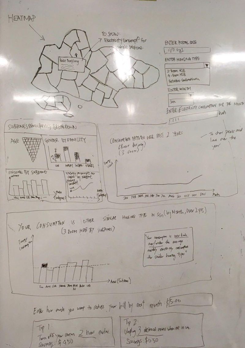
Our solution is aimed at helping households to visualize the energy consumption patterns in Singapore in simple, easy to understand components and also to allow them to compare with other similar households(i.e by housing type). It will also suggest simple ways to help households conserve energy by referring to data on energy consumption so that users can enter how much they want to reduce their bill by and appropriate energy saving activities will then be recommended to meet the target set.
At the end of the day, the solution aims to provide insights or trends to users with regards to energy usage patterns so that they can take action to reduce their bill at the end of the month.
Dataset
| DATASET | DESCRIPTION |
|---|---|
|
Average Monthly Household Electricity Consumption Link (1H): https://www.ema.gov.sg/cmsmedia/Publications_and_Statistics/Statistics/23RSU.xls Link (2H): https://www.ema.gov.sg/cmsmedia/Publications_and_Statistics/Statistics/25RSU.xls |
|
|
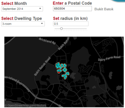
Average Monthly Household Electricity Consumption by Postal Code (Private Apartments), 2015 Link: https://www.ema.gov.sg/cmsmedia/Publications_and_Statistics/Statistics/2RSU.xls |
|
|
Basic Demographics Characteristics (2015) |
|
|
Resident Households (2015) |
|
Survey of Related Works
| RELATED WORKS | PROS AND CONS |
|---|---|
|
|
|
|
|
|
|
|
|
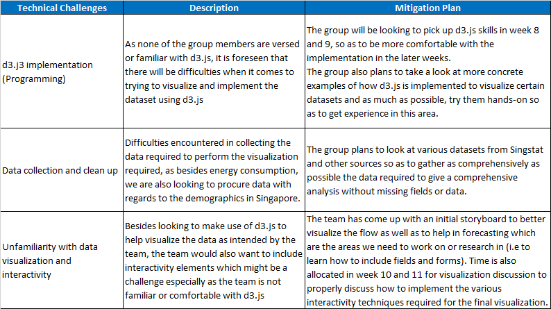
Key Technical Challenges
Storyboard
Timeline and Milestones
Milestones
Task Allocation
References
1. http://www.channelnewsasia.com/news/singapore/utilities-bill-redesigned/3002418.html
2. http://www.e2singapore.gov.sg/Households/Saving_Energy_At_Home/HEA.aspx
3. https://services.spservices.sg/elect_audit_frameset.asp
4. https://www.ema.gov.sg/Singapore_Energy_Statistics.aspx
5. http://www.singaporepower.com.sg/irj/servlet/prt/portal/prtroot/docs/guid/6024ae5b-746a-2e10-3bbe-c705f591cc8f?spstab=Our%20Services
Comments
Your feedback is important to us. Please let us know how we may improve.
