JJJ: Proposal
Proposal
|
Contents
Problem & Motivation
Land scarcity is persistent issue faced by Singapore since its independence, being a country with only the size of a typical city or smaller of a fellow developed nation. As such, one of Singapore’s main challenges is in the area of Urban Planning to optimize land use without compromising on the standards of living for its residents.
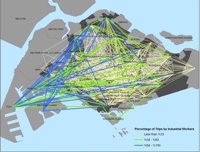
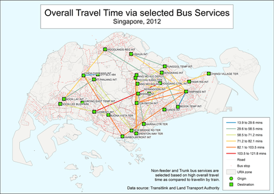
One of the ways to assess the effectiveness of urban planning would be to study commuter patterns, understanding how people travel for their work and educational needs. Some who stay near to their workplace enjoy a shorter journey with less commuting time. However, there are also people who stay far from their workplaces and spend long hours on travel, for example an individual who stays at Tampines yet having to travel to Tuas for work. Hence, we would like to create a tool to gain a closer look into commuter patterns in Singapore to find out more on current commuter patterns. We believe that the tool in investigating commuter patterns would be useful for urban planners to be able to identify potential problems and patterns in the current design so as to improve the urban landscape in preparation for population growth.
Objectives:
- To explore recent commuter data for bus travel in Singapore
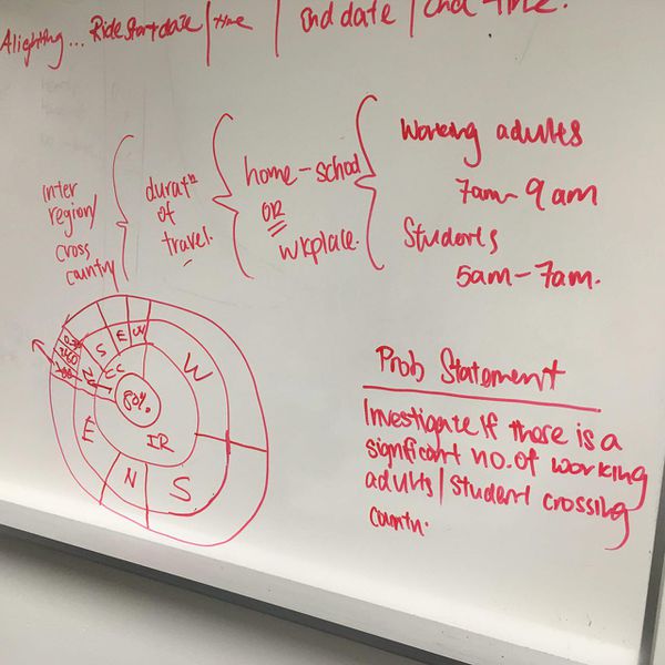
- To visualize commuter patterns during the morning peak hours
- To explore the impact of current commuter patterns on possible challenges in urban planning
- To create a visualization for an easy and intuitive understanding of the current situation for the average Singaporean
Background Survey of Related Work
| Related Works | What We Can Learn Based on Sources |
|---|---|
|
|
|
| |
|
Choice of Dataset
Data Source: https://data.dex.sg/organization/land-transport-authority
- Preparation of Data
We downloaded a total of 8 CSV files which consists of commuter and bus data from the data source above. The main dataset provides an extensive number of up to 1,000,000 commuter records and needs careful analysis of what we need. Here is a list of attributes that are of our concern when cleaning the data:
- Commuter ID
- Ride Start Time
- Ride End Time
- Boarding Bus Stop
- Alighting Bus Stop
- Bus Service Number
Other datasets provides us more attributes such as the coordinates of the bus stops
Description of the approach
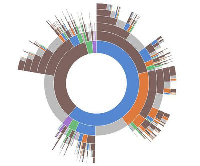
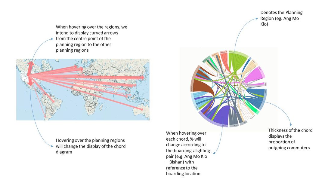
| Type of Visual | Why do we think it is useful |
|---|---|
|
|
|
| |
|
Storyboard
References
- http://worksingapore.com/articles/live_4.php
- https://www.lta.gov.sg/content/dam/ltaweb/corp/PublicationsResearch/files/ReportNewsletter/LTMP2013Report.pdf
- https://www.quora.com/In-Singapore-it-takes-more-than-an-hour-to-reach-a-destination-via-the-public-transport-bus-train-but-just-quarter-of-the-time-if-I-were-to-take-the-taxi-Would-we-still-call-the-public-transport-successful
- http://web.mit.edu/11.521/papers/WorkingSocialDocument_Aug2012_v2.pdf
- http://www.enterpriseinnovation.net/article/singapores-transport-vision-analytics-new-interfaces-autonomous-vehicles-1298824564
- http://business.asiaone.com/career/news/3-factors-determine-if-singaporeans-leave-their-jobs
- http://community.jobscentral.com.sg/articles/your-daily-work-commute-ruining-your-life
- http://blog.moneysmart.sg/lifestyle/cheap-fast-and-painless-commuting-in-singapore-is-it-possible/
- http://lkyspp.nus.edu.sg/wp-content/uploads/2014/01/Transport-Planning-for-Singapore.pdf
- http://lkyspp.nus.edu.sg/wp-content/uploads/2013/04/Barter-Sg-urban-transport-sustainable-by-design-or-necessity.pdf
- https://www.ura.gov.sg/uol/master-plan/view-master-plan/master-plan-2014/Growth-Area
- http://www.smartnation.sg/initiatives/Mobility/spearheading-research-in-standards-for-sdvs
- https://www.ura.gov.sg/skyline/skyline09/skyline09-02/text/04.htm
Key Technical Challenges
Big Data Processing
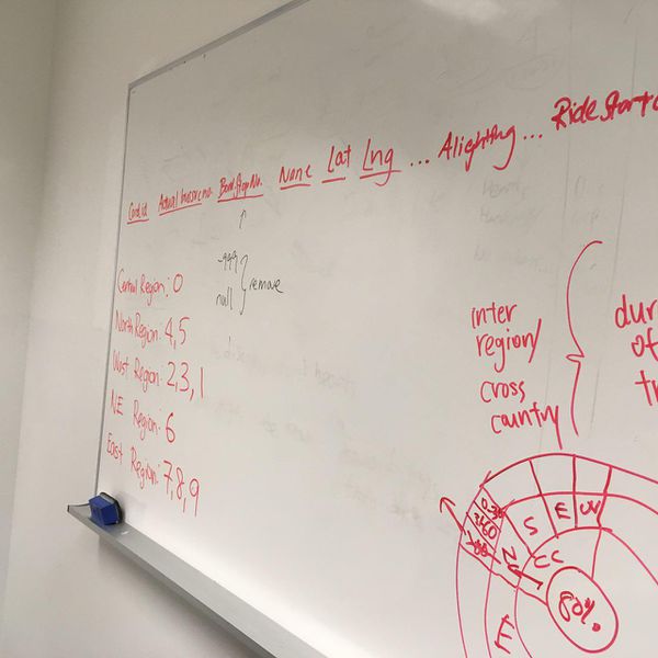
Processes such as data cleaning needs to be done to ensure the data is in appropriate formats for us to run our analysis.
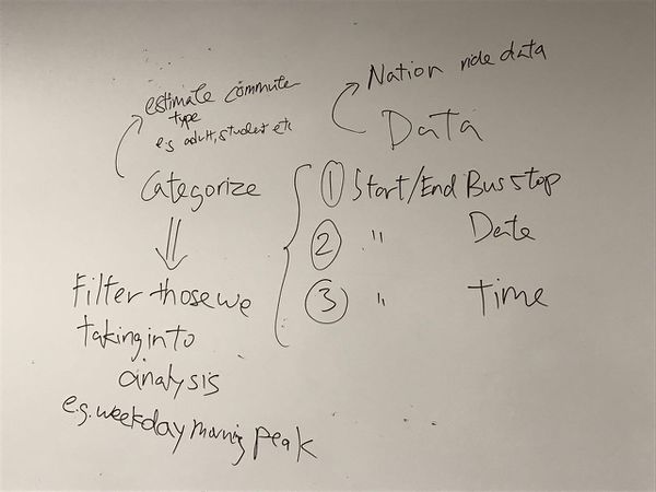
Given the data, we might need to make estimations with appropriate assumptions to group the data such as categorizing the commuter groups.
Certain data points may be excluded from our analysis as it is out of scope, for example commuters travelling to and from bus stop in Johor Bahru, Malaysia.
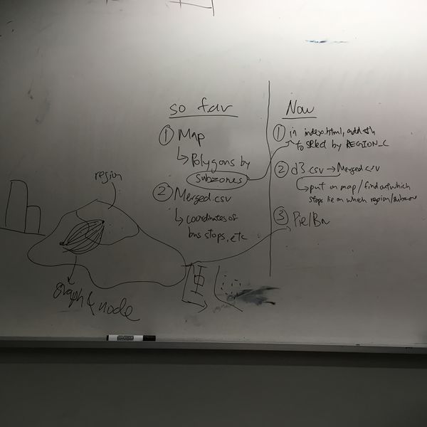
As we have multiple datasets, we need to ensure appropriate merging of data sets without errors.
Unfamiliarity with visualization tools
As we have yet to go in depth into the hands-on of some of the visuals suggested, we might need to research and practice on using our specific data to create the visuals we have in mind. There may be limitations due to software we try to use to generate the visual we want. We may not end up with what we had in mind or miss out on exploring other softwares that could have helped us achieve what we wanted.
D3.js has high customization ability, but requires a lot more work on manual coding to achieve the visualizations we want compared to commercial tools such as Tableau with off the shelf functions/capabilities that we can adjust using their user interface.
Managing the trade offs between static and interactive visualizations
Interactive Visualizations and Static Visualizations have their own strengths, and we need to understand the trade off of choosing one over the other. Some interactive visualizations may engage the user more, however the effectiveness may depend on the user's knowledge and capability in manipulating the tools to gain insightful results. On the other hand, static visualizations may present a more comprehensive view at a glance, but require more technical knowledge for the user to fully understand the data visualization.
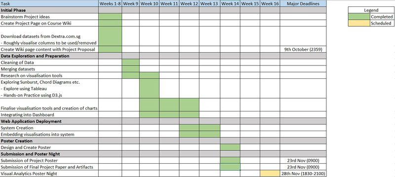
Milestones
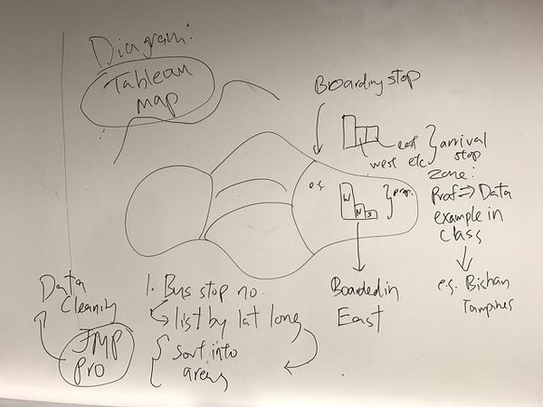
Brainstorming
Comments
Please feel free to comment on our proposal.
