IS428 2016-17 Term1 Assign3 Tan Kee Hock
To be a Visual Detective: Detecting spatio-temporal patterns
Contents
- 1 Overview
- 2 The Task
- 3 Background Information
- 4 The Data
- 5 Data Cleaning
- 6 Data Import/Configuration
- 7 Visualisation
- 8 Use Case
- 9 Findings - Task #1
- 10 Findings - Task #2
- 11 Findings - Task #3
- 12 Findings - Task #4
- 13 Conclusion
- 14 Improvement
- 15 Visualisation Software
- 16 Submission details
- 17 Assignment 3 Q&A
- 18 References
- 19 Comments
Overview
After the successful resolution of the 2014 kidnapping at GAStech’s Abila, Kronos office, GAStech officials determined that Abila offices needed a significant upgrade. At the end of 2015, the growing company moved into a new, state-of-the-art three-story building near their previous location. Even though the employee morale rose somewhat with the excitement of the new building, there are still a few disgruntled employees in the company.
The new office is built to the highest energy efficiency standard, but as with any new building, there are still several HVAC issues to work out. The building is divided into several HVAC (heating, ventilation, and air conditioning) zones. Each zone is instrumented with sensors that report building temperatures, heating and cooling system status values, and concentration levels of various chemicals such as carbon dioxide (abbreviated CO2) and hazium (abbreviated Haz), a recently discovered and possibly dangerous chemical. CEO Sten Sanjorge Jr. has read about hazium and requested that these sensors be included. However, they are very new and very expensive, so GAStech can afford only a small number of sensors.
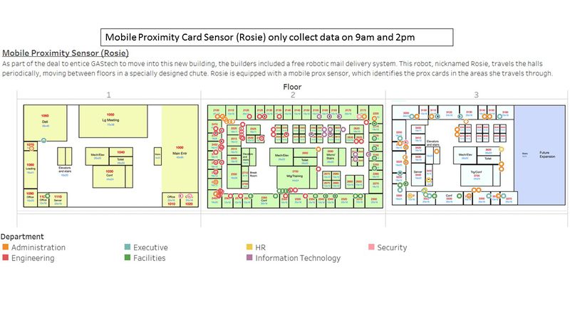
With their move into the new building, GAStech also introduced new security procedures, which staff members are not necessarily adopting consistently. Staff members are now required to wear proximity (prox) cards while in the building. The building is instrumented with passive prox card readers that cover individual building zones. The prox card zones do not generally correspond with the HVAC zones. When a prox card passes into a new zone, it is detected and recorded. Most, but not all, areas are still open to staff members even if they forget their prox cards. People are somewhat careless with their prox cards, but some diligent staff members will go to the security desk and pick up a new prox card if their old one is mislaid. As part of the deal to entice GAStech to move into this new building, the builders included a free robotic mail delivery system. This robot, nicknamed Rosie, travels the halls periodically, moving between floors in a specially designed chute. Rosie is equipped with a mobile prox sensor, which identifies the prox cards in the areas she travels through.
The Task
As an expert in visual analytics, you have been hired to help GAStech understand its operations data. In this assignment, you are given two weeks of building and prox sensor data. Can you use visual analytics to identify typical patterns of and issues of concern?
You will be asked to answer the following types of questions:
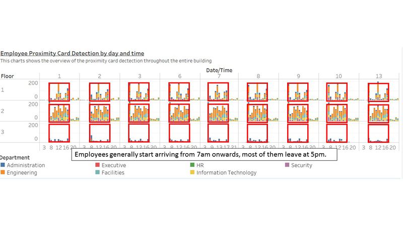
- What are the typical patterns in the prox card data? What does a typical day look like for GAStech employees?
- Describe up to ten of the most interesting patterns that appear in the building data. Describe what is notable about the pattern and explain its possible significance.
- Describe up to ten notable anomalies or unusual events you see in the data. Prioritize those issues that are most likely to represent a danger or a serious issue for building operations.
- Describe up to five observed relationships between the proximity card data and building data elements. If you find a causal relationship (for example, a building event or condition leading to personnel behavior changes or personnel activity leading to building operations changes), describe your discovered cause and effect, the evidence you found to support it, and your level of confidence in your assessment of the relationship.
Background Information
Heating, ventilation and air conditioning (HVAC) is the technology of indoor and vehicular environmental comfort. Its goal is to provide thermal comfort and acceptable indoor air quality.
Key Measurement attributes and their significance
- Lights Power [W] Power used by the lights in the zone
- Equipment Power [W] Power used by the electric equipment in the zone
- Thermostat Temp [C] Temperature of the air inside the zone
- Thermostat Heating Setpoint [C] Heating set point schedule for the zone
- Thermostat Cooling Setpoint [C] Cooling set point schedule for the zone
- VAV Availability Manager Night Cycle Control Status On/off status of the HVAC system during periods when the system is normally scheduled off. The night cycle manager cycles the HVAC system to maintain night and weekend set point temperatures.
- VAV_SYS SUPPLY FAN:Fan Power [W] Power used by the HVAC system fan
- BATH_EXHAUST:Fan Power [W] Power used by the bathroom exhaust fan
- VAV REHEAT Damper Position Position of the zone's air supply box damper. 1 corresponds to fully open, 0 corresponds to fully closed
- REHEAT COIL Power [W] Power used by the zone air supply box reheat coil
- VAV_SYS HEATING COIL Power [W] Power used by the HVAC system heating coil
- VAV_SYS Outdoor Air Flow Fraction Percentage of total air delivered by the HVAC system that is from the outside
- VAV_SYS Outdoor Air Mass Flow Rate[kg/s] Flow rate of outside air entering the HVAC system
- VAV_SYS COOLING COIL Power [W] Power used by the HVAC system cooling coil
- VAV_SYS AIR LOOP INLET Temperature [C] Mixed temperature of air returning to the HVAC system from all zones it serves
- VAV_SYS AIR LOOP INLET Mass Flow Rate [kg/s] Total flow rate of air returning to the HVAC system from all zones it serves
- VAV_SYS SUPPLY FAN OUTLET Temperature [C] Temperature of the air exiting the HVAC system fan
- VAV_SYS SUPPLY FAN OUTLET Mass Flow Rate [kg/s] Total flow rate of air delivered by the HVAC system fan to the zones it serves
- RETURN OUTLET CO2 Concentration [ppm] Concentration of C02 measured at the zone's return air grille
- SUPPLY INLET Temperature [C] Temperature of the air entering the zone from its air supply box
- SUPPLY INLET Mass Flow Rate[kg/s] Flow rate of the air entering the zone from its air supply box
- Mechanical Ventilation Mass Flow Rate [kg/s] Ventilation rate of the zone exhaust fan
- Hazium Concentration Concentration of Hazium measured at the zone's return air grille
- Drybulb Temperature [C] Drybulb temperature of the outside air
- Water Heater Tank Temperature [C] Temperature of the water inside the hot water heater
- Water Heater Gas Rate [W] Rate at which the water heater burns natural gas
- Supply Side Inlet Mass Flow Rate [kg/s] Flow rate of water entering the hot water heater
- Supply Side Inlet Temperature [C] Temperature of the water entering the hot water heater
- HVAC Electric Demand Power [W] Total power used by the building's HVAC system including coils, fans and pumps.
- Total Electric Demand Power [W] Total power used by the building
- Loop Temp Schedule Temperature set point of the hot water loop. This is the temperature at which hot water is delivered to hot water appliances and fixtures.
- Water Heater Setpoint Water heater set point temperature
- DELI-FAN Power [W] Power used by the deli exhaust fan
- Pump Power [W] Power used by the hot water system pump Water Heater
The Data
You will have the following data and supporting information at your disposal:
- A building layout for the GAStech offices, including the maps of the prox zones and the HVAC zones
- A current list of employees, roles, and office assignments
- A description of the data formats and fields provided
- Proximity sensor data for each of the prox zone regions
- Proximity sensor data from Rosie the mobile robot
- HVAC sensor readings and status information from each of the building’s HVAC zones
- Hazium readings from four sensors.
The datasets above can be generally grouped into 2 different category
- Employee Proximity Card Data
- Building Data
The data will then be visualized using Tableau. However, data cleaning is required to ensure all is working properly.
Data Cleaning
| Problem #1 | Building Data |
|---|---|
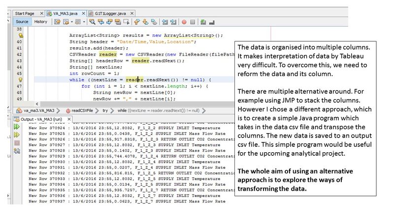
| Issue | The original building data provided is not "user-friendly". Tableau does not have difficulty reading it, but to plot the charts, it will pose a lot of issue. Tableau's default pivot function does not effectively transpose the columns into rows. Thus, there is a need to seek for non-Tableau solution/alternative. |
| Solution |
| Problem #2 | Building Data |
|---|---|
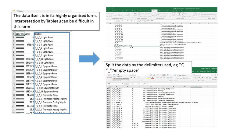
| Issue | The original data provided, concatenate information into the column itself. For example "F_1_Z_1:Lights Power", it is a column header by itself. The column header tells us that the reading is taken from floor 1, zone 1 and it is measuring the Lights Power. However, such information is only understood by humans instead of business intelligence software like Tableau. Therefore, there is a need for us to transform into a more "software-friendly" form. |
| Solution |
| Problem #3 | Employee Proximity Card Data |
|---|---|
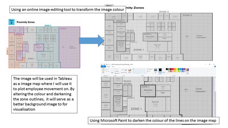
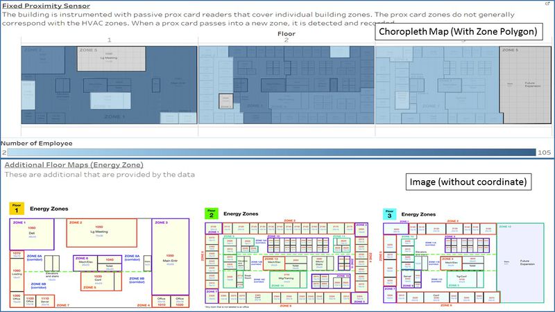
| Issue | The given images are rich in color to denote the various zones. However, to use it effectively as background for a choropleth map, the image should ideally be dull in color. For example, it should be in colors like gray. Furthermore, the zone boundaries are to be demarcated more obviously especially when it is transformed to color such as gray. |
| Solution |
| Problem #4 | Employee Proximity Card Data |
|---|---|
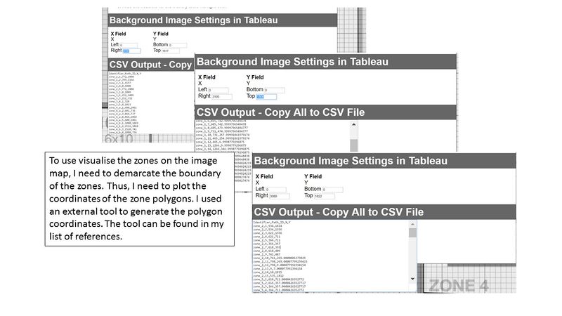
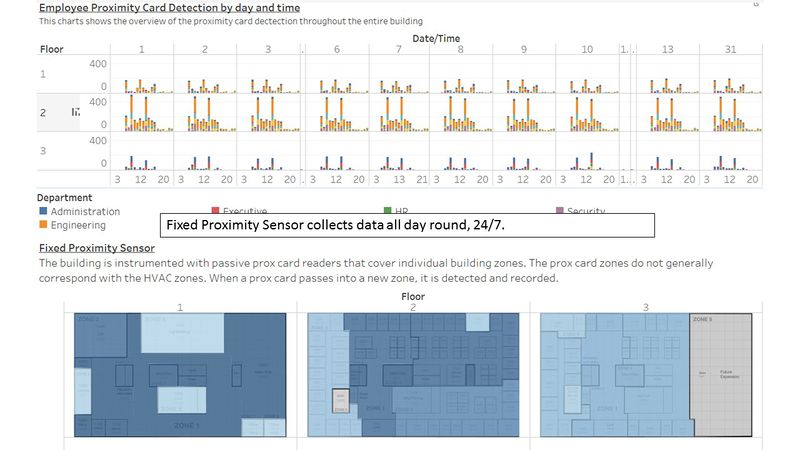
| Issue | The fixed proximity sensor collects data based on the zone which it is in. Unlikely the mobile proximity sensor which bases it detection on coordinates, the fixed sensor detects the cards within its designated zones. Thus, the only information which we are able to get from the fixed sensor is the time which the proximity card is present in the zone. To visualize the zones, we need to mark it out on the image map. Then with the polygon data, I can tell tableau where the zones are on the map. Thus, I need to plot the zones on the given image and retrieve the coordinates. The coordinates are to be saved in a mapping CSV file which will be processed by Tableau. |
| Solution |
| Problem #5 | Employee Proximity Card Data |
|---|---|
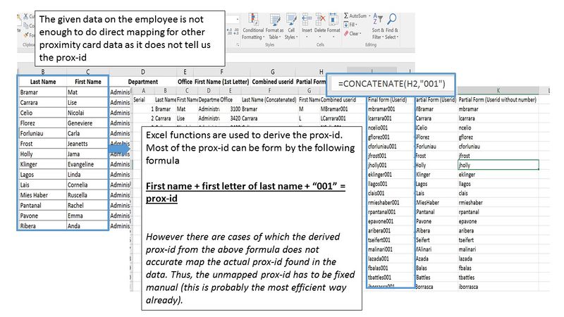
| Issue | The given employee data does not provide the prox-id. The proximity data provided by both the fixed and mobile sensors records only prox-id. Those sensors does not capture the name or any other characteristic of the employee. Therefore, there is a need to merge the employee data set and the proximity card data. However, to do so, I need to form the prox-id from the data available from the employee data. After initial observation, the formula for prox-id is as follows : "first name + first letter of last name + 001". However, this formula only works for the majority. There are some which do not obey the formula. |
| Solution |
| Problem #6 | Employee Proximity Card Data |
|---|---|
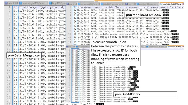
| Issue | For the visualization, I would need to combine the data logically in Tableau. I would need to combine the files. After the initial combination, I would also need to merge these data with the employee dataset. However, as I am merging multiple files, there have to be common attributes. To ensure that the merge can be successful, I created a row id in the proximity data merged file. Id columns are also created in the individual fixed and mobile proximity files. With the ID, the integration is carried out easily, without confusion to Tableau. As we are trying to clean the data, there would be times where we made modification to the data. Thus, I need a column which would be indepedent of changes/modifications. |
| Solution |
Final Excel Files
- bldg-MC2.csv Contains all the building related data (including hazium)
- bldg-MC2_mapping.csv Contains all the necessary mapping of the attributes in building data, so that Tableau can understand which floor and zone which the data was taken from.
- employee.csv All the employee related data.
- proxData_Merged.csv Contains the merged data from both fixed and mobile proximity sensor.
- proxMobileOut-MC2.csv Contains all the proximity card data that are recorded by the mobile sensor (Roise).
- proxOUt-MC2.csv Contains all the proximity card data that are recorded by the fixed sensor.
- proxOut-MC2_zoning_polygon.csv Contains all the polygon mapping of the zones for the fixed proximity sensor.
Data Import/Configuration
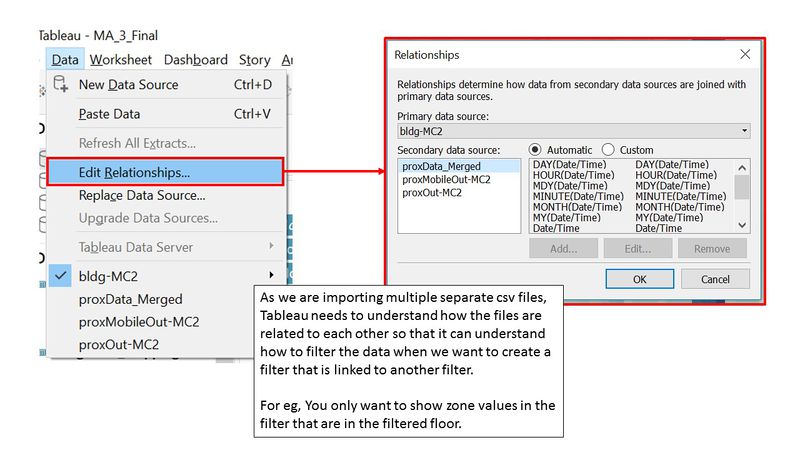
As we are importing multiple files, we need to tell tableau how the files are related to one another. In this case, the files do have a common attribute for all, such as its date/time. However, to allow us to use a filter from one data source to another data source, Tableau needs to understand how the files within the data source are related. For example, in your zone filter, you only want to display zone values which are available at the particular floor which was previously filtered by the user.
Brief Implementation Steps
Once you open up the edit relationship dialog, like the image above. Based on the filter you want to use, choose the common attribute which is present in both datasets. Normally automatic mapping will suffice, however in our case, because of the complexity of our data, Tableau was unable to establish a meaningful relationship between the datasets. Thus, we have to do the custom mapping ourselves.
Visualisation
The visualization is based on the category of the data. The breakdown of the proposed visualization is as shown below.
- Homepage
- Building Data Explorer : Air Supply Controls / Water Supply Controls / Fan Controls / Coil Controls / Additional System Controls
- Employee Movement Explorer
- Variable Explorer
The original dataset is overwhelming. There are over 400 different columns. To make the analysis more meaningful, the data columns has to be group logically based on the purpose of the sensor/data point. I have grouped the data into 6 different categories, namely;
- Air Supply data
- Water Supply data
- Fan data
- Coil data
- Additional System data
- Employee Proximity Card data
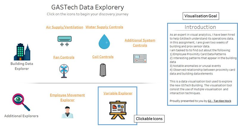
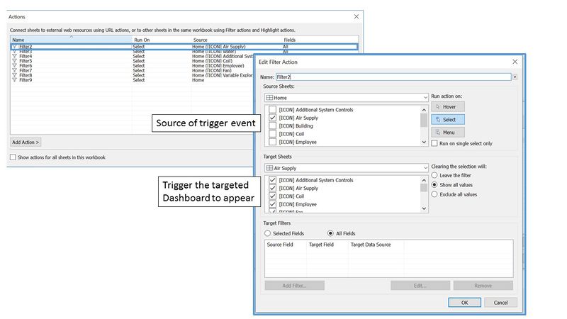
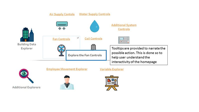
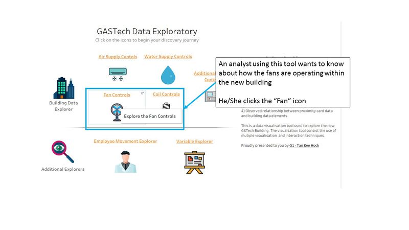
The design of the visualization is based on the "Overview first, zoom and filter, then details-on-demand" (Shneiderman, 1996). Thus when the user uses the tool, first he/she will be on the homepage [Step 1]. Through the homepage, it provides an overview of the data exploratory functions available. It provides a summary group of all the available data. The user will then choose the data of his/her interest and be redirected to it.
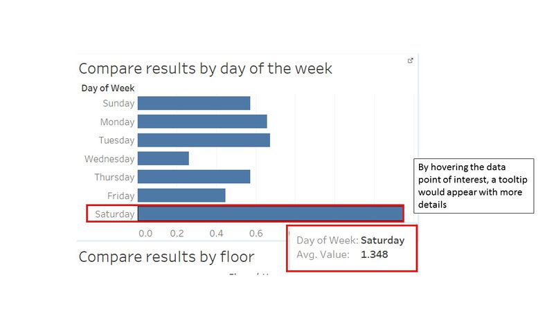
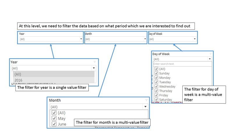
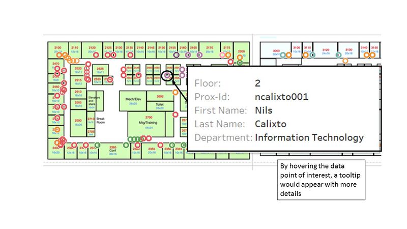
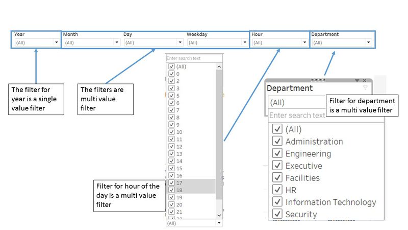
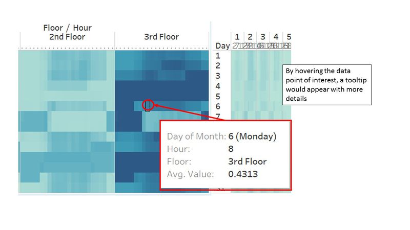
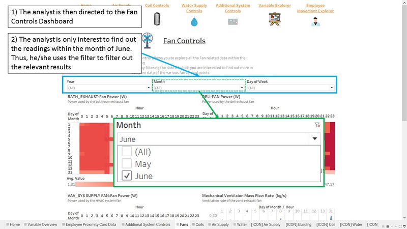
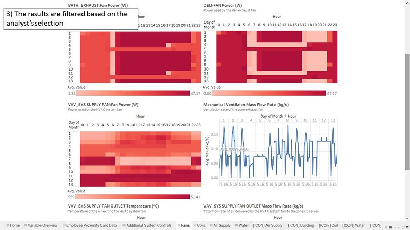
Once you are redirected at to the dashboard after [Step 1], you are at [Step 2] now. Basically, at this stage, you are looking at the data which you are interested in. You can interact with the data, by using the filters. Hovering on the data point will provide you more details on the data.
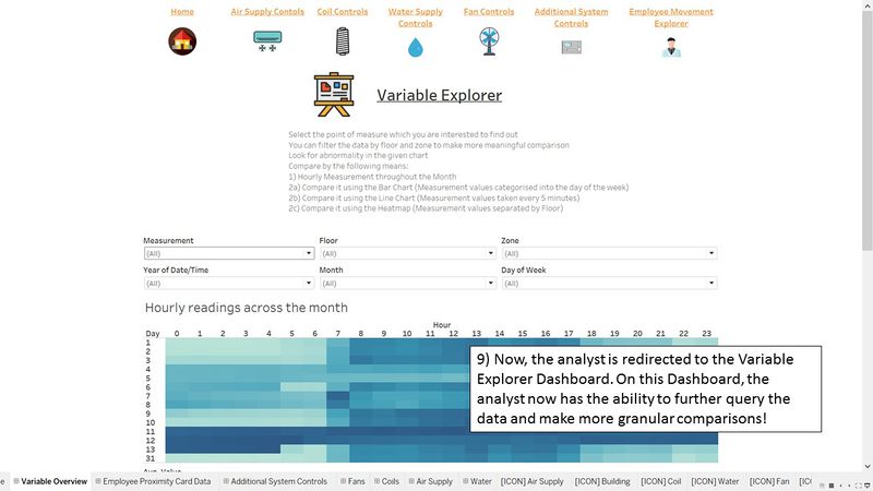
If you are keen to find out more about the particular dataset/column, you can proceed to [Step 3] where you explore in finer details of the variable which you are looking at. At [Step 3] you proceed to the Variable Explorer. At this dashboard, you are given the ability to drill down the data into finer details. For example, breaking the data up by floor, zones, time etc.
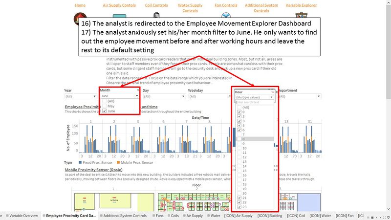
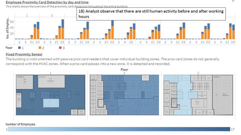
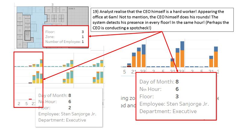
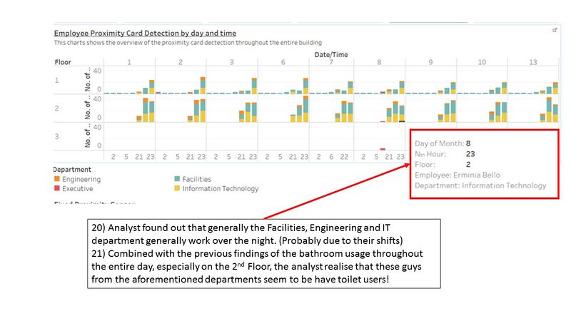
Alternatively, using the Employee Proximity Card data can be either in [Step 2] or [Step 3]. When you are at this dashboard, you can explore the locations of the employees and determine its correlation with the other dataset.
| [Step 1] Homepage |
|---|
| Purpose / Description The homepage is the landing page you will see when you use this Visualisation tool. The data explorery tools are all displayed on the homepage. This homepage makes use of the Tableau Dashboard and its action functions to enable interactivity. It is to serve as a "Home" panel for this visualisation and it would enable the user ease of navigation between the dashboards. |
Interactive Technique
|
| [Step 2] Building Data Explorer : Air Supply Controls / Water Supply Controls / Fan Controls / Coil Controls / Additional System Controls |
|---|
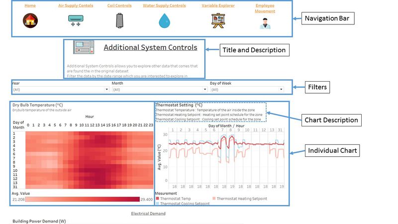
| Purpose / Description The purpose of this dashboard is to give the user and overview of the data of the related controls. Within the HVAC system, there are a lot of intra-working sub-systems which help keep the entire HVAC system working. This dashboard groups all the related controls together and presents an overview of the data. This will allow the user to easier understand the sub-systems of the data. In general, I had grouped the date into 5 sub-systems:
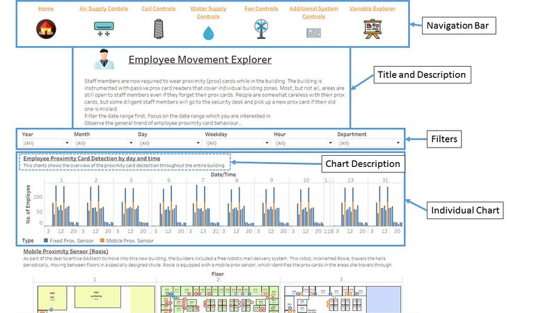
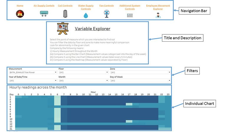
The dashboard is logically designed for to ease usability. The layout as shown below. The dashboard starts with the navigation bar right at the top, followed by the title and description. After which are the filters which are specific for the dashboard. The individual charts then follow. Within the charts itself, it is descriptive by nature. It has its title and this description of what the data is trying to measure. |
Interactive Technique
|
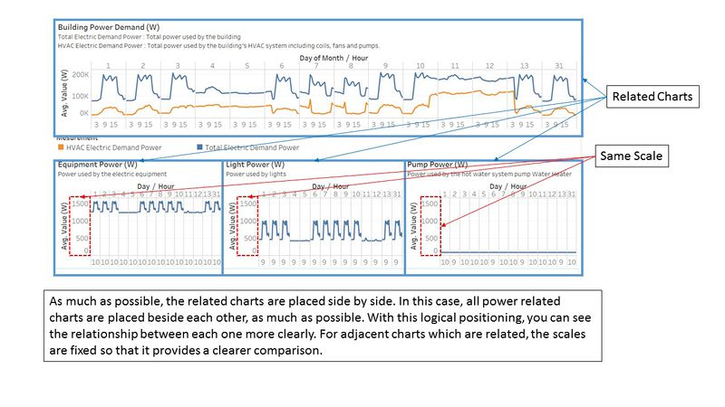
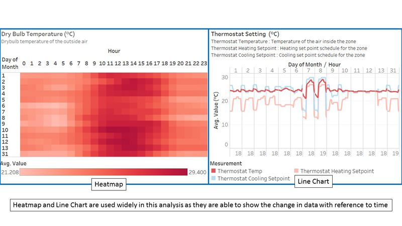
| Types of Charts used The data provided are readings taken from various HVAC/Proximity Sensors. Thus, all of the readings are taken against time. To do meaningful comparison and analysis with time as one of the dimension, I used mainly,
The image below is a representative of the type of charts used. It does not represent all the charts that are present in the dashboard. |
| [Step 2/3] Employee Movement Explorer |
|---|
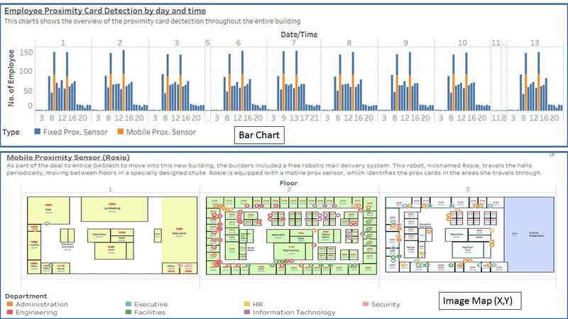
| Purpose / Description The purpose of this dashboard is visualise the employee proximity card data. The data are given with X,Y coordinates. Thus, we can plot the data on a background image map which is provided in the original dataset. The proximity card data are visualized on the floor map itself. There are modifications to the floor map so that the data can be better visualized. Now that the employee's movements are visualized on an image map, it gives much higher clarity on the employee's movement/activities around the building. |
Interactive Technique
|
| Types of Charts used For this dashboard, much of the data are given based on the location itself. Thus, the data needs to be plotted on an image to effectively show the pattern between the employee's location and the time of the day. This will help to tell us what the employee's movement/activities are like.
The image below is a representative of the type of charts used. It does not represent all the charts that are present in the dashboard. |
| [Step 3] Variable Explorer |
|---|
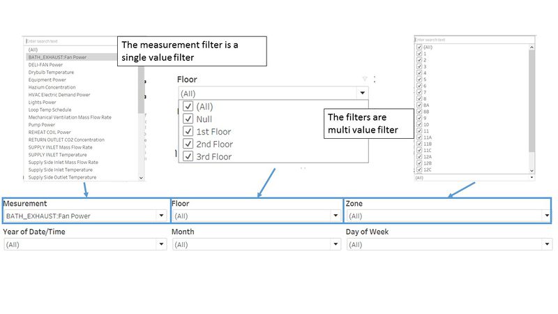
| Purpose / Description Variable Explorer is to allow the user to further explore the data in more details. In the previous dashboards, especially for the controls, the level of detail is limited so that the analyst can see the bigger picture. In this dashboard, it is designed to empower the analyst to view more about the data and how it changes across floor, zones and time. This is to help the analyst understand how the readings varies across the mentioned building attributes and time. The aim of this dashboard is to focus on just one measurement and understand its pattern/behaviour. |
Interactive Technique
|
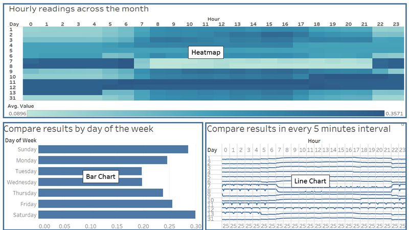
| Types of Charts used The data all have one common attribute, which is date/time. Thus, to enable flexibility for the dashboard to handle all of the variable types, the dashboard is fundamentally be required to visualize time-related data. Therefore, the following types of charts are used.
The image below is a representative of the type of charts used. It does not represent all the charts that are present in the dashboard. |
Use Case
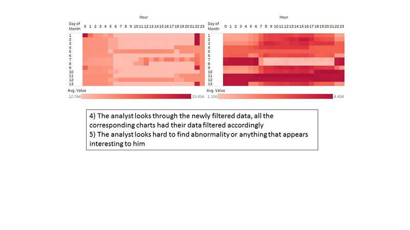
| Visualisation Tool Demonstration |
|---|
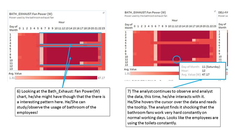
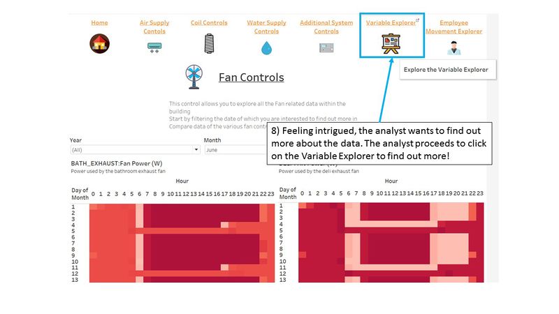
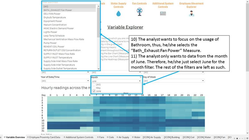
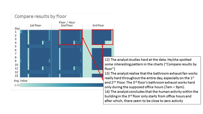
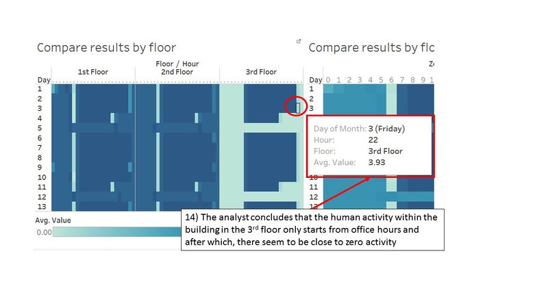
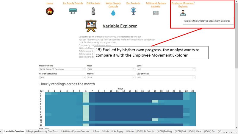
| Scenario There is a hardworking analyst who wants to explore for patterns with regards to the bathroom use in the building! |
| Steps |
Findings - Task #1
What are the typical patterns in the prox card data? What does a typical day look like for GAStech employees?
| Serial | Observation |
|---|---|
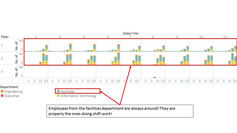
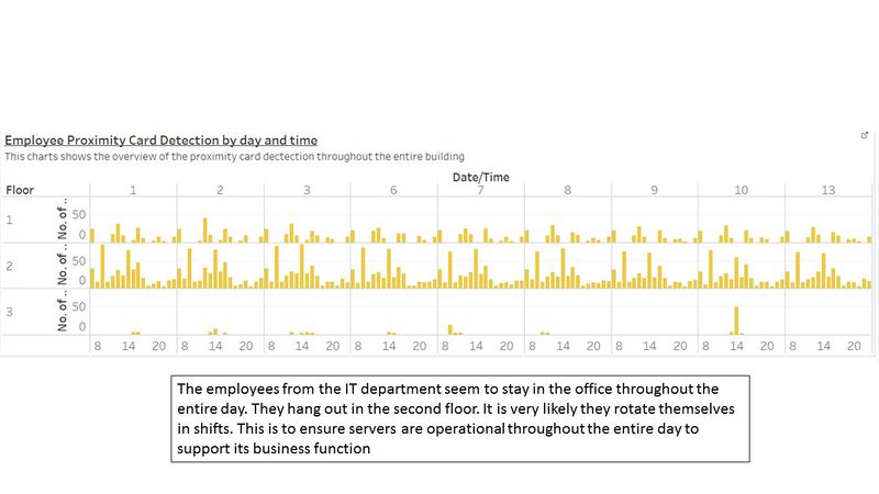
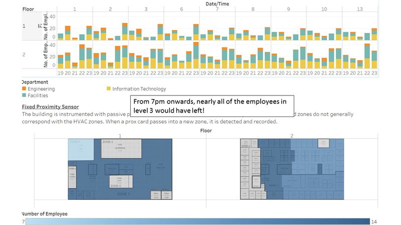
| 1 | The people from the facilities department are always around the building 24/7. They are located mostly in level 1. It appears that they work in shifts and they ensure that there is always someone from the department around ay anytime of the day. |
| 2 | |
| 3 | |
| 4 | |
| 5 | |
| 6 | |
| 7 | |
| 8 | |
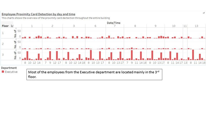
| 9 | The offices of the employees are arranged by position. The higher position the employee is, it is likely that his/her office will be at the higher floor. The executive departments are mainly located on the 3rd floor, while people from the facility and security department comes from the 1st and 2nd floor. |
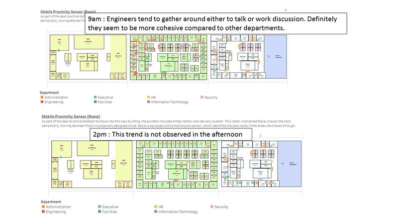
| 10 | Floor 2 is where the bulk of the employees are. Most of the employee's offices are on the 2nd floor. Although their offices are located on the 2nd floor, they still move about the building as frequently. Also, as seen in the floor map and the employee proximity card data, floor 1 is where meetings and front desk offices are located. Thus, the reduced employee presence in floor 1 also suggests that the meeting rooms in floor 1 are likely to be used to host guests/events |
Findings - Task #2
Describe up to ten of the most interesting patterns that appear in the building data. Describe what is notable about the pattern and explain its possible significance.
| Serial | Measurement Category | Description and Significance |
|---|---|---|
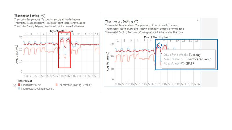
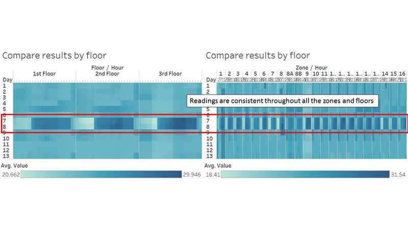
| 1 | Thermostat Setting | The general setting for the thermostat heating and cooling setpoints tend to be opposite of each other. When the heating set point is being set to a higher point, the cooling setpoint will be set to a lower point. This is normally because the user is trying to adjust the temperature of the air within the zone. Naturally, when you want the place to be cooler, you will set the heating point at a lower point, and the cooling point to be at a higher point. This is to produce an equilibrium temperature within the zones. You see that the temperature of the air is between the two setpoints. However in the month of June, the period of 7th to 10th. The behavior of the thermostat setting seems to be off the norms. It betrays the general behaviour which is shown in the rest of the month. As the heating setpoint increases, the cooling setpoint increases as well. The general temperature of the air within the zones seems to increase significantly during mid-day. It peaks up as much as to 28.88°C. The average temperature of the air in the zones hovers around 24°C. This is approx. 4°C above the norm. The average temperature in Singapore, especially during the hottest month,February, is around 27°C. The observation here is definitely something worth investigating. The behavior is consistent throughout all the floors and its zone. There are potential reasoning to this cause.
Significance |
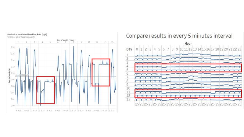
| 2 | Mechanical Ventilation Mass Flow Rate | This measurement tells us how much air is flowing through the zone exhaust fan. In the month of June, in particular, there is some inconsistency for the readings on two particular weekends, namely 4th-5th June and 11th-12th June. In general, the readings of this specific measurement has its own cycle within the day. Naturally, it would be lower on the weekends. However, the 2 weekends in June, displays very different reading. The first weekend shows a reading that is below the average while the second weekend shows a reading that is significantly higher than the average. You can also observe that the readings are consistent throughout the weekdays and weekends. During the weekday, the flow rate generally increases during mid-day (Possibly due to the hot weather). On the weekend the pattern is very different. |
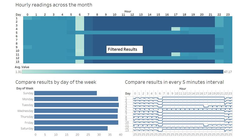
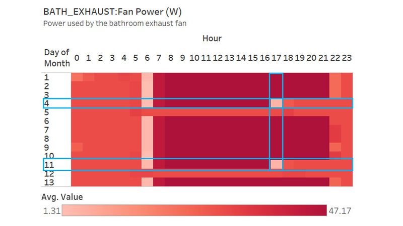
| 3 | Bath_Exhaust:Fan Power | This is the measurement of the power used by the bathroom fans. The power indicates usage of the bathroom. There is consistent use of the bathroom throughout the weekday. On the weekend, especially Saturdays (4th and 11th), the usage drops drastically after 1600H. Significance |
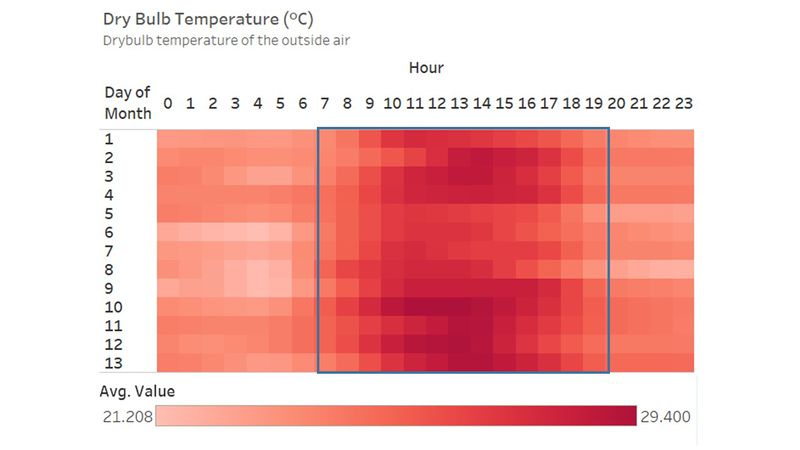
| 4 | Dry Bulb Temperature | The dry-bulb temperature (DBT) is the temperature of air measured by a thermometer freely exposed to the air but shielded from radiation and moisture. DBT is the temperature that is usually thought of as air temperature, and it is the true thermodynamic temperature. Thus, this reading tells us the relative weather condition of outside of the building. As shown in the picture, the readings are very consistent throughout the month of June, you can see that the temperature generally goes up during noon. This reading strongly correlates to the time of the day. Generally, you would expect the temperature to go up during mid-day. |
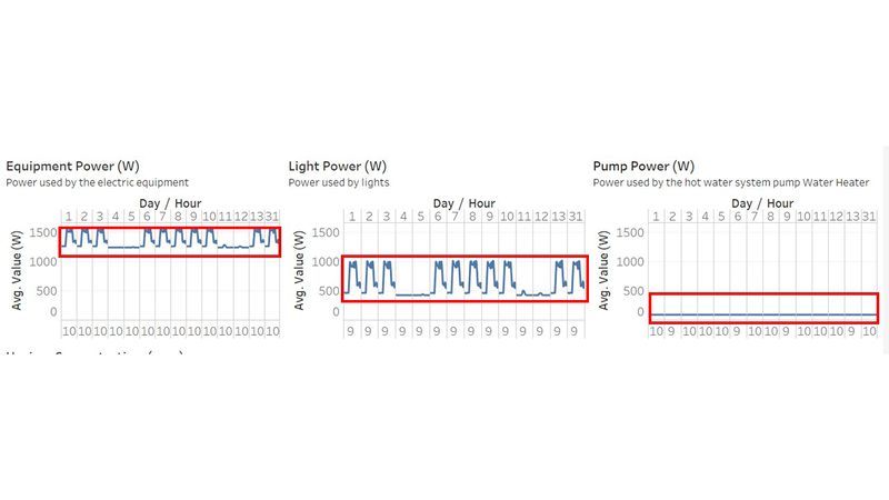
| 5 | Lights/Pump/Equipment Power | The readings from all three power consumers, namely lights, pump and equipment display very health power consumption. Their power consumptions are very consistent throughout the month. Light and Equipment power generally peaks up during the weekday. During the weekend, you can see a significant drop in the power consumption. However, for the pump, the power it consumed is a constant number. Either it could be efficiently used, or potentially there is a faulty sensor which causes this reading. Constant reading of 91W can be suspicious.
|
| 6 | Water Heater Setpoint & Loop Temp Schedule | The loop temperature schedule refers to the temperature set for the hot water loop. This is the temperature at which hot water is delivered to hot water appliances and fixtures. The temperature for both readings were at a constant value throughout all the month. Both are set at the temperature of 60.0 degree celsius. |
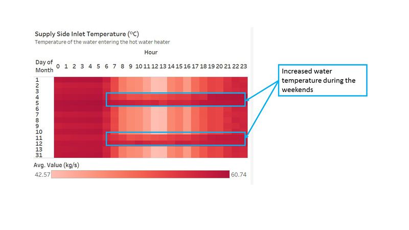
| 7 | Supply Side Inlet Temperature | This reading measures the temperature of the water entering the hot water tank. The readings intensified as the temperature increases especially on the weekend. The water going into the hot water tank is generally higher during the weekend then compared to the weekday. This is worth investigating as there are lesser human activities over the weekend. The system could be boiling the water unnecessarily, thus, wasting energy.
|
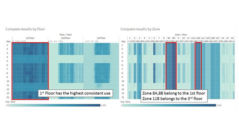
| 8 | Lights Power | Despite the consistent total Lights power consumption, there is some interesting pattern to it. Lights power in the first floor is generally not turned off. Much of the power consumption comes from the 1st floor. Even past working hours, the 1st floor still consumes significantly high power, while the rest of the floors' consumption dropped to their minimal level. What is more surprising is that the zones, 8A, 8B, and 11B reflect the lights consumed in corridors. It appears that the building is not really energy efficient after all!
|
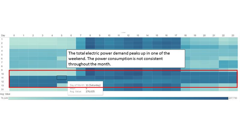
| 9 | Total Electric Power Demand | The new building claims to be of the highest energy efficiency standards, however, there are questionable data points which do not accurately reflects the energy efficiency capability. The total electric power demand peaks up and intensify on a particular weekend in June (10th - 13th). It begins from Friday morning, and intensify all the way till the following morning. After which, the demand for electric power drops. This is an interesting finding as there should be lower employee activities during the weekends.
|
Findings - Task #3
Describe up to ten notable anomalies or unusual events you see in the data. Prioritize those issues that are most likely to represent a danger or a serious issue for building operations.
| Priority | Measurement Category | Description and Significance |
|---|---|---|
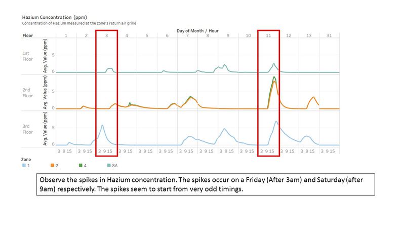
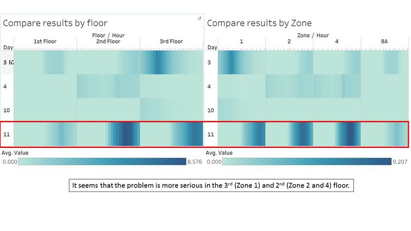
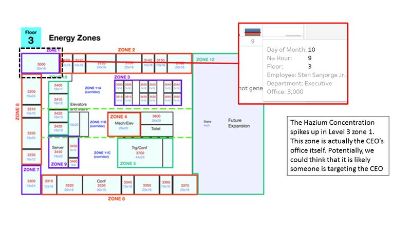
| 1 | Hazium Concentration | Hazium is a recently discovered and possibly dangerous chemical. It poses health hazards to the employees whom inhales it. There are spikes in Hazium concentration especially on 3rd (Friday) and 11th (Saturday) June. What is more surprising is that, one of the areas with high concentration is coming from office 3000(CEO's office). Signifiance As mentioned in the background text, hazium is a dangerous chemical. High concentration of haizum is likely to pose health issues to employees. No one can explain the effects of hazium, but it was concluded to likely be a dangerous chemical to employee. Therefore, it is crucial for the company to look for the root course and address it. |
| 2 | Return Outlet CO2 Concentration | This reading tells us the CO2 concentration within the building. The healthy co2 concentration ranges from 250ppm to 1000pm. However on 2 conservative days (6th and 8th of June), the CO2 concentration spike above 1800 ppm. Signifiance High concentration of CO2 within the building would post health hazard to the employee. PPM reading above 1000, the employees would experience drowsiness. As it reaches above 2000, employees will experience headaches, sleepiness and stagnant, stale, stuffy air. Poor concentration, loss of attention, increased heart rate and slight nausea. It is vital for the company to look investigate the high CO2 concentration. |
| 3 | Thermostat Setting | This finding is as per one which was mentioned in above in Task #2, the malfunction of this Thermostat would be devastating. Signifiance The thermostat is responsible for regulating and maintain the internal temperature of the building. You can effectively say that, the readings from the thermostat would control the temperature of the building. There have been instances of it peaking up. The high temperature may potentially cause health hazard for the employee |
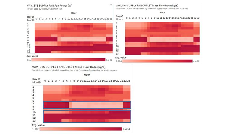
| 4 | VAV_SYS Supply Fan Outlet Mass Flow Rate | This reading tells us the total rate of air delivered by the HVAC system fan to the zone it serves. The data collected in the month of June is not showing consistent results. The readings do tally with the VAV_Sys Supply Fan Outlet:Power. The readings intensify in 2 particular periods, 7th-8th June and 10th-13th June. During 7th-8th June (Tuesday to Wednesday), the reading intensifies in the early hours and late night. This is an abnormal phenomenon. This is telling us that more air is being delivered by the HVAC system fan when there is no supposed employee during this period. The second period, 10th-13th June, shows intensified readings consistently from 10th June evening to 13th June Morning (Friday to Monday).
This reading is important because it will indicate the overall system health of the HVAC fans. It tells us if the HVAC fans are working harder. It also indicates if the HVAC system's ability to maintain the building's internal temperature/ventilation. |
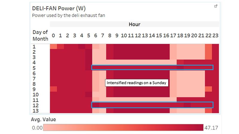
| 5 | Deli-Fan Power | This reading tells us the power used by the deli exhaust fan. There are some suspicious data points with regards to the use of Deli-Fan. The fan usage seems to be consistently high during a Sunday(5th and 12th June). The readings do not seem to tally with the increased human activities during the weekday. The inconsistent readings do not seem to establish any form of correlation with the human activity. But rather, the pattern of seem to be established by other unknown factors. |
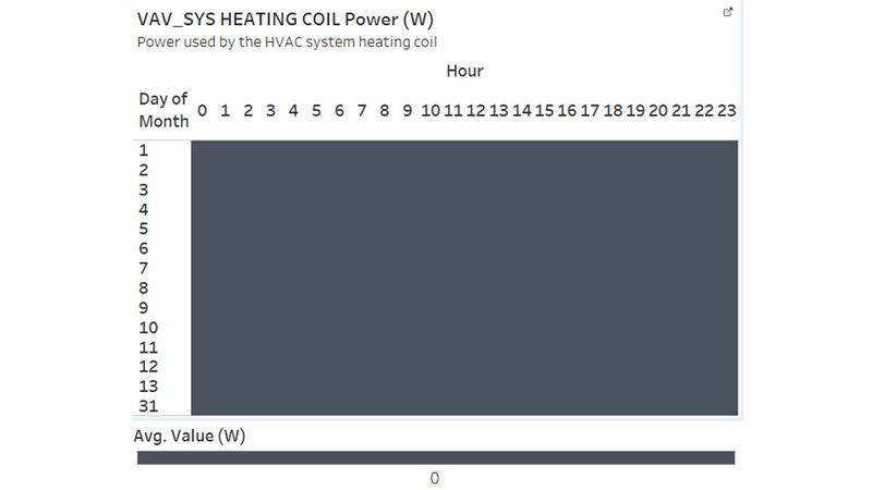
| 6 | VAV_SYS Heating Coil Power | There is completely 0 power used for the heating coil. This is entirely not possible as the HVAC system seem to be working properly. Thus, there is very little prove that the Heating Coil is broken/faulty. Signifiance |
| 7 | VAV_SYS Supply Fan:Fan Power | The system supply fan consumes more power on the weekend (both Saturday and Sunday). This is highly unusual as there is lower employee activity within the building. Most of the power comes from the fans in level 3. On Saturday it is a half day, but on Sunday only those who are on shift would be in the building. Therefore, on Sunday, there would be close to zero human activity. Signifiance The supply fan is responsible for circulating the air within the HVAC system. In this case, the unnecessary power consumed by the fan would incur additional cost to the company. Not only that, it is a waste of energy. |
Findings - Task #4
Describe up to five observed relationships between the proximity card data and building data elements. If you find a causal relationship (for example, a building event or condition leading to personnel behavior changes or personnel activity leading to building operations changes), describe your discovered cause and effect, the evidence you found to support it, and your level of confidence in your assessment of the relationship.
| Serial | Discovery |
|---|---|
| 1 |
|
Conclusion
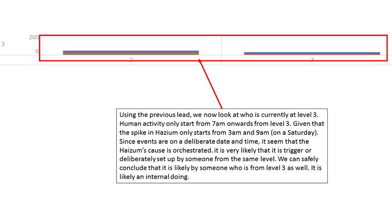
There are many interesting findings which do not reflect the energy efficiency ability which the builders had claimed to be. The new building does not seem to be as energy-efficient as what was previously advertised. As for the occurrence of Hazium, it is postulated to be caused by the employee themselves. The evidence points towards a deliberate attack towards the CEO himself. As Hazium is a newly discovered chemical, its potential impact on the employees is unknown. Many cautious steps should be taken when investigating the Hazium outbreak. Evident suggest that the culprit seem to be an employee from level 3!
This is one tough assignment - https://public.tableau.com/views/MA_3_0/Home?:embed=y&:display_count=yes
Improvement
Given more time, i would focus on improving drilling capability of the this visualisation tool. I would also work on improving the interface for the Employee Movement Explorer. But nonetheless, it was a tough fight against time and my analyatical ability. I am still glad manage to generate something like that.
Visualisation Software
To perform the visual analysis, this is a list of the software which I used.
- Tableau
- Excel
- Chrome
- Netbeans
Submission details
This is an individual assignment. You are required to work on the assignment and prepare submission individually. Your completed assignment is due on 24th October 2016, by 12.00 noon.
You need to edit your assignment in the appropriate wiki page of the Assignment Dropbox. The title of the wiki page should be in the form of: IS428_2016-17_T1_Assign3_FullName.
The assignment 3 wiki page should include the URL link to the web-based interactive data visualization system prepared.
Assignment 3 Q&A
Need more clarification, please feel free to pen down your questions.
- What is Hazium? Hazium is a (fictitious) chemical that has become a recent concern on the island of Kronos. Not much is known about its effects, but it is suspected that Hazium is not good for people.
- There are a few extra building file data fields in the .json dataset that do not appear in the .csv data. These extra data fields are actually valid for the building for the dates and times they were recorded, but they will not add significantly to your analysis. So for this assignment, please just use the data fields included in the .csv file.
- Can you provide more info on the data provided in the mobile proximity card data? Are the x,y coordinates bound to a normal (x,y) plane, where in this case the plane is the floor maps? The (x,y) coordinates are bound to a normal plane. The (x,y) plus the floor number would identify a specific location. The lower left of the provided map is (0,0) and the upper right is (189,111).
- In some cases, data is reported for some sensors and not others, or it is documented but not reported. Where can we find this data? Please use the data fields you have available to perform your investigation. In general, the documented set of attributes may not be reported for all zones.
- What does the (x,y) coordinates represent for the mobile robot sensor? The (x,y) coordinates for these reading represent the location of the mobile sensor.
- Sometimes, mobile prox data for a prox card repeats multiple times in a minute. Does this indicate the number of seconds that the prox card was within range of the sensor? No. Multiple readings do not indicate what fraction of the minute that the mobile sensor was in proximity of the prox card.
- In some cases, the value of the VAV Availability Manager Night Cycle On/Off is 2. Is this a valid value? Yes.
- Does F_3_Z_9 VAV Damper Position mean F_3_Z_9 VAV REHEAT Damper Position? Yes.
References
- http://www.picturetopeople.org/image_utilities/image-grayscale-converter/grayscale-image-generator.html
- https://community.tableau.com/message/320738
- http://www.thedataschool.co.uk/niccolo-cirone/tableau-tip-week-wednesday-creating-dashboard-navigator-buttons/
- http://kb.tableau.com/articles/howto/renaming-dimension-column-row-headers
- https://tableauandbehold.com/2015/04/13/creating-custom-polygons-on-a-background-image/
- https://www.kane.co.uk/knowledge-centre/what-are-safe-levels-of-co-and-co2-in-rooms
- https://en.wikipedia.org/wiki/HVAC
Comments
Do provide me your feedback!:)
