IS428 2016-17 Term1 Assign3 Tee Yu Xuan
Contents
- 1 The Task
- 2 Data Cleaning
- 3 Findings
- 3.1 What are the typical patterns in the prox card data? What does a typical day look like for GAStech employees?
- 3.2 Describe up to ten of the most interesting patterns that appear in the building data. Describe what is notable about the pattern and explain its possible significance.
- 3.3 Describe up to ten notable anomalies or unusual events you see in the data. Prioritize those issues that are most likely to represent a danger or a serious issue for building operations.
- 3.4 Describe up to five observed relationships between the proximity card data and building data elements. If you find a causal relationship (for example, a building event or condition leading to personnel behavior changes or personnel activity leading to building operations changes), describe your discovered cause and effect, the evidence you found to support it, and your level of confidence in your assessment of the relationship.
The Task
As an expert in visual analytics, you have been hired to help GAStech understand its operations data. In this assignment, you are given two weeks of building and prox sensor data. Can you use visual analytics to identify typical patterns of and issues of concern?
You will be asked to answer the following types of questions:
- What are the typical patterns in the prox card data? What does a typical day look like for GAStech employees?
- Describe up to ten of the most interesting patterns that appear in the building data. Describe what is notable about the pattern and explain its possible significance.
- Describe up to ten notable anomalies or unusual events you see in the data. Prioritize those issues that are most likely to represent a danger or a serious issue for building operations.
- Describe up to five observed relationships between the proximity card data and building data elements. If you find a causal relationship (for example, a building event or condition leading to personnel behavior changes or personnel activity leading to building operations changes), describe your discovered cause and effect, the evidence you found to support it, and your level of confidence in your assessment of the relationship.
Data Cleaning
Findings
What are the typical patterns in the prox card data? What does a typical day look like for GAStech employees?
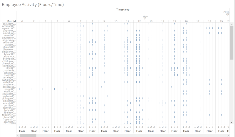
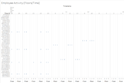
The above visualization shows the fixed proximity sensors results in GAStech. By identifying each employees movement on each floor at a point of time (by the hour). We were able to identify what a typical day looks like for GAStech employees.
Working Hours
Office Hours
Firstly we were able to see that the most common working hours are between 7am and 5pm, where most employees start appear at floor 1 and proceed to either 2 or 3. Thus it can be inferred that the normal office working hours for GAStech employees are between 7am and 5pm.
However not all employees seem to work at the common office hours. There also seem to be shift workers who work odd hours. One such example can be seen in the visualization is proxorid earpa001. He/She seems to work from 12am to 6am timings. Such working shifts are common for engineers who maintain equipment that needs to be operational 24/7, or simply building security officers or housekeeping staff.
Shift Workers
Shift workers also seem to only stay within 1/2 floors and are constantly on the move, therefore they always come up on the fixed prox sensors throughout their working hours. Compared to office workers that simply stay in their office most of the day, will not appear on the sensors consistently throughout their work times at GAStech due to lack of movement.
Movement Reasons
We are also able to identify the lunch times for GAStech employees. With most offices being on the 2nd and 3rd floors. We can see lots of movement between floors around 11am and 1pm. This is very likely the lunch time for GAStech employees where they had to travel back down to 1st floor to leave the office building.
Each employees common movement patterns and stationed floor is also easily identified. Take for example the first employee on the list, acalzas001. He/She enters the office building floor 1 at 7am and proceeds to floor 2 at the same hour. Following, acalzas001 only appears on prox sensors on the 2nd floor, only appearing on the 1st floor prox sensors at 11am (very likely leaving for lunch) and 1pm (He/She has returned from lunch). After which, the rest of the day is spent on the 2nd floor until 5pm where acalzas001 appears on the 1st floor again to leave the building (likely an office worker, no other prox sensor after 5pm). Simply observing the ways employee trigger these fixed prox sensors, we can track their movements within the building and which floor they are currently situated at a specific time/day.
Describe up to ten of the most interesting patterns that appear in the building data. Describe what is notable about the pattern and explain its possible significance.
Describe up to ten notable anomalies or unusual events you see in the data. Prioritize those issues that are most likely to represent a danger or a serious issue for building operations.
| S/N | Compared Parameters | Description |
|---|---|---|
| 1 | Temperatures (Heating and Cooling Setpoint) |
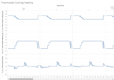
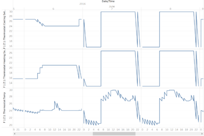
An interesting pattern that occurred in the building data is how temperatures was really unstable on the 7th and 8th June. As seen in the above visualizations. Temperatures were normally adjusted by heating and cooling setpoints which tries to keep temperatures of the office between 23 - 27 degrees. Which is the preferred air-conditioned temperature people are comfortable with. However on these 2 days, temperatures of the office spiked between 20 - 30 degrees, with the heating and cooling setpoints showing very extreme settings as well (spiking to 30 or -26 settings). This caused an unstable air-conditioning within the office building for those 2 days. |
| 2 | Unusual activity on weekends (Light usage and employee activity) |
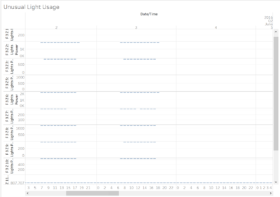
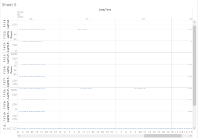
From the above visualizations, we can see that there are unusual light usage on floor 3 zones on the 11th and 12th June. Lights that are usually not switched on during weekends are being used. In this example, Floor 3 zone 2/8 lights are in used during weekends. What is interesting to note, is that it is actually possible to track who actually accessed these areas and used the office during the weekends. With the employee activity chart, we were able to identify that employees with proxid mbramar001, ostrum001 and illagos001 were the 3 employees that accessed floor 3 during these 2 days. Their activity captured on the charts also tallies with the time the lights on floor 3 were switched on. Using these visualizations, we were not only able to identify which employees accessed the office during non-usual working hours, but also identify which floors/zones they are actually accessing to. |
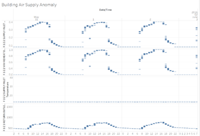
| 3 | Air Supply Anomaly (Supply inlet temperature, return outlet CO2 levels, supply inlet flow rate, VAV reheat damper position) | |
| Example | Example | Example |
| Example | Example | Example |
Describe up to five observed relationships between the proximity card data and building data elements. If you find a causal relationship (for example, a building event or condition leading to personnel behavior changes or personnel activity leading to building operations changes), describe your discovered cause and effect, the evidence you found to support it, and your level of confidence in your assessment of the relationship.
| Example | Example | Example |
| Example | Example | Example |
| Example | Example | Example |
