IS428 2016-17 Term1 Assign3 Wang Jingxuan
Contents
Overview
After the successful resolution of the 2014 kidnapping at GAStech’s Abila, Kronos office, GAStech officials determined that Abila offices needed a significant upgrade. At the end of 2015, the growing company moved into a new, state-of-the-art three-story building near their previous location. Even though the employee morale rose somewhat with the excitement of the new building, there are still a few disgruntled employees in the company.The new office is built to the highest energy efficiency standard, but as with any new building, there are still several HVAC issues to work out. The building is divided into several HVAC (heating, ventilation, and air conditioning) zones. Each zone is instrumented with sensors that report building temperatures, heating and cooling system status values, and concentration levels of various chemicals such as carbon dioxide (abbreviated CO2) and hazium (abbreviated Haz), a recently discovered and possibly dangerous chemical. CEO Sten Sanjorge Jr. has read about hazium and requested that these sensors be included. However, they are very new and very expensive, so GAStech can afford only a small number of sensors.
With their move into the new building, GAStech also introduced new security procedures, which staff members are not necessarily adopting consistently. Staff members are now required to wear proximity (prox) cards while in the building. The building is instrumented with passive prox card readers that cover individual building zones. The prox card zones do not generally correspond with the HVAC zones. When a prox card passes into a new zone, it is detected and recorded. Most, but not all, areas are still open to staff members even if they forget their prox cards. People are somewhat careless with their prox cards, but some diligent staff members will go to the security desk and pick up a new prox card if their old one is mislaid. As part of the deal to entice GAStech to move into this new building, the builders included a free robotic mail delivery system. This robot, nicknamed Rosie, travels the halls periodically, moving between floors in a specially designed chute. Rosie is equipped with a mobile prox sensor, which identifies the prox cards in the areas she travels through.
Approaches
Research Questions
1. What are the typical patterns in the prox card data? What does a typical day look like for GAStech employees?
2. Describe up to ten of the most interesting patterns that appear in the building data. Describe what is notable about the pattern and explain its possible significance.
3. Describe up to ten notable anomalies or unusual events you see in the data. Prioritize those issues that are most likely to represent a danger or a serious issue for building operations.
4. Describe up to five observed relationships between the proximity card data and building data elements. If you find a causal relationship (for example, a building event or condition leading to personnel behavior changes or personnel activity leading to building operations changes), describe your discovered cause and effect, the evidence you found to support it, and your level of confidence in your assessment of the relationship.
Data Preprocessing
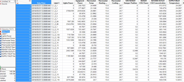
For the data of building, i added the category of floor and zone. In order to do that, I used JMP stack function stacked all the lights power (for example) from level 1 to level 3, then i stacked all the equipment power from level 1 to level 3, and copy the value to the first sheet which contains lights power, and I keep doing this until i get all the attributes separated from floors and zones. Then I created a new column and used JMP col utility text to column function to separate floor name and zone name. The results are as shown:
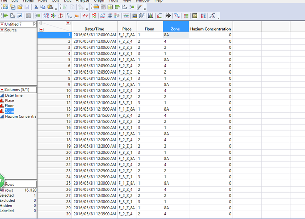
For the Hazium concentration data, I copied all the columns of Hazium concentration over to the same sheet by using JMP, then I used the same technique as shown above to separate floors and Hazium Concentration.
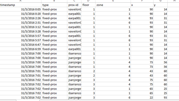
For the proxy card data, as we dont know the x and y coordinates of each zone. I firstly estimated the rough coordinates of each zone (around center) and assign them to each record based on its floor and zone number. I did that by using excel and lookup function. Basically I combined number of floor and zone first by writing excel statement "floor&""&zone". Then I used lookup function that I set lookup value to be the "floor&""&zone", lookup vector and results vectors are the rough coordinates I made for each floor+zone identifier, for example floor 1 zone 1 identified by "11" and its x coordinate is 90 and y coordinate is 14. I applied it to all the records and achieved this:
Link to Interactive Dashboard
Analysis
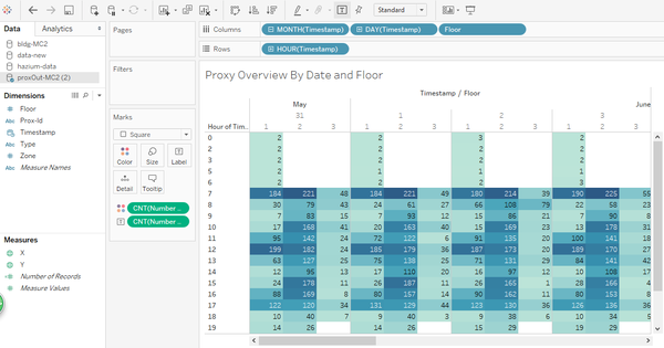
Firstly I looked at the proxy data. I ploted the overview of the proxy data by dates and hours, also segregated them by floor number 1,2,3.
The first graph shows how I did the overview graph and second graph gave us a holistic view of employees schedule and movement based on proxy card data.
Patterns in the prox card data
From the above graphs, from May 31 to May 13 and from hours 0-6 there are a very small number of people going into level 1, and almost no people going to level 3. From hours 7 onwards, a great number of people are going to level 1 and level 2 and level 3. So we could possibly assume their working time starts from 7. And after hours 17, the number becomes to decrease and this could be because their working time ends at 5PM afternoon. And we can see that on 5th, 11th and 12th of June, there are very few proxy records, this is because these days are weekends. So during weekends very few people entering the building. And general speaking, level 1 has a large number of records, it could mean that the number of people on level 1 is large and level 2 has even larger number than level 1, but very few people working on level 3 compared to level 1 and 2.
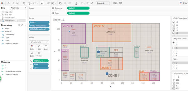
floor 1 day 2:
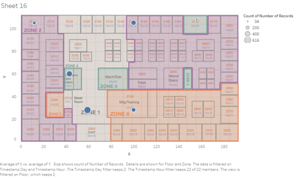
floor 2 day 2:
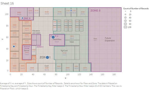
floor 3 day 2:
The graphs show during a normal working day, how are the proxy records look like mapping onto floor plans of different floors. We can see that because people keep entering and leaving from the main entrance and they also need to walk through corridor(zone 1), so number of people recorded at zone 1 is the largest. Zone 4 is the elevator or staircase which is needed by officers to go up to 2rd floor and 3rd floor, the number of people recorded also very high.
And level 2 is the main working area and we can see that zone 1 has the largest number followed by zone 7 which is different from zone 1, mainly open area, consisting mainly working offices. And very few people working on level 3 and level 3 zone 1 recorded largest number.
Hazium Concentration
Tools Utilized
- Excel 2013
- JMP-PRO 13
- Tableau
