IS428 2016-17 Term1 Assign3 Joachim Fu Jun Hao
Contents
- 1 Problem & Motivation
- 2 Data Transformation & Analysis
- 3 Data Visualisation
- 4 Observations & Patterns
- 4.1 What are the typical patterns in the prox card data? What does a typical day look like for GAStech employees?
- 4.2 Describe up to ten of the most interesting patterns that appear in the building data. Describe what is notable about the pattern and explain its possible significance
- 4.3 Describe up to ten notable anomalies or unusual events you see in the data. Prioritize those issues that are most likely to represent a danger or a serious issue for building operations
- 4.4 Describe up to five observed relationships between the proximity card data and building data elements. If you find a causal relationship (for example, a building event or condition leading to personnel behavior changes or personnel activity leading to building operations changes), describe your discovered cause and effect, the evidence you found to support it, and your level of confidence in your assessment of the relationship
- 5 Comments
Problem & Motivation
After the successful resolution of the 2014 kidnapping at GAStech’s Abila, Kronos office, GAStech officials determined that Abila offices needed a significant upgrade. At the end of 2015, the growing company moved into a new, state-of-the-art three-story building near their previous location. Even though the employee morale rose somewhat with the excitement of the new building, there are still a few disgruntled employees in the company.
The new office is built to the highest energy efficiency standard, but as with any new building, there are still several HVAC issues to work out. The building is divided into several HVAC (heating, ventilation, and air conditioning) zones. Each zone is instrumented with sensors that report building temperatures, heating and cooling system status values, and concentration levels of various chemicals such as carbon dioxide (abbreviated CO2) and hazium (abbreviated Haz), a recently discovered and possibly dangerous chemical. CEO Sten Sanjorge Jr. has read about hazium and requested that these sensors be included. However, they are very new and very expensive, so GAStech can afford only a small number of sensors.
With their move into the new building, GAStech also introduced new security procedures, which staff members are not necessarily adopting consistently. Staff members are now required to wear proximity (prox) cards while in the building. The building is instrumented with passive prox card readers that cover individual building zones. The prox card zones do not generally correspond with the HVAC zones. When a prox card passes into a new zone, it is detected and recorded. Most, but not all, areas are still open to staff members even if they forget their prox cards. People are somewhat careless with their prox cards, but some diligent staff members will go to the security desk and pick up a new prox card if their old one is mislaid. As part of the deal to entice GAStech to move into this new building, the builders included a free robotic mail delivery system. This robot, nicknamed Rosie, travels the halls periodically, moving between floors in a specially designed chute. Rosie is equipped with a mobile prox sensor, which identifies the prox cards in the areas she travels through.
Data Transformation & Analysis
Given files
- Employee List Excel File
- Building CSV File
- Floor 1 Zone 8 CSV File
- Floor 2 Zone 2 CSV File
- Floor 2 Zone 4 CSV File
- Floor 3 Zone 1 CSV File
- Mobile Prox CSV File: Measures the location of employee cards (by x,y coordinates) detected based on mobile sensors
- Prox-out CSV file: Measure the location of employee cards (by zone area) detected based on fixed mobile sensors
Employee ID in Fixed + Mobile Proximity CSV File and Employee List Excel File
- In the employee list excel file given, I analysed the data and removed the index column. Since I felt that the numbers that denote the number of cards the employee has due to misplacement were not necessary, I removed them.
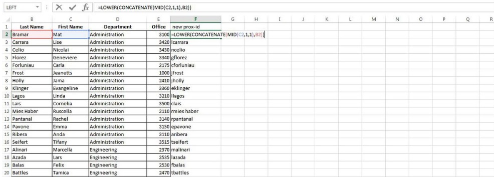
- Based on the Mobile Prox and Prox-out CSV files, the employee ID detected were in the format as follows: <first letter of the first name> + <last name> + <number of times replaced (i.e. 005 means replaced card 4 times)>. As such, I ensured that the employee list excel file, mobile prox and prox out CSV files had the identical employee ID meant for joining of tables in Tableau. Using the excel formula: =LOWER(CONCATENATE(MID(C10,1,1),B10)) to generate each employee's prox id.
Since having decided that I will not be using the last three digits (004), both the proxMobileOut-MC2.csv and proxOut-MC2.csv both have it, I used the excel formula (=LEFT(C2,LEN(C2)-3) to remove as shown below.
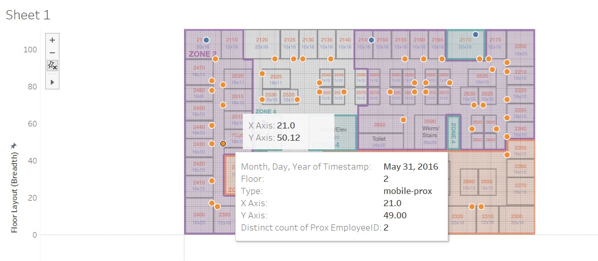
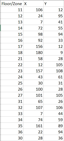
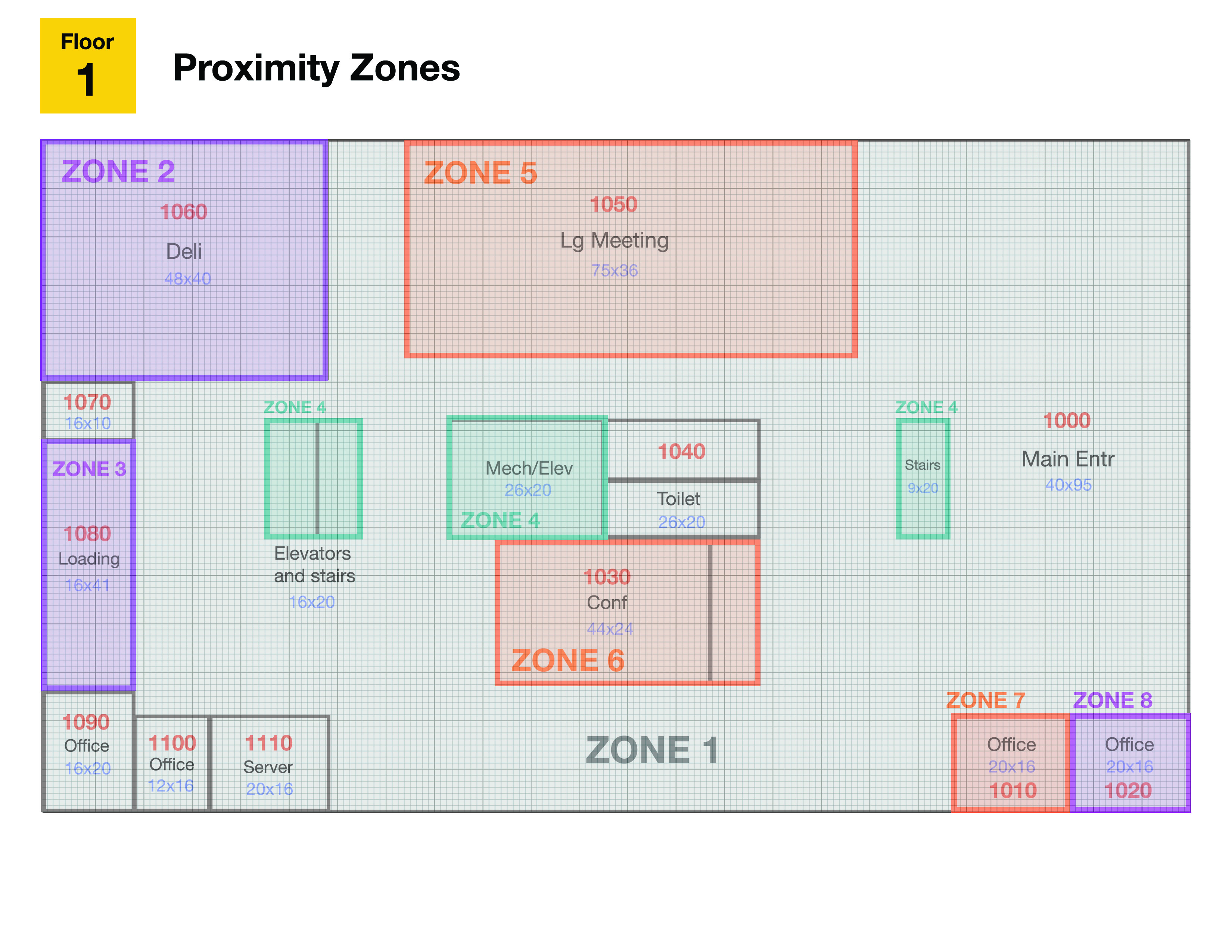
Another issue that I faced was with proxOut-MC2.csv file not having x,y coordinates. As such, I made use of tableau by importing the picture as jpeg image and set X value (0,189) and Y value (0,111). I gave a rough estimate of the centre by annotating as shown below and noted the points on a new sheet in excel for reference between concatenated floor/zone against x and y coordinates. Each floor and zone were input slowly into tableau and specified that zone 1 will be displayed if floor 1 is selected on the filter.
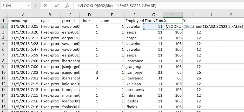
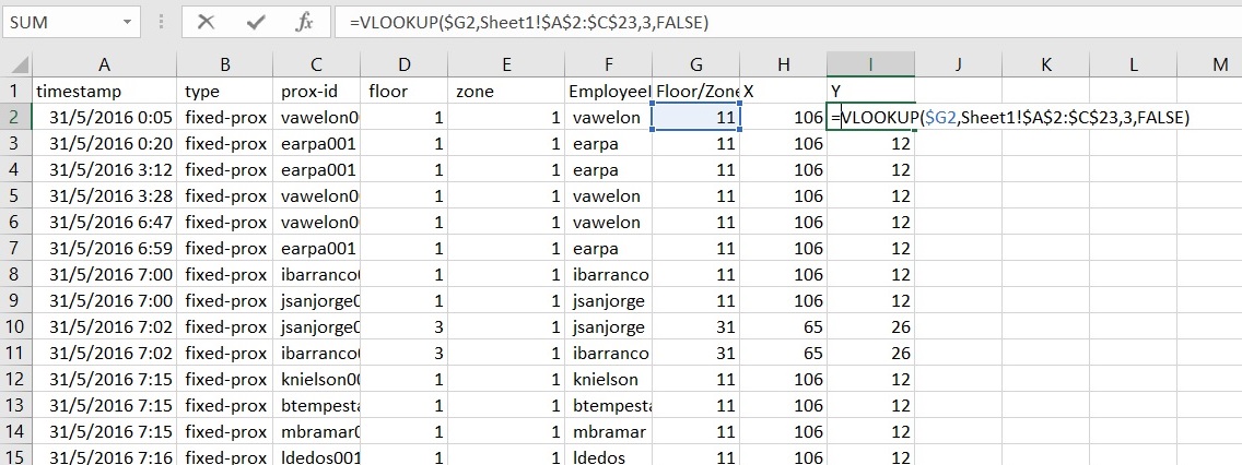
After obtaining the estimated coordinates, I used the excel formula (=VLOOKUP($G2,Sheet1!$A$2:$C$23,2,False) for X coordinates and (=VLOOKUP($G2,Sheet1!$A$2:$C$23,3,False) for Y coordinates as shown below to populate out all the X and Y values.
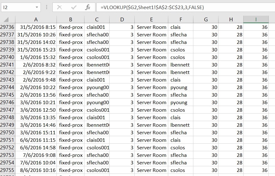
I realised that there were a few data that had server room displayed as shown
Hence I reviewed the floorings on level 3 and added a new concatenated value as shown in the earlier diagram (30) - Floor 3 Zone 0.
Finally, to avoid dual import of files, I combined both data files into 1 and removed the zone column in the proxOut-MC2.csv with the following attributes: timestamp, type, prox-id, floor, x axis, y axis.
Building CSV File + Hazium Readings
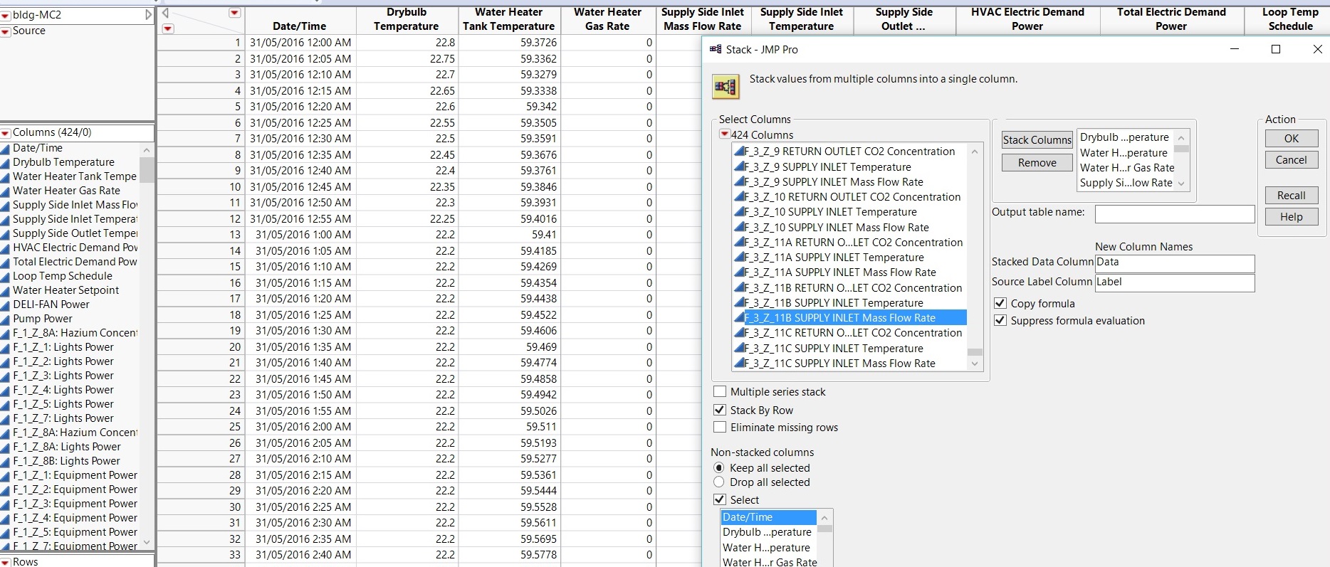
- In the building csv file given, I input all the Hazium Readings accordingly by adding columns as per given by the four Hazium Records into the building excel file. I realised that the column names included the floor and zones together with the energy types. For instance, F_1_Z_1_Light_Power. Hence I made use of JMP Pro and input the building excel file.
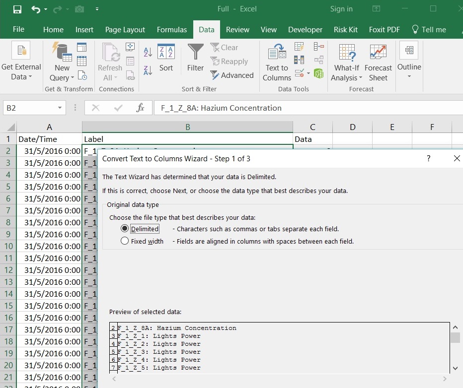
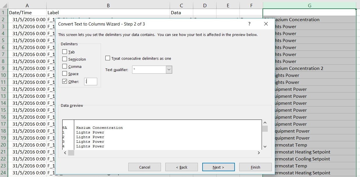
After saving it as CSV file, I had to delimit the Floor and Zones with the '_' and ':' character delimiters. I googled a new function called Convert Text To Columns and the process is as follows:
Since the data only consisted of floor and zone, I concatenated the floor and zone referenced back to the Sheet as shown earlier to obtain the x and y coordinates.
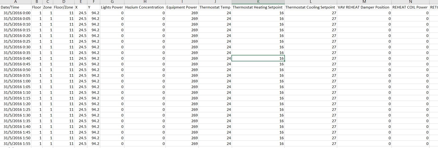
The final result is as follows:
Data Visualisation
Prox Card Sensors Data
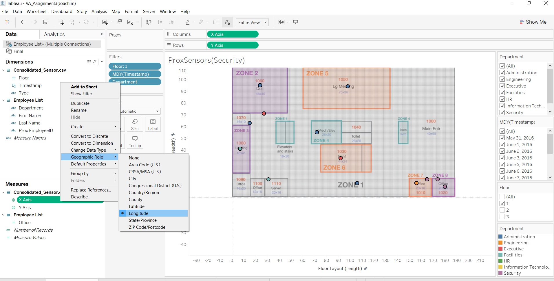
- Changing of X and Y axis to longitude and Latitude and into dimensional data
- Changed Floor into Dimensional Data
- Select None for Map > Background Maps so as to remove the default map backgroud given by Tableau
- Removed spaces and text on VAST_ProxZones_F1, VAST_ProxZones_F2 and Vast_ProxZones_F3
For instance,
and changed into
I did this for the HVAC Energy Zones pictures as well.
As such my first visualisation was to display the coordinates of the employee's card based on each floor and the type of sensors that detected the card. I also counted and displayed the number of employees in that zone with multiple colours denoting the departments they are being sensored. Filters used were the timestamp in (MM/DD/YYYY), Floor, Department.
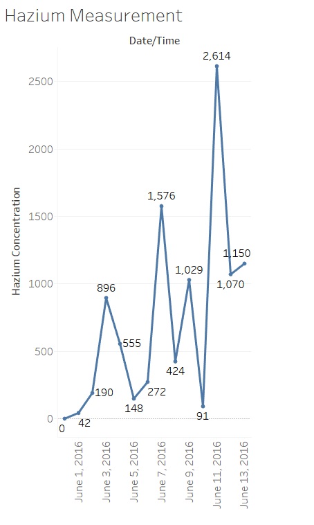
Along with this, I used Hazium Concentrations as it is hazardous and reflects on the safety of the individuals with the exposure to these harmful substances on the different days so that medical attention can be given.
Building Operations Data
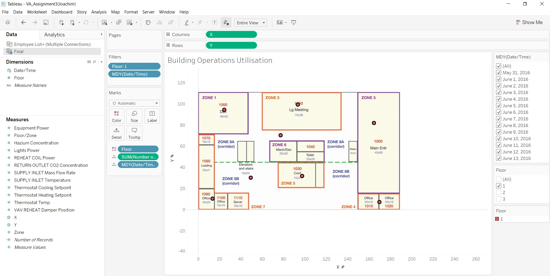
Like the ProxSensor Data, the X,Y coordinates were changed to longitude and latitude and input the background picture. The floor and x,y coordinates was also changed into dimensional data and each floor was filtered together with the timestamp (MM/DD/YYYY).
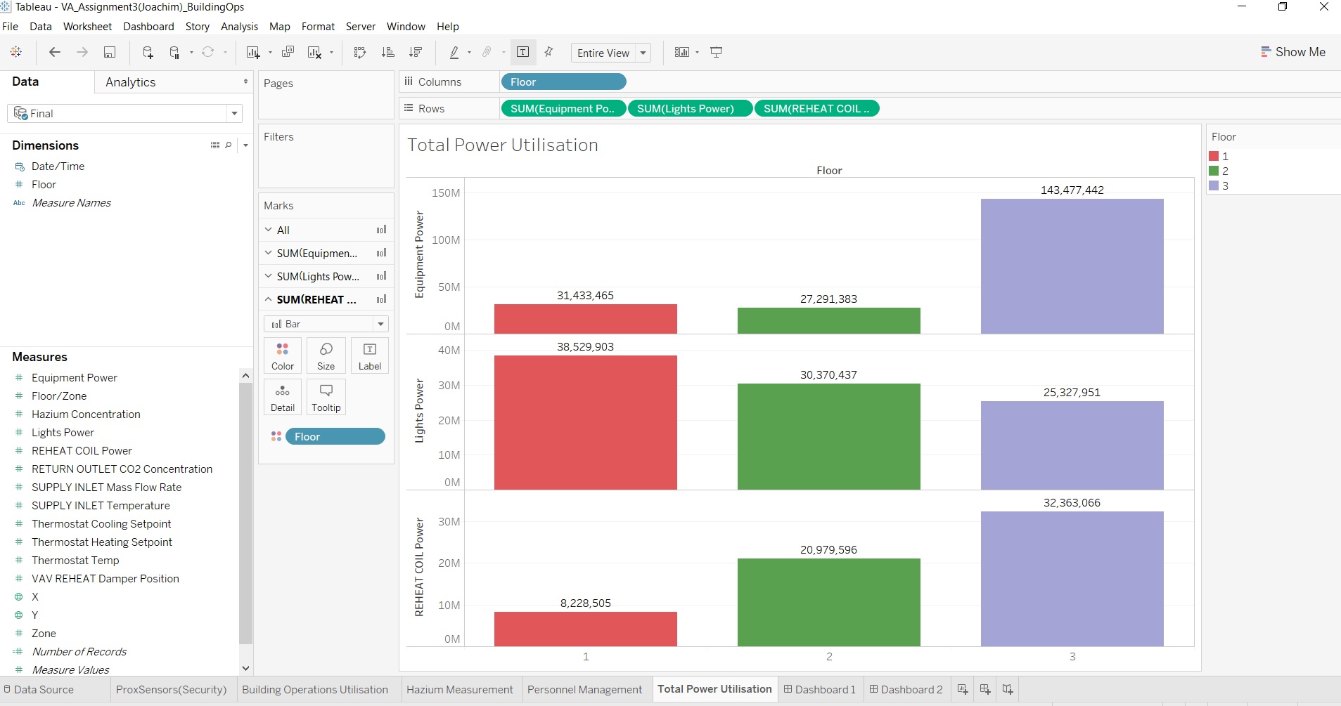
Along with the Building Operations Data, I input the Total Power Utilisation Data to allow the management to better manage its resources.
It is important to understand the identification of Security and Safety for employees to ensure that they are working in a conducive environment which could boost their morale. Likewise for the Building Operations Data for the management team to have an overlook of daily operations and energy consumption levels.
Final Visualisation
Visualisation tools: Tableau, JMP Pro
Please refer to the interactive visualisation link here: https://public.tableau.com/profile/publish/VA_Assignment3Joachim/Dashboard1#!/publish-confirm
Observations & Patterns
What are the typical patterns in the prox card data? What does a typical day look like for GAStech employees?
- Engineering employees are mostly populated on level 2
- Administrative employyees are mostly on level 3
- There are few/no engineering employees on level 3
- There are not many executives going to office often
Describe up to ten of the most interesting patterns that appear in the building data. Describe what is notable about the pattern and explain its possible significance
- Numbered list item
- Numbered list item
- Numbered list item
- Numbered list item
- Numbered list item
- Numbered list item
- Numbered list item
- Numbered list item
- Numbered list item
Describe up to ten notable anomalies or unusual events you see in the data. Prioritize those issues that are most likely to represent a danger or a serious issue for building operations
- Numbered list item
- Numbered list item
- Numbered list item
- Numbered list item
- Numbered list item
- Numbered list item
- Numbered list item
- Numbered list item
- Numbered list item
- Numbered list item
