IS428 2016-17 Term1 Assign1 Thomas Thio Kit Sun
Contents
- 1 Abstract
- 2 Problem and Motivation
- 3 Approaches
- 3.1 Stock’ data:
- 3.2 ‘Transaction’ data:
- 3.3 Analysis:
- 3.4 Share in Supply of Private Property
- 3.4.1 How is the private property supply divided amongst the property types? Which area has a higher percentage of each property type?
- 3.4.2 Which private property types grew consistently over time? Which did not follow the overall trend?
- 3.4.3 Where are most of the supply of private properties located?
- 3.5 Distribution of Private Property Prices
- 4 Tools Utilized
- 5 Results
- 6 Infographic
Abstract
This project aims to understand, identify and reveal patterns in the:
i) Share of private property supply in 2015
ii) Distribution of private property prices in 2015
iii) Provide three policy recommendations for 2016
Through cross-tabulating and analysing private property stock and transaction data, it is possible to identify certain trends in the market especially over time and location. Data is cross-analyzed by Quarter and Location, having used URA’s excel reference for mapping Postal Sectors to General Locations.
My focus were mainly based on Supply-demand comparisons and Supply-price relationships found from through a series of questioning you may follow in the "Contents" links above.
Problem and Motivation
The main problem I wanted to solve was interpreting supply and demand property data easily. I aimed to have data displayed intuitively, such that anyone can understand the findings easily. This is important as data may not necessarily be provided in a form which is easily interpretable, thus my work to unlock information from data.
However, there were some hiccups involved, especially in obtaining and cleaning the data before displaying it. This involved using appropriate visualizations that could fit the question I was trying to ask. Thereafter, more questions would be raised, but there may not necessarily be enough data to concretely answer them.
My motivations prior to this project were to:
1. Understand and correctly define types of housing correctly. This would come in useful in the future for investing in property and the likes. For private property, there is Landed property, Apartments and Condominiums. Landed property refers to Detached, Semi-detached and terrace houses. There are also ‘Private Hybrid’ properties, namely HUDC and Executive Condominiums. Thankfully, REALIS provides these under the ‘Private’ category.
2. See how exactly dirty/clean datasets can be, and what we can do to perform accurate calculation and analysis despite the quality of data.
3. Visualize data to derive answers to the questions we want to ask, for example knowing seasonal fluctuations in price which can be useful when finding a home or selling one in Singapore.
Approaches
I wanted to find out basic information on the 2015 property market, and had to think of the ideal data I would need. However, ‘ideal’ data is not easily available. Exploring REALIS’s site took some work, and understanding what kind of data they gave access to, and this limited the kind of questions I could ask, and even more so when going through the data.
Certain questions could not be answered concretely without other kinds of data (e.g. mortgage and income group of buyers by General Location, Postal Sector or Purchase). For example, when wanted to know the demographics or income levels of those purchasing property in a certain location and identify a trend from there.
I decided to keep my analysis simple, by dividing the questioning process by “Supply”, representing the stock of private properties, and “Demand”, representing the sale of private properties, thus forming the basis of the rest of my analysis. Through the questions, it directed me to ask the next one, thereby revealing more information from the data not otherwise thought of at first glance.
Stock’ data:
Had to download this on a separate REALIS page, which was limited to downloading data in 3 dimensions at a time. I selected postal sector/code, type of property, and quarter. However, the table that was produced was not grouped in the private property segments again, and a custom variable had to be created. Furthermore, there was no distinction between ‘Condominiums’ and ‘Executive Condominiums’, which prevented the proper segmentation between the wholly ‘Private’ and ‘Private-hybrid’ type.
Additionally, REALIS only gives postal sector and the general location as a reference– not a specific location, for example it will only give “Serangoon Gardens, Hougang and Punggol“ or “Seletar” instead of individual areas like Sengkang, which actually crossed into both of these general locations. I decided to leave out joining the supply excel with the postal code reference excel and instead focus on a general analysis of supply/demand comparisons based on the general location at the end.
Tableau would also ignore ‘0’ in front of numeric values when converting into string, thus a calculated field needs to be created to put the zero back, or we can treat both fields as a numeric whole number. However, this is meant to be a category field instead of count, so there needs to be care in how Tableau sees the data and to remember to treat it as a category. REALIS also puts ‘null’ for values that do not exist. Tableau needs to understand this as ‘ISNULL’ to turn it into 0 for calculation later on.
Since REALIS supply data is on a quarterly basis, I had to be careful to ensure calculating the totals by quarter – in short, it is a snapshot on the current available private properties by postal sector, and not how many dwellings were created each quarter!
‘Transaction’ data:
Had to download new sale, re-sale, sub-sale for all 3 types of property. Thereafter, used JMP to combine data together, and turn ‘Sales date’ column into a format Tableau could understand. Total of about 14,000 records for 2015, thereafter can be grouped or segmented in time-series (Quarter, Monthly, Daily). Aggregating the counts of prices could also give the number of transactions, which was useful in the analysis.
REALIS also gives private property data that is not grouped in the three private property segments, so there is a need to group the relevant data into a custom category before producing any charts.
Analysis:
Having gone through and preparing the ‘stock’ and ‘transaction’ data with JMP, I started to pen down questions I could ask. The first few were very basic, which led to other deeper questions – some of which I had to scrap because it either went to deep and deviated from the main task, or that the data was simply not available.
I cross-checked Data.gov.sg for additional data that can lend a hand. However, their supply and demand data were lacking important variables such as address, postal codes or sectors, which I needed to join the data with. Additionally, the other data provided was in raw values, and were not ideal for conducting cross-analysis. Going back to the REALIS data and Tableau, I focused the rest of my effort in figuring out what visualization method would work well, given being a Tableau-Greenhorn, until finding what I thought works well. It was a continuous cycle, selecting graph types, adjusting colors and headings until I reached what I thought was appropriate to answer the question I wanted to ask. In doing so, the analysis was built based on the answers I arrived at, eventually meeting the task requirements.
In this process, I found that I could standardize the encoding of certain colors to meaning. For example, counts of All property types were in purple, Apartments in Blue, Condominiums in Orange, Landed Property in Brown, and anything relating to price in Green.
The results and detailed elaboration of arriving at my analyses are as follows:
How is the private property supply divided amongst the property types? Which area has a higher percentage of each property type?
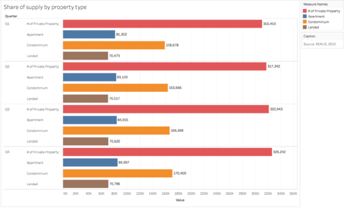
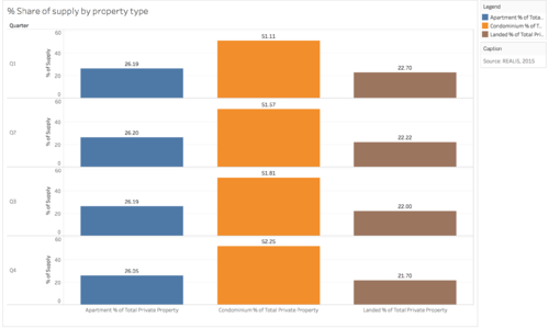
Rationale: Bar charts can display shares and percentages simply, and it understandable to do drill-down analysis by using the same color. I used orange to represent the count of condominium supply, while yellow represents the percentage – similar color schemes are also present for the other property types here and in the following charts
Observation 1: In the first bar chart, the total private property supply in 2015 to 326, 242, growing steadily from 310, 453 at Q1. The second bar chart shows that Condominiums make up a bulk of the share in the 51% region is shown from quarter to quarter – this indicates a linear trend of maintaining the same share of property types.
Which private property types grew consistently over time? Which did not follow the overall trend?
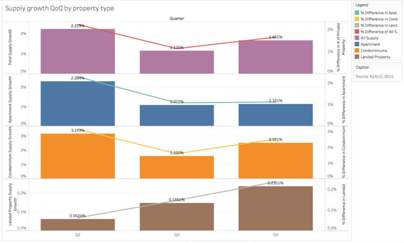
Rationale: Bar charts was shown to visually show the difference in change of supply over the quarters. I used complementary colors for lines drawn, so as not to distract the viewer but aid them in seeing the changes easily. All property types were shown first, followed by the rest of the property types to give a general idea before viewers look at its subset of data. Q1 was left out to calculate the differences, and seemed to waste screen real estate. I felt that this gave an easier time to the audience to see relative changes quarter by quarter, and notice patterns of growth easier.
Observation 2: On a whole, Q3 shows smallest growth in supply, thereafter increasing in growth in Q4. Both Apartments and Condominiums show this slight dip in Q3. Landed Properties see consistent growth through the quarters indicating a steady rise in throughout the year.
This information can let URA see if the absolute numbers (easily swapped in Tableau) or percentage growth is in line with the housing plans. We can also segment this by area, such as in the following graphs to see which General Locations on a whole have a consistent increase in supply according to URA’s planning.
Where are most of the supply of private properties located?
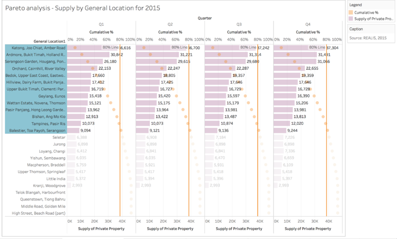
Rationale: A Pareto chart with percentage marks was drawn to quickly see the locations which made up a large bulk of supply. I highlighted locations leading up to the 80% reference line, where it slightly crosses the cumulative total mark.
Observation 3: Apart from looking at solely condominiums, we can look at the overall supply and see which locations have the most supply, throughout the quarters. Using the pareto chart, we find that 80% of supply of private property comes from 13 General Locations, namely:
1. Katong, Joo Chiat, Amber Road 2. Ardmore, Bukit Timah, Holland Road, Tanglin 3. Serangoon Garden, Hougang, Ponggol 4. Orchard, Cairnhill, River Valley 5. Bedok, Upper East Coast, Eastwood, Kew Drive 6. Hillview, Dairy Farm, Bukit Panjang, Choa Chu Kang 7. Upper Bukit Timah, Clementi Park, Ulu Pandan 8. Geylang, Eunos 9. Watten Estate, Novena, Thomson 10. Pasir Panjang, Hong Leong Garden, Clementi New Town 11. Bishan, Ang Mo Kio 12. Tampines, Pasir Ris 13. Balestier, Toa Payoh, Serangoon
We previously observed that property supply was gradual, and the same trend is also shown here, by location. This means that these areas are focused on as the main areas to produce more supply.
With a Pareto chart, URA planners can see if the areas’ supplies are meeting their projected supply plans or not. We can go deeper to see which General Locations have highest concentrations of private property supply. With these observations of the supply data, we can compare this with the REALIS sales data, and see if the planning has met demand. Before doing so, let us look at the trend of the private property supply to understand more about what we can investigate.
Distribution of Private Property Prices
Which unit price (psm) and transactions prices are most common?
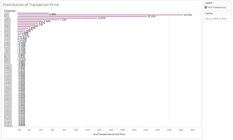
Rationale: Histograms were used, with missing values removed (due to no counts belonging in the bin) so as to preserve space, and see an overall distribution clearer. It was the histogram is sideways so as for easier time to look at to the bin value while being able to analyze the shape of the distribution. One histogram was for Transaction Price, and another for Unit Price (psm) to compare the differences in distribution.
Observation 1: The distribution of transaction prices is right skewed. There seems to be a majority (50.63%) of private property transactions the fall in the $640,000 bin. As bin sizes were in amounts of $320,000, 50.63% of transactions were in the range of $640,000 and $960,000.
What is the degree of the relationship between property size and unit price (psm) ?
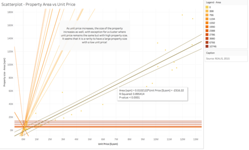
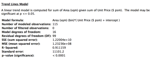
Rationale: To find the degree of correlation between these two variables before using it to find the best property area. Trend lines were drawn and equations shown to see the correlation and P-value to know if the relationship is significant or not.
Observation 2: At 95% confidence, the relationship between Unit Price (psm) and Property Size is highly significant, as the p-value of 0.0001 is < 0.05. The R value gives us 0.95, which is very close to 1 – meaning a very high level of correlation. Thus, anything that does not follow such a relationship is a rare find indeed.
When did transaction volume peak?
Rationale: The sum of transaction price and number of transactions over time were drawn to show a general trend of when the most transactions occurred.
It seems that the number of purchases and transaction volume peaks across all locations and property types in Q3 July as well. Additionally, we can tell that if we want to purchase house at a cheaper rate and with more supply, February or December look like a better time where prices and number of transactions and lower!
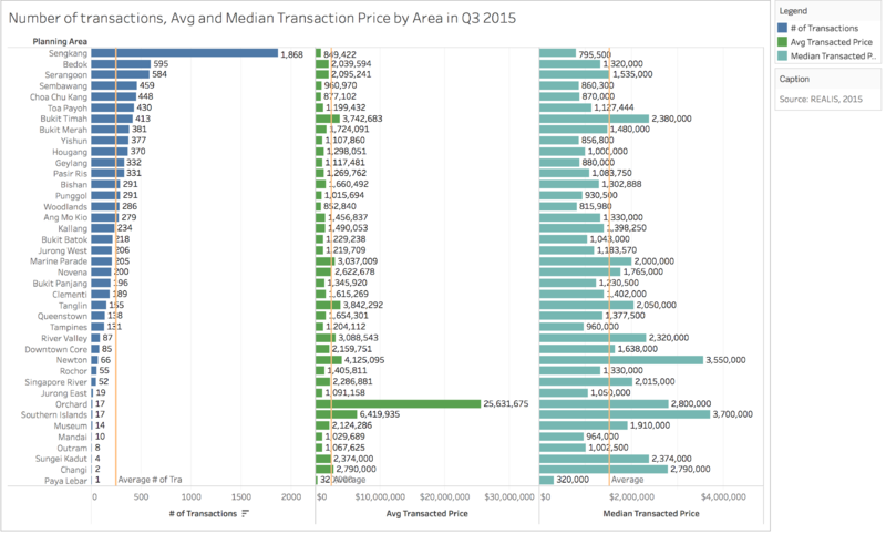
Drawing a chart of the Number of Transactions, Median and Average Transaction Prices by Location for Q3, we get:
Rationale: This was to show a simple method of comparison between transaction volume, and transaction price. One click to sort each of the columns can give the results we want quickly, and I think this is useful for URA to have in their future analysis, especially for finding locations that have gone above their intended price range. As such, policy recommendations can be done in a simpler way.
Observation 3: It turns out that Sengkang has the highest number of sales (1619/2941 = 55.04%) in Q3, and that both the average and median transaction prices fall below the average across all locations for Q3 – this disproves that large volume of transactions at Sengkang had caused the transaction price total – rather, it is due to the high volume of transactions that occur, therefore justifying that many transactions have taken place during that period.
Where would be a good place to buy property in 2015?
Using a ratio of property size/price (psm), we put the data into boxplots to identify the best area in Singapore:
Rationale: A boxplot compared one another by each Planning Region and Area can reveal interesting insights into the variation and quantity of a variable. Since we want to find the best place to get property, a ratio was used as a form of ‘weight’, establishing a balance between Property Size (area psm) and Unit Price (psm), and it removes the need to have these two variables in its own column. The color was used to represent ‘Count’, same as the other charts. The size of the circles was made slightly bigger to see how the counts of the different ratios were located in each boxplot. The orange reference line refers to the Median of the ratio, so that any boxplots whose quartiles were beyond it could be established as having a decent Property Size/Unit Price ratio.
Observation 4: We can see that Sengkang’s boxplot has its larger upper 50th percentile shorter than its bottom 50th percentile, indicating that it has a right-skewed distribution, indicating that SengKang has relatively more larger area/unit price ratios than small ones. This can be seen with its median of 3.431, far beyond any other location. Furthermore, its first quartile is well-above the median line – this also indicates a high amount of private properties with a big Area/Unit price ratio. Therefore, Sengkang is a good place to have bought private property, having a right balance of property size and unit price psm. It is no wonder so many people bought there!
Tools Utilized
JMP Pro 12 – for data pre-processing (cleaning, massaging, joining), removing unessential data such as duplicates and those records not in the ‘private’ property criteria.
Excel – standard format used to import to Tableau
Tableau 10 - for building visualizations and creating calculated fields to represent data, and mapping one excel to another with the occasional filter.
Results
Overall Conclusions
Supply - Stock data tells us that...
i) The total private property supply in Q4 2015 amounted to 326, 242. Condominiums make up a consistent 51% of private property supply.
ii) Landed Properties had consistent growth through the year, while Apartments and Condominiums had a slight dip in growth in Q3.
iii) 80% of the private property supply comes from: 1. Katong, Joo Chiat, Amber Road 2. Ardmore, Bukit Timah, Holland Road, Tanglin 3. Serangoon Garden, Hougang, Ponggol 4. Orchard, Cairnhill, River Valley 5. Bedok, Upper East Coast, Eastwood, Kew Drive 6. Hillview, Dairy Farm, Bukit Panjang, Choa Chu Kang 7. Upper Bukit Timah, Clementi Park, Ulu Pandan 8. Geylang, Eunos 9. Watten Estate, Novena, Thomson 10. Pasir Panjang, Hong Leong Garden, Clementi New Town 11. Bishan, Ang Mo Kio 12. Tampines, Pasir Ris 13. Balestier, Toa Payoh, Serangoon
Demand - Transaction data tells us that...
i) Most transactions for the year were between $640,000 and $960,000.
ii) Property size and unit price (psm) are highly correlated, and relationship is highly significant. A large property size and low unit price psm is a rare opportunity, especially in Singapore.
iii) Transaction volume peaked in Q3 – primarily caused by Sengkang, as it was a good place to buy, having the highest ratio of Property Size/Unit Price, as well as the availability of such private properties.
iv) A good time to have bought property would be in February and/or December, where the volume of transactions and price is low.
Recommendations
Which areas are Over-subscribed or Over-supplied?
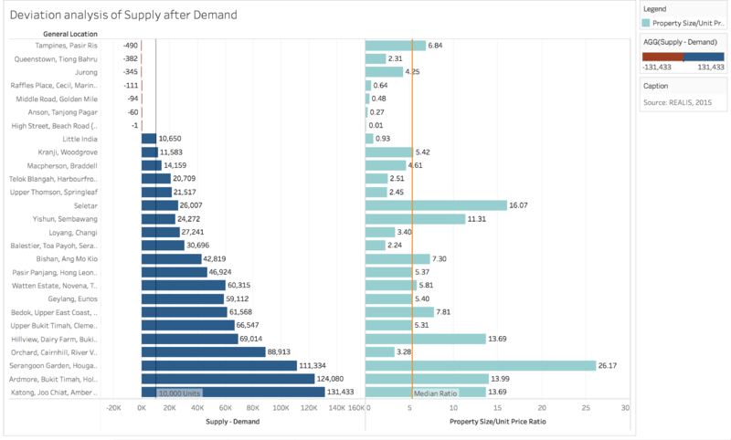
As the supply data took ‘snapshots’ of supply over time, I decided to use Q4 to show the values at the end of 2015 against sales data. I imported a separate data source and filtered out the rest of the quarters to obtain this. On the right, I plotted the Property Size/Unit Price ratio to see if buyers would be getting a good deal based on the General Location they bought in, by comparing against the Median ratio. Unfortunately, the supply data does not have specific Planning Areas to tabulate the data, so we will have to work with General Locations only.
Other than using a chart shown in the slides as a form of deviation analysis, I thought of displaying the remainder of supply after demand (i.e. Supply minus Demand) on a bar chart, so that negatives (red) would be clearly seen as the areas that had more demand than supply, and vice versa for the positives (blue). A 10,000 unit reference line is drawn so we can tell which areas need work in clearing stock.
With such a view, one can intuitively know which areas are oversubscribed or oversupplied, and where would be a good deal for buyers. If URA can get access to income groups of buyers, they would be better able to compare the General Location’s attractiveness based on the Property Size/Unit Price ratio.
Recommendation 1:
There is a need to focus on efforts to raise demand to clear private property stock in the regions with at least 10K counts or more. URA may not be able to implement the same strategy as in Sengkang to other areas for quick take-up in planned development areas as we have identified the oversupplied areas as places with ratio of lower property size but high unit price – which may not be as good a bargain as in Sengkang. There is a need to make these areas more attractive for take-up, such as lowered stamp duties, or mortgage loans if applicable – before they lose their novelty and attractiveness to buyers!
Recommendation 2:
Looking at the Property Size/Unit Price ratio for those high in remainder of supply, URA also needs to clear those that may not be so attractive. For example, Little India has 2578 units left, but has one of the lowest ratios, indicating a less than ideal bargain. As such, creating supply in such areas should be stopped for the areas above 10,000 units as the take up rate would be slow in 2016. What URA can do is focus on filling the existing supply with good deals first, and let the excess demand naturally spillover into areas such as Little India.
Recommendation 3:
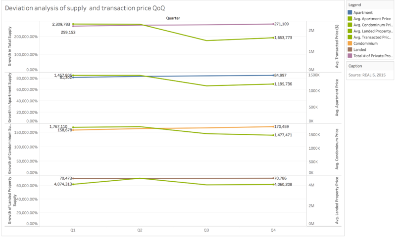
I enabled Quarters 1-3 again for the supply data to compare against change in Transaction price to see if there was a difference in the price across quarters. I also edited the relationship for both supply and sales data to sync by Quarter.
This chart displays supply of the respective property types (Overall, Apartments, Condominiums, Landed Property) and average transaction prices of the property types over time. Both variables are normalized with each other to see a general trend.
The Overall view shows that average transaction prices were lower at the end of the year even though supply increased. Landed Properties do not follow this trend, where transaction prices increased with greater supply. As transaction prices drop from Q2 to Q3, URA should take note of this trend so as to ensure private property prices do not drop too much – they should recover to healthy levels by Q4. Assuming that Q1 is where prices are ‘normalized’, URA can focus on coordinating supply and demand levels as mentioned above to regulate property pricing.
Thank you for your time and attention, I hope you've enjoyed the read!
