IS428 2016-17 Term1 Assign3 Timothy Tan Swee Guang
Abstract
GAStech has moved into a new office and is now having HVAC issues. To make matters worst, there is a new health hazard, Hazium, which is harmful to people. However, hazium detectors are very expensive to install and only afew key spots in the company will have these detectors. Therefore, this assignment mainly helps GAStech understand its operations data, identify insightful patterns, raise any issues of concerns and provides solutions to GAStech if need be.
Approaches
Data Preprocessing
1. For all CSVs, parsed "Date/Time" into Day, Month, Year & Time
2. Variables with only one unique values are deemed uninformative
3. Mapped coordinates in employee list in various departments by floors
4. Added Prox zone, HVAC zone and grouped names per office number in employee list
5. Combined all Hazium csv sheets into one
6. Grouped time variables to be plotted on Tableau
7. Standardized all variables of all levels to prepare for parallel coordinates chart that could be used for pattern exploration
Research Questions
1. What are the typical patterns in the prox card data? What does a typical day look like for GAStech employees?
2. Describe up to ten of the most interesting patterns that appear in the building data. Describe what is notable about the pattern and explain its possible significance.
3. Describe up to ten notable anomalies or unusual events you see in the data. Prioritize those issues that are most likely to represent a danger or a serious issue for building operations.
4. Describe up to five observed relationships between the proximity card data and building data elements. If you find a causal relationship (for example, a building event or condition leading to personnel behavior changes or personnel activity leading to building operations changes), describe your discovered cause and effect, the evidence you found to support it, and your level of confidence in your assessment of the relationship.
Link to Interactive Dashboard
https://public.tableau.com/profile/publish/Assignment3_150/Storyboard#!/publish-confirm
Analysis
Note: Questions 1, 2, and 4 are answered throughout the analysis as I explore and dive deeper into the data. Question 3 will be mainly examined in the section "HVAC: Anomalies" although you may see various answers to it even before this section. To mark out when I think I am answering question 4. I will bold the sentence.
Basic Floor Plan
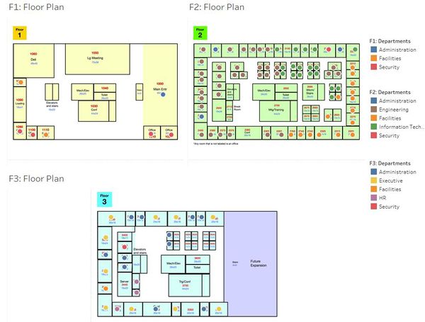
Figure 1
From the basic floor plan, we can derive afew things:
1. Level 1 consists of mainly security and facility officers.
2. Level 2 houses most of the GAStech's employees by departments. As you can see, departments are highly clustered together.
3. Level 3 contains the HRs and Executives. Additionally, each executive seems to have a personal administrator as seen by the alternating offices shown on the map.
4. All levels consist of Administration, Facilities and Security departments. This make sense as these departments are usually the backbone of most companies.
As you can see, from the basic floor plan alone, you are able to see the hierarchical structure of the company and the way each floor layout aims to boast efficiency levels I.e. keep departments close together but have each department close to an administration office
Contour & Heatmaps: Typical Days at Work, Interesting Patterns, Relationships & Anomalies
Floor 1
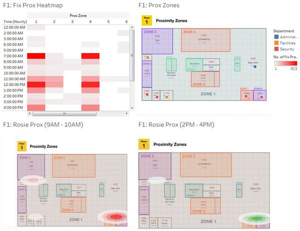
Figure 2
Figure 2 shows the heat & contour maps of the people who work on level 1.
From the heatmap:
1. We can see that people typically come in at 7.30am and leave at 5.30pm. This can be seen by the darker spots in zone 4 (the elevator) and zone 1 (the corridor) at both timings.
From the same zones 4 and 1, we can also tell that lunch time starts between 11:30am and end at 1:30pm.
2. It is easy to see why the heat map in zone 1 spans from 12am to 11pm. There are 4 security officers in the area and they mostly likely patrol the ground off hours. This leaves proxy data to be detected throughout the night.
3. One could infer that people have their lunch at the company's deli (zone 2), as seen by the high frequency spot only during lunch hours (Zone 2: 11am to 1pm, hot red).
4. We can also see the typical operation hours for the loading and unloading bay (zone 3) which seems to be from 8.30am to 9.30am and 2pm to 4pm respectively.
5. Looking the sparseness of the heatmap in zones 7 and 8 (security office) , one could infer that the security officers seem to follow some sort of schedule that requires them to be in and out of their offices every few hours
From the contour map:
NOTE: From the data, it was found that Rosie only roams around from 9am to 10am and 2pm to 4pm respectively. Therefore, we can only infer the places people frequent at these two timings. For comparison, the contour map was split into the two timings.
1. First off, we can see how Rosie highlights a pattern not prominent by the fix prox. That is, between 9am and 10am, people frequent the deli. This pattern came as a surprise as it was not clear in the heatmap. It is very likely that this pattern emerged due to employees going for breakfast during these timings. For such a pattern to appear however, perhaps this is an insight into the companies' culture where employees tend to go for breakfast during their work hours.
2. Secondly, we can see that in the morning hours, Security staff, Pherigo Alcide and Nant Irene from facilities will be in their offices but after lunch hours (2-4pm) they are not. Albeit not alarming, this gave us a sneak peek into the daily routines of these two company staffs.
3. Turning our attention to zones 7 and 8, we can see that the pattern of heat signature is quite similar from the morning and afternoon. Being security offices, this tells me that both security officers Fusil Stenig and Lagos Varjas are not scheduled for prowling the premises at these hours. In addition, given that the data collected was over 2 weeks, at least we can be confident that these security officers are following a strict schedule.
Floor 2
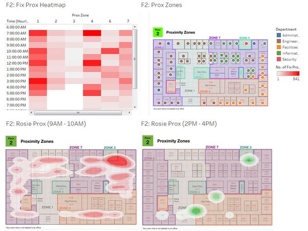
Figure 3
Figure 3 shows the heat & contour maps of the people who work on level 2.
From the heatmap:
1. People who work on this floor tend to come in work at 7.30am and leave work by 5.30pm. This can be seen by the darker spots in zone 4 (the elevator) and zone 1 (the corridor) at both timings. From the same zones, we can also tell that lunch time starts between 11:30am and end at 1:30pm.
2. Looking closely at the heat patterns after-hours (past 5.30pm) in proxy zones 1, 4, 5, 6 & 7, I can hypothesize two scenarios on why this could be the case.
Either:
- Employees in these zones tend to do overtime (explaining the afterhours heat signatures)
Or
- The heatmaps are capturing the security officers patrolling at night.
- Zone 3 could be the main head security office in the building given the high number of people in that office (16 security officers in this department).
Having said that, there are some anomalies here.
If security officers patrol at night:
1. Why is zone 2 not patrolled after closing hours? Are the security officers not prowling the route? Or do the fix sensor turn off in these areas every day? If that is the case, could the turning off be deliberate or a technical flaw in the system?
2. Why are there no heat signatures in zone 3 (the security office) afterhours? To make things worst, Rosie's data captures activity levels from 2pm to 4pm at zone 3. The heatmap's data however, ceases at 3pm. This further supports some sort of a daily breakdown of the fix sensor or a technical flaw somewhere.
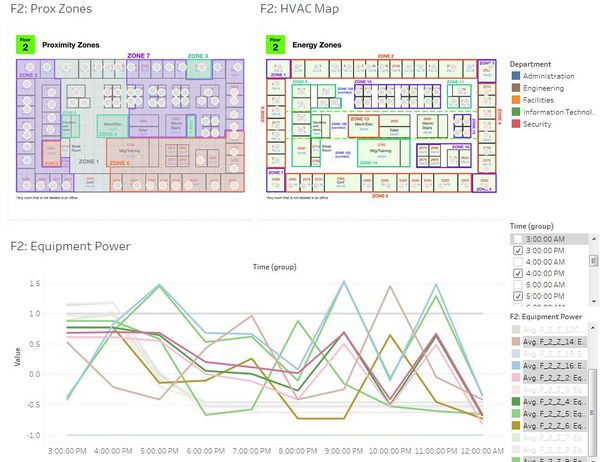
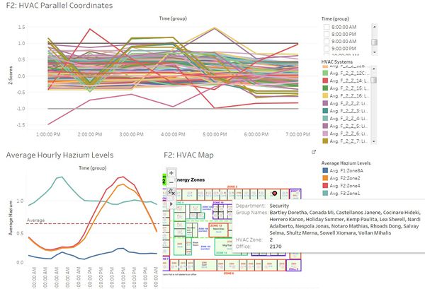
Figure 4
After investigating further (Refer to figure 4 above), it was found that equipment power fluctuates rapidly in HVAC zones 2, 4, 5, 6, 9, 10, 14 & 16 after working hours. This indicates there is some form of night activity going on every night i.e. lights coming on and off nightly. As these HVAC zones corresponds with proxy zones, 2, 3, 6 & 7, it cannot be the case that security officers are not prowling the route at night since there is equipment activity throughout the level. As such, I am confident that there could potentially be a technical flaw in the fix proxy sensors in proxy zones 2 & 3, where it automatically turns off after working hours.
From the contour map:
1. We can see the activity levels from 9am to 10am is high in zone 3. This is due to zone 3 being the only security office in level 2 having the highest density of people at one location (16 security officers are housed in zone 3).
2. It is peculiar here that no one goes to the toilet in the morning (9-10am) but there are high levels of activity near the toilet area in the afternoon (2-4pm). Perhaps this is due to the "food coma" we all experience after lunch and people just needed to walk it off.
3. Taking a closer look at the activity levels in the afternoon (2-4pm), we can also see how most meetings or conferences are held post-lunch hours. The contour map indicates high activity levels near the meeting room and conference room. This pattern cannot be seen in the morning.
Floor 3
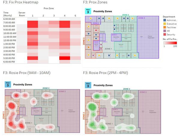
Figure 5
Figure 5 shows the heat & contour maps of the people who work on level 3.
From the heatmap:
1. People who work on this floor tend to come in at 7.30am and leave by 6.30pm. This can be seen by the darker spots in zone 4 (the elevator) and zone 1 (the corridor) at both timings.
2. One key difference is that lunch hours here are not as well defined here than the other levels. The elevator usage (zone 4) is quite evenly spread out throughout the day indicating high levels of movement in between levels throughout the day.
3. There is no heatmap data in zone 5 due to the area being under construction.
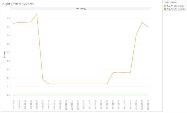
4. There is no heatmap data after working hours in this floor. This is due to the whole floor being closed off afterhours which can be seen by the VAV Availability Manager Data showing no signs of it turning on after working hours. (See figure 6 below) Being an executive level, there are most likely highly classified items here. Thus, the company might have deem it fit to close off the level every day.
Figure 6
From the contour map:
1. For both morning and afternoon times, we can see that all activity levels occurs mostly at an administrator's office. This would be what you expect from the executive level where people who walk in will first meet the an admin officer first before waiting around in that same area.
2. What is peculiar is the activity level in both morning and afternoon at office 3350, where Executive Blue Hobert sits. The activity level about his office seem to occur because he does not have an administration officer with him. Thus, he has to handle all the walk-ins and administrative stuff himself.
3. Building on the previous point, it may also be the case that his office is situated infront and next to conference rooms. As level 3 is an executive level, it is plausible that the activity comes from morning meetings. It could also be possible that the activity near his office is the combination of both hypotheses.
4. As with level 2, activity levels for the toilet seem to increase in post-lunch. Indicating that my hunch on the "food coma" and walking it off might be true.
HVAC & Hazium: Interesting Patterns, Relationships & Anomalies
Overview: Hazium Levels
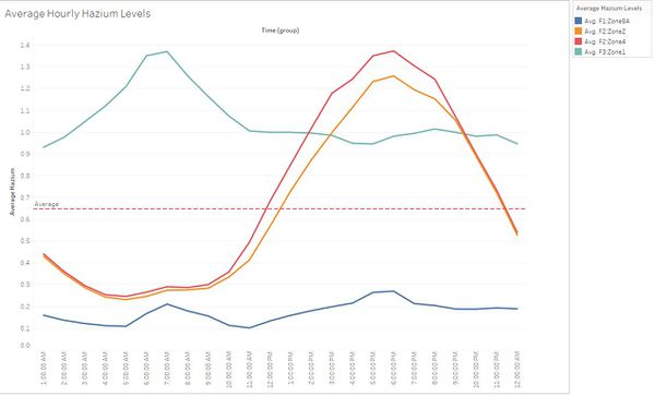
Figure 7
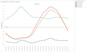
Figure 7 shows the overview of hazium levels across all floors and at the zones the sensor was set up in.
From here you can see afew distinct patterns:
1. Level 1 has the lowest overall hazium levels.
2. For level 2, interestingly the two zones detect similar patterns in Hazium levels. This is significant as from this, we can infer that hazium levels will approximately be equal across each level and that would mean that GAStech does not require anymore investments in more hazium detectors. In addition to that, in level 2, hazium levels tend to start spiking in the early afternoon (11am to 12pm) and will hit an all time high by 6pm before declining again.
3. Level 3 has the highest overall hazium levels with its peak at 7am.
HVAC: Anomalies
Note: All information here, came from the dashboards of HVAC data floor 1 to 3. In addition, I ranked them based on what I felt was more harmful.
1. It has been establish that high levels of hazium is in floor 3, zone 1. However, what is significant in this location is that the zone corresponds to office 3000, GAStech's CEO Sanjorge Jr Sten office. Therefore, perhaps it would be better for GAStech's CEO to shift office to a lower level where he is not as so exposed to hazium. Given that office 2500, in zone 9, has never had a heat signature for 2 weeks and that it is near an administration office. It seems like a vacant office and a good place to shift to temporary.
2. From figure 8 below, we can tell the department most at risk from hazium exposure. As you can see, the security office (consisting of 16 people) is situated at zone 2 i.e. one of the zones with high hazium levels after the lunch hours. This posed a treat to the company as it cannot afford for an entire department falling ill due to over exposure. The same can be said for zone 4 which houses all facilities offices.
Figure 8
Having said that, this is under the assumption that hazium is only present at zones 2 and 4. But what if my initial hypothesis that hazium levels follow similar trends across all zones in a level? For this, it is important to look into the building data to find clues to causes the hazium levels. My next point will bring you through a "clue" in understanding hazium.
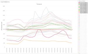
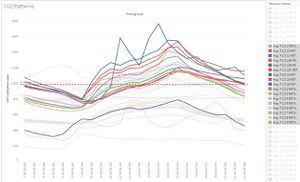
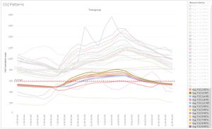
3. There is a clear pattern of CO2 concentration across all floors (See figure 9a, b & c below). Level 1 has a very spread out pattern throughout its zones, level 2 follows a pattern very similar to a sine wave with little variance and level 3 follows a cosine wave pattern with little variance as well. Here, we can also see that CO2 centration is highest in level 2 and lowest in 3 with level 1 being in between showing no real distinct pattern. It is also evident that the corridors seem to be always correspond to abnormally low CO2 concentrations. I akin this finding to corridors being an open space.
Figure 9a - Level 1 & 9b - Level 2
Figure 9c - Level 3 & Figure 7 - Hazium Levels
Now, let us compare this to the hazium data, it seems there is a negative correlation here between CO2 and Hazium levels in levels 2 and 3. No such correlation can be seen in level 1. i.e. For level 3, with the lowest the CO2 concentration, it has the highest Hazium level. In addition to that, another interesting pattern can be observed here. The behavior characteristic of hazium is a lot like CO2. In both levels 2 and 3, the pattern of hazium and CO2 concentration is exactly the same (a sine and cosine wave respectively). This is significant because little is known about hazium and knowing that hazium behaves alot like CO2 in terms of concentration patterns might help GAStech to keep the hazium levels at safer levels.
4. The air-conditioning in the CEO's office does not seem to be functioning properly. There are abnormal spikes in temperatures in his room which usually occurs after 12pm everyday. This is surprising as one would expect the CEO to get better comfort than his subordinates but it seems like the temperature in his room is the highest among everyone else. I suppose this is a facilities issue and GAStech should get someone to check the temperature in his office.
5. Turning our focus to the patterns of the air flow dampers, another abnormality has emerged. The CEO office dampers are almost closed from 12pm onwards. This ties up with what is happening in the above scenario (CEO's "air-condition" spoiled). Apparently, the timelines on how temperature change corresponds to when the dampers are fully opened or closed. Thus, there is a negative correlation between the damper and zone temperatures. After further analysis on this hunch, I am quite certain that there is a negative correlation between these two variables. Thus, fixing the damper should solve the problem above(point 4).
6. Through out the day and across the levels/zones, supply inlet temperature will always show a steady increase. However, what's interesting is that as temperature increases, supply inlet mass flow rate always steady decrease. It seems to me that these two systems are negatively correlated to each other. This is significant as it shows that throughout the 2 weeks, we know that that the regulatory system of air flow is working well. The system tends to pick up the temperature increase thus it would reduce to air flow of hot air into the zones.
7. Across all floors, equipment power usage is very high for all corridors and main areas. What is peculiar is the extremely high raw equipment power usage for the server room in zone 9, level 3. Perhaps GAStech should try look into reducing the power usage for their server room to cut energy expenditure and cost. It utilizes ten times more power than the next highest power user (level 1 main entrance).
8. Across all floors, there is always a sharp drop in the power usage of bath exhaust fans at 6am every day. This is very unusual. Though I am unable to give any explanation as to why this consistently occurs, perhaps this is a sign of a malfunction and facilities management should look into this matter.
9. Another abnormality in the data lies very subtly in level 1. The deli exhaust fan. Although on first glance it may look "normal". It is actually not energy efficient for the company to have it the fan running overnight. As you can see, the fan turns on from 9pm to 5am every night. I may not have an idea as to why the exhaust fan must be on off hours but I am pretty sure unnecessary energy is being expanded here. Therefore, GAStech should take a closer look into this matter if they want to cut some electricity cost.
10. This anomaly comes from the water heater tank temperature and water heater gas rate. From my understanding, the water heater gas rate and tank temperature should almost positively correlate with one another. The problem is that, in the data, they negatively correlate. I am perplexed as to why this is so and am unable to find any logical explanation of it. My hunch is that this is a problem with the data itself and not so much with the facility. Perhaps the system to capture either the rate of gas burn or temperature change of the water is faulty. Hence, I suggest that facilities management to look into this matter as well. Albeit this does not cost anything to the company, capturing accurate data is always important.
Summary
In summary, I have taken you through employee's typical days at work, described various patterns and anomalies seen in the heatmaps, contour maps and building data, described any problems or relationships I have come across and offered solutions to them when I can. I have also built a storyboard on how I gained all the varying insights.
Tools Utilized
- Excel 2013 for data preparation
- JMP-PRO for data preparation and visualization
- Tableau for visualization
