IS428 2016-17 Term1 Assign3 Joanne Ong Shi Ying
Contents
Data Transformation
HVAC Sensor Readings
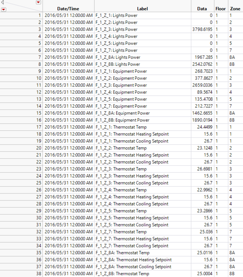
The data given is categorized in the columns, F_1_Z_1: Lights Power for example is a column. Hence, I have stacked them to have them in rows as shown below. Data for the entire building has been excluded.
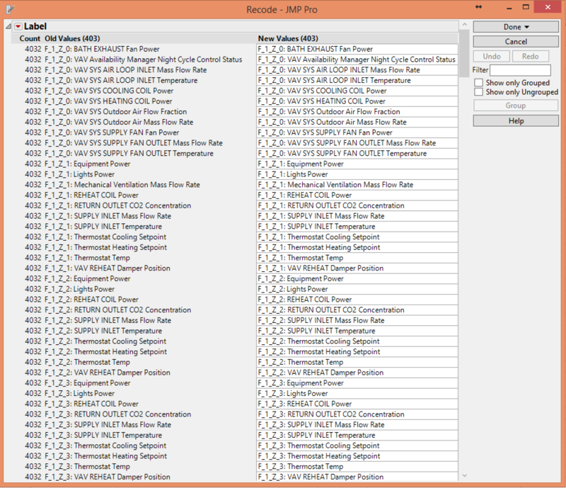
After stacking the column, I realized that the different categories are not of the same format. A standardized format is needed in order to retrieve the various zones and floors. Hence, I have recoded them into a standardized format. For example, F_1_Z_1: Lights Power. This includes data for the entire floor where it will be categorized as zone 0.
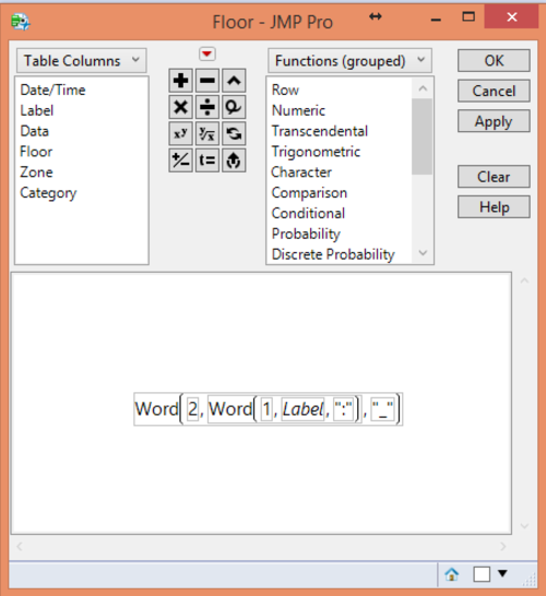
With the standardized format, the different floors can be retrieved with the following formula.
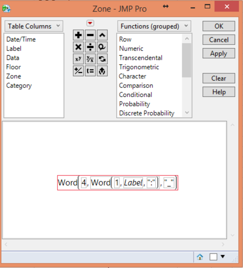
Also, the different zones can be retrieved with the following formula.
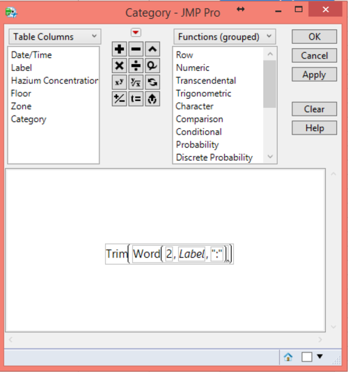
Lastly, the ‘label’ column is used to retrieve the categories with the following format.
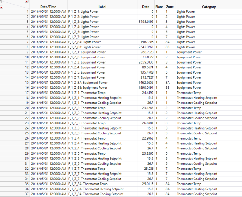
Final dataset used with floor, zone and category in different columns.
Hazium Concentration Readings
We are given a few CSV files for the Hazium concentration for different zones in different levels. Hence, I joined them using JMP by matching the date time.
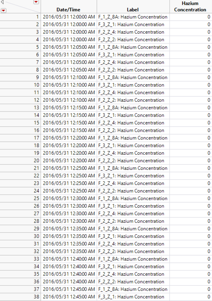
After joining all the CSV files, the columns are stacked to have the data in rows instead of by columns.
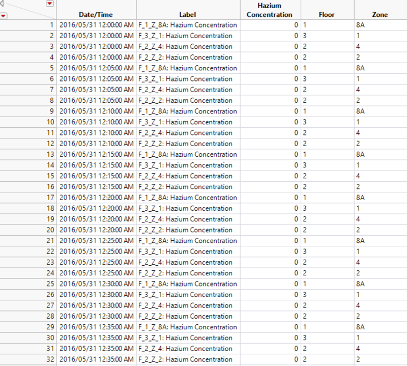
The ‘label’ column will be used to retrieve the different zones and floors, similar to how it is being done for the building data. The image below shows the final dataset used for hazium concentration after retrieving the individual floors and zones.
Proximity sensor data
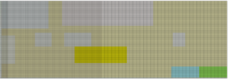
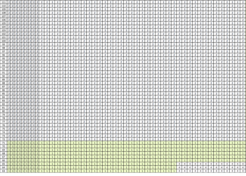
The proximity sensor data from the mobile robot provides XY coordinates instead of the various zones. Hence, it is required to convert the XY coordinates into zones in order to combine with the data proximity sensor data for each of the zone regions. Using the map given, the various zones are mapped out in Excel to find out the all XY coordinates for each zone. Each box in the Excel sheet represent a XY coordinate, and the content of the cell represents the zone number.
Then, with the inputs of XY coordinates, we will be able to find the corresponding zone using an Excel formula.
Lastly, merge the proximity sensor data from the mobile robot and the data for each zone regions.
Building the Visualizations
Building Elements
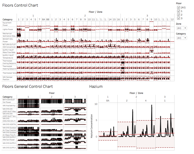
Control chart is chosen to view the HVAC sensor readings and hazium readings as it allows the user to easier identify the anomaly using the average and standard deviations reference lines. As seen in the hazium concentration control chart, the dotted lines represent the standard deviation reference distribution, and the red solid line represents the average reference line.
Users can choose to filter by floors, zones and categories to further zoom into the different filters. However, only filtering by floor applies to all three control charts. Filtering by category applies to the control chart for HVAC sensor readings as hazium readings control chart has a fixed category. Also, filtering by zone is only applied to HVAC sensor readings for floors and zones, and hazium readings. This is because HVAC sensor readings for the entire floor is categorized as zone 0.
Proximity Sensors Data
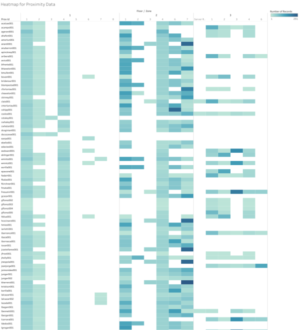
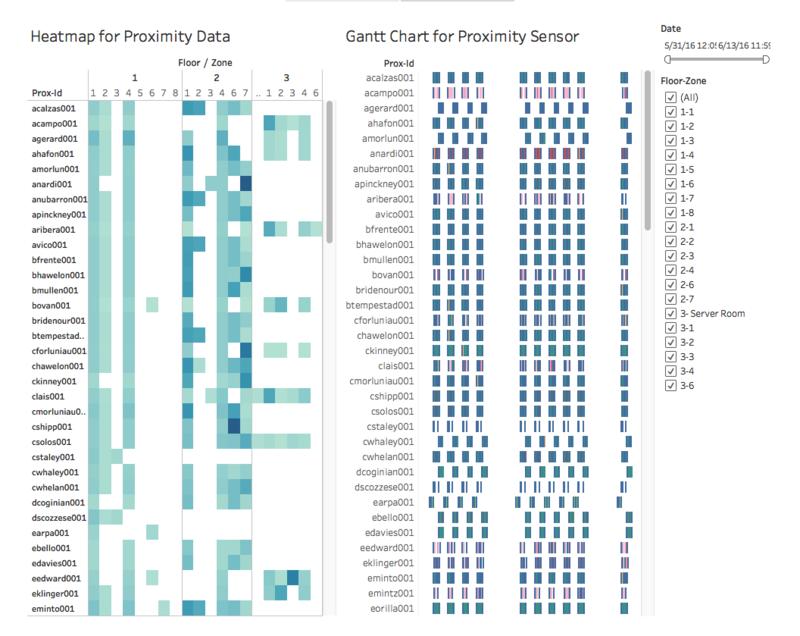
Heatmap is used for the proximity data where it gives an overview of how many times each proximity ID was at a particular zone on a particular level during a period of time. The number of times is color coded with the same color of different intensity, where a darker red shows that the employee was detected to be at that zone of the particular floor more than those of a lighter shade of red.
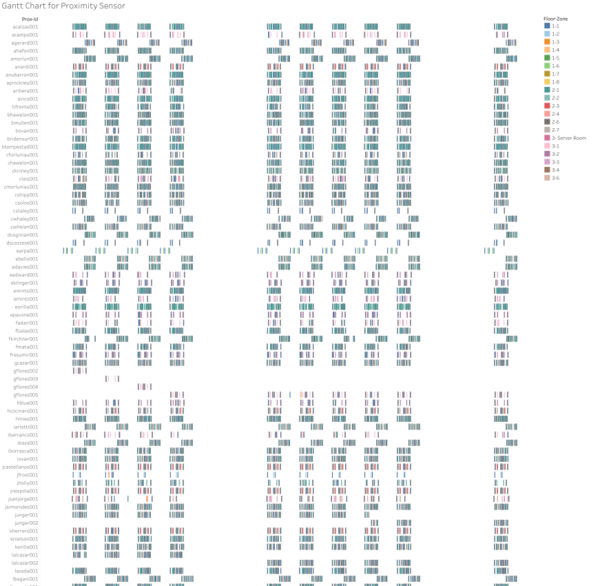
In order to show the schedule for each employee throughout the day, gantt chart is being utilized. The chart enables users to view floor and zone by proximity ID given a range of dates and time. The floors and zones are color coded for users to easily identity where different proximity ID is mostly at.
This dashboard allows for filtering by date and floor/zone. Users will input a range of date time and select multiple floors/zones for both the heatmap and gantt chart.
Patterns, trends and anomalies found
Typical day for the employees
- Most of the GAStech employees start work at 8am and end work at 6pm.
- Other employees may start work at 4pm till 12am or 12am till 7pm.
- Most employees usually have lunch break from 12pm to 2pm.
- Employees are not on shift work since each day starts and ends at about the same time.
- Also, they have a rather regular working patterns where they will visit certain zones each day.
Patterns
- The thermoset cooling setpoint is inversely related to the thermoset heating setpoint since heating and cooling are the opposites. Hence, once the setpoints are of a direct relationship, it means that there might be issues worth looking into.
- Floor 3 zone 9 (server room) has a higher supply inlet mass flow rate and equipment power as compared to other zones. This is because server room is constantly running, causing the difference in the sensor data with the other zones. Server room’s sensor readings will be different from other zones due to its function, hence if the readings become similar to other zones, it is unusual and should be looked into.
- Supply inlet temperature varies a lot more for floor 1 and 2 as compared to floor 3. Also, each floor has a similar trend for each zone.
- It is noticed that the bath exhaust fan power is switched on throughout the days for floor 1 and 2. Floor 3 has the fan power switched on from 7am to 10pm each day. This shows that the new office is not following energy efficiency standard as claimed.
Anomalies
- It is noticed that the thermoset cooling setpoint is inversely related to the thermoset heating seatpoint. However, for floor 2 zone 16, both graphs dipped on 31st May 2016 from around 9.30am to 11.20am.
- Floor 2 zone 12B (corridor) has a greater standard deviation for Return Outlet Carbon Dioxide Concentration, where the concentration varies more than other zones.
- Hazium concentration has been very inconsistent across all floors and zones. Given how dangerous the gas is, it is important to have measures to keep it low and consistent. It is noticed that the gas concentration peaks on 11 June around 6pm to 8pm. Also, the high hazium concentration usually lasts for a few hours which pose danger for the employees.
- Before 4 June, the cooling coil power usage is generally consistent across all day. However, after the weekend (from 6 June onwards), the usage trend becomes inconsistent and unusual. Previously, it is observed that the usage is the highest from around 7am to 10pm. Yet, after 6 June, it starts to peak from 10pm onwards. This lasted till 9 June. From 10 June onwards, the power usage remains relatively constant till 13 June, which implies that the power was switched on throughout the few days. This shows that the office energy efficiency is not consistent. This also applies to other categories such as fan power and fan outlet mass flow rate.
