IS428 2016-17 Term1 Assign2 Tan Kee Hock
Contents
- 1 Overview
- 2 Recommended Best Practises
- 3 Theme
- 4 Dataset
- 5 Summary of Questions
- 6 Data Cleansing
- 7 Visualisation Plan
- 8 Problems Encountered/Critique
- 9 Conclusion from My Work
- 10 Additional Findings from other Non-Tableau Software
- 11 Software Used
- 12 Final Deliverables
- 13 Impovement
- 14 Modification
- 15 Feedback/Critique
Overview
Just three months back, the Ministry of Manpower (MOM) commented that it is concerned with the deteriorating Workplace Safety and Health (WSH) situation. In the first half of 2016, there had been 42 fatal accidents. This is a 40% increase from last year.
The main cause for this deteriorating situation was due to "inadequate risk assessments carried out by the companies, lack of planning and coordination, and insufficient safety awareness among the workers. On the whole, it points to an absence of a robust WSH management system in the companies involved". (Lim, 2016)
After reading this article, I was curious to find out more based on the given data. Although the data is extracted from year 2014, and the statement was made in 2016, I was keen to find out more about what is happening on the ground. I also had read the WSHI Statistical Report 2014. The report painted a positive image of the workplace safety situation.
Therefore, I would like to find out more through the given WPI dataset(compared to the other dataset).
The goal of this assignment is also for me to apply the interactive data exploration and analysis techniques that I have learned by using commercial-of-the-shelf and opensource software. It also provides me the opportunity for hands-on experiences on using the visualization tool and at the same time, to evaluate the pros and cons of the tool in real-world applications.
This article could be found from Channel News Asia.
Recommended Best Practises
After you have the initial question and the appropriate datasets, construct a visualization that provides an answer to your question. As you construct the visualization, you will find that your question evolves – very often, it will become more specific. Keep track of this evolution and the other questions that occur to you along the way. Once you have answered all the questions to your satisfaction, think of a way to present the data and the answers as clearly as possible. The presentation must be in the form of interactive visualization.
- As you go, maintain a wiki notebook of what you have to do to construct the visualizations and how the questions evolved.
- Where you get the data from
- Documentation about the format of the dataset.
- Describe any transformations or rearrangements of the dataset that you need to perform; in particular, describe how you get the data into the format needed by the visualization system.
- Keep copies of any intermediate visualizations that have helped you refine your question.
- After you have constructed the final visualization for presenting your answer, write a caption and a paragraph describing the visualization, and how it answers the question you posed.
- Think of the figure, the caption and the text as materials you might include in a research paper.
Theme
I want to investigate work-related accidents across industries and how they vary. Thus, I have decided to use the Workplace Injuries Data 2014 with Reference to the WSHI National Statistics Report 2014. To also start things off, I had taken a quick glance in the WSHI National Statistics Report 2014 and the WSHI website so that I have a clearer idea and purpose in my analytic process.
My overarching theme for this assignment would be: Investigate work-related accidents across industries and how they vary.
Dataset
- WPI Dataset
- SSIC Code Description Dataset
The above dataset is an addition to what was given. I did my own research and decided to include this dataset as it would include provide more clarity on the accident. The dataset provides a set of description based on the SSIC code.
Summary of Questions
The analytical process is all about answering all the questions that comes into the mind of the analyst when presented the data. Thus, a summarised overview of my questions is shown below:
- What is the overall situation of the workplace safety climate like?
- How severe are the accidents when compared with the other industries?
- Which particular industry which faces the most accidents?
- Are there any patterns of accident during different time of the day?
- If so, are they working overtime?
- Is there a difference between those who were working overtime and those working in normal shift?
- How is the victims’ job experience distributed?
- How much long did it take for the accident to occur from the time the victim started work?
- How is it distributed?
- How is the accident severity (No. MC days) correlated to the employee’s experience?
- From these accident, how does the injuries differ?
- How the causes of accidents vary across industries?
- What is the main economic activity of the occupier with relation to the accidents?
- Does the pattern differ between gender?
- What are the more common causes of injuries within the industries?
- How the injuries differ between the type of work?
- Who/what induced the injuries?
- What is the demographics of the victims like?
- Is there a relationship between victim’s age and employment length?
- If so what is the difference between male and female workers?
- Does the pattern differ between gender?
- If so what is the difference between male and female workers?
- What is the distribution of the employment length like?
- What is the distribution of the “Lag in Reporting (Days)”?
- How long companies take to report an injury in their workplace?
- Is there a relationship between victim’s age and employment length?
Data Cleansing
Is Manual Work – Manual Work Score (New Calculated Field)
This field will be used to help us create a divergent chart. For Tableau, the divergent chart can be shown through a Measure which shows distinct positive and negative value. In this case, I used the Amount of Manual Work to derive the score

IsMajor – Severity Score (New Calculated Field)
The severity of the accident (Minor/Major) is currently a Dimension, in order to use it as a Measure type in Tableau, so that we can actually use it to rank industry, it must be transformed.

SSIC Code
After initial study on SSIC, I decided to include more details on SSIC codes into the data as it provides useful information on the Occupier’s economic activity. This information will give us more insight in relation to the accident.Data on SSIC Code 2010 can be found here. [[1]]

Further transformation performed in excel was needed to make the data more “friendly”. The data is then joined to the WPIData dataset.

Hierarchical Relationship between Major Industry and Sub-Industry
The Sub-Industry is a subset of the Major-Industry. Thus, by transforming it to a hierarchical relationship, we can use it more effectively in Tableau to explore the data.

Age Group
The victim’s age is a wide range of numbers. The numbers can be further categorized to enable ease of use to the user when filtering data.

Transforming into more reader-friendly data ouput
Some of the given data are not reader-friendly. They may contain words that are entirely in uppercase or even comes withe special character. Therefore, I have to use the "Alias" function in Tableau, to screen through the data and transform them if nesscessary.

Splitting of data column[Sub-Industry]
The data column contains formatted data. It consists of data in the following formatt : "Main Industry - Sub Industry". The splitting function in Tableau can help us split the word and make it more reader-friendly.

Visualisation Plan
The objective is to create a Tableau Story with 4 interactive Dashboards. Each of the Dashboards is designed to answer the main and sub-questions which I had listed earlier. Also, they are configured with Dashboard Actions to enable interactivity. This is also to allow the user to search for the information they want. Also, the Dashboards are configured with filters to allow the user to filter the data they want. The Dashboards will be used for interactive data exploration and allows the user to perform brushing and selecting of data.
- Dashboard: What is the big picture like?
Interaction Technique:
- Selection - Pointer
Selecting a single object in a plot. Upon selection, the tooltip will appear, providing the user with more information on the selected data point. - Filter
Non-selected records are excluded in the graph.Upon filtering, the user can select what economic activity to exclude from the chart.
The user wants to understand the overview of workplace safety issues of all the industry. The user also wants to know these accidents differs across the different economic activity of the occupier
Steps:- User selects the data point of his interest
- User uses the filter
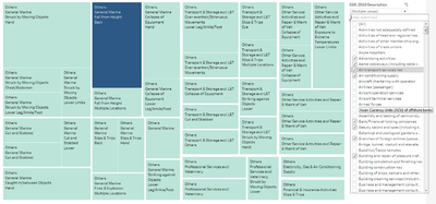
- Economic Activity (SSIC 2010 Description)
One of the best practices of the Treemap as adopted from the slides, was not to use the hierarchical attribute of the Treemap as a filter.
Sub-Questions:
- What is the overall situation of the workplace safety climate like?
Data Attributes:
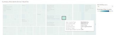
- Major Industry (SSIC 2010) (String – Dimension)
- Sub Industry (SSIC 2010) (String – Dimension)
- IsMajor (Number – Measure)
- Number of Records (Number – Measure)
- Accident Type level 2 Category (String – Dimension)
- Body Parts Injured (String – Dimension)
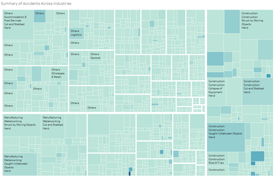
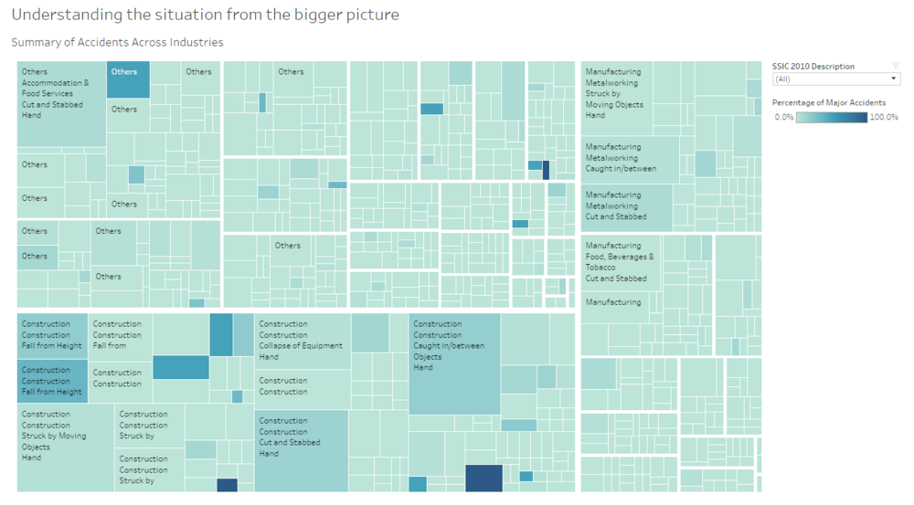
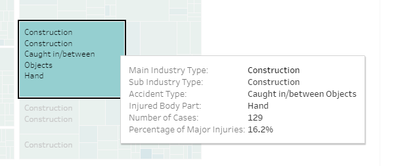
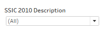
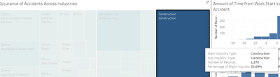
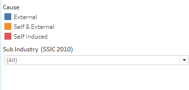
Chart: Treemap
Interpretation: The color is used to denote the severity of the accidents. It presents the % of Major Accidents within the Sub-Industry and the Accident Type. The size is used to represent the frequency of total accidents within the Sub-Industry.
Objective:To allow user at view the overview of these accidents across the industries.
Conclusion: The construction industry experiences the most number of accidents and its percentage of Major Accident is the highest among the industries. Remarks: The dataset is a multivariate dataset. Upon further study of the dataset, I realize that the data can be hierarchically related. To showcase such complex hierarchy of this multivariate dataset, I chose Treemap to do the visualization. The main motivation is because Treemap allows easy denotation of the relationship between the attributes. - Selection - Pointer
- Dashboard: How the accident differs from industry to industry?
Interaction Technique:
- Selection - Pointer
 400px
400px
Selecting a single object in a plot. Upon selection, the tooltip will appear, providing the user with more information on the selected data point. Filtering is applied to the rest of the graphs. Thus, allowing user interaction. Upon selecting the data-point of interest the data will be filtered dynamically. You will see the effect on the rest of the graph. - Filter
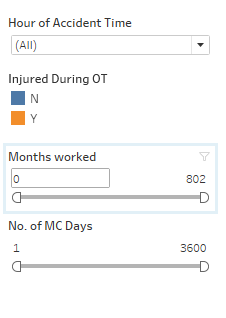
Non-selected records are excluded in the graph.Upon filtering, the user can select to filter the data by the time of the day. User can also filter through the job experience of the victim or the number of MC which the victim was entitled. The rest of the chart will be updated dynamically.
Use Case
The user wants to understand if Rush factor for is a legitimate cause of accident in specific industry.
Steps:
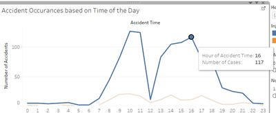
- User selects the industry of his/her interest. Eg.Metal Working.
Upon selection, the rest of the chart will be updated dynamically. From the graph, you realise that, the accident rates peak up after lunch and before lunch. This potentially suggest “Rush Factor” is at work. There is also a weak positive correction between experience and number of MC. - User uses the filter to further define his choice of selection.
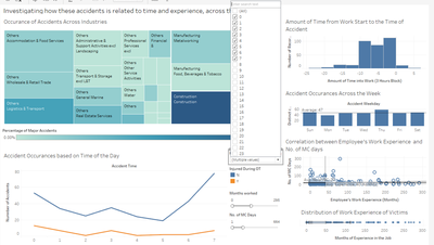
The user reduces the job experience to 1 year (12 months). The correction between No.of MCs and Work experience become negative. This means that, for victims that worked for less than a year. This shows that, in this particular industry, the younger workers tend to get fewer MCs compared to the more experienced workers. Potentially, we are looking at cases of malingering.
- Hour of Accident Time
- Months Worked
- No. of MC Days
Sub-Questions:
-
How severe are the accidents when compared with the other industries?
- Which particular industry which faces the most accidents?
Data Attributes:
- IsMajor (Number – Measure)
- Number of Records (Number – Measure)
- Major Industry (SSIC 2010) (String – Dimension)
- Sub Industry (SSIC 2010) (String – Dimension)
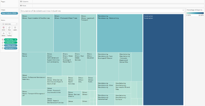
Chart: Treemap
Interpretation: The color is used to denote the severity of the accidents. It presents the % of Major Accidents within the Sub-Industry. The size is used to represent the frequency of total accidents within the Sub-Industry.
Objective: To allow user at first glance spot which Major/Sub Industry experiences accidents frequently. If so, how much of these accidents are major accidents.
Conclusion: The construction industry experiences the most number of accidents and its percentage of Major Accident is the highest among the industries. - Selection - Pointer
- Dashboard: From these accident, how does the injuries differ?
Filters:
- Sub Industry (SSIC 2010)
Sub-Questions:
- How the causes of accidents vary across industries?
Data Attributes:- Major Industry (SSIC 2010) (String – Dimension)
- Sub Industry (SSIC 2010) (String – Dimension)
- Accident Type level 2 Category (String – Dimension)
- Number of Rows (Number – Measure)
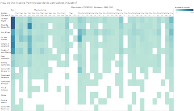
Chart: Heatmap
Interpretation: The frequency of the Accident type is denoted by the colour.
Objective: To allow user at one glance understand which Accident type happen more frequently in which industry.
Conclusion: The construction industry experiences more accident relating to fall from height. This is very likely attributed to the nature of the occupier’s economic activity. (Next chart will show what economic activity of the occupier) - What is the main economic activity of the occupier with relation to the accidents?
Data Attributes:- Number of Records (Number – Measure) – Left Axis
- Number of Records (Number – Measure) – Right Axis
- SSIC 2010 Description (String – Dimension)
- Number of Rows (Number – Measure)
Chart: Pareto
Interpretation: The yellow line above shows the cumulative percentage of the type of economic activities which makes up the entire activities of what the occupier does, in relation to the accidents.
ObjectiveTo allow the user to understand what is breakdown of the business/operation (Economic activity) of the occupiers in the filtered field in the dashboard.
Conclusion: The highest number of accidents by economic activity of the occupier is the one which does “General contractors (building construction including major upgrading works)” activities. This economic activity contributed to 12.34% of the total accidents. - What are the more common causes of injuries within the industries?
Data Attributes:- Number of Records (Number – Measure) – Left Axis
- Number of Records (Number – Measure) – Right Axis
- Accident Agency Level 2 Desc (String - Dimension)
- Number of Rows (Number – Measure)
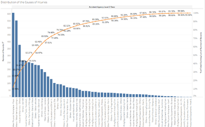
Chart: Pareto
Interpretation: The yellow line above shows the cumulative percentage of the type of causes of injury, in relation to the accidents.
ObjectiveTo allow the user to understand what is breakdown of causes of injuries in workplace.
Conclusion: The single highest contributor to accidents is caused by “Other Physical Workplace - Floor/Level Surfaces”. - How the injuries differ between the type of work?
- Who/what induced the injuries?
- Amount of Manual Work (String – Dimension)
- Is Manual Work (Number – Measure)
- Body Parts Injured (String – Dimension)
- Cause (String – Dimension)
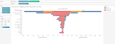
Chart: Divergent bar chart
Interpretation:The type of cause (Self/External/Self & External) is denoted by the color. The bars are stack and grow towards the left/right to show what type of work the activity is (laborious vs non laborious).
ObjectiveTo allow the user to understand what is breakdown of causes of injuries in workplace.
Conclusion: Back Injuries tend to be self-induced in both laborious and non-laborious work. The next question for governing authority to investigate is why back injuries are the most self-induced common injuries? Are the workers skilled to handle the tasks?
Remarks: Divergent bar chart is not easy to create in Tableau. Much transformation and steps are needed to show the Divergent bar chart. Some of the steps are used to "trick" tableau into the display I want. Even so, it is better to show as a Divergent bar chart as it allows the user to have a quick comparison of the type of injured parts and how its related to the type of activity.
Findings:
Let's take a look at the Construction Industry again. In this Dashboard, you will find that Construction Industry has the most number of accidents which happens due to a fall from height. These victims tend to suffer injuries either on their hand, their ankle, their lower leg or foot. All these injuries are self-induced. Of all cases, their occupiers are "General contractors (building construction including major upgrading works)". 26% of the accidents are due to "Means of Access - Ladders". Thus, we can infer that construction industry on the whole, needs to improve on their lack safety mechnism/measures for the employees on their use of ladders. - Dashboard: What is the demographics of the victims like?
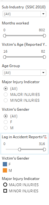
Filters:
- Sub Industry (SSIC 2010)
- Months Worked
- Victim's Age
- Age Group
- Major Inury Indicator
- Victim's Gender
- Lag in Accident Reporting
Sub-Questions:
- Are the victims older workers who are new to the job?
- Is there a relationship between victim’s age and employment length?
- If so what is the difference between male and female workers?
- Does the pattern differ between gender?
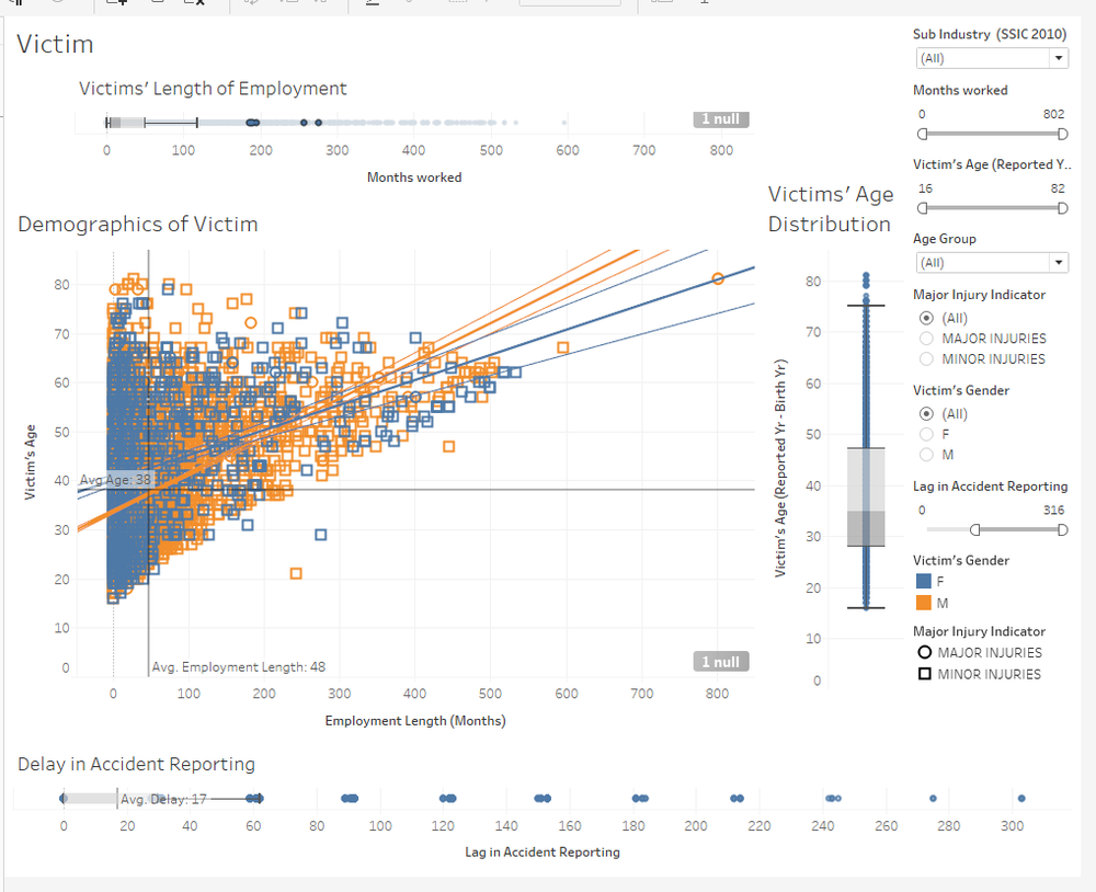
Remarks: I had initial questions on whether these victims are older workers who are new to the job. If so, naturally they face a higher risk of getting into an accident.
Data Attributes:- Months Worked (Number - Measure)
- Victim's Age (Reported Yr - Birth Yr) (Number - Measure)
- Victim’s Gender (String - Dimension) – Color
- Major Injury Indicator (String - Dimension) - Details
- Occupation (Cleansed) (String - Dimension) - Details
- Body Parts Injured (String - Dimension) - Details
- Nature of Injury (String - Dimension) - Details
- Hospital / Clinic Treated or Examined (String - Dimension) - Details
- SSIC 2010 Description (String - Dimension) - Details
- Cause (String - Dimension) - Details
- No. of MC Days (Number - Measure)
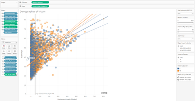
Chart: Scatter Plot
Interpretation: The gender of the victims is denoted by colour. The Average lines are shown to show the mean of each variable. Trend lines are added to show the correlation between the variables. Extra details are added to the plot so that when the user hover over the point, the details of relevant details of the victims can be shown.
Objective: To allow the user to understand the demographics of the victims and understand the relationship between age and employment length in relation to the injuries.
Conclusion: There are positive correlation between the 2 variables. Thus, it signifies that the injured victims who are older are also the ones who stays in the job. It helps us establish that older workers tend to stay longer in the job but they too despite their experience do get injured. This applies for both male and female employees. - If so what is the difference between male and female workers?
- What is the distribution of the employment length like?
Data Attributes:- Months worked (Number - Measure)
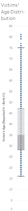
Chart: Box Plot
Interpretation: The distribution of the employment length of the victims is shown with the Box Plot.
Objective: To allow user to identify the distribution of victims’ age (months).
Conclusion: The median is 35 with the upper whisker at 75. There are a significant number of older workers involved in accidents. - What is the distribution of the “Lag in Reporting (Days)”?
- How long companies take to report an injury in their workplace?
- Lag in Accident Reporting (Number - Measure)

Chart: Box Plot
Interpretation: The distribution of the lag/delay in reporting accident with a box plot.
Objective: To allow user to identify the distribution of reporting delay
Conclusion: The median and lower whisker are at 0 while the upper whisker at 62. The average delay is 16 days. There are significant number of cases which takes extremely long amount of time to be report. Such irregularities are an issue for governing authority to investigate. Accident reports should be made promptly to safeguard the interest of the victim.
Findings:
We shall look at the Construction Industry again. It is quite obvious, with our common knowledge that the demographics of workers in this industry are mostly male. This is also reflected in this scatterplot where majority of the victims are male. At one glance we also can see that most of the accidents are minor injuries. We can use the filter to show those whom suffered from a major accident. In such a group, the average age is 36 and on average they had worked for 25 months (2 years). In comparison with the opposite group, those who suffered minor injuries, the average age is slightly lower, at 24 while the average employment length is the same. This is very likely due to the nature of the job, as it is more laborious, the older workers tend to get suffer more from a accident compared to a younger worker.On the whole, we can also see a positive correlation between age and employment length. This goes on to affirm that these victims are not older workers who are new to the job (this is probably the most vulnerable group). However, we can see that for an accident to be reported, it takes an average of 17 days (more than 2 weeks). The mean value could also be pulled due to extreme data points. Long delays in accident reporting do not reflect well on the protection of the employees in the construction industry. The next set of questions are "Do the victims know how to seek help when they suffer a workplace injury? Are the victims well aware that they are protected by the Singapore Law?"


Problems Encountered/Critique
Disjoint Line Graphs

The initial display of the line graph is disjoint. However, it does not mean that there is missing data, it just shows that no accidents happened at that particular timeframe.
Solution: To overcome this, change the display of “special values” in the left pane as shown above, to “Show at Default Value”

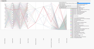
Lack of Support for Parallel Coordinates in Tableau

The display above is the best I can get for Parallel Coordinates in Tableau with regards to this dataset.
Issue: The Parallel Coordinates in Tableau only allows for a Single X and Y Axis. In typical Parallel Coordinates chart, they have reflects multiple Y axis (they can be of different scale) on a single X axis. However in Tableau, you only have a single Y axis.
Solution: It is still possible to create Parallel Coordinates in Tableau, however the variables which you are comparing should be using a similar scale. Otherwise, you will get something like the image above.
Creation of Divergent Bar Chart

Tableau does not allow a quick method to create a divergent bar chart.
Issue: In the "Show Me" pane, divergent bar chart could not be found.
Solution: So I went to Google for Help, to resolve this issue. I thought that having the divergent bar chart allow easier interpretation of data by the user.
Thus, the key idea to having a divergent chart is to have a Measure which shows a significant negative and positive value. In my case, I created a new calculated field "Is Manual Work". Once you have such a Measure, you can the given Dimension in the dataset to group them. You must tweak the scale to show negative value as positive. That's the trick.
Conclusion from My Work
Although the data is from the year 2014 and it does not reflect accurately on the current situation now, it still gives a good overview of the workplace safety across the industries. During the course of my analytical journey for this assignment, I found several "dubious" data points which are worth investigating.
One particular finding which struck me was the delay of accident reporting in the workplace. This does not reflect well on the industries and their practices in workplace safety. More work needs to be done to ensure a more robust and rapid reporting procedure.
There are also a significant number of cases which accidents are self-induced. Of which, one had caused a victim 3600 days of medical leave. Such cases, raise questions on the competencies of the workers. Are they fully trained for their job? Are the companies trying to cut corners and rush to complete their training? If so, it means that there are unethical business practices lurking within the industries.
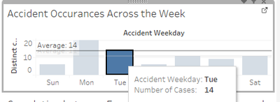
Caption: "There are prominent signs that within the Construction Industry that employees tend to rush their work prior to lunch time which had resulted in a peak in accident rates. There are spikes in the occurrence of accidents prior to lunch. The accident rates are fairly consistent throughout the week. The industry also experiences the most amount accidents from falls. 26% of these falls are due to the use of ladders. Within this sub-group, all these accidents are all self-induced. Further analysis reveals that these workers are not job-hopers but people who tend to be in the job for an average of 44 months in the job. These are worrying signs indeed. People are getting injured just by using the ladder! What happened to our safety culture within the industry!"
Visualisation Description: The visualisation tool is designed to facilitate the thinking of the analyst/user who is using it. It goes by the mantra, "“Analyze first, show the important, zoom, filter and analyze further, details on demand". You can see that the first dashboards give you an overview of the industry. The second dashboard narrows into the injury. The last dashboard focuses on the most micro detail, the victims. Thus, it flows smoothly downwards from the overview, all the way towards the micro level. This flows naturally with the analytical questions which I had in the back of my head. The charts are purposefully chosen to specifically answer the sub-question as the user is using the interactive dashboard. For example, the Treemap is used to show hierarchical relationship within the industry and how it fares to others through the colour and size.
Additional Findings from other Non-Tableau Software
JMP Pro
- Ternary Plot (Age, Months Worked, No of MC Days)
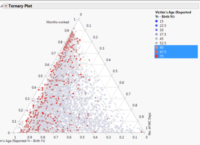
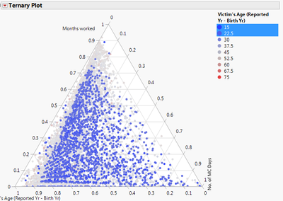
Interesting Findings: Look at the age group of these older workers. They are the ones who probably worked the longest and the oldest in the workplace. Due to the experience and skills, the No. of MC due to accident is still relatively low (10%). In contrast, the younger group has a higher number of MCs compared to the older workers. This is contrary to the popular belief that the younger workers are better workers. - Parallel Plot
Interesting Findings: JMP’s parallel plot is really powerful. It allows us to plot both continuous and categorical data in one plot, unlike Tableau. The above graph was part of my journey to find out more insights from the data. There is one particular case which struck me. There is an employee who the construction industry whom suffered an electric shock. He had been on a 3600 days of medical leave. This is equivalent to 10 years. This accident is entirely self-induced. This data point is worth investigating for the governing authority. The questions in my mind were, “Does the company ensure that their employees are properly trained prior to their work? Are there safety mechanism in place? Are other companies like this?”.


Software Used
- Mircosoft Excel
- Tableau
- JMP Pro
- Google Chrome
Final Deliverables
My hard work all described in one link. Tableau Story
Impovement
More data can be collected so that it can be used to give us more conclusive insights into the industry. One such example, data on the exact number of hours the employee was performing official work-related activities till the time of the accident. As of now, the current data as the supposed Official Working time and the reported Accident Time. However, there are gaps in this two variables. For example, the reported Accident Time is 30/12/1899 12:00:00 AM but the Reported Start time is 30/12/1899 7:00:00 AM. The dates are still the same. It might cause confusion as of whether the employee had injured after he started work from 12 am IN THE PREVIOUS DAY or he injured himself way early in the morning. Although there is an “Injured during official duty” variable, we would still need more to establish the truth and nature of the injury.
Modification
After listening to Prof's Feedback during class in week 7, he mentioned the following;
- Graphical Furniture should be tidied up
- The data should be readable - Should not contain "THIGH_KNEE", but rather, we should parse the data to improve readablity
- Short Use-Case Description
- Writeup on the use of Interactive Technique used
My second round of updates includes modifications focused on the aforementioned areas.
Feedback/Critique
Do feel free to give me any feedback so that I can improve my charts!:)