TheBigScreen
| Proposal | Poster | Application | Research Paper |
Contents
Problem and Motivation
Is it possible to predict how good a movie will be before it even screens? This is a subjective question. While some rely on movie critics and early reviews, others depend on instinct. However, we know reviews can take a long time to gather and human instinct is simply unreliable. Thousands of movies are produced every year and all of them our clamouring for the $11 we spend on movie tickets! Our group wants to know if we can predict which movies are worth you spending your money and time on.
Data
We are using the IMDB 5000 Movie Dataset from Kaggle. The Internet Movie Database (IMDB) is an online database of information related to films, television programs and video games [1]. Amongst its functions, IMDB allows users rate movies on a scale of 1 to 10.
The dataset contains the following variables, including but not limited to:
- movie title
- director name
- actors’ names and Facebook likes
- length of movie
- year
- gross earnings
- genres
- language
- country
- content rating
- budget
- IMDB rating
Related Work
| Visualizations | Learning Points |
|---|---|
|
|
|
| |
|
Technical Challenges
| Challenges | Approach | |
|---|---|---|
|
Data Cleaning & Exploration |
| |
Use of Javascript and D3 |
| |
Implementing Interactive Visualizations |
|
Method of Approach
|
Features:
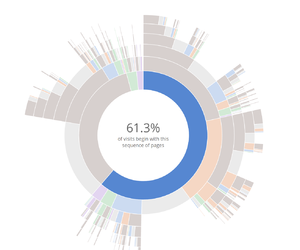
Our team felt that a Sunburst chart will be useful to visualize the data as users will be able to go deeper and understand the the data as they break it down further. It is important to note that a detailed guide for its usage is needed as this is a rather uncommon visualization chart. | |
|
Features:
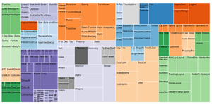
Our team felt that a Treemap will be useful for delivery insights of the data easily to everyone. As compared to visualizations like sunburst where users are required to learn about interacting with the chart for more insights, Treemaps deliver them effortlessly and usage is also simple. | |
|
Features:
|
Proposed Storyboard
|
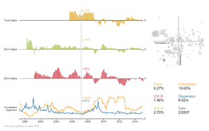
Our first proposed storyboard includes line/bar/scatter chart that works together like the Tablaeu dashboard, the Sunburst diagram and the Treemap. This initial mockup will be done in tableau allowing us to easily try out different combinations of variables and see the kind of results we will get. The line/bar/scatter chart will be used for showing if a relationship exist between variables and if they are correlated strongly. We plan to experiment on the following but not limited to:
The Sunburst diagram will let users breakdown deeper into each category based on:
The Treemap will |
Milestone and Schedule
