IS428 2016-17 Term1 Assign2 Aaron Mak Kang Sheng
Overview: How to Stay Safe at Work
I wanted to see if there are any main factors that cause employees to be injured. So I first started exploring certain factors such as months worked, gender, industry, day of the week, time of the day, the age of victim or weather.
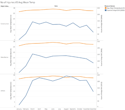
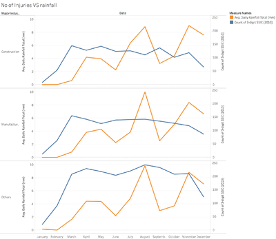
My initial hypothesis for weather was that the temperature fluctuations or rainfall affect the frequency of injuries in certain industries. The initial data set does not consist of weather so I had to gather data from http://www.weather.gov.sg/climate-historical-daily/. To prepare the data, I had to create a new column called date and export the table to a new one. After linking both tables from 2 datasets using the LEFT JOIN function, I’m able to construct a graph.
There’s no clear trend that weather affects it in general. Even after exploring into greater detail by filtering by industries or going to specific days rather than months, there is no correlation at all. So I’ve decided that this hypothesis is proven false and moved on.
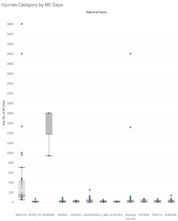
I’ve wondered if there’s a relationship between the nature of injuries and the MC Days. I assume that the number of MC days are related to the seriousness of the injury.
True enough, some nature of injuries are much more serious than others. I then wondered if they could be split further into more industries.
I wanted to find out if a particular industry has more of a certain nature of the injury and the seriousness of it (which I assume is related to the number of MC days) so I investigated this further in the next few graphs.
Analysis
Does an industry increases the chances of a particular nature of the injury and the seriousness of it?
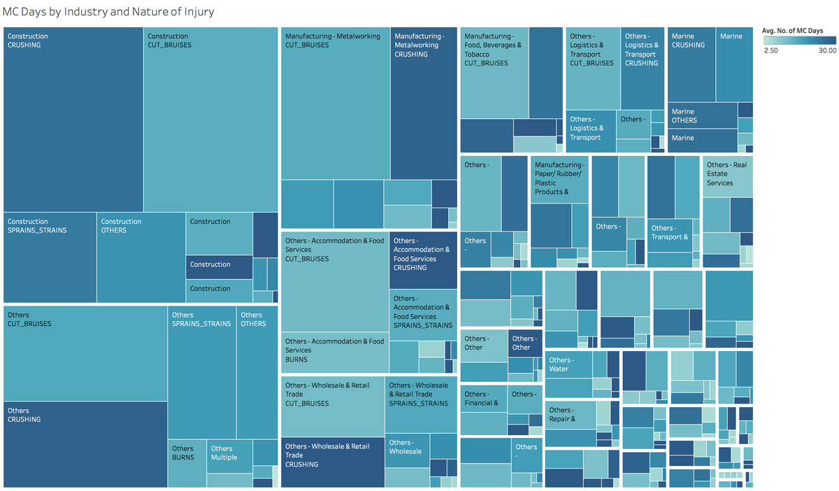
The area of the treemap represents the number of injuries and the shade of blue represents the average amount of MC days which were given. The treemap is categorised by the industry and nature of the injury.
In summary, you can see that most of the injury reports came from the construction industry and the majority of injuries in the construction industry has ‘CRUSHING’ as the nature of the injury. For most of the other industries, ‘CUT_BRUISES’ nature of the injury has the most number of injuries. At a glance, you are able to see that the construction industry seem to be the most dangerous industry, to no one’s surprise.
It is generally true that the nature of the injury determines the No. of MC days given regardless the industry. For example, ‘BLINDNESS’, ‘AMPUTATION’ and ‘CRUSHING’ have a much darker shade that other natures of injury. As such, a good indicator of the seriousness of the injury can be determined by the nature of the injury.
It’s also quite clear that the industry does play a large part in the nature of the injury. For industries that require less heavy manual work such as ‘Wholesale & Retail Trade’ and ‘Accommodation and Food Services’, the majority of injuries come from ‘CUT_BRUISES’. For the ‘Construction’ industry which requires more heavy manual work, ‘CRUSHING’ is the major source of injuries. Another good example would be the industry of ‘Health Activities’ where the majority of injuries come from ‘SPRAINS_STRAINS’.
In conclusion, yes, the industry does play a large role in determining your chances of getting into a particular nature of the injury and as a result, the seriousness of injury can be determined.
Does work experience reduce the chance of an injury?
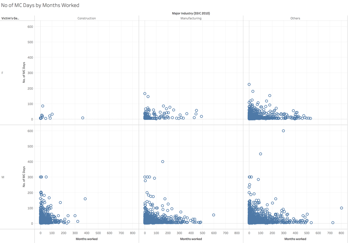
Extra data preparation is needed for this data because there was no index (row number). I had to add one more column in excel to create a unique identifier for each row so that the scatter plot shows every data point and is not summarised.
With the exception of a few outliers, it does seem that an increase in work experience reduces the incidence of injuries whether by industry or gender.
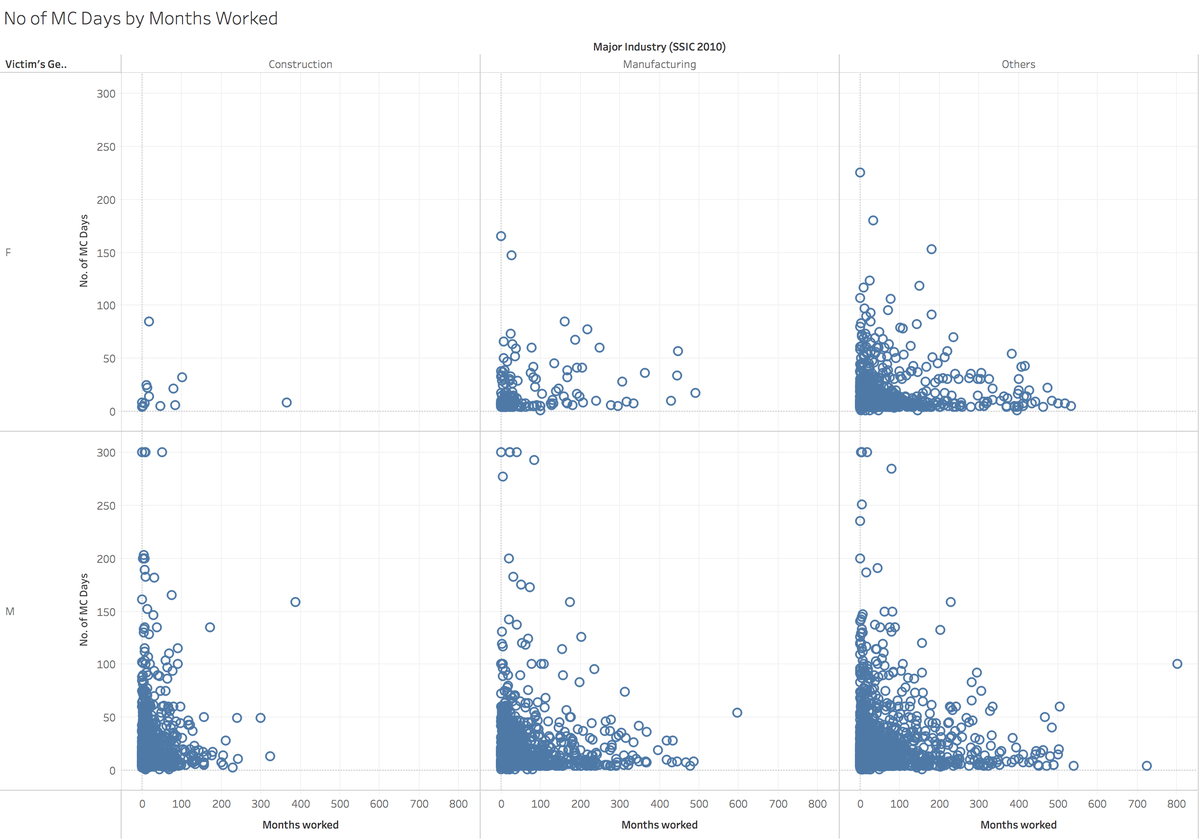
In this zoomed-in version, we can see an even clearer indication that as the employee’s experience increase, the number of injuries decreases.
Consequently, is quite likely that the amount of work experience helps workers to decrease the chances of getting injured.
Does the time of day increase the chance of an injury?
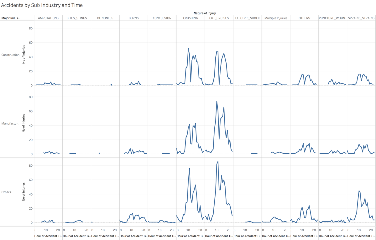
From the trellis plot, you can see that there is a spike in injuries just before lunch, 11am, and after lunch, 3pm-4pm.
This happens not just with common injuries such as ‘CRUSHING’ or ‘CUT_BRUISES' but also ‘SPRAINS_STRAINS’. From the trellis plot, you can see that ‘CUT_BRUISES’ have higher peaks in the Manufacturing industry than the Construction industry.
Data Visualization
Placing these graphs together on the same Tableau Dashboard, we can interact with the data more easily to find out any observations we might have missed while they are in isolation.
How to use the dashboard
Filters
Filters are on the left of the dashboard. They can be used to dive deeper into specific sub-industries, nature of an injury, and various categories. In addition, you can choose a smaller range of MC Days or the hour of the accident.
An example of this can be found below. Let’s say I’d like to look at the manufacturing industry. I’d select only the manufacturing sub-industries using the drop down filter on the left.
Zooming into the manufacturing industry, we can see that the majority of injuries are cuts and bruises. In addition, the spike in injuries at 10am and 4pm is quite high and mainly concentrated in crushing and cuts and bruises nature of injuries.
Filtering by Highlighting
For the treemap, if you’d like to take a closer look at a specific section, you can click on one of the rectangles and the map will filter out the rest of the data that isn’t within the highlighted rectangle.
From the example below, I have clicked on the crushing injuries in the construction industry. The other graphs have been filtered accordingly to show only data from the selected rectangle. It is clear that the majority of employees injured are Male and the number of injuries peak at 11am and 1pm-4pm.
Another way to highlight data is by using a drag box in the scatterplot and line graphs.
For the example below, I wanted to dive deeper into the spikes of injuries in the Metalworking industry’s crushing injuries. After clicking on the rectangle with of crushing injuries in the Metalworking industry, I simply used a drag-box to select the spikes in injuries.
Now I can see that for the metalworking industry, work experience is unlikely to help decrease the seriousness of crushing injuries during the injury spikes (10-11am, 2-4pm) since there’s quite a substantial number of serious injuries even with long work experience.
That said, there are many more combinations to be explored using filters in combination with highlighting.
For the full interactive visualization, you can go to tableau public at https://public.tableau.com/views/SGworkplaceinjuries2014/Published?:embed=y&:display_count=yes
