IS428 2016-17 Term1 Assign2 Wang Ziteng
Contents
Abstract
Workplace security has always been an important issue for Singapore Minister of Manpower. To develop a productive workforce and progressive workplaces, MOM should know more about the workplace injuries in different aspects. Through 2014, the data regarding to workplace injuries was collected by all the employees in Singapore. This report will focus on the workplace injuries issue and give analysis based on Workplace Injuries Data 2014.
Theme of Interest
To know more about the situation of workplace injuries and better deal with it, we need to know the overall trend of the number of injuries and injuries situation in different groups according to different categorizations. Thus, the government can make more specific policies to help employees.
Analytical & Investigation Questions
1. What is the overall trend of number of injuries through the year?
2. What is the overall trend of number of injuries in each day of the week through the year?
3. What is the injuries situation in different occupation?
4. Does the months worked matters?
5. What is the frequency of different causes of injuries?
Data Preparation
1. Data Selection
From all the 48 variables, I choose 11 of them.
Accident Day
Accident Weekday
Accident Month
Major Industry
Sub Industry
Body Pars Injured
Nature of Injury
Accident Type level 2 Category
Cause
Occupation
Months worked
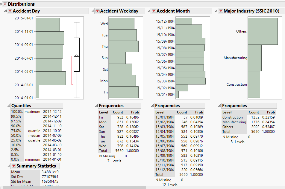
2. Check the distribution of the fields
To check the categorized data and numerical data and see whether they are valid. For categorized data, I need to know whether the categorizations are typed correct. For numerical data, I need to see whether the distribution make sense.
Data Visualization
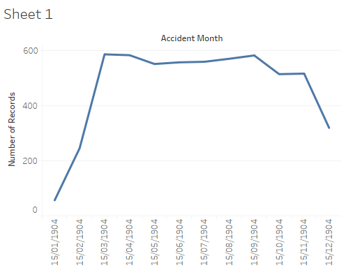
1. What is the overall trend of number of injuries through the year?
- Through the chart, we can see that the number of injuries increases dramatically from Jan to March
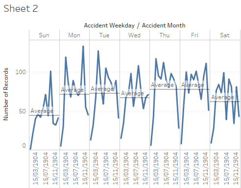
2. What is the overall trend of number of injuries in each day of the week through the year?
- From the chart, we can know the trend in each weekday through the year.Tuesday and Friday has the highest average number of injuries.
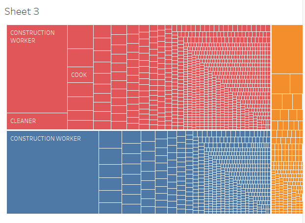
3. What is the injuries situation in different occupation?
- From the Mosaic plot, we can clearly see the injuries situation in each occupations.
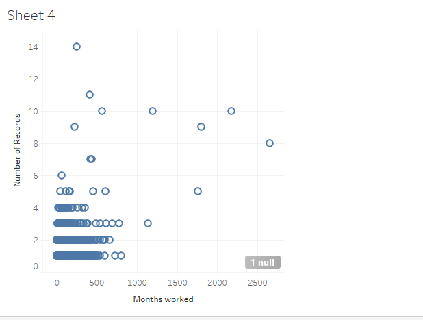
4. Does the months worked matters?
- From the scatterplot, we can see that employees with lower worked months tend to get injured.
Conclusion
From the charts, we can see the overall trend of the number of injuries happened in 2014. So I think government can get more resources to help injured employees according to the chart. They can prepare it in advance. Also, we can see the injury situation in different occupations. Employees who have heavy labour work like construction workers, drivers and cooks tend to get injured. Last but not least, employees with more worked months are less likely to get injured. (got some problem when publishing the workbook. Cannot signin the Tableau online)
Tools
1. Tableau Desktop
2. JMP Pro 12
