IS428 2016-17 Term1 Assign2 Nguyen Duy Loc
Contents
Abstract
Food variety around the world always fascinate people. Different countries have different food consumption patterns and eating habits. Having lived in three countries for a long period, I could easily point out the difference among the food from these places. British food is all about cheese. Singapore's food is very diverse, coming from all over the world. But some of the traditional dishes are oily. And Vietnam's food is more about the balance of spices and herbs. However, in today's world, people have more concern for the calories amount and nutrition inside their food. Thus, this study aims to explore the patterns of not only calories but also other characteristics of food around the world.
Problem and Motivation
Obesity is an issue in first world countries. The abundance of food in these countries may lead to the increasing trend. Some of the questions I have in mind approaching this study:
Do the characteristics of food traditions in some countries like US make their citizens fatter?
Is there a difference in term of food nutritions and healthiness between Europe and Asia?
Data Gathering and Data Processing
The data I used for this study is the Open Food Facts from kaggle website. It is a multivariate source. Each record contains the information on a type of food. The fields are the details of each dish, nutritions, type, country, etc.
A snapshot of the data is as below:
The country_en column has a problem. Some records have multiple countries. Thus, I use the functions in JMP to edit it into one country only to guarantee the consistency of data.
Exploration and Analysis
Since the study is about discovering unknown unknowns. I apply all the techniques learnt in class to explore the data and find out any interesting patterns in it.
- Ternary diagram
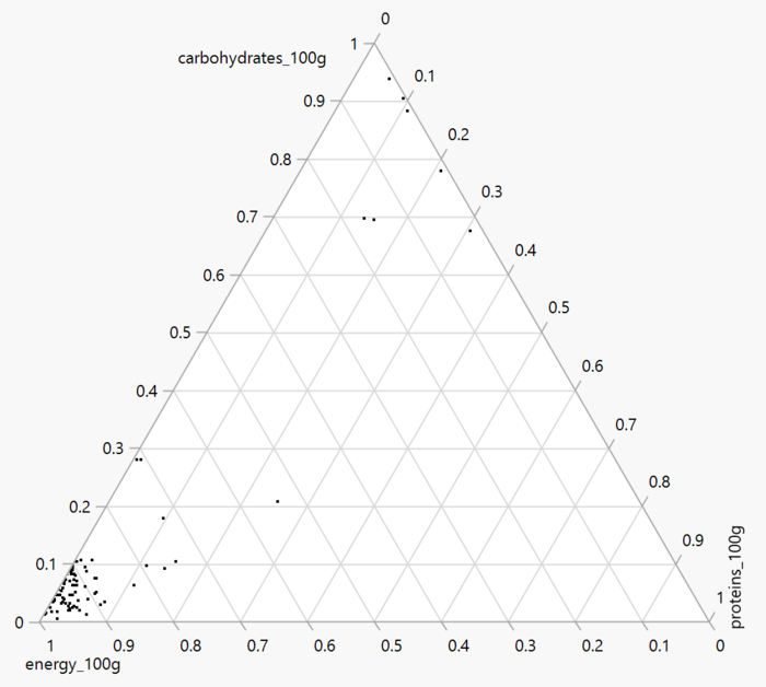
The three indicators used for ternary diagram is the energy per 100g, carbohydrates per 100g, and proteins per 100g. This is to have a first gauge on how healthy the food in the world is. The majority of the food is high in energy and protein level while low in carbohydrates. There are some that are really high in carbohydrates.
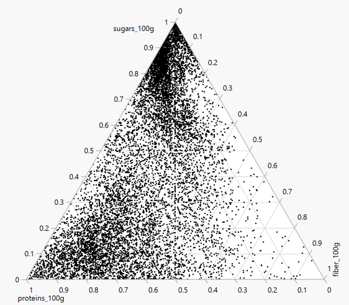
However, the graph doesn't show many records. So I chose other columns such as proteins per 100g, sugar per 100g, and fiber per 100g. Turn out the pattern is much clearer. Food that contains high portion as fiber is harder to find as compared to food with high protein or sugar proportion.
- Parallel coordinates
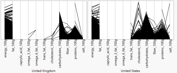
As we can see, the parallel graph of US has a denser and higher parts in fat and cholesterol categories. Thus, in comparing the two country, UK is more healthy than US.
- Trellis
- Mosaic plot
- Divergent bar chart
- Parallel Sets
- TableLens
- Treemap
Conclusion
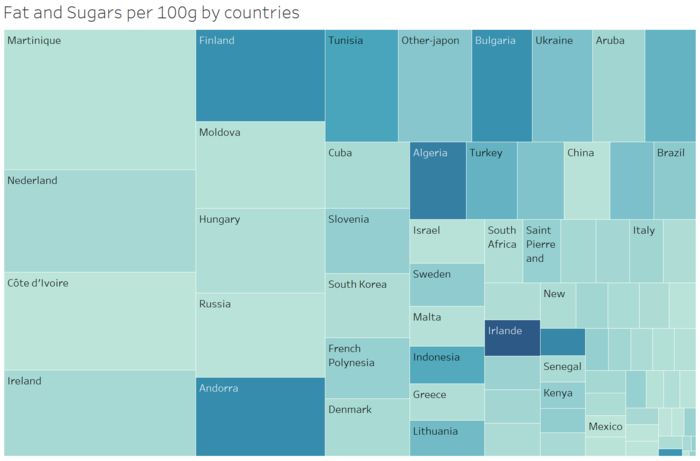
Europe countries tend to have a higher portion of fat in their food than the rest of the world.
Tools Utilized
- Excel 2013 for data preparation
- Tableau for visualization


