IS428 2016-17 Term1 Assign2 Dina Heng Li Gwek
Contents
Abstract
Twenty-two workers have died from workplace accidents since the start of 2016, more than the 18 from the same period last year, the Workplace Safety and Health (WSH) Council said on Monday (Apr 4). It is urging relevant industries to review their safety procedures at work immediately and to ensure that all control measures are in place.
Manpower Minister Lim Swee Say, noting that in the first half of 2016, there have already been 42 fatalities - 12 more compared to the same period last year. Mr Lim added that the construction sector remains the top contributor with 18 fatalities - an 80 per cent increase from last year, which saw 10 fatalities in the sector.
This issue has sparked my curiosity as I want to find out more about the trends occurring in specific industries, the key figures in workplace injuries, top sectors with workers injured, top causes of injuries etc.
Theme of Interest
Questions for Investigation:
• Which industry has the highest rate of workplace injuries?
• Which body parts got injured most of the time?
• Which gender suffered more injuries and particularly in which industry?
• Who is more prone to injuries? Is it the younger or older ones?
• How did they get injured?
• Who gets injured most of the time?
• When do accidents occur the most? (Which month and why? Does it occur more frequently during overtime?)
• What is the distribution of the number of MC given to injured employees?
Identifying appropriate attributes
The following data attributes are selected for analysis:
- Reported Date
- Reported Month
- Informant's No Of Employees
- Accident Month
- Major Industry
- Sub Industry
- Body Parts Injured
- Nature of Injury
- Major Injury Indicator
- Accident Type Category
- Victim's Age
- Cause
- Victim's Gender
Blog
To get things started, I examined and analysed the raw data ("WPI_data") to understand the dataset and attributes given to me. I also noticed that some data are either improper or irrelevant. For example, there were some spelling mistakes. As a data analyst, I needed to ensure that I have done proper data cleaning before doing analytics so that my analysis is true and accurate. I used Microsoft Excel 2016 and JMP to clean and transform my data. Then, I used Tableau to do my visualization.
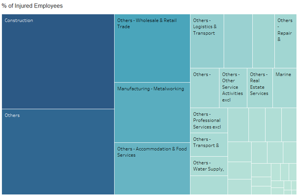
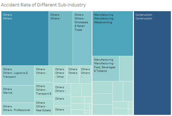
I want to identify which industry has the highest rate of injuries so I created a new attribute called "% of Injured Employees". The reason being it would be a biased estimate if I just use the sum of the number of records to determine the highest rate of injuries by industry since different industries have different sizes of worker pools.
I used a treemap because it is relatively easier for the user to see a bird's eye view of the injury rate of the different industries.
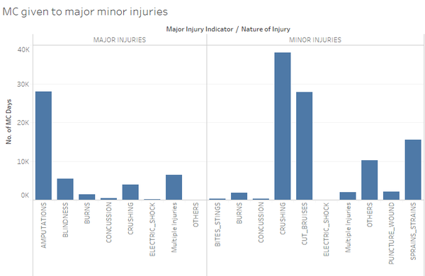
2. From this dashboard, you could see the MC given to minor and major injuries.
You can see that for major injuries, blindness was given the most number of MC, followed by amputations then multiple injuries. However, my findings is that not enough MC days have been given to amputations and multiple injuries.
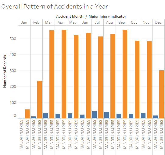
3. Overall Pattern of Accidents in a Year
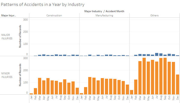
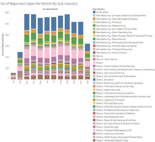
You can see that for the months of January and February, not a lot of accidents have occurred. The peak was during March, April and September. I reckon that especially at those months, perhaps precaution has been lax or either there are more construction happening during those months.
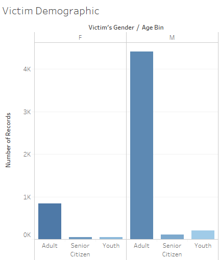
4. Victim Demographic
5. Pattern of Accidents in a Year by Industry
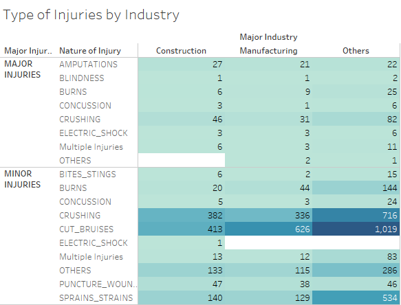
6. Type of Injuries by Industry
7. # of Accidents of Different Major Industry
8. Accident_Rate_of_Different_Sub-Industry.png
9. No of Reported Cases Per Month By Sub Industry
Findings & Recommendations
Others
Tools Utilized
- Excel 2013 for data preparation
- Tableau for visualization
