IS428 2016-17 Term1 Assign2 Lim Zi Yu Jouta
Introduction
I have chosen to work on the Workplace Injuries Data 2014. Looking through the WSHI National Statistics Report 2014, I noted that compared to 2013, the total number of workplace injuries have increased with types of injuries having increased occurrences except for fatal injuries, which has decreased, which I found rather ironic that it was not the case that injuries increased or decreased uniformly. Beyond the workplace injuries, Occupational Diseases (OD) attributed to the workplace has also seen an increase. Through the investigation of this data, I hope to uncover causation or correlation between variables that could be used to explain the occurrences of workplace injuries so that effective steps can be taken to reduce it.
Data Visualization System Design Process
Step 1: Identify a theme of interest
Given the workplace injuries dataset, my theme of interest would be on reasons for workplace injuries. I believe that Singapore as a safe country would have had a number of regulations to ensure the safety levels of workplaces. Yet the incidence rates of workplace injuries continue to increase, which brings up the question of why is this the case.
Step 2: Define questions for investigation
- Is there a relationship between severity of injury and industry?
- Is there a relationship between time and day of the week with injury occurrence rates?
- Are there any outliers with high incidence rates of injuries?
- Is there a relationship between gender and injuries?
Step 3: Find appropriate data attributes
After looking through the data, I noted some data formats can be improved by first making some simple alterations in Microsoft Excel.
The column for Accident Day, has a mix of dates saved in excel format as serial numbers while others are saved as string. To make all data format in the column uniform, I used text to columns to select the column data format to be date in DMY format
The column for Accident Month shows the month in a date, such as 15/04/1904 and 15/06/1904, to show the month of the accident. To make it clearer, I added in another column “Accident Month Num” to take only the month number from the date. I did the same for the accident day. The accident date column data appears to only have dates that are the first day of the month, which I don’t think is accurate in reflecting the actual accident date. Hence, I created a new column Accident Date Combined with the date created from the day, month year numbers, which I believe to be a more accurate reflection of the actual accident date.
The Sub Industry column has data in the format of “major industry – sub industry”, hence I used text to columns to split them by the - delimiter. I also made sure that the “Non-metallic Mineral Pdts” sub industry was formatted correctly despite my actions. I also ran the trim function on them to remove redundant spacing in the string. Also did something similar for the column Accident Agency Level 2 Desc, but this time round I tried using the search function to find the character number of the hyphen and used it to get the string on the left and right of it instead. It was only much later that I realized you can right click on the column in Tableau to “split”, however it also split the “Non-metallic Mineral Pdts” into two so I did not use that function as a result.
Added column Major Injury Boolean based on column Major Injury Indicator such that if the value is “MAJOR INJURIES”, value in Major Injury Boolean will be TRUE, else FALSE. Did the same for columns Pct Manual Work, Hospitalized for at least 24 hours, Injured when Working Overtime, Injured While Performing Official Work Duties. Even though I am not sure now if I will be using those variables or if the transformations are needed, but I think it is better to prepare them in advance to ensure smooth progression when exploring the data later on.
Added calculated field to split victim age to 3 groups, under 30, 31-55 and over 55. The reason why I chose these 3 group is due to the attitudes at the work place from my personal experience. Those below 30 were the young people, 31 – 55 were the main age group at work, after 55 was the more elderly group of people at work. Given that people of the similar age groups then to group together and engage in similar activities, I believe that this would help aid in the data exploration by allowing us to gain insights into the possible habits and behaviors that give rise to the risk of injuries at work.
Data Exploration
Initial steps to explore the data
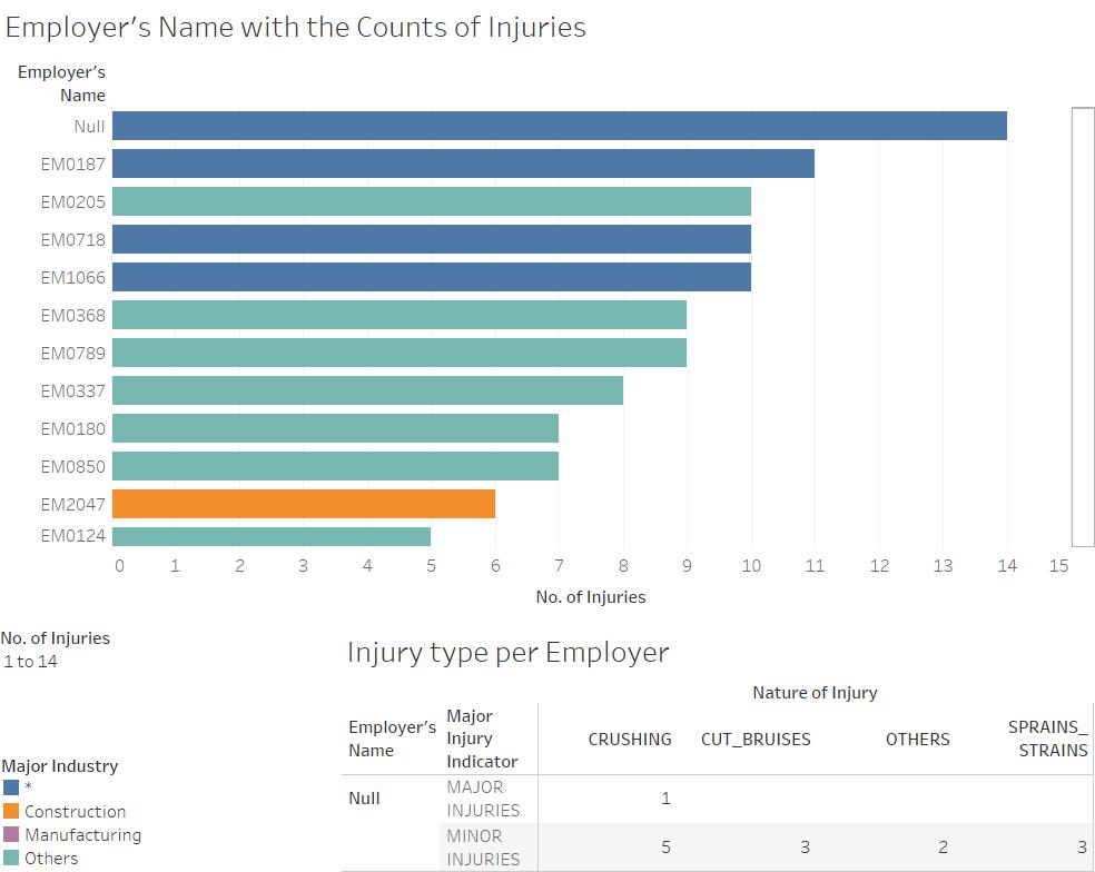
As I was just starting out, I started to play around with the data based on the questions I had listed out above. One of the first graphs I created was a bar chart showing the count of injuries per Employer name sorted from largest to smallest. To add in more detail, I created a filter with range of values and use color to show the injury by major industry, and made major industry an attribute to the data in the tree map. Adding it to a dashboard allowed me to link it with an action to another graph, such that as you hover over the bar for the specific employer, a table below will give you the breakdown of the major/minor injury and the nature of the injury.
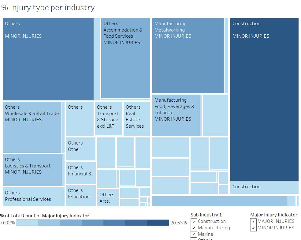
I constructed a tree map to illustrate the percentage of injury types by the Sub Industries. I set the color gradient for the tree map to be only of blue color, and made it a 7 step color change as I think it gives a clearer representation of the differences between values like 202 and 125 by making a clear 1 step distinction in color compared to a smooth gradient. I added filters for Sub Industry 1 (sub industry header) and Major Injury Indicator so that people can adjust to see in more detail as they like.
I created two graphs, one to show the distribution of injury counts by weekday of each month and another by the month, with color to indicate major or minor injury.
Visuals
Injury count per Employer
Visit this link for the full interactive visual
https://public.tableau.com/views/Assignment2_248/EmployerxInjuries?:embed=y&:display_count=yes

From this dashboard, we are able to see the injury count per employer, with some null values as the employer field was left blank for some data rows. By hovering over each employer row, we can see the breakdown of injuries by Major/Minor, and the Nature of the Injury. We can also filter by the number of injuries per employer to narrow down on specific employers.
From this graph, we see that majority of the employers see only 1 injury count, and only a handful of them have more than 6 injury counts in 2014. Those with 6 and more injury counts are from the major industries of Construction and Others, with others having more than 1 major industry. Most of the injuries in the employers with multiple injuries are minor injuries instead of major injuries, which may hint on some issues in the working environment resulting in some easily caused minor injuries, such as placement of equipment with sharp edges near a walkway whereby people who are not careful would easily injure themselves there.
% Injury Type per Industry
Visit this link for the full interactive visual https://public.tableau.com/shared/7NPDCT2SN?:display_count=yes
This treemap gives a breakdown of injury counts by the Major/Minor Injury Indicator, Sub Industry 1 (the main category), Sub Industry 2 (the sub category). The interactive visual allows you to filter by Sub Industry 1 and Major/Minor Injury Indicator, allowing you to view a tree map that narrows down to specific parameters instead of just the overview. Pct of Manual work can be seen upon hovering over the respective areas.
As expected, Construction takes up the largest chunk of the Major Injuries, followed by Others with no sub subcategory, further followed by metalworking. However, Others as the main subindustry still takes a bigger slice of the pie compared to construction as a main subindustry. This can be attributed to the way the data was recorded, which results in only the Construction, Manufacturing and Marine subindustry to be separate from the Others subindustry, resulting in Others consisting of most of the other subindustries recorded in the data. The tree map for Minor Injuries also see the same trend as that for Major injuries, which supports my initial thought that some of the (sub) industries does indeed see more incidence rates for injuries, which may very well be rooted in the very nature of the occupation and work. However, it also shows that much more needs to be done to ensure the welfare of those who are working there, knowing very well that the job has certain risks that can be narrowed down with ease and take measures against it. As such statistics are not widely reported and made available to the general populace, there may not be much motivation to ensure safety for some of the workers, especially for the construction industry that sees a large number of injuries. Furthermore, the construction industry consists of mainly foreign workers whom left their families back in their hometown to work for their keep here, if proper measures are not taken to ensure their welfare is met, I do not think that there is anything left to help them in this foreign land. From the data, it is also apparent that more manual work results in more chance of injuries, as more than half of the injuries are from work involving more than 50% manual work.
Some subindustries with a large number of injuries include:
- Construction
- Manufacturing – metalworking
- Others – accommodation & food services
- Manufacturing – food, beverages & tobacco
- Others – wholesale & retail trade
These are some of the low skilled work industries in Singapore that mainly turns to the foreign workers pool to look for workers. Could it be a systemic discrimination against low-skilled foreign workers that results in such injury rates to mainly occur in these industries? Most of us who have been for internship would be aware of the safety measures taken by most offices to prevent injuries and emergencies, and would not expect much injuries to happen at the workplace. Maybe we should not be looking at what is already there, but what is it that is not there, things that we usually do not observe in our daily life. From what I see in this data, there appears to be a possible unfair discrimination against unskilled workers, giving them a disadvantaged workplace that holds certain risk for injuries.
Pareto Chart for Accident Hour
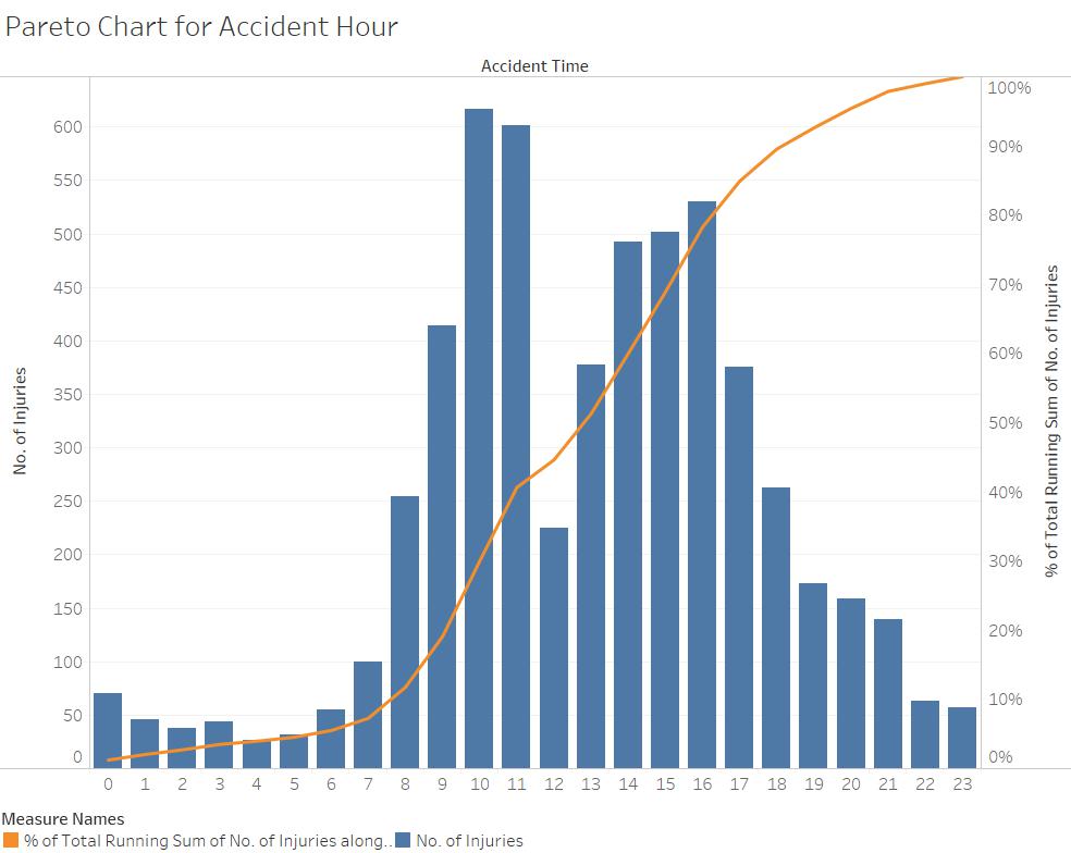
Next, I created a bar chart to show the accident hour on the x-axis against the number of injuries on the y-axis. It appears that the chances for injuries and accidents are significantly higher both right before and right after lunch hour. 1000h and 1100h seem to be the prime time for injuries to take place, similarly, 1400h to 1600h also have heightened injury occurrence rate compared to other timings.
If we follow the basic assumption that people let their guard down and lose their attention when they are tired, it could explain why accident rates are heightened during those time periods. Prior to lunch time, people get hungry and as a result feel more mentally tired than if they were not hungry. The tiredness they feel makes them more prone to making mistakes or not taking care of their surroundings, increasing the chances of accidents. Also, the flow of human traffic in work places may increase before and after lunch hour and groups of people move across the grounds, increasing the odds for collision. The same can explain for the rise in accident rates after lunch. After lunch, the body focuses on its digestive systems, hence resulting in decreased blood flow to the brain resulting in decreased levels of focus. Furthermore, the change in environment for the individual after a relaxed period of time leads them to not put their guard up that much, giving rise to opportunities for such accidents.
Other than such individualistic factors that affects one’s behavior, systematic routines conducted on a daily basis may give rise to such patterns in accidents occurring on a particular hour of the day. Further investigation into the daily routines of those of the occupation may give insight as to why certain accidents happen, or happen repeatedly.
Compared to other time/day measurements for accident occurrences, the hour of the day which accidents take place has a more defined trend. Perhaps it could be explained by the existence of a daily routine that creates a specific time frame whereby accidents are more prone to happening.
Below is a thumbnail of the interactive visual for injuries by month and day of week by each month, which I do not see any clear trends other than the reduced numbers for December, January and February, which could be explained as a seasonal loss of manpower as people quit their jobs after getting their bonuses, or goes on holiday with their family, whereby such behaviors stabilize as March comes and people move on to their new jobs.
Injuries and Manual Work
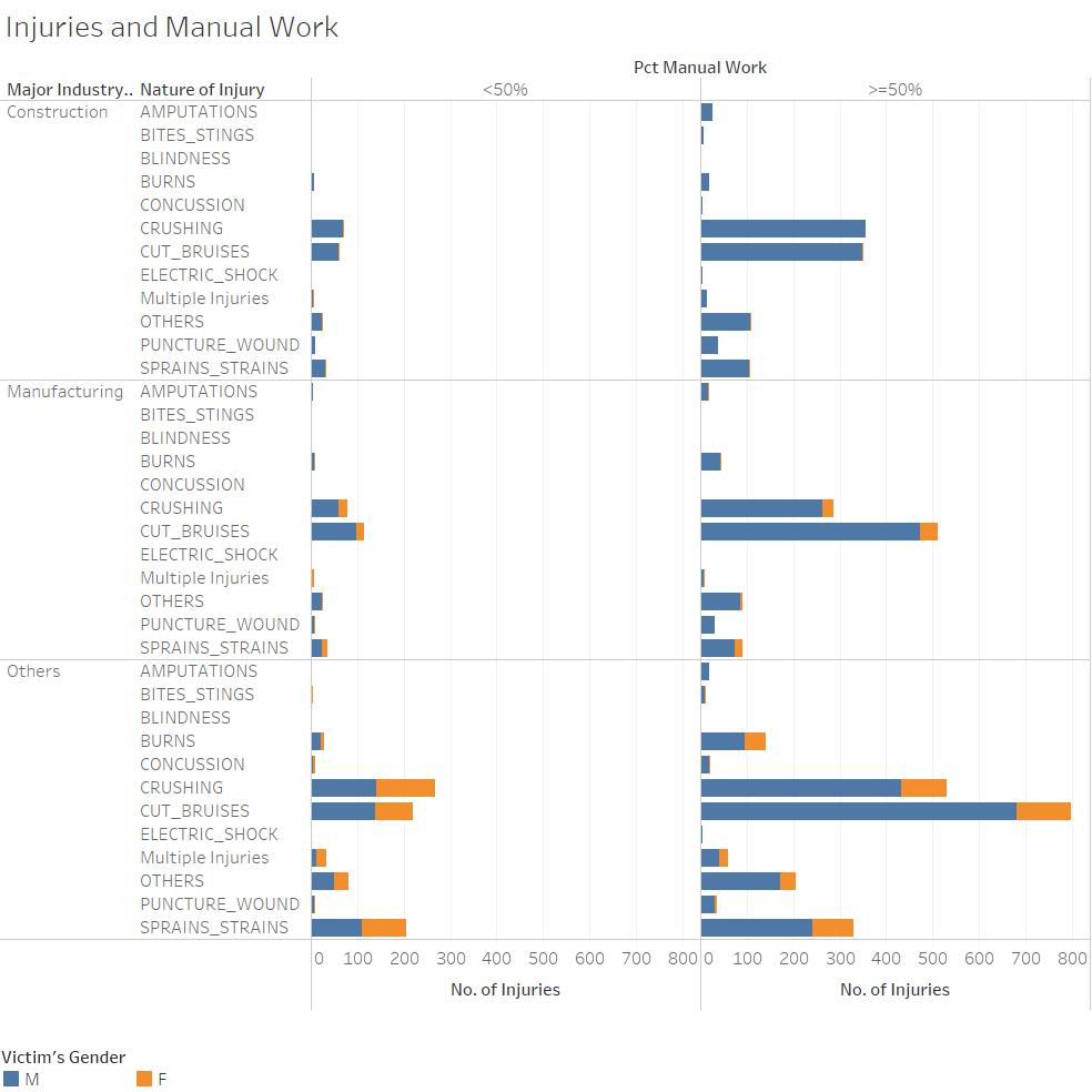
This table shows major industry followed by the nature of injury on the rows, followed by percentage of manual work on the columns. The color of the bar charts shows the Victim’s gender, orange for F, blue for M. One of the glaring things that I first noted from this chart was that the number of injuries for more manual work greatly outweighs that of less manual work. This can be taken as a given considering the nature of the work which provides for opportunities for injuries.
However, there is also a glaring gender bias when it comes to more manual work compared to less manual work. The orange areas denoting female injuries do not differ that much between more or less manual work, however, we see that the blue area denoting male injuries as good as doubled from less manual work to more manual work.
Perhaps some jobs do favor male labor more, given the physical capabilities of a male compared to a female. Or is it also because of a societal bias against males when it comes to more manual work? For example, males are expected to be physically strong, hence when help for manual work is needed, people tend to turn to males instead of females. Because of the expectations that come with the request, males may force themselves to exert more to be able to perform more and prove their ego. Such unspoken societal pressures in the workplace may manifest itself in the form of injuries on the individual under pressure as they end up over exerting themselves. Given their performance, others do not perceive the overexertion and hence do not make improvements to reduce stress on them, creating this cycle that continues until one side breaks. As such, we would not observe improvement in equipment and facilities to help improve the situation for the existing employees as such a need is not seen.
Compared to females, males are more often victims of life changing injuries such as amputations, burns and blindness. If males are really in a disadvantaged situation that makes them more prone to such injuries, something needs to be changed to ensure they don’t have to risk having such life changing injuries that would never be able to heal fully.


