IS428 2016-17 Term1 Assign2 Chua Shan Yong James
Contents
Abstract
Workplace injuries have always been a concern in Singapore as the fatalities and accident rates number are worrying. Safety protocols have been in placed and perhaps adhered to but injuries are still unavoidable. This topic has therefore caught my interest to work on as i hope to find out trends in specific industries, age, body parts injured etc and the relationship between them.
Theme of Interest
The theme of interest for workplace injuries that i will be working on is identifying and analysing the contributing factors to workplace injuries and the relationship between each of these factors.
Questions for investigation
- Which industry has the highest rate of workplace injuries?
- Which are the body parts that got injured the most number of times?
- Which gender suffer more injuries?
- Is it justified in each industries?
- Are the older workers more careful than the younger workers? Or vice versa?
- For each industry, is the above finding justified?
- Does experience make a worker more slack and negligent about workplace safety (months worked)?
Identifying appropriate attributes
With reference to the theme of interest and questions for investigation that i have came up with, i needed the following attributes to carry out my analysis :
- Body parts injured
- Victim's gender
- Victim's age
- Months worked
- Sub industry
- Informant's number of employees
Transformations/Rearrangements of dataset
After removing all the redundant attributes using excel, i proceed to use the data in tableau.
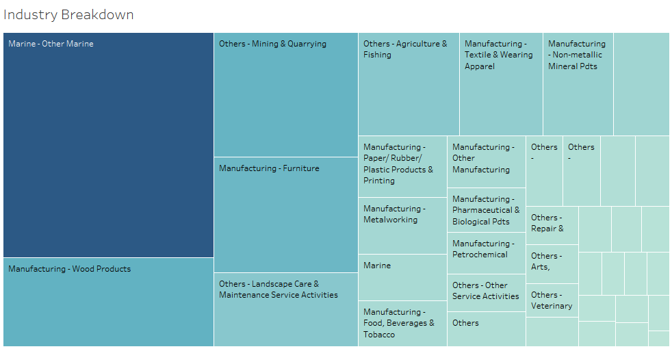
To find out which industry has the highest rate of injuries, i created a calculated field - % of injured employees (out of total employees). I created this field as i can't just use the total number of records as it will be unfair since construction has a high number of workers and also more records but what i am more interested is the rate. therefore, i use the number of records / informants total employees and expressed it as a percentage.
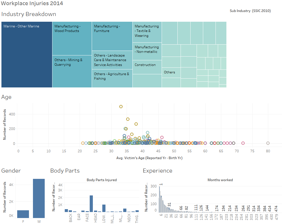
Using a treemap, i used this calculated field and sub industry to identify to show the rate of injured workers in each sub industry. The reasons i used a treemap are because there are many sub industries, it is easy to understand and identify immediately which size of the rectangle is the biggest and therefore having the highest rate and it provides an overview and summary against the other sub industries.
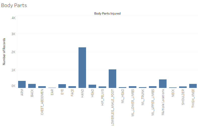
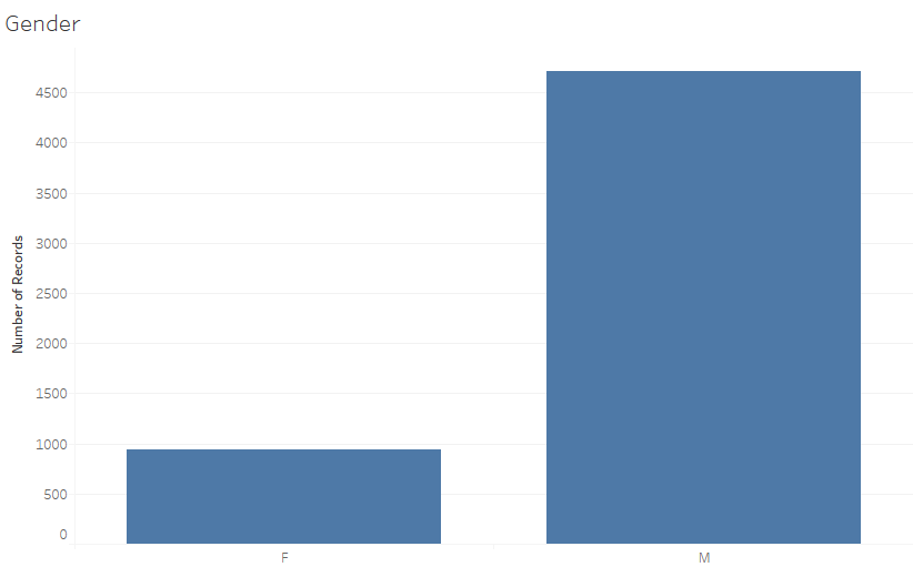
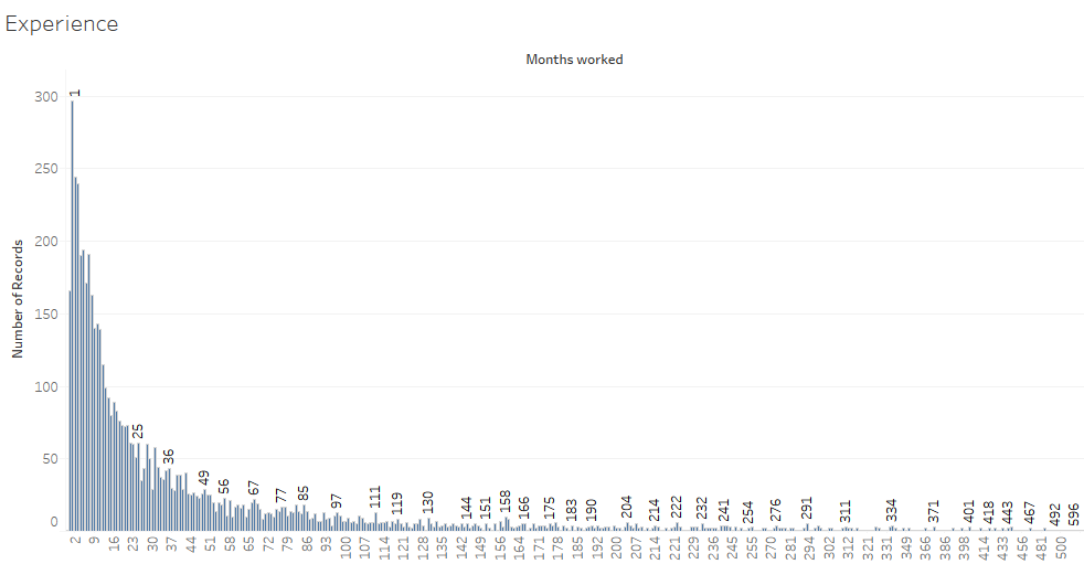
For the distribution of the body parts injured, gender and experience charts, i used bar chart as it is simple and easy to understand. In a glance, i am able to identify that hand is the most injured body part, males suffer more injuries as compared to females and employees who work for 1 month suffers the most injuries throughout all sub industries.
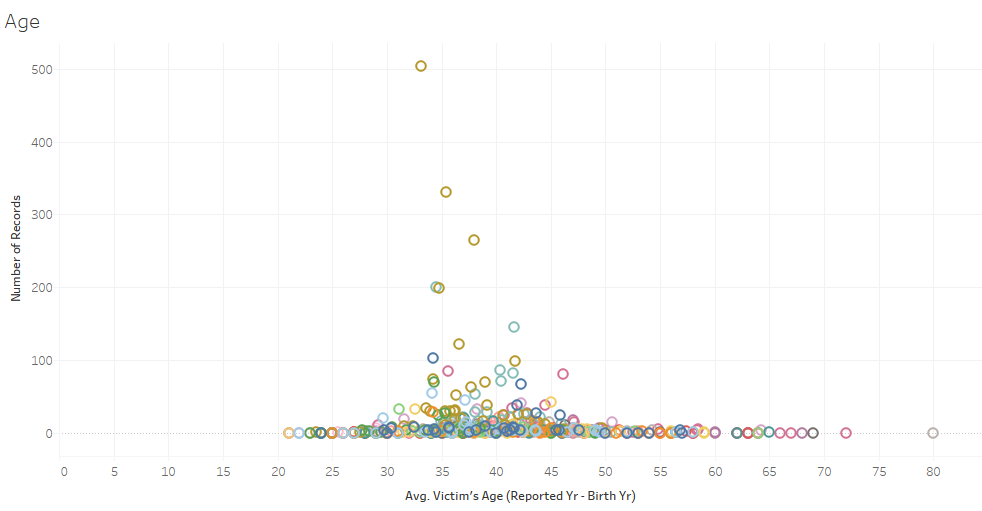
For the distribution of the age charts, i used a scatter plot since there are a large quantities of age range data and scatter plot make it easy to see clustering effects. I could identify from the scatter plot that there is a high clustering effect at age ranging from 35-45 who suffers the most workplace injuries.
Visualization
The visualization dashboard consists of a treemap, bar charts and also the scatter plot. Each of these charts allows interactivity as it can be used as a filter against the other charts. For example, in the treemap, i can select a specific sub industry and it will change all the other 4 charts - the scatter plot for showing the age, the bar charts that show the body parts injured, gender and experience of the specific industry respectively.
URL to Interactive Dashboard : https://public.tableau.com/profile/publish/Assignment2_246/Dashboard1#!/publish-confirm
For each of the questions that i posed, i could answer them using the interactive visualization:
- Which industry has the highest rate of workplace injuries?
- Using the treemap, i could identify that Marine - other marine has the highest rate of workplace injuries by seeing that it has the largest rectangle size among all the other sub industries.
- Which are the body parts that got injured the most number of times?
- Using the bar chart, hand is identified to be the body part that got injured the most number of times.
- Which gender suffer more injuries?
- Using the gender bar chart, males can be identified to suffer more injuries as compared to females.
- Is it justified in each industries?
- By using the dashboard, i could select specific sub industry from the treemap and the gender bar chart will update and change according to the sub industry selected.
- Are the older workers more careful than the younger workers? Or vice versa?
- Using the scatter plot for age, i could see a clustering effect for age 35-45 who suffer the most number of injuries.
- For each industry, is the above finding justified?
- By using the dashboard, i could select specific sub industry from the treemap and the age scatter plot will update and change according to the sub industry selected. A new clustering effect will be shown for that specific industry.
- Does experience make a worker more slack and negligent about workplace safety (months worked)?
- Using the experience bar chart, employees who worked for a month suffer the most injuries and therefore an experienced employee are more careful and work safely as compared to new employees.
Tools Utilized
- Excel 2013 for data preparation
- Tableau for visualization
