IS428 2016-17 Term1 Assign2 Lim Zi Yu Jouta
Contents
Introduction
I have chosen to work on the Workplace Injuries Data 2014. Looking through the WSHI National Statistics Report 2014, I noted that compared to 2013, the total number of workplace injuries have increased with types of injuries having increased occurrences except for fatal injuries, which has decreased, which I found rather ironic that it was not the case that injuries increased or decreased uniformly. Beyond the workplace injuries, Occupational Diseases (OD) attributed to the workplace has also seen an increase. Through the investigation of this data, I hope to uncover causation or correlation between variables that could be used to explain the occurrences of workplace injuries so that effective steps can be taken to reduce it.
Data Visualization System Design Process
Step 1: Identify a theme of interest
Given the workplace injuries dataset, my theme of interest would be on reasons for workplace injuries. I believe that Singapore as a safe country would have had a number of regulations to ensure the safety levels of workplaces. Yet the incidence rates of workplace injuries continue to increase, which brings up the question of why is this the case.
Step 2: Define questions for investigation
Is there a relationship between severity of injury and industry? Is there a relationship between time and day of the week with injury occurrence rates? Are there any outliers with high incidence rates of injuries? Is there a relationship between gender and injuries?
Step 3: Find appropriate data attributes
After looking through the data, I noted some data formats can be improved by first making some simple alterations in Microsoft Excel. The column for Accident Day, has a mix of dates saved in excel format as serial numbers while others are saved as string. To make all data format in the column uniform, I used text to columns to select the column data format to be date in DMY format
The column for Accident Month shows the month in a date, such as 15/04/1904 and 15/06/1904, to show the month of the accident. To make it clearer, I added in another column “Accident Month Num” to take only the month number from the date. I did the same for the accident day. The accident date column data appears to only have dates that are the first day of the month, which I don’t think is accurate in reflecting the actual accident date. Hence, I created a new column Accident Date Combined with the date created from the day, month year numbers, which I believe to be a more accurate reflection of the actual accident date. The Sub Industry column has data in the format of “major industry – sub industry”, hence I used text to columns to split them by the - delimiter. I also made sure that the “Non-metallic Mineral Pdts” sub industry was formatted correctly despite my actions. I also ran the trim function on them to remove redundant spacing in the string. Also did something similar for the column Accident Agency Level 2 Desc, but this time round I tried using the search function to find the character number of the hyphen and used it to get the string on the left and right of it instead. It was only much later that I realized you can right click on the column in Tableau to “split”, however it also split the “Non-metallic Mineral Pdts” into two so I did not use that function as a result. Added column Major Injury Boolean based on column Major Injury Indicator such that if the value is “MAJOR INJURIES”, value in Major Injury Boolean will be TRUE, else FALSE. Did the same for columns Pct Manual Work, Hospitalized for at least 24 hours, Injured when Working Overtime, Injured While Performing Official Work Duties. Even though I am not sure now if I will be using those variables or if the transformations are needed, but I think it is better to prepare them in advance to ensure smooth progression when exploring the data later on.
Data Exploration
Initial steps to explore the data
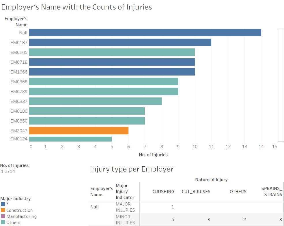
As I was just starting out, I started to play around with the data based on the questions I had listed out above. One of the first graphs I created was a bar chart showing the count of injuries per Employer name sorted from largest to smallest. To add in more detail, I created a filter with range of values and use color to show the injury by major industry, and made major industry an attribute to the data in the tree map. Adding it to a dashboard allowed me to link it with an action to another graph, such that as you hover over the bar for the specific employer, a table below will give you the breakdown of the major/minor injury and the nature of the injury.
I constructed a tree map to illustrate the percentage of injury types by the Sub Industries. I set the color gradient for the tree map to be only of blue color, and made it a 7 step color change as I think it gives a clearer representation of the differences between values like 202 and 125 by making a clear 1 step distinction in color compared to a smooth gradient. I added filters for Sub Industry 1 (sub industry header) and Major Injury Indicator so that people can adjust to see in more detail as they like.
I created two graphs, one to show the distribution of injury counts by weekday of each month and another by the month, with color to indicate major or minor injury.
Visuals
Injury count per Employer
Visit the link below for the full interactive visual
https://public.tableau.com/views/Assignment2_248/EmployerxInjuries?:embed=y&:display_count=yes
