IS428 2016-17 Term1 Assign2 Gwendoline Tan Wan Xin
Contents
Theme Of Interest
The analysis will be conducted using the 101 Innovations – Research Tools Survey Dataset from Kaggle. With new tools and sites appearing to assist people in the entire research process, the types of tools/sites that people get to choose from are enormous. However, one could not have the ability to use all available tools at the same time. As such, I’m interested to identify the factors that could affect people’s choice of tools/sites in supporting their research process.
Analytical/Investigation Questions
The analysis attempts to answer one main question:
- What factors could affect people’s choice of tools/sites used throughout the research process?
However, as the analysis process evolves, two additional questions arises:
- In which phase of the research do people use the most number of tools?
- Are there different patterns of the type of tools used to search data based on different roles or disciplines or across different regions of the world?
The "Analysis & Visualization Construction Process" section will further elaborate on the evolution of questions from one to the other.
Selected Data Attributes for Analysis
The following data attributes are selected for analysis:
- Participant’s Role
- Country
- Discipline
- Date of Publication
- Tools/Sites to Search Literature/Data
Data Transformation Process
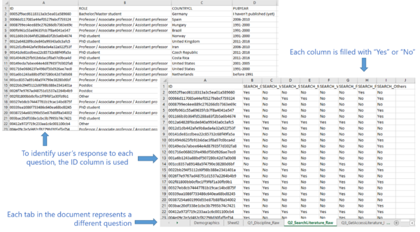
Before the analysis began, the dataset is analysed to identify its format and attributes. The dataset comes from a survey conducted across 20,663 researchers, librarians and other groups. In the survey, participants are presented with questions that provide them with the option to choose multiple answers. For example, one of the question in the survey asked participants to check all tools that they use during the process of researching for data. They could select multiple tools, such as a combination of Google Scholar and Web of Science. Each tool is a column in the dataset and if users indicate that they use the tool, the column will be filled. However, if they did not indicate it, the column will be left blank. An example of a row in the dataset is as follows:
After understanding the format of the data, the following is performed to transform the data into a format that could be used for analysis.
- Firstly, the columns in the initial dataset is grouped into its own respective questions. Each question will have its own sheet. For all demographics questions (e.g. role, country etc.), it will be grouped together into a single sheet. To identify the user who answered each question, the ID column will be present in all the spreadsheets.
- For each column, the response is either a “Yes” (user use the tool) or a “No” (user don’t use the tool). To allow better visualization, empty fields are filled with “No” and fields that are filled are changed to “Yes”. This is done using Excel’s Replace All feature. The resulting dataset will then look like the following:
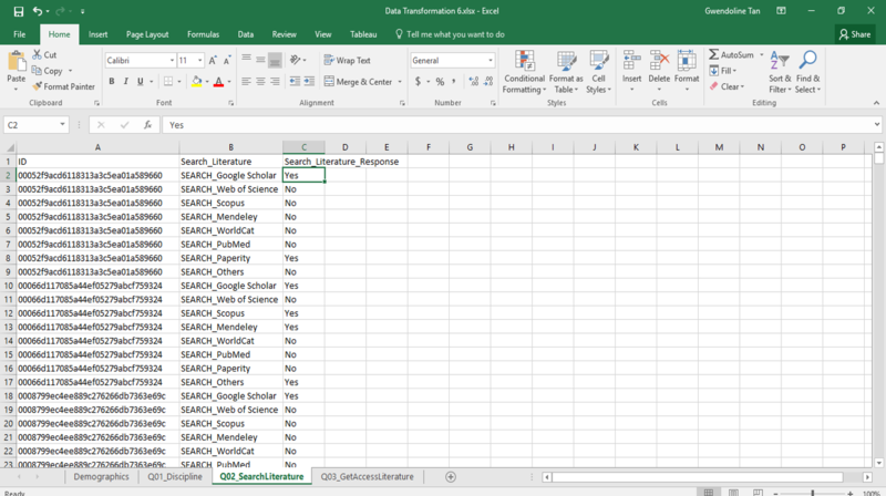
- It is difficult to perform analysis and processing on the data even though they have now been grouped into its own sheet. To make the data readable by Tableau, the data needs to be reshaped. This is done using Tableau’s Excel Add-In. The usage of the tool is as shown in the following steps:
- Install the Tableau Add-In in Excel and make use of the “Reshape Data” Feature. Enter the cell to begin the data reshaping process.
- A progress bar will be shown as the data is been reshaped. The end result of the reshaped data will look like this:
- Install the Tableau Add-In in Excel and make use of the “Reshape Data” Feature. Enter the cell to begin the data reshaping process.
- The dataset is now transformed and it will be imported into the tools (e.g. Tableau, PowerBI) for analysis and processing.


