IS428 2016-17 Term1 Assign1 Chua Feng Ru
Abstract
Housing and residential properties have always been a hot topic in Singapore. Even with the cooling measures in place since 2013, the property market has yet to "cool down", and this means that there are opportunities for insights within the data. This project aims to allow students to go through the phases of 1) Data Compilation, 2) Data Cleaning & Transformation and 3) Visual Analysis of Data. The trends and analysis will be presented in an infographical form, where the static visualizations used in the infographics will be created by Tableau software. Lastly, policy recommendations will be recommended based on the trends or analysis.
Problem and Motivation
The main motivation is to understand the buyers' behavior with regards to Singapore's property market. The motivation is important and crucial, as it directly affects the decision on whether the property cooling measure can be lifted or not. The property cooling measures are being put in place, since year 2013, to prevent inflation of property price, and ultimately to prevent any financial vulnerabilities. With recent announcements from the government stating that the property cooling measure is here to stay, it is definitely relevant to take a closer look at the current situation and analyse the behavior of the buyers.
The main variables involved would be the transaction prices or volumes, and the supply of the housing units.
Ultimately, the findings should address the question on how the current property cooling measures policy can be tweaked to effectively drive down the property prices so that the property cooling measures can be lifted.
Approaches
- Examining and Analyzing of Data
Firstly, as I am personally not familiar with the property market, it will be good approach to understand the property market well before proceeding with any analysis. Acquiring the domain knowledge is well important as it allows you to compile the right data, which will be used for analysis.
Secondly, it would be beneficial to clean and transform the data, and ensure that the data is valid before moving on for more in-depth analysis. In my case, I used SAS Enterprise Guide and Excel to help ensure the data is valid. Personally, I did a brief analysis on the data and realised that stocks for all quarters in 2015 totaled to more than 300,000 units, and immediately I sensed that this is fishy. At last, the data is transform and tabulated to ensure that each quarter shows the absolute value for that quarter only.
Lastly, it will be helpful to analyse the data from a top-down approach. The top-down approach means that you start examining and analysing of data from the more general view of the data, such as the general pattern of transaction volume or sales over time. From there, it will be easier to dig down into more details. This approach helps me to be not overwhelmed by the large amount of dataset, and the large number of dimensions and measures. It provides a systematic way of performing visual analytics.
- Design Rationale
The objective of the overall design of the infographic is to show an abstract and general trend of the data, therefore the precision of visuals is not that important. It aims to deliver the idea that Singapore property buyers are shifting towards more affordable properties in the East and North East regions, despite the fact that properties in the Central regions are more enticing.
Within my infographic, I have used 3 types of visualisations; mainly bar-charts, line-charts and packed bubbles. In addition, a map of regions is also included, which allow readers to refer to when they area interpreting "Condominium Supply By Areas".
Bar Chart: The decision of using bar-chart is to allow the readers to perceive the proportions between each of the categories within the graphs. As bar-charts encodes the values according to the height, a huge difference in the heights of the bar allow the readers to know how big is the difference between the categories. There is no need to color-code the bars, as there is already labels and any color-codes will cause unnecessary distractions. Furthermore, an average line is usually added to allow readers to know how much higher is the value of a certain category.
Line Chart: Line-Chart is used in the event where there is a need to show how a value changes over time. This is typically used in transactional-data, which is to show growth over a certain timeframe. Color-code is normally needed for each line, as this will allow readers to easily differentiate between categories.
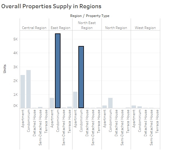
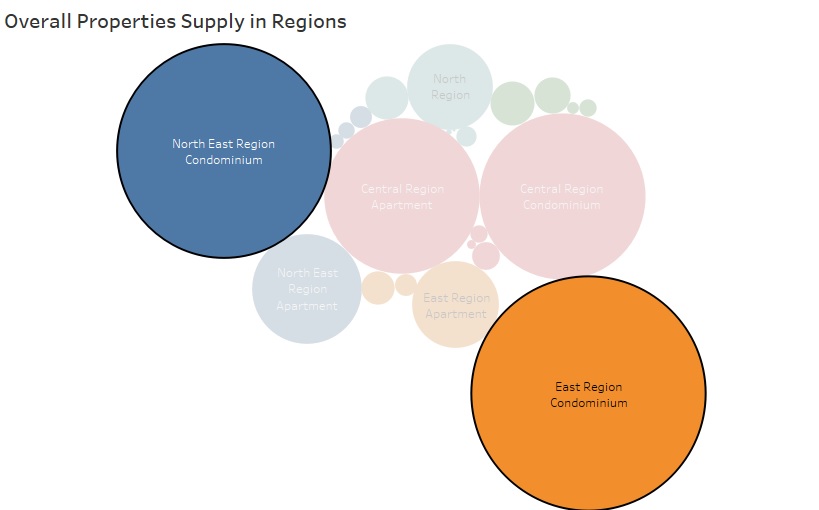
Packed Bubbles: The decision to use packed-bubbles to display the "Overall Properties Supply in Regions" as it is difficult to visualise 2 dimensions in a uncluttered way. My previous attempts of using bar-charts has made the entire graph to be too cluttered. Since my objective is to show the general trends, I thought that it would be appropriate to display it in packed-bubbles as it will show the biggest property contributor by property types and regions. With reference to the pictures below, it can be said that the packed bubbles chart allows readers to make sense of the visualisation at one glance.
In general, highlighting of certain objects in the graph is used only when there is a need to bring readers' attention to. An example is in the graph "Overall Properties Supply in Region", the highlighted bubbles indicate that the bubbles are the on to focus on. Accompanying texts and headers (e.g., Supply, Prices and Demand) are also used with a lighter tone, this is to prevent any distractions when the readers are reading the graphs.
- Data Downplayed By Visual Design
With reference to the graph "Condominium (Completed in 2015) Demands by Regions", it showed a high demand for central, north and north-east regions. The height of the bar seems comparable to the supply chart "Condominium Supply By Area", however it must be reminded that the Y-Axis on both tables works in different scale. In reality, the amount of condominiums are actually oversupplied by a huge amount.
The second part of the infographic has its data obscured. With reference to the Supply chart "Property Growth in 2015", the condominiums and apartments showed a increasing trend. However, if you plot each quarters' absolute number, you will realise that both condominiums and apartments experience a dip from the third quarter onwards.
Tools Utilized
This section describes the different technologies used throughout the project:
1. SAS Enterprise Guide (EG)
The SAS EG software is used to compile the transactional data, which comes in a few parts, to a single Comma-Seperated-Value (CSV) file. In addition, SAS EG also enables me to transform and consolidate the absolute values of the housing units. Lastly, it is also being used to perform preliminary data explorations, such as analysing the values and distributions of the data, to ensure that the data is valid.
2. Tableau 10.0 Software
Tableau is generally being used to create different visuals to allow visual analysis. It enables me to do a more in-depth analysis, as compared to SAS EG. The visuals, which contain certain findings, are then used in the infographics.
3. Pixelmator (Mac OS X)
Pixelmator allows me to handle images from Tableau and create high resolution images, which is required in creating an infographic.
Results
The results from the analytics inforgraphics is described as below:
- Implementing Flexible Cooling Measure
From the discovery of my analytical infographics, it can be seen that Condominiums contributed most in terms of total sales. This also means the strong demands for Condominiums, might drive up the prices of Condominiums or prevent it from dropping. As according to the infographics, the median price of for all properties transacted generally show no signs of any upward or downward trends. Ideally, the price of these condominiums should show a decreasing trend with the cooling measure in place. These findings can potentially mean that the cooling measures is not effective, and a improvised version of the cooling measure can be put in place such that the government will be able to pin point certain areas of the market effectively.
- Oversupply of Condominiums
While there is an oversupply of condominiums, as we can see from the "Condominium (Completed in 2015) Demands by Regions" compared to the "Condominium Supply By Areas", government can actually make use of these data to understand better the buyers' behavior or needs, and allow developers to cater to buyers' needs. In this way, this can potentially help to reduce the oversupplies of condominiums by forecasting the demand.
- Redistribution of Demand
While there is an above average demands for both East & North-East regions as we can observe from the infographics, it would be helpful for government to understand the buyers' demands, and try to redistribute these demands to other regions where buyers' have low demands. The redistribution can allow the residents in a specific region, such as the East or North-East region, to avoid situations of overcrowding.


