IS428 2016-17 Term1 Assign1 Lim Ting Zhi
Abstract
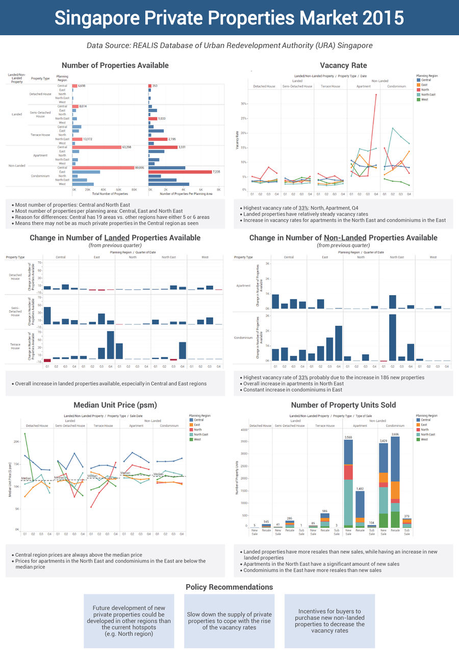
Using the data from the REALIS database of the Urban Redevelopment Authority (URA) Singapore, the project aims to analyse the private properties market in 2015 in terms both supply and prices. Based on the analysis found, policy recommendations will be recommended for 2016 and an analytical infographic will showcase the analytical findings.
Problem and Motivation
Due to the limited land resources that Singapore has, the government has to plan for the utilization of our land very carefully. One of the programmes to help with the long-term development of Singapore is a Government Land Sales (GLS) Programme. The GLS releases State land for development by private developers to develop private residential sites, and commercial and residential sites. Each GLS Programme is planned and announced every six months. Thus, it is important to consider the current supply and demand for these sites to ensure proper planning to be done. The project would only focus on the private residential properties.
The main variables involved would be the property type, planning region, the number of private properties, vacant stocks, unit price (psm), the number of property units sold.
Approaches
Before analysing any data, it is always important to understand the domain that you are working on. Thus, I went to understand a little better on what does URA does, find out what are the available data that the REALIS database has and understand the data terms from the REALIS’s data directory. This had helped me to know what I should focus on for the project. Next, it is to download the relevant datasets from the REALIS database and compile them into one Excel file for analysis. Data cleaning is also done here to ensure the file is readable by Tableau.
Using Tableau to analyse the data, the following are some design decisions I have made:
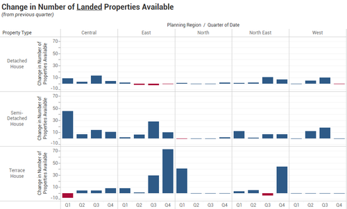
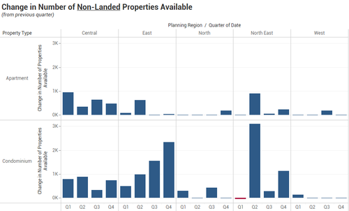
- Change in Number of Landed Properties Available and Change in Number of Non-Landed Properties Available
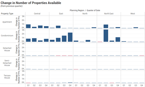
The bar chart is used here than the time-series chart is to be able to more clearly show the difference in each quarter, region and property type. The bar chart is coloured coded in two colours, red and blue, to differentiate the decrease and increase in the number of properties from the previous quarter respectively. The reason why the landed and non-landed properties are split into two graphs is because the y-axis for the two types of properties vary greatly and it would then affect the visual representation of the analysis as shown below.
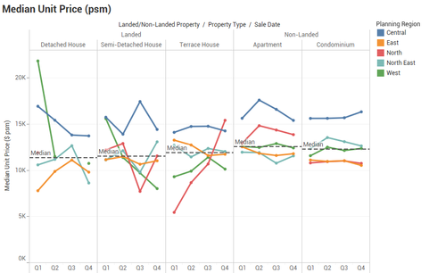
- Median Unit Price (psm)
The time-series chart is used to show the change in value across time. The planning region is coloured coded to differentiate clearly the different categories. A median reference line is being added to each pane to show the overall median unit price for each property type. A reader would be able to have a guideline to compare which quarter and region fall above or below the overall median price.
Tools Utilized
The following tools were used during the project:
- Microsoft Excel – Compile raw data and data cleaning for analysis
- Tableau 10.0 – Create charts and in-depth analysis for infographic
- Microsoft PowerPoint and Abode Illustrator – Create infographic
