IS428 2016-17 T1 MA1 Au Loong Zer Kirby
Contents
Abstract
The Singapore Government introduced several property cooling measures between 2012 and 2013 to prevent an uncontrolled property bubble. The measures have worked to good effect, resulting in a sustained fall in property prices since its implementation. Some developers have called for the cooling measures to be relaxed but is it too early to do so? We attempt to find an answer by analyzing the price and supply of private residential properties in 2015.
Problem & Motivation
On one hand, there are the concerns associated with a housing bubble. On the other, there is also the concern that falling prices may contribute to a recession and stagnate the economy. In Singapore, where most people own their residential properties, falling house prices will mean a drop in their main form of wealth. Foreign investment might also fall if the property market continues to look gloomy. So is it a case of simply continuing with or lifting the cooling measures? Or is there a different approach to this problem?
In the following analysis we try to identify:
- Is there a certain segment of the market which requires special attention and a review of policies?
- Patterns in the supply of residential properties.
With these pieces of information, we would then recommend a few strategies that attempt to achieve a balanced outcome for the property market.
Tools
These tools were used in mini assignment 1:
- Microsoft Excel - For data cleansing and transformations
- Tableau 10.0 - For data exploration and the generation of charts
- Piktochart - For generation of infographics.
Approaches
Domain Knowledge
An initial look at the data left me with many question marks. Regardless, I downloaded a few datasets which I felt would be useful including the transaction data and price indices. Thereafter, the quest for acquiring property market domain knowledge began. I had to clarify what was meant by supply. Whether it refers to only new launches or also resales. What was the difference between new sale, resale, and sub-sale? How was the PPI calculated? Did it consider all types of sales. Some of the questions were hard to find on the internet so I had to look for alternative sources. From the "research" here, I was also able to formulate a potential problem and devise my plan for answering the questions.
Data Cleansing and Transformation
After acquiring the datasets I'm interested in, I began combining different datasets together in excel rather than racking my brains later on how to join the tables in tableau. Some of these resulted in the addition of columns and some required modifications to the column headers as Realis had some tables with nested headers. This process took the longest and was very tedious.
Data Exploration
Having gained some insights from articles I have read, I tried to piece together some of the data from Realis to support the information gained. When something seems amiss, my first approach is to recheck the data and see if I had not cleaned it properly. Next, is to check if I had put the measures and dimensions where they should go. If at this stage, the data and information still does not tally then I have to make a decision to trust the data since we are doing analytics which is to solve problems through a data driven approach. Sometimes, new insights are gained when exploring the data and I re-position my approach to answering the questions.
Results
Property Prices on the Decline
As with all time series charts, I opted for a line chart to show the changes over time. Instead of separating the 3 lines into different charts, I opted to combine them into a single chart as this helps to illustrate the point that the price movements across all categories are similar. I used the default colour template as the colours are quite distant from each other on the colour wheel and that makes them easy to distinguish.
The data for this chart begins in 2012 as research tells me that the government implemented property cooling measures at that time and I felt that 4 data points in 2015 alone is too little to show and conclude on a trend. To help visualise the impact and lead time before the measures take effect, I also added in vertical lines to show when each measure is implemented.
Increase in Property Supply, Fluctuations in Vacancy Rate
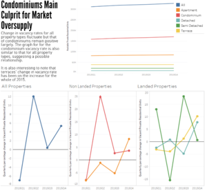
For the first chart, even though there are 6 lines, it is still relatively neat as the lines are all parallel. To show vacancy changes however, 6 lines in a chart was too much going on. I decided to split them into categories of all, landed, and non landed, property types. The colours were kept similar to the chart before so as to facilitate comparison. The fluctuating lines still felt a bit messy for me. So I added marks in the form of shaded circles so it pin points where the data point is at. Lastly, I added a bold constant line at 0% across all 3 charts so that it is easy to tell at a glance whether vacancy change was positive or negative.
Area Distribution of Property Resales, Condominiums Dominant in Resales.
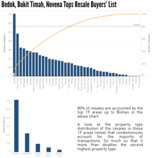
Bar charts were used for categorical data - in this case it is the area. The bars were sorted into descending order so as to see easily which are the areas that have the most resales and which are the areas that have the least.
The cumulative percentage of total is used in the same chart as a dual axis and the data is plotted as a curve. I wanted to know which areas contributed to 80% of total resales volume and a reference line was added to aid visualisation. In our case, we can see that it is between River Valley and Bishan.
I also wanted to find out the what the majority of property types involved in resales was. So once again, bars were used for categorical data. The data is filtered based on the 80% mark in the previous chart.
Larger Area does not mean More Expensive
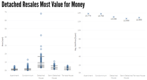
A boxplot was used to show the distribution of property type area size (in square metres) broken down into the property types. From the chart we are able to tell that detached houses have a large deviation in terms of size. The main point however is to show that most of the detached houses have larger areas compared to the rest of the property types and that apartments and condominiums have the least areas.
Another chart was created side by side and the x axis arranged in the same order to facilitate comparison. This chart brings out the point that apartments and condominiums are very expensive per square metre despite them having the least areas among the different properties.


