IS428 2016-17 Term1 Assign1 Timothy Tan Swee Guang
Contents
Infograph
Abstract
Given Singapore's scarce resources and limited land, it is essential that proper urban planning. After a series of trends analysis, it is clear that Singapore has done well so far in this regard. However, we can never be complacent and should strive to better make use of our limited land. The forthcoming analysis was conducted to garner insights into Singapore's property market, find points to improve and propose recommendations for them to further Singapore's development.
Problem & Motivation
Understanding the property market in Singapore is key for URA to derive insights that could help in the planning phase for future developments of estates. In addition, given the limited space in Singapore, knowing what to build, where to build and who to build for will be the key to great planning. Therefore, this assignment aims to derive insights from the supply and prices of the property market in Singapore. For the scope of this assignment, private residential properties including executive condominiums were used for this analysis.
Terminologies
This sections brings you through the terminologies used for this assignment.
- YoY - Year on Year
Refers to the yearly representation of a timeline.
- QoQ - Quarter on Quarter
Refers to the quarterly representation of a timeline.
- NPR & PR
Refers to Non-permanent Resident and Permanent Resident respectively.
- Price Ranges
Affordable - Less than $500k to $1.5million
Mid Range - >$1.5million to $4million
High Range - > $4million to $5million or more
Tools Used
1. Excel 2015. For transforming data not in table format before uploading into Tableau.
2. Tableau. For churning out the visuals used for analysis.
3. REALIS Urban Redevelopment Authority (URA). Used to extract out datasets.
4. Piktochart. Used to build my infograph.
Approaches
The assignment was essentially broken down into answering a series of questions based on the distribution of property supply and prices.
In hopes of deriving greater insights and clarity of the problem, you will notice that the analysis will always start from a macro perspective (YoY perspective) before diving into 2015 (QoQ perspective). With each visual a short description of it will follow.
Analysis
Distribution of Supplied Properties
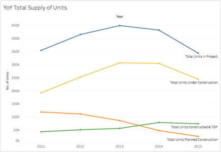
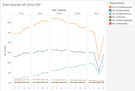
YoY we can see a decline in the total number of projects. However, there seems to be an increasing trend of total housing projects being completed from 2013 onwards. Drilling down further, we can see the exact QoQ distribution of property units supplied over the years. Here, we can see that there has been a increasing supply of condos, apartments and ECs up till 2013 where both condos and apartments started to decline in their supply. ECs seem to have maintained its constant supply even after 2013 while terrance, semi-detach and detached houses has had a constant supply from 2011 up till 2015. In 2015 however, there seems to be a peculiar dip in total units in the 3rd quarter.
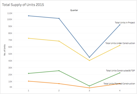
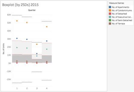
Now the question begets, is there a source for this dip? Taking a closer look at the total supply of units QoQ in 2015 below, we can a constant dip in all components i.e. units under construction, units TOP and units planned. Showing that the dip was not solely cause by a dip in any one component. To further confirm this, the box plot below shows all types of units within 2SDs of their respective quarter means. From the looks of it, the spread in unit types were relatively equivalent throughout the quarters including the 3rd quarter. This indicates the likelihood that this dip was cause by the same underlying event that could have taken effect in those three months. Due to the lack of further data, one can only speculate on what caused this dip.
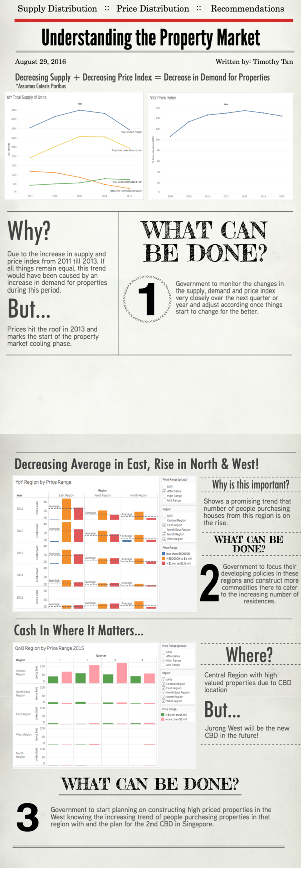
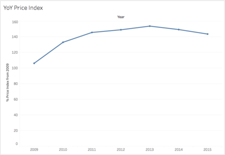
To sum up this section before moving on, the key take away would be the decreasing supply of properties that would most likely carry forward to 2016. Taking into account the YoY decreasing trend of the price index as shown below, the property market does not look too healthy in the coming year. To further analyze this trend, by accounting for both the decrease in supply and price index under the ceteris paribus assumption, one can infer that the demand of properties is on a decline. Since we know that the supply of properties has been increasing from 2011 to 2013 and with the price index increasing in the same period. This would mean that the demand was high during this period. Therefore suggesting the property market in a cool off phase where 2013 was the ceiling. This would explain why the decreasing trend in supply and price index from 2013 onwards. If my speculations are correct, the only logical thing the government can do now is to watch the changes in the supply, demand and price index very carefully over the next quarter and year.
Distribution of Private Property Prices
In this section, the main overarching questions I will be attempting to answer in this segment are:
• What does the distribution of price ranges look like?
○ What does the YoY distribution look like?
○ Is there a pattern of prices with regards to region?
• What type of houses do the different nationalities buy? (In terms of property price range)
○ Who buys what?
• Looking at the nationalities of people in SG, who stays where?
○ Are there specific patterns of distribution in this regard?
Overview of Descriptives
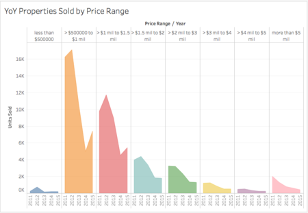
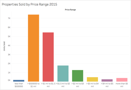
Above is the YoY price distribution from 2011 to 2015. As you can see, majority of the private properties sold lies within 500k and 1.5mil range. Thus, looking at the 2015 figures, it comes to no surprise the same pattern of distribution is observed.
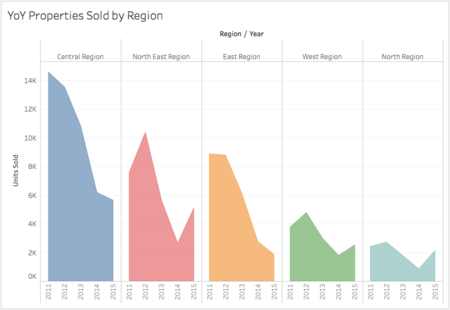
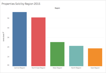
Here, the YoY properties sold by region shows that majority of the units sold seem to cluster about the Central region followed by the North-East and the East. Drilling down to the 2015 figures, we can see that the pattern observed holds for both Central region and the North-East region but not the East region. Seems like 2015 was the year people bought houses in the West and North more than the East. Why is this so?
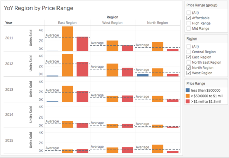
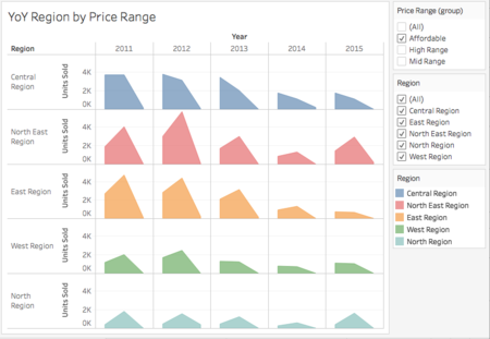
Isolating just the East, West and North regions and looking at properties with affordable prices, we can see a focus shift in affordable housings being bought YoY. The average houses being sold is significantly decreasing as the years go by in the East. (as seen by the reference line) This probably due to less housings available in the East for sale which inevitably causes people to buy houses in the west and north. It would not be surprising to see this pattern in 2016 as well. From this trend, more and more people would be buying houses in the West and North regions. This could be an indication to the government to focus on developing these regions with commodities to cater to the increasing number of people purchasing houses in that regions.
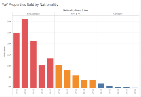
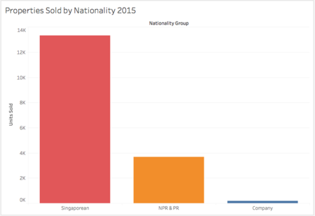
Moving on and looking at the YoY property distribution below, it comes with no surprise that Singaporeans get about 70% of the total houses sold to them with PRs, NPRs and Companies sharing the other 30%. The same pattern is observed in 2015 alone.
Distribution of Prices by Regions
Affordable Price Range
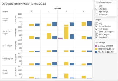
Here you can see, YoY affordable houses bought are relatively evenly distributed among the differing regions albeit the spike in sales in the North East region in 2015. Upon further investigation however, we can see that the spike was due to both the sale of properties costing less than $500K to 1.5mil in the 3rd quarter of 2015 in the North East.
Mid Price Range
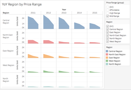
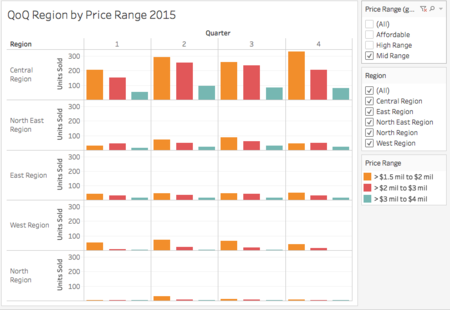
As for the mid range property prices, YoY we can clearly see the properties in these range are clustered about the Central regions. In addition, YoY the North-East and East regions seem to also consist of a good amount of mid range properties while the West and North regions have the least of them so far. Zooming into QoQ 2015 data, we can see the same pattern of distribution as well.
High Price Range
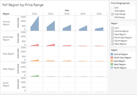
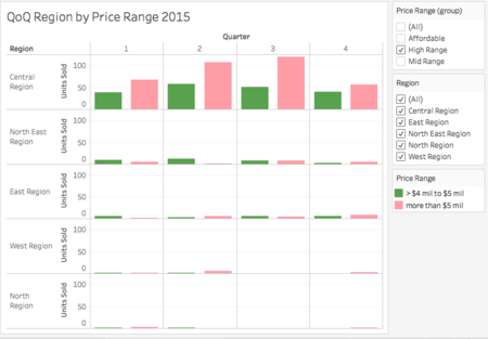
Here we can clearly see that the high priced properties are also clustered about the Central region. Although YoY, sales have been dropping, it is not a cause for alarm as there will definitely be lesser properties for sale as the years go by. Looking into 2015, the same pattern of distribution can be seen here. We can expect 2016 to follow the same pattern of distribution.
Distribution of Nationalities by Property Prices
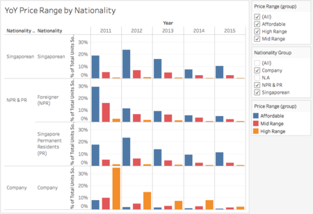
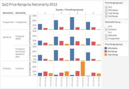
Here we can answer the question "Who buys what?". YoY, you can a high percentage of properties in the affordable range being bought by mostly the Singaporeans, PRs and NPRs. Properties that are in the mid range are mostly purchased by NPRs and companies . Likewise, high priced properties are mostly bought by companies. With respect to the QoQ 2015 data, we can see the same pattern and can conclude that companies are the source of high priced properties sales. Additionally, there is a high percentage of NPRs who are purchasing mid range properties more than Singaporeans and PRs.
Distribution of Nationalities by Region
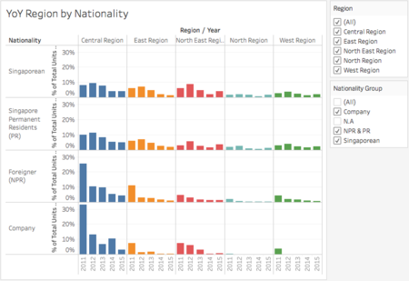
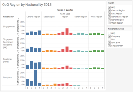
Here we can answer the question "Who Stays where?". YoY, we can see that a high percentage of companies and NPRs reside mainly in the Central region. This is not surprising given that the CBD at the Central region. Besides that, there is no clear pattern of distribution when it comes to Singaporeans and PRs . They seem to be evenly distributed about all regions. The YoY pattern of distribution seems to hold true for QoQ 2015.
Recommendations
1. Due to the decrease in supply and decrease in price index YoY, I suspect the property market is at a cooling phase now and suggest that government monitor the changes in the supply, demand and price index very closely over the next quarter and year. They should adjust according once things start to change for the better.
2. Due to the increasing number of people buying houses in the West and North regions. It can be said that the trend would follow into 2016. Thus, this could indicate that the government focus their developing policies in these regions and perhaps construct more commodities there to cater to the increasing number of people.
3. Knowing the distribution of house prices by regions, perhaps the government can look into constructing high priced properties in other regions besides the Central region. Knowing that the West would be the new business district in the future, the West regions seems to be a good place to start. Additionally, the increasing trend of people purchasing properties in that region is another factor to all the more start building high priced properties there.
