IS428 2016-17 Term1 Assign3 Liu Bowei
Contents
Introduction
For this project, visualization will be done in Tableau.
Data Exploration and Cleaning
Floor Plan Data
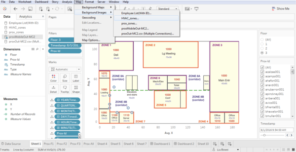
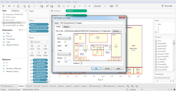
To allow visualization of the data in the form of a choropleth map, we would have to create polygons representing the proximity and HVAC zones. This can be done in excel, with the help of the floor plan maps provided. The floor plan can be loaded onto a graph in the background of a dataset in tableau. This can be accomplished by clicking map->background images and then selecting the dataset you want to link the map to.
The map can be loaded by selecting an image, and specifying the ranges for the X and Y axis.
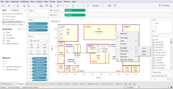
To create custom polygons, we can first identify the coordinate of the polygons using the annotate options in tableau.
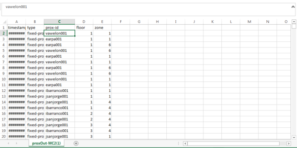
These coordinate can be input into a csv file specifying attributes required for polygons like X, Y coordinates and Point Order.
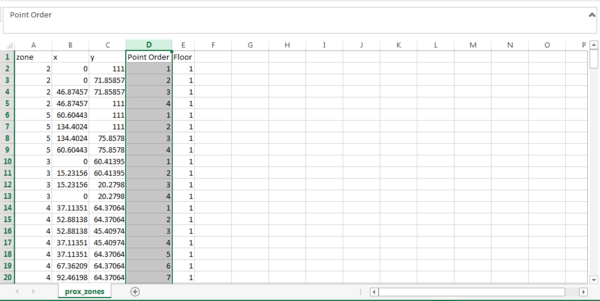
The completed csv file can be loaded into Tableau to form the polygons delineating the zones.
Proximity Zone Data
In the proximity sensor data (prox-Out-MC2) given, there is a column for Prox-Id, representing the id of the prox card of an employee.
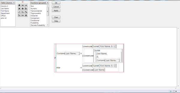
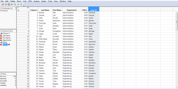
Expecting there to be some relation to the employee list (Employee List) dataset provided, I took a look at the employee list, an realized that the prox id is made up of the first letter of the employee’s first name, concatenated with the employee’s full last name in lowercase, followed by a number. For example, Avelon Varro will have the prox id vawelon001. Using this method, I created prox-id for all employees in the employee list. This is done in JMP
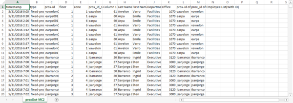
For the proximity sensor data, I created a column for the prox id, minus the numbers at the end. I then joined the employee list with the proximity sensor data, based on the prox id.
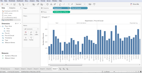
Visualizing this in tableau highlighted some non-matching records.
This is due to some errors in the prox id creation by the company. For example, rparade is the prox id for an employee named Raye Paredes. The errors found are rectified manually.
Building Sensor Data
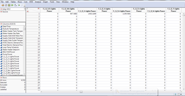
As the building data (bldg.-MC2) is in a different format compared to the proximity sensor data, some transformation is required in order to make use of it.
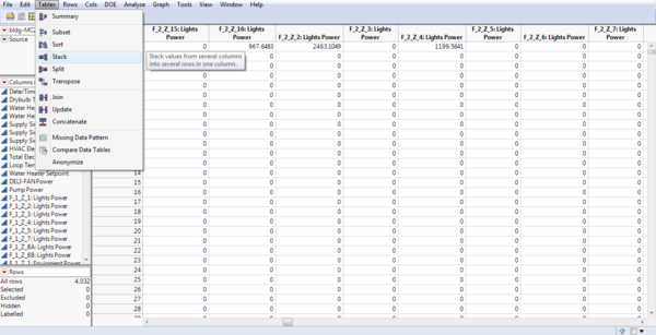
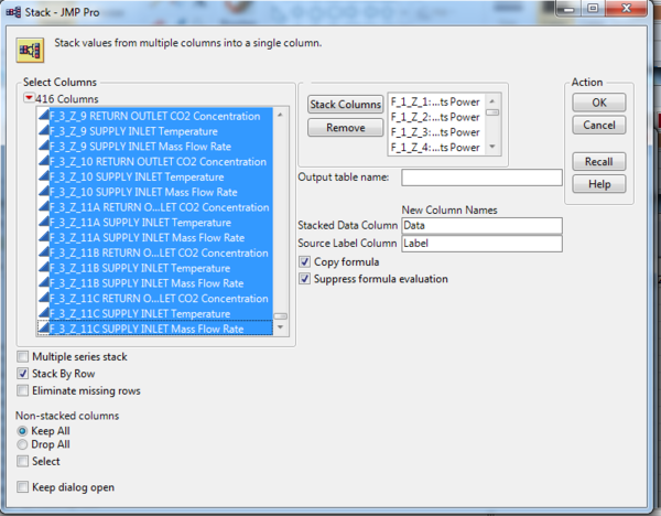
Currently, each column represent a sensor at a location. The goal is to transpose them into rows, such that each row show a reading for a sensor at a location. This can be done using the Table->Stack function in JMP.
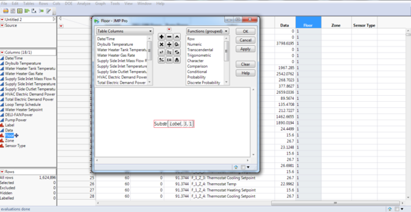
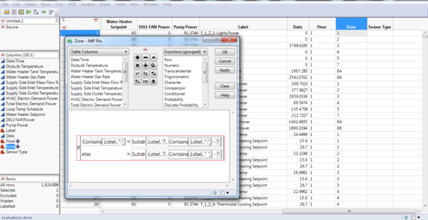
I then had to create columns to record the Floor, Zone and Sensor type. This is accomplished using the character functions in JMP.
Question 1: What are the typical patterns in the prox card data? What does a typical day look like for GAStech employees?
To answer this question, I will be looking at prox data during work days. As such, I will be filtering out the days 4th, 5th, 11th and 12th of July as they are weekends. As a prox card is detected and recorded when it passes a new zone, I feel that the number of records will be a sufficient representation of human traffic in the office.
Cycle Plot
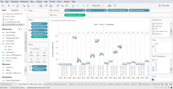
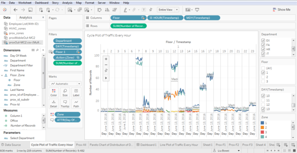
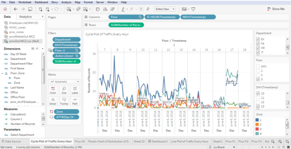
Due to the large amount of data, I will be aggregating the proximity sensor records by the hour. As the goal is to find out typical patterns in the prox card data and to find out what a typical day looks like for GAStech employees, I have decided to visualize the pattern using cycle plot as it can help me visualize the cyclical patterns in a day. For the cycle plot, proximity sensor data for 1 floor will be shown at a time. The data will then be further divided by zones, and finally by hours. Within the hour division, proximity sensor readings across days will be compared.
Here we can see that the amount of employee traffic in floor 1 of zone 1 spikes at around 7 AM, 12PM and 5PM every day. The floor and zone can be selected using filters. This view allows us to visualize traffic across a day.
Choropleth Map
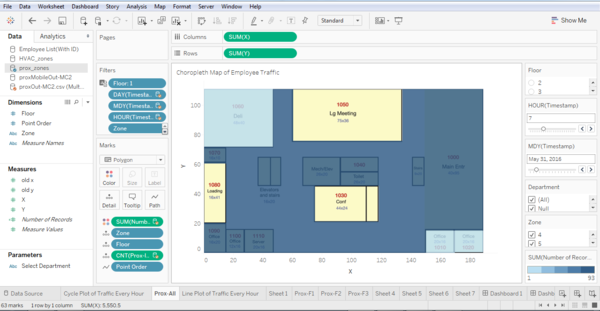
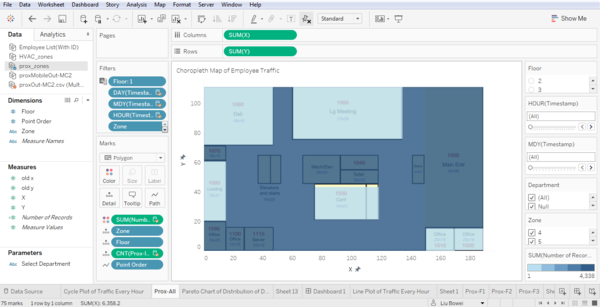
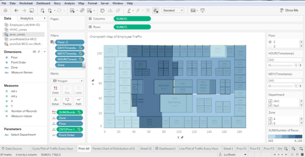
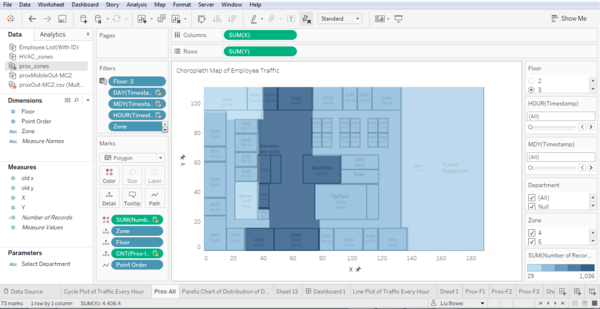
Only seeing the floor and zone numbers in the cycle plot is insufficient information. In addition to the floor and zone number, we need to know the facilities these zones corresponds to in order to have a good idea of a typical day in GAStech. To achieve this, I created a choropleth map using the building’s basic floor plan as the background, with each zone of the building being colored according to the number of records corresponding to it.
This choropleth map shows the traffic of floor 1 on May 31st, 7 AM. The date, time in hours and floor can be selected using filters. This visualization allows us to visualize the traffic in a floor.
Pareto Chart
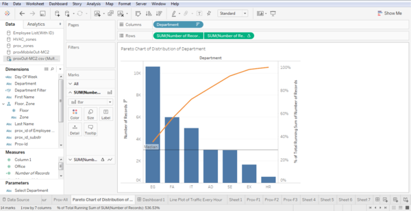
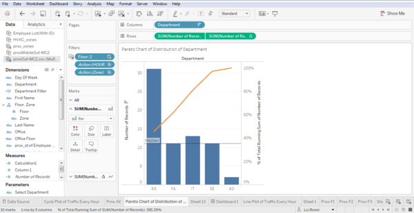
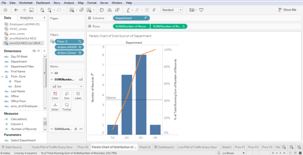
Another piece of information that could be important is the Department the employees are working in. As such, I have created a pareto chart with the department as columns, and the number of records as rows.
Dashboard 1
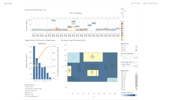
As the information from the Cycle Plot, Choropleth Map and Pareto Chart is insufficient by themselves, I have created a dashboard to combine the three visualizations together. The choropleth map can be used to filter the Cycle Plot by selecting a zone on the map. The Cycle Plot can be used to filter the Pareto Chart by Floor, Zone, Day and Time by selecting a point on the Cycle Plot. The Cycle Plot also highlights the corresponding zone by hovering over a point on the Cycle Plot.
Answering the Question
Floor 1
From the Cycle Plot of floor 1, we can see that Zones 1(Blue) and 4(Grey) experience a spike in traffic around 7AM, 12PM, and 5PM, while Zone 2(Orange) experiences a spike in traffic around 11AM to 12PM.
From the choropleth map, we can see that Zone 1 covers the main entrance and some offices, Zone 2 covers the Deli, and Zone 4 covers the elevators and stairs.
Therefore, the spikes in traffic in floor 1 can be explained by employees coming to work at 7AM, thus passing the main entrance (Zone 1). They then make use of the elevators and stairs (Zone 4) to get to the various floors. At 12PM, employees come down to floor 1 (Zone 1) using the elevators and stairs (Zone 4), and move to the Deli(Zone 2) for their lunch. At 5 PM when work ends, the employees one again make their way down using the elevators and stairs (Zone 4) and proceed to the main entrance (Zone 1) to make their way home.
Floor 2
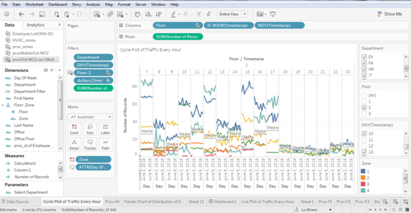
We can see from the cycle plot that Zone 1 has high traffic most of the time, with the exception of 9 AM, where the traffic in Zone 7 is higher. Another interesting thing to note is that the traffic in Zone 6 is usually low, except for a spike in traffic at 10 AM. Zone 4, containing the elevators and stairs, have the same reason as Zone 4 in floor 1 for the traffic pattern observed.
From the choropleth map, we can see that Zone 1 is the zone connecting the rest of the floor to the elevator and stairs, and divides the floor into 2 sections. This explains the high traffic and employees will pass this zone when moving down floors, or going from one side of the floor to the other. The traffic at Zone 7 may be high due to a similar reason, as it covers one of the stairs, therefore employees using the stairs will have to pass this area. Furthermore, Zone 7 covers the toilet as well, which may be another factor for its high traffic. The traffic at Zone 6 spikes at 10 AM and 2PM perhaps because it covers a meeting room, and a meeting is conducted at 10AM and 2PM every day. The pareto chart below shows the distribution of traffic by department in Zone 1, at 7AM.
We can see that the second floor mainly contains the offices of employees in the Engineering, Facilities, Security and Information Technology departments.
Floor 3
In floor 3, the zones with high traffic are zones 1 and 4.
Zone 1, being a connector to the elevator and stairs, as well as dividing the floor into 2, would experience high traffic due to people accessing the elevators and stairs, as well as moving from one side of the floor to another. As a result, this zone as well as Zone 4 experience higher traffic between 7 and 8 AM, 12 to 1 PM, as well at 5PM.
Looking at the distribution of traffic at Floor 3 Zone 1 at 7 AM, we can see that those alighting are mainly from the Administration and Executive departments, indicating that most of the offices of these two departments are on the 3rd floor.
Patterns and Anomalies
Visualization 1: Building Air Circulation
Amongst the data provided, I noticed 2 sensor readings that could be compared to each other to give an idea of the state of air circulation in the building. These readings are:
1. F_X_VAV_SYS SUPPLY FAN OUTLET Mass Flow Rate, which tells us the total flow rate of air delivered by the HVAC system to all the zones it serves
2. F_X_VAV_SYS AIR LOOP INLET Mass Flow Rate, which tells us about the total flow rate of air returning to the HVAC system from all zones it serves
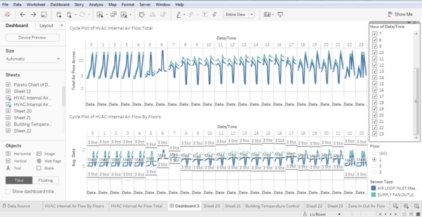
Plotted together, these two readings tells us about the circulation of air in the building. Using a Cycle Plot, I am able to compare the rate of flow of air out of and in to the HVAC System in every hour across different days. A filter allows the user to select a floor to visualize. The user can also choose to visualize the circulation for all floors. The user can also select the period of time to visualize through a multi-valued list. To show the total air flow across all three floors, I did a separate calculation to sum the average air flow of each floor. I combined this visualization with the visualization of air flow for each floor onto a dashboard. Below is the full view of the dashboard.
Pattern 1: An interesting pattern we can see from the median is that from late at night to the early mornings, from 10 PM to 6 AM, there are generally lower values for air flowing into and out of the HVAC system as compared to from 7AM to 9PM. This is intuitive as since it is after working hours, there is less need for air in the building to be well circulated. During working hours, we can see that the in-flow and out-flow of air into the HVAC system is increased. Perhaps to provide a comfortable working environment. The higher circulation is maintained up till 9PM, which is probably when everyone has gone home.
Anomaly 1: The general pattern applies for most of the days except for 7th, 8th and 13th of June, where there is a large spike in both in-flow and out-flow of air from 10 PM to 6 AM, and a large drop in both in-flow and out-flow of air from 7AM to 9PM. This is strange as this would mean the circulation of air in the building will be bad while employees are working in the building. The air in this case would be stagnant and may cause discomfort and health problems to employees. The unnatural ventilation patterns of the building on the days 7th, 8th and 13th June could signify scheduling errors in the HVAC system for these days.
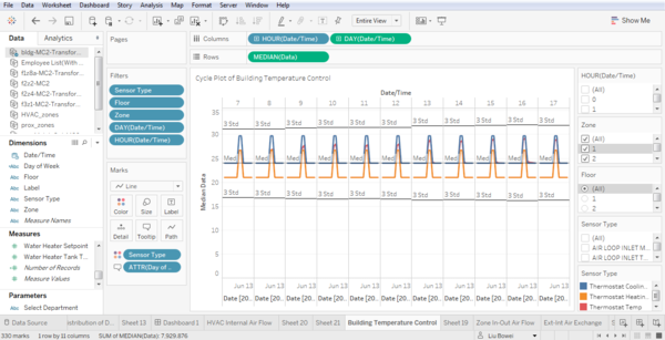
Visualization 2: Building temperature control
I combined three sensor readings to give an idea of the building’s temperature control status. The three readings are:
1. F_X_Z_X Thermostat heating setpoint, which signifies that temperature of the zone being below this point would result in the heater switching on
2. F_X_Z_X Thermostat cooling setpoint, which signifies that temperature of the zone rising above this point would result in the cooler switching on
3. F_X_Z_X Thermostat temp, which shows the actual temperature in the zone
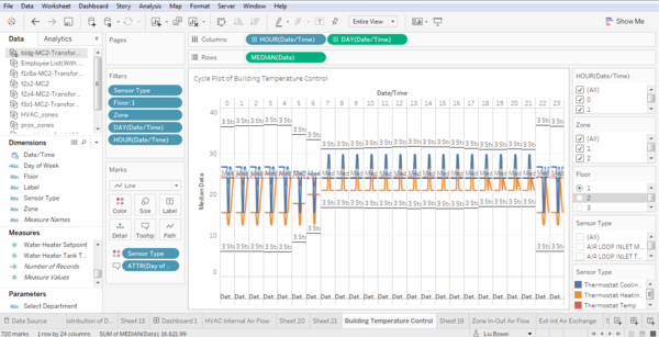
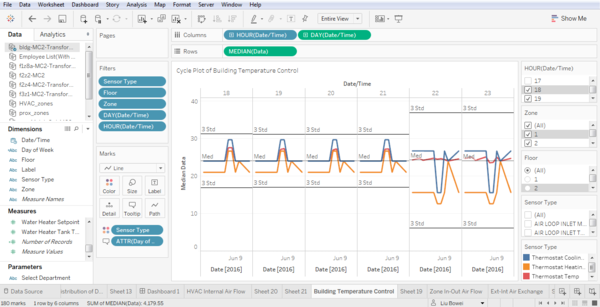
Plotted together, these readings tells us the temperature control settings of the building and their effectiveness. Using a Cycle Plot, I am able to compare the temperature changes in the buildings in every hour across different days. A filter allows the user to select a floor and zone to visualize. The user can also choose to visualize the circulation for all floors and zones. The user can also select the period of time to visualize through a multi-valued list.
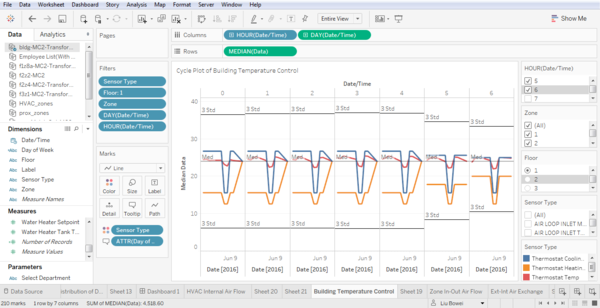
Pattern 1: We can see that from 12AM to 6AM, there is a larger difference between the cooling and heating set points as compared to during working hours. This is probably implemented to save energy as there is a larger allowable temperature range before the heating or cooling system has to kick in.
Anomaly 1: We can see that for most of the days, the actual temperature falls between the cooling and heating setpoint. The exception are the days 7th and 8th June, where the difference between the cooling and heating setpoints are smaller, and the settings of both setpoints are lower. Also, the actual temperature of the room falls above the cooling setpoint, perhaps because that is the limit of the cooler.
Anomaly 2: Another interesting point is that for June 13th, the heating and cooling setpoint are the same, at 24 degrees. This means that the temperature of the room in controlled to precisely that temperature. This is strange as there should be no one working at that time, making such precise control meaningless and power intensive due to the constant fluctuation between heating and cooling. This same pattern can be seen for 10th June, between 10 and 11 PM.
Visualization 3: Carbon dioxide concentration
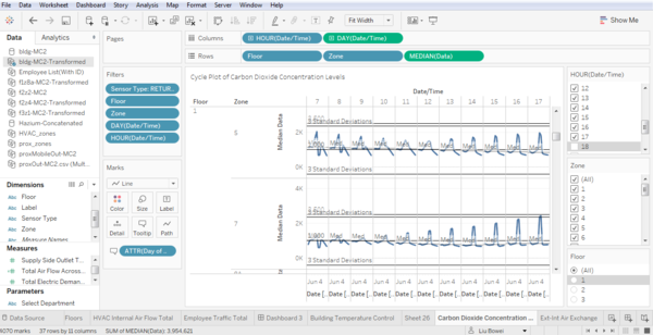
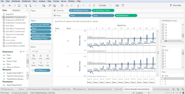
For this visualization, I have decided to visualize the carbon dioxide concentration in the building during office hours. The sensor reading I will be using will be the F_#_Z_# RETURN OUTLET CO2 Concentration, which measures the C02 concentration at the zone’s return air grill. I will be visualizing this using a Cycle Plot, comparing the C02 concentration across days for every hour. The cycle plot is further divided into floors and zones. The time period, floor and zone can be selected using filters. The visualization is shown below
Pattern 1: There is a general decreasing trend of carbon dioxide concentration in the zones in floor 1 as the work day progresses. This is probably due to traffic on floor one being highest at the start of the day, when employees are coming into the office for work.
Pattern 2: An interesting pattern we can see is that there is a general trend of increasing carbon dioxide concentration as the day progresses in the zones in floors 2 and 3. As the number of employees should not be increasing, this means that the HVAC system is unable to completely expel the carbon dioxide produced and replace it with fresh air. This is of concern as we can see that for many zones, the concentration of C02 is above the lower limit of 1000ppm, which causes drowsiness, for most of the work day. This means that employees spend most of the day working under drowsy conditions, influencing efficiency and possibly causing health problems.
Anomaly 1: The carbon dioxide concentration in the zones 10 and 11 of floor 2 on 7th and 8th June is very high, with the concentration levels in zone 10 from 2 to 5 PM and concentration levels in zone 11 from 12 to 5 PM being more than 3 standard deviations higher than the mean. These zones also have C02 concentrations above 2500 ppm, which may lead to adverse health effects.
Visualization 4: Exchange of Air
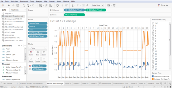
I combined 2 sensor readings to visualize the exchange of air in the building. The sensor readings used are: 1. F_#_Z_#: Mechanical Ventilation Mass Flow Rate, which shows the ventilation rate of the zone exhaust fan, the output of air to the building’s surroundings 2. F_#_VAV_SYS Outdoor Air Mass Flow Rate, which shows the flow rate of outside air entering the HVAC system, the input of air from the building’s surroundings The visualization is shown below
Pattern 1: The visualization shows that the input and output of air from the building for each day fluctuates before work hours, from 10PM to 6AM. The input of air into the building stabilizes for each day during work hours, from 7AM to 5PM, as well as from 6PM to 9PM. Anomaly 1: However, it can be seen that the input of air to the building during work hours is much lower for 7th and 8th June as compared to other days. Pattern 3: The input of air into the building increases during work hours. This is perhaps to ensure that employees will receive a sufficient supply of fresh air. Anomaly 2: The input and output of air from 10AM to 4PM on the 31st of May and 1st of June is zero. This means that during that period of time, the HVAC system stopped drawing in external air, and stopped ventilating exhaust. Instead, the HVAC system is cycling the internal air of the building.
Visualization 5: Hazium Sensors
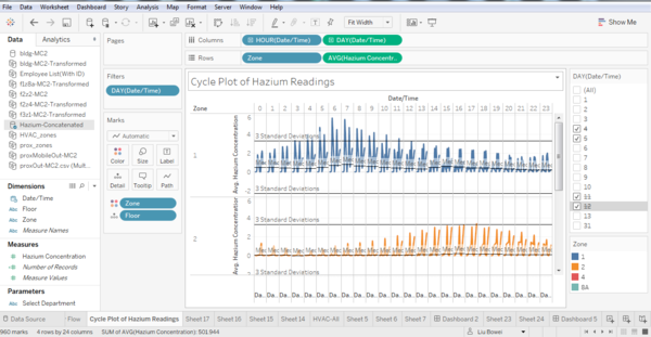
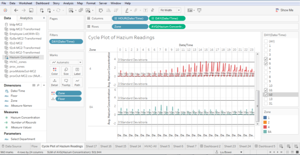
I used a Cycle Plot to visualize the hazium sensor readings data. The cycle plot is shown below.
We can see from the cycle plot that that hazium concentration in each zone peaks at different times. For Floor 3 Zone 1, the hazium concentration reaches a minimum at 9PM, after which is starts increasing every hour till it reaches a peak at 6AM, after which it begins decreasing again, and the cycle repeats. Furthermore, the hazium concentration varies between days, with 3rd June and 9th June having the highest concentration. For floor 2 Zone 2, the pattern is similar, but with the peak at 5PM and the trough at 3 AM. The days with the highest concentration of hazium are 7th June and 13th June.
The hazium concentration on Floor 2 Zone 4 has a similar pattern as well. Floor 2 Zone 4 has its peak at 3PM, trough at 3AM, and the days with highest concentration are 7th June and 13th June. However, the hazium concentration on Floor 1 Zone 8A has multiple cycles of peak an troughs, and there is only one day at which the hazium concentration is highest, the 9th of June.
Observed relationship between proximity card and building data
Relationship 1: Employee traffic in an area effects the C02 concentration in the area
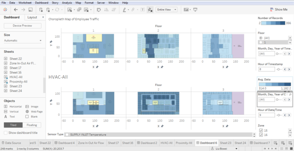
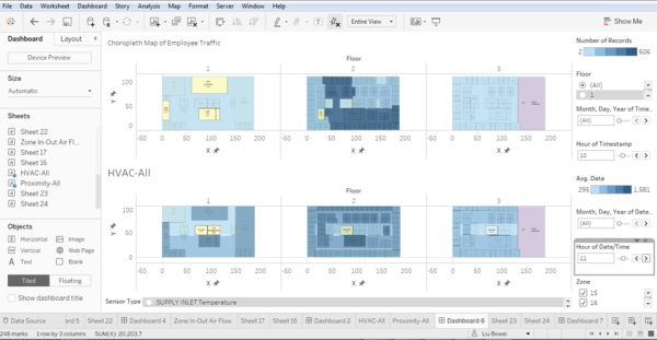
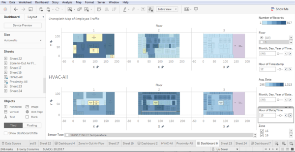
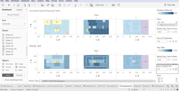
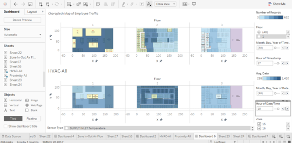
As stated earlier in the project, a typical day of GAStech employees consists of the following stages: 1. Arrival at the building at 7AM, and proceed to respective offices 2. Proceed to 2nd floor meeting room at 10AM 3. Move to deli or outside of building for lunch at 12 PM 4. Proceed to 2nd floor meeting room at 2 PM 5. Leave office at 5PM A typical day in GAStech consists mainly of these activities. Taking into consideration the time required for C02 to build up in the room, I compared the choropleth map with the proximity data to the choropleth map with the C02 concentration readings one hour after. The results are as shown.
At 8 AM, Employees are arriving at the building, and heading to their offices on the second floor. The HVAC Choropleth Map shows higher C02 readings near at the main entrance and offices at Floor 1. Also, the HVAC Map shows increased C02 readings in the offices at Floor 2. These areas overlap with the areas in the Proximity Readings Choropleth.
At 10 AM, employees begin moving to the meeting room. We can see increased C02 readings in the meeting room on Floor 2.
At 12 PM, employees start their lunch break. The HVAC Choropleth Map shows higher C02 concentration at the Deli and Main Entrance.
At 2 PM, another meeting is held. The HVAC map shows high C02 concentration at the meeting room again.
At 5 PM, employees start heading home from work. The map shows higher C02 concentration at the main entrance.
Relationship 2: Employee Traffic in a zone affects power used for lights in the zone
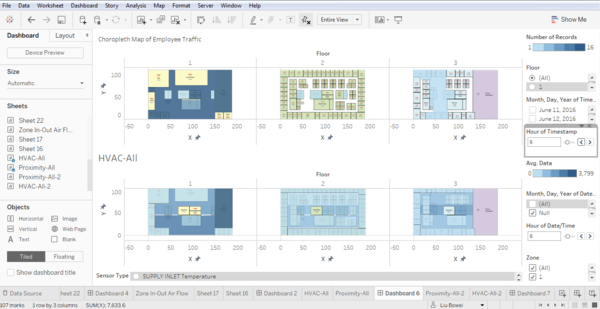
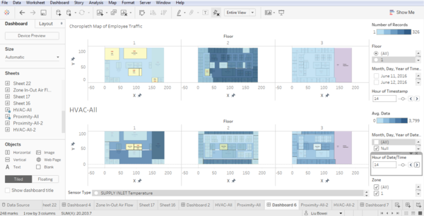
Using the same method as above, I intend to run through the main activities in a working day, and compare the changes in both the HVAC and Proximity Maps. This set of maps shows the building at 6 AM, before most of the employees have arrived at the GAStech building.
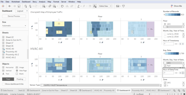
This set of maps shows the office building at 7 AM, where most of the employees are arriving at the building and heading to their offices.
We can see increase light usage in the Level 1 and Level 2 offices in the HVAC Map.
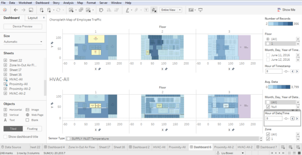
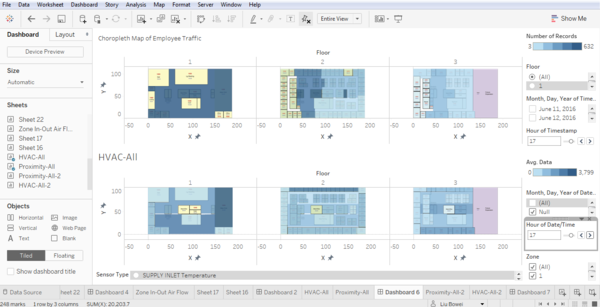
By 8AM, most employees have arrived at their offices.
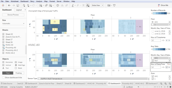
We can see a greater increase in power usage in the offices at Floors 2 and 3. At 12 PM, employees begin heading out for lunch.
We can see a decrease in power usage in many of the Floor 2 offices, and an increased power usage in the Deli. At 2PM, employees begin heading to the Meeting Room.
This is characterized by an increase in power usage in the meeting room as shown in the HVAC Map. At 5 PM, employees begin heading home.
We can see a drop in power usage in many of the offices on Floors 2 and 3.
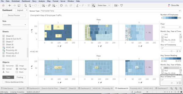
Relationship 3: Employee Traffic affects Thermostat Temperature
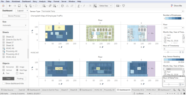
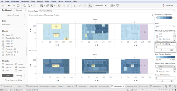
This set of maps shows the building at 6 AM, before most of the employees have arrived at the GAStech building.
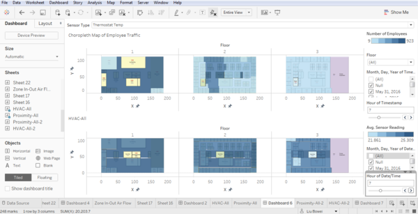
At 7 AM, GAStech employees arrive at the building and heads towards their offices
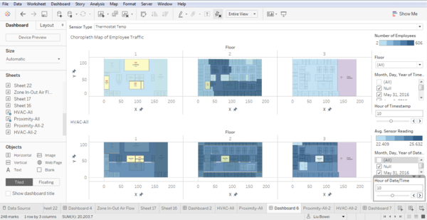
From the map, we can see that the thermostat temperature in offices in Floors 1,2 and 3 increased with the increase in employee traffic. At 10 AM, employees move to the meeting room.
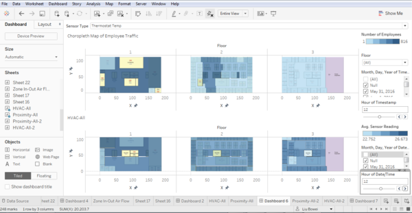
We can see a rise in thermostat temperature as compared to one hour before. At 12 PM, employees head out for lunch. This is represented as the increase in thermostat temperature in the Deli.
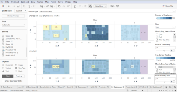
At 2 PM, employees head to the meeting room again.
We can see that the thermostat temperature in the meeting room is now higher than the surrounding areas. At 5 PM, GAStech employees begin to head home.
This is characterized by the drop in thermostat temperature in the various offices.
Visualization
The link to the visualization can be found here https://public.tableau.com/shared/G8CH4F9WG?:display_count=yes
