Talk:Lesson07
Have we been looking at the wrong map our whole lives?
During class today, it came to my surprise that the world map used by classrooms, news platforms, governments, almost everyone (including Google) are actually 'wrong'.
'Wrong' in the sense that we have always taken the sizes of continents and countries on the flat map literally. Like Thomas mentioned in class, Africa when compared to North America is supposed to be much bigger (As shown in first image below).
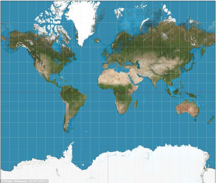
But what do we usually see on our flat maps?
From what we can see above, the usual flatmap we use actually depicts Africa much smaller than North America. Sadly this is inaccurate visually so why do we still use it?
The problem is, there is not a perfectly accurate map we can display on flat surfaces. The earth is a sphere, but maps are flat. This means that when maps are created, we have to somehow flatten the sphere. This flattening must create some distortion. This distortion could affect the relative angles, shapes of countries, or sizes, or all of these. While we can't avoid distortion, we can flatten the sphere in different ways, based on the "projection" we choose, and depending on what we're going to use the map for.
The Mercator Projection
One of the most commonly used projections is the Mercator projection. The Mercator was incredibly useful for ocean navigation because it keeps angles accurate, making it easier for sailors to navigate the ocean. The downside is that it distorts how large things are. Which results in how Africa looks smaller than North America when it isn't. After all, what was most important back then was your directions and not the size of the continent.
That said, many maps found online, like Google Maps use a variation of Mercator known as "Web Mercator".
Since the common map is inaccurate in land mass
Wouldn't the size of the continent change some of the perspectives we want to get across with the visualization? If so, what kind of projection of the Earth do we use if we want to do a geographical data visualization on a continent level? What do you guys think?
- Tee Yu Xuan

