IS428 2016-17 Term1 Assign3 Yang Chengzhen
Contents
- 1 Description
- 2 Data Preparation
- 3 Data Visualization and Findings
- 4 Visualization Software
- 5 Final Outcome
- 6 Reflection of the effectiveness of tools
- 7 Comment
Description
After the successful resolution of the 2014 kidnapping at GAStech’s Abila, Kronos office, GAStech officials determined that Abila offices needed a significant upgrade. At the end of 2015, the growing company moved into a new, state-of-the-art three-story building near their previous location. Even though the employee morale rose somewhat with the excitement of the new building, there are still a few disgruntled employees in the company.
This project aims to identify the patterns and problems arose after moving to the new office building for GASTech. This is achieved by using GASTech operational data sets, including:
- Proximity sensor data for each of the prox zone regions
- Proximity sensor data from Rosie the mobile robot
- HVAC sensor readings and status information from each of the building’s HVAC zones
- Hazium readings from four sensors
Data Preparation
Create HH:MM:SS Field from timestamp
To analyse the moving pattern over each day, we need to extract time from the date since tableau does not support auto extract well.

Convert Server room to the corresponding Zone
For ProxoutMC2.csv, there are 29 records with zone name "Server Room" instead of a numeric number of majority. After checking the floor map, I found server room belongs to Floor3 Zone4, so I converted these values as following:

Covert X Y in proxMobileOut-MC2.csv to corresponding Zone
For Mobile Prox data, the position of the point is indicated by X,Y , while for fixed prox data, the position is indicated by zone. In order to analyse the movement together, we need to align the 2 data sets.
I used tableau to create calculated field to convert X,Y to the corresponding zones:

Data Transform and Union of Hazium Data
There are 4 data sets of Hazium, each represent one sensor in a floor zone. To analyse the pattern, we need to merge those data as shown below:

Data Transform of Building data
I used JMP to convert building measurements to one attribute instead of different columns:

Data Visualization and Findings
Patterns of Employees by Prox Card Data
Floor-Zone Analysis
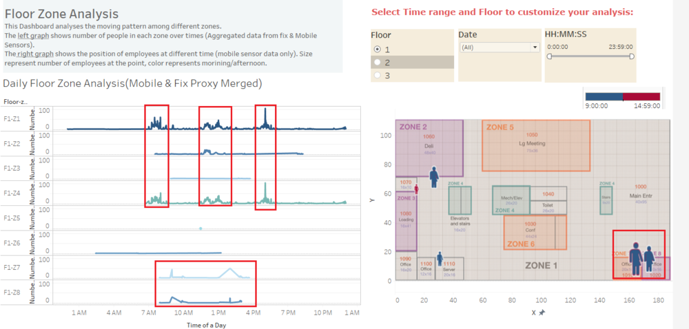
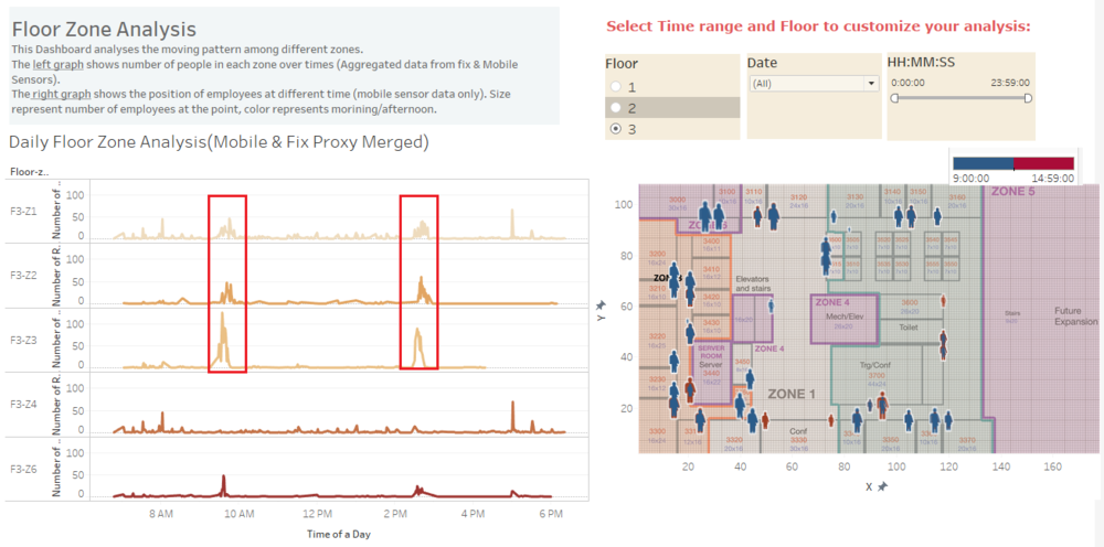
This Dashboard analyses the moving pattern of employees among different floor zones.
The left graph shows number of people in each zone over times (Aggregated data from fix & Mobile Sensors).
The right graph shows the position of employees at different time (mobile sensor data only). Size represent number of employees at the point, color represents morning/afternoon.


Moving Pattern -Per Employee Analysis
This Dashboard shows the Movement across zones over each day per employee prox card. We can zoom in/out our analysis by using the Floor / Time Filter on the right.

Findings
- For floor 1, Most people appears at F1-Z7, F1-Z2 and F1-Z8 in the morning and F1-Z7 in the afternoon. The zones mentioned above are offices and meeting rooms.
- F1-Z1 and F1-Z4 generally have the same pattern: there are 3 peak period per day: around 7-8 AM, 11-2PM and 5PM. These time period can be categorized as: come to work, lunch break and leave office.
- For floor2, people are evenly spread among all the offices in the afternoon. In the morning, there are noticable large group of people stay at F2-Z6(Meeting & Training) room. This may indicate employees normally gather in the morning for meeting and back to their office in the afternoon.
- F2-Z5 and F2-Z7 generally have the same pattern: there are 2 peak period per day: around 9 AM and 2PM.
- For floor3, people are evenly spread among all the offices.
- F3-Z1, F3-Z2 and F3-Z3 generally have the same pattern: there are 2 peak period per day: around 9 AM and 2-3PM.
- There are 2 different types of employees by working hour: 8AM-5PM; 4PM-12AM (detailes can be found in dashboard)
Notable pattern in Building data
Building data analysis dashboard
This dashboard takes the building data, projects the value of each measurement overtime. The right graph shows the Hazium value by Floor-zone.

Notable anomalies or unusual events
- Problem1:Some of the employees seem to change prox card frequently (e.g. G.Florez changed 5 security cards over 5 days). The lost cards may cause potential problems (e.g. P.young was tracked of using 2 cards on the same day appearing at different zones, which may be caused by someone else using one of the card)
Observed relationships between the proximity card data and building data elements
Visualization Software
- Microsoft Excel for data cleaning
- JMP for data Transformation
- Tableau for data visualization
Final Outcome
Reflection of the effectiveness of tools
- Time format for Tableau: I found it hard to do the formatting / extracting of time from date in tableau. If your initial time format in excel is "9:00:00 AM", Tableau cannot convert it to a time measure automatically. Initially i followed this tutorial here only to get the time part from the timestamp:http://kb.tableau.com/articles/issue/extract-time-from-date-and-time-field But after evaluating the effectiveness, I feel adding another Time column in excel manually may be faster :(.
- Data extraction: Unlike JMP, it is more difficult for you to export the data you edited via the software. For tableau, if you want to export the data source you have modified, you can only extract as a .tde file or do a view data-> copy paste manually.(https://community.tableau.com/thread/117150)
