Difference between revisions of "IS428 2016-17 Term1 Assign1 Margot Marie T Stelleman"
| Line 14: | Line 14: | ||
==If I was the president...== | ==If I was the president...== | ||
==Inforgraphics== | ==Inforgraphics== | ||
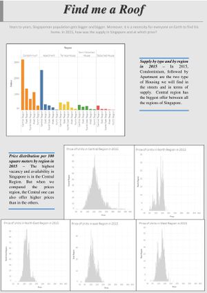
| − | [[File:Findmearoof-page-001.jpg| | + | [[File:Findmearoof-page-001.jpg|thumbnail]] |
==Suggestions== | ==Suggestions== | ||
Revision as of 17:59, 28 August 2016
Contents
Abstract
Housing, business for ones, investment for others, but necessity for all. This project gives an analysis and understanding of the private properties supply and their prices during the last year, 2015. A major step to do it is to first determine and understand the problem and next collecting and cleaning, transforming the data required. Then, the trends will be enlightened and easier understood thanks to graphical images. This graphs are designed thanks to Tableau Software. Based on this and information discovered, policy recommendations are imagined and shared for 2016.
Problem and Motivation
According to Singapore statistics, in 1970, 2 013 600 persons were forming the resident population of Singapore. Thirty years later, the next billion was already reached, with 3 273 400 people. Last year in 2015, the forth billion was almost obtained with 3 902 700 billion for Resident Population. It means that the raise has been almost twice faster between 2000-2015 than between 1970-2000. This raise will probably continue and might be more aggressive than ever. All this people must have a roof, that is a necessity for all of us. That is why it is interesting to have a look at the housing situation in Singapore. Private properties supply is here studied. In this project it will be considered as the residential properties only, not commercial and industrial properties because the problem is centralized on the housing problem for the population. And the term supply will refer only to the residential properties available and habitable on the market. But a quick look to the planned and under construction projects is interesting too. Prices of the residential properties will be also considered given that everyone has not the same budget and revenues. All this will be considered for the 2015 year, last whole year with available data. Because population is growing, is the supply also following it? How is the share of the supply by type of housing and also geographically? What type and region were the most expensive during 2015? And have the prices fluctuated a lot? It is important to know the answers to this question to make good decisions about housing, so for personal decisions as well as for policy development.
Data choices and cleaning
How to represent the supply share for private properties as clearly understandable as possible? When I read share, I am directly thinking to a pie I could share with family or friends. So Pie chart could be an option but it is actually not the best solution. We want to be clear as possible but it won’t be the case with it. The lecture of a pie chart graph can be messy like we have seen it during class lessons. A big graph for not so much which can be misleading the information we want to enlighten because of bad choices in colors of the pie, labels misplaced or bad perception of ratio we do. Bar chart will be more appropriate. We want to concentrate on thy supply by type or still by region. These are made of different categories; this is why it will fit perfectly to bar chart.
