From Visual Analytics for Business Intelligence
Jump to navigation
Jump to search
|
|
| Line 16: |
Line 16: |
| | | | |
| | | style="font-size:120%; text-align:center; background-color:#e2b70b" width="0.5%" | | | | style="font-size:120%; text-align:center; background-color:#e2b70b" width="0.5%" | |
| − | | style="font-size:120%; text-align:center;background-color:#ffffff; width=12%" | [[TheBigScreen Research Paper|<font face = "Century Gothic" color="#000000">Back To Project Groups</font>]] | + | | style="font-size:120%; text-align:center;background-color:#ffffff; width=12%" | [[https://wiki.smu.edu.sg/1617t1IS428g1/Project_Groups|<font face = "Century Gothic" color="#000000">Back To Project Groups</font>]] |
| | | | |
| | | style="font-size:120%; text-align:center; background-color:#e2b70b" width="0.5%" | | | | style="font-size:120%; text-align:center; background-color:#e2b70b" width="0.5%" | |
Revision as of 00:06, 23 November 2016
Problem and Motivation
Is it possible to predict how good a movie will be before it even screens?
This is a subjective question. While some rely on movie critics and early reviews, others depend on instinct. However, we know reviews can take a long time to gather and human instinct is simply unreliable. Thousands of movies are produced every year and all of them our clamouring for the $11 we spend on movie tickets!
And this information is not just for consumers like us. The entertainment industry has always stayed strong despite economical factors. Investors are always looking for opportunities such as purchasing the rights to produce themed goods or services based on popular movies. If only looking for a deal after the movie is successful, why not predict their success and make a move first?
Not stopping there, movie sponsors are getting popular these recent years. Remember the Chevrolet cars all over the Transformer movies, Bumblebee? That was marketing done right, where all eyes are fixated on the battle machines bearing a real company's brand name. But what kinds of movie should your brand appear in? Maybe through this project, we can discover some trends that may help lead to an answer.
Our group wants to know which movies are worth you spending your money and time on.
Data
We are using the IMDB 5000 Movie Dataset from Kaggle. The Internet Movie Database (IMDB) is an online database of information related to films, television programs and video games [1]. Amongst its functions, IMDB allows users rate movies on a scale of 1 to 10.
The dataset contains the following variables, including but not limited to:
- movie title
- director name
- actors’ names and Facebook likes
- length of movie
- year
- gross earnings
- genres
- language
- country
- content rating
- budget
- IMDB rating
Related Work
Technical Challenges
| Challenges
|
Approach
|
|
Data Cleaning & Exploration
|
- Collaborate in data cleaning and transformations
|
Use of Javascript and D3
|
- Attend coding workshop in recess week
- Consult with Prakash
|
Implementing Interactive Visualizations
|
- All team members to explore the use of various visualization tools e.g. Tableau, Power BI, Qlik Sense
- Explore how to implement interactivity and animation through online tutorials
|
|
Method of Approach
| Sunburst Chart
|
Comments
|
|
|
Features:
- For a breakdown of
- Genres
- Combination of Genres
- Actors and Actresses
- Director
- Size of each portion illustrates figures for the category such as grossing, number of likes on social media platform.
Our team felt that a Sunburst chart will be useful to visualize the data as users will be able to go deeper and understand the the data as they break it down further. It is important to note that a detailed guide for its usage is needed as this is a rather uncommon visualization chart.
|
| TreeMap
|
Comments
|
|
|
Features:
- Able to identify weights of each category by size and color (highest grossing genres, largest area)
- Easily understood by general public, using only simple sizing and colors to differentiate characteristics of the categories.
- Size of each portion illustrates figures for the category such as grossing, number of likes on social media platform.
Our team felt that a Treemap will be useful for delivery insights of the data easily to everyone. As compared to visualizations like sunburst where users are required to learn about interacting with the chart for more insights, Treemaps deliver them effortlessly and usage is also simple.
|
| Line/Bar/Scatter
|
Comments
|
|
|
Features:
- Offers great visualization of relationship between variables
- Displays much clearer figures for each variable, interactiveness is highly customizable
- Commonly used therefore generally easy to understand for readers
The commonly used and still popular line/bar/scatter charts displays visualization that allows readers to accurately determine relationship between categories. These charts will be frequently used by us to present figures such as grossing against budget, movie success and social media popularity.
|
Proposed Storyboard
| First Proposed Storyboard
|
'
|
|
Our first proposed storyboard includes line/bar/scatter chart that works together like the Tablaeu dashboard, the Sunburst diagram and the Treemap. This initial mockup will be done in tableau allowing us to easily try out different combinations of variables and see the kind of results we will get.
The line/bar/scatter chart will be used for showing if a relationship exist between variables and if they are correlated strongly. We plan to experiment on the following but not limited to:
- Grossing vs Budget
- Social media popularity or actors vs Movie ratings
- Genre vs popularity/grossing/budget
The Sunburst diagram will let users breakdown deeper into each category based on:
- Genre (possibly multiple combinations of genre)
- Directors
- Grossing
- Viewership
- Ratings/Critic scores
The Treemap will be used to display movie popularity or grossing based on their Directors.
- Directors (by color)
- popularity/grossing of their movie (by size)
This proposed visualization gives our users 2 interactive charts in the line/bar/scatter combination and sunburst, where they can explore further to gain more insights. The Treemap will display immediately understandable data such as which director are the most popular or profitable and which movie are bringing in these figures. Simply hover-over-for-information on the Treemap diagram is also easy for users to gain more details about the specific item.
We will be testing these ideas out and other visualization charts to find the most optimal one for our dataset.
|
| Second Proposed Storyboard
|
'
|
|
The second proposed storyboard includes bar/scatter/starplot dashboard that works together, the Network diagram and the Treemap. This initial mockup will be done in tableau allowing us to easily try out different combinations of variables and see the kind of results we will get.
The bar/scatter/starplot dashboard will be used to show specifics parameters of the movie. (Through the bar chart) Users will be able to use a filter to show top movies with selected parameter (budget, grossing, social media likes). Selecting the specific movies will reveal more detailed information.
- Starplot showing movies parameters for IMDB Score, Social Media Likes, main actor facebook likes, number of voted users, cast total facebook likes, movie duration
- Scatter plot showing movies budget/grossing as compared to all other movies. (budget/IMDB score, to show some oscar movies vs box office movies)
The Treemap will be used to display movie genres.
Tiers
- Movie Genre (count)
- Sized by Directors with total highest grossing of selected genre
- Movies of the selected genre, sized by grossing of each movie
The Network Diagram will be used to display connections between actors and directors:
- Community identifying if certain actors/actresses or directors (maybe sized by their popularity) often work together.
- Do the most successful directors always work with the top actors/actresses?
- Is there a certain combination of directors and actors/actresses that produce more popular movies
We removed Sunburst as our data might not be a good fit for using it. Each of our parameters have far too many variations and differences in size/count. Making it very difficult to see differences in a Sunburst Diagram. Instead we chose to adopt new visualizations such as starplot for easily seeing different parameters of a selected movie. As well as a network diagram to show relationships between the cast and directors.
We will be testing these ideas out and other visualization charts to find the most optimal one for our dataset.
|
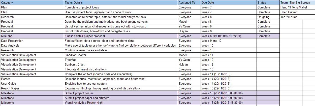
Milestone and Schedule