Difference between revisions of "JJJ: Proposal"
| Line 29: | Line 29: | ||
== Background Survey of Related Work == | == Background Survey of Related Work == | ||
| − | + | {| class="wikitable" style="background-color:#FFFFFF;" width="100%" | |
| + | |- | ||
| + | ! style="font-weight: bold;background: #536a87;color:#fbfcfd;width: 50%;" | Related Works | ||
| + | ! style="font-weight: bold;background: #536a87;color:#fbfcfd;" | What We Can Learn | ||
| + | |- | ||
| + | | | ||
| + | <p><center>'''An Analysis of Death Tolls & Terrorist Incidents''' </center></p> | ||
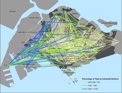
| + | [[File:% Trips by Industrial Workers - Working Social Document.JPG|400px|center]] | ||
| + | <p><center>'''Source''': http://web.mit.edu/11.521/papers/WorkingSocialDocument_Aug2012_v2.pdf </center></p> | ||
| + | || | ||
| + | * The infographic provides annotations to help the users understand major terrorist attacks that have happened overtime. | ||
| + | * Colour scheme used by the infographic is clean and neat. | ||
| + | * Use of colors on the same color scale ensures that it will not confuse the users. Also, the need to reference to a legend repeatedly, to understand the data, will be reduced. | ||
| + | |- | ||
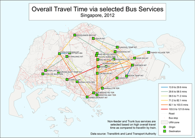
| + | | <p><center> '''An Animated Time-Lapse Visualization of Terror Attacks On The World Map''' </center></p> | ||
| + | [[File:Bus travel time.png|400px|center]] | ||
| + | <p><center> '''Source''': http://sgtptr.chrissng.net/ </center> </p> | ||
| + | || | ||
| + | * The time-lapse animation provides a clear overview to users as it shows the spread of terrorist activities over the years. | ||
| + | |- | ||
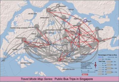
| + | | <p><center> '''An Interactive Visualization to Show Trends And Events Shaping History of Terrorism''' </center></p> | ||
| + | [[File:Travel Mode Map Series - Working Social Document.JPG|400px|center]] | ||
| + | <p><center> '''Source''': http://web.mit.edu/11.521/papers/WorkingSocialDocument_Aug2012_v2.pdf </center></p> | ||
| + | || | ||
| + | * The time-series chart allow users to make use of a scrollbar to look at a time range (of 12 months). Use of a scrollbar act as a filter to look at the selected time range and this prevents users from getting overwhelmed by the data. | ||
| + | * The visualization consists of 2 charts linked together and this provides a clear representation of the spread of terrorist activities overtime. Firstly, the bar chart shows the number of fatalities in each month across the years. Secondly, the world map shows the spread of terrorist activities as user selects a time series. When the user drags across the scrollbar on the bar chart, the activities in the world map changes based on the selected time series. Such linkage between charts are useful and provides a good interactive tool to help users analyze spread of terrorist activities overtime. | ||
| + | * Use of tooltips allow users to know more information about the number of fatalities as they interact with the map. | ||
| + | |- | ||
| + | | <p><center> '''An Animated Time-Lapse Visualization of Terror Attacks On The World Map''' </center></p> | ||
| + | [[File:Bus travel time.png|400px|center]] | ||
| + | <p><center> '''Source''': http://sgtptr.chrissng.net/ </center> </p> | ||
| + | || | ||
| + | * The time-lapse animation provides a clear overview to users as it shows the spread of terrorist activities over the years. | ||
| + | |- | ||
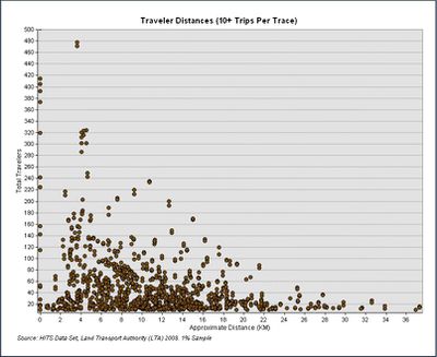
| + | | <p><center> '''An Animated Time-Lapse Visualization of Terror Attacks On The World Map''' </center></p> | ||
| + | [[File:Traveller_distances_-_Working_Social_Document.JPG|400px|center]] | ||
| + | <p><center> '''Source''': http://web.mit.edu/11.521/papers/WorkingSocialDocument_Aug2012_v2.pdf </center> </p> | ||
| + | || | ||
| + | * The time-lapse animation provides a clear overview to users as it shows the spread of terrorist activities over the years. | ||
| + | |} | ||
== References == | == References == | ||
Revision as of 16:14, 4 October 2016
Proposal
|
Contents
Problem & Motivation
Land scarcity is persistent issue faced by Singapore since its independence, being a country with only the size of a typical city or smaller of a fellow developed nation. As such, one of Singapore’s main challenges is in the area of Urban Planning to optimize land use without compromising on the standards of living for its residents.
One of the ways to assess the effectiveness of urban planning would be to study commuter patterns, understanding how people travel for their work and educational needs. Some who stay near to their workplace enjoy a shorter journey with less commuting time. However, there are also people who stay far from their workplaces and spend long hours on travel, for example an individual who stays at Tampines yet having to travel to Tuas for work. Hence, we would like to create a tool to gain a closer look into commuter patterns in Singapore to find out more on current commuter patterns. We believe that the tool in investigating commuter patterns would be useful for urban planners to be able to identify potential problems and patterns in the current design so as to improve the urban landscape in preparation for population growth.
Objectives:
- To explore recent commuter data for bus travel in Singapore
- To visualize commuter patterns during the morning peak hours
- To explore the impact of current commuter patterns on possible challenges in urban planning
- To create a visualization for an easy and intuitive understanding of the current situation for the average Singaporean
Background Survey of Related Work
| Related Works | What We Can Learn |
|---|---|
|
|
|
| |
| |
| |
|
References
- http://worksingapore.com/articles/live_4.php
- https://www.lta.gov.sg/content/dam/ltaweb/corp/PublicationsResearch/files/ReportNewsletter/LTMP2013Report.pdf
- https://www.quora.com/In-Singapore-it-takes-more-than-an-hour-to-reach-a-destination-via-the-public-transport-bus-train-but-just-quarter-of-the-time-if-I-were-to-take-the-taxi-Would-we-still-call-the-public-transport-successful
- http://web.mit.edu/11.521/papers/WorkingSocialDocument_Aug2012_v2.pdf
- http://www.enterpriseinnovation.net/article/singapores-transport-vision-analytics-new-interfaces-autonomous-vehicles-1298824564
- http://business.asiaone.com/career/news/3-factors-determine-if-singaporeans-leave-their-jobs
- http://community.jobscentral.com.sg/articles/your-daily-work-commute-ruining-your-life
- http://blog.moneysmart.sg/lifestyle/cheap-fast-and-painless-commuting-in-singapore-is-it-possible/
- http://lkyspp.nus.edu.sg/wp-content/uploads/2014/01/Transport-Planning-for-Singapore.pdf
- http://lkyspp.nus.edu.sg/wp-content/uploads/2013/04/Barter-Sg-urban-transport-sustainable-by-design-or-necessity.pdf
- https://www.ura.gov.sg/uol/master-plan/view-master-plan/master-plan-2014/Growth-Area
- http://www.smartnation.sg/initiatives/Mobility/spearheading-research-in-standards-for-sdvs
- https://www.ura.gov.sg/skyline/skyline09/skyline09-02/text/04.htm
Key Technical Challenges
Description of the approach (Storyboard)
Milestones
Test
Comments
Please feel free to comment on our proposal.


