Difference between revisions of "IS428 2016-17 Term1 Assign3 Chen Huiyan"
| Line 40: | Line 40: | ||
* Floor 3 has the most number of COOLING COIL Power | * Floor 3 has the most number of COOLING COIL Power | ||
* Floor 2 has the most number of concentration of C02 measured at the zone's return air grille | * Floor 2 has the most number of concentration of C02 measured at the zone's return air grille | ||
| + | [[File:ElectricDemand.png]] | ||
===Describe up to ten notable anomalies or unusual events you see in the data. Prioritize those issues that are most likely to represent a danger or a serious issue for building operations.=== | ===Describe up to ten notable anomalies or unusual events you see in the data. Prioritize those issues that are most likely to represent a danger or a serious issue for building operations.=== | ||
Revision as of 11:00, 24 October 2016
Contents
- 1 Data Source
- 2 Data Analysis
- 3 Data Transformation
- 4 The Tasks
- 4.1 What are the typical patterns in the prox card data? What does a typical day look like for GAStech employees?
- 4.2 Describe up to ten of the most interesting patterns that appear in the building data. Describe what is notable about the pattern and explain its possible significance.
- 4.3 Describe up to ten notable anomalies or unusual events you see in the data. Prioritize those issues that are most likely to represent a danger or a serious issue for building operations.
- 4.4 Describe up to five observed relationships between the proximity card data and building data elements. If you find a causal relationship (for example, a building event or condition leading to personnel behavior changes or personnel activity leading to building operations changes), describe your discovered cause and effect, the evidence you found to support it, and your level of confidence in your assessment of the relationship
- 5 Tools Utilized
- 6 Final Visualization
- 7 Comments and Suggestions
Data Source
Data Analysis
Proximity sensor data for each of the prox zone regions is used to discover the typical working patterns for GAStech employees. In order to identify the pattern, I need find the relationship between prox-id and employees. Through some observations, I have spotted prox-id is constructed by the first character of employee's first name and full last name followed by numbers which start from 001. For example, one employee called Mat Bramar with prox-id "mbramar001". In addition, the same employee may have multiple prox-ids with increasing numbers such as 002.
Data Transformation
For proxOut-MC2.csv, I have extracted employee's last name to identify the unique employee from prox-id by using the "Left and Right" functions in Excel.
For bldg-MC2.csv, in order to discover interesting patterns in the building data, I have to segregate dataset by making use of Stack function of JMP Pro.
Step 1: Stack
Step2: Create new columns for Floor, Zone and Element segregated by Label through applying formulas.
Finally, the results from Step 2 can be used by Tableau to produce visualizations.
The Tasks
What are the typical patterns in the prox card data? What does a typical day look like for GAStech employees?
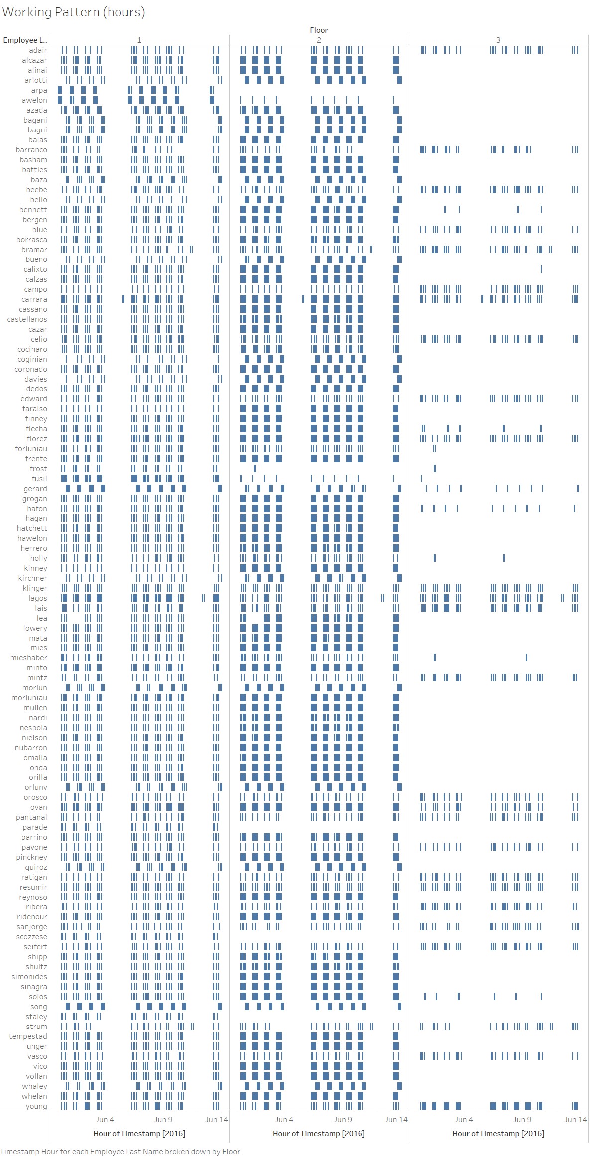
 Through looking at Gantt view above, I can easily tell most of employees work on the first and second level. For people working on the first floor, there are three working shifts: 12am - 7am (night shift), 7am - 4pm and 4pm - 11pm. For people on the second floor, there is no night shift and employees on the third floor only work from 7am to 4pm.
Describe up to ten of the most interesting patterns that appear in the building data. Describe what is notable about the pattern and explain its possible significance.
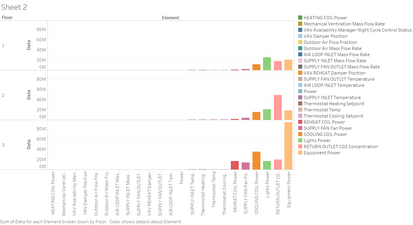
- The Equipment Power of floor3 are much higher than floor 1 and floor 2.
- Floor 3 has the most number of COOLING COIL Power
- Floor 2 has the most number of concentration of C02 measured at the zone's return air grille
Describe up to ten notable anomalies or unusual events you see in the data. Prioritize those issues that are most likely to represent a danger or a serious issue for building operations.
Describe up to five observed relationships between the proximity card data and building data elements. If you find a causal relationship (for example, a building event or condition leading to personnel behavior changes or personnel activity leading to building operations changes), describe your discovered cause and effect, the evidence you found to support it, and your level of confidence in your assessment of the relationship
Tools Utilized
- Excel to clean data
- JMP PRO to segregate and transform data
- Tableau to do data visualisation

