Difference between revisions of "Kabak: Proposal"
| Line 32: | Line 32: | ||
=Survey of Related Works= | =Survey of Related Works= | ||
| + | {| class="wikitable" style="background-color:#FFFFFF;" width="100%" | ||
| + | |- | ||
| + | ! style="font-weight: bold;background: #ffffff;color:#000000;width: 50%;" | Related Works | ||
| + | ! style="font-weight: bold;background: #ffffff;color:#000000;" | Pros and Cons | ||
| + | |- | ||
| + | | | ||
| + | [[File:energy_consumption.PNG|400px|center]] | ||
| + | <p><center>'''Source''': http://tinyurl.com/kho65tl</center></p> | ||
| + | || | ||
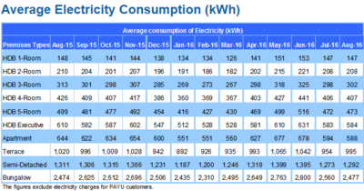
| + | * Time series data displayed in a tabular format with numerical values is hard to digest. | ||
| + | * The alternating white and blue rows do not have any meaning and does not add value to the visualisation. | ||
| + | |- | ||
| + | | | ||
| + | [[File:energy_static.PNG|400px|center]] | ||
| + | <p><center> '''Source''': http://tinyurl.com/hdux9ou </center> </p> | ||
| + | || | ||
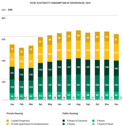
| + | * The stacked bars is able to show overall energy consumption for the month and also the consumption for each component. | ||
| + | * Green hue is used for public housing and yellow hue is used for private housing. This aids the audience in categorisation of what they are seeing. | ||
| + | * Numbers are added into each bar to help in comparison for bars that look similar in size. | ||
| + | |- | ||
| + | | | ||
| + | [[File:energy_geog.PNG|400px|center]] | ||
| + | <p><center> '''Source''': http://tinyurl.com/jnzvfyg </center></p> | ||
| + | || | ||
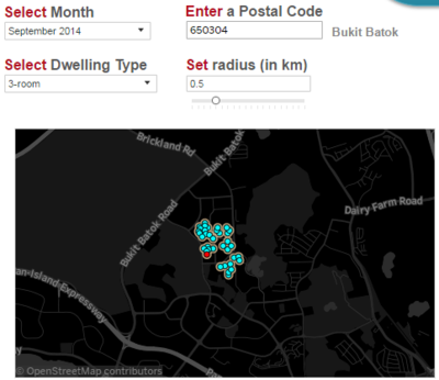
| + | * The public tableau dashboard by Energy Market Authority has geographic visualisation. | ||
| + | * However, it is not able to do comparison across housing types nor estates. | ||
| + | * The marks on the map also do not vary in colour or size, which does not really add value to having data on a map. | ||
| + | |} | ||
<br/> | <br/> | ||
Revision as of 17:16, 9 October 2016
Contents
Problem and Motivation
As a country with no natural resources, the government has always been vested in encouraging Singaporeans to reduce energy consumption and wastage in Singapore. For example, the National Environment Agency (NEA) has the energy label scheme which requires goods such as Air-conditioner, Refrigerator, Clothes Dryer and Television to be affixed with an energy label sticker depicting how much electricity they consume when used.
More recently in August 2016, Singapore Power (SP) has redesigned the utilities bill in a bid to help fellow Singaporeans track and take steps to reduce their energy and water consumption.
While there are data and statistics available on the Energy Market Authority with regards to the energy consumption by household, it is in quite a raw form with no visualization to aid users in better understanding energy consumption in Singapore. The statistics or data provided also does not link to other factors such as the population demographics, which perhaps could provide interesting insights on the usage patterns of Singaporean households. As such. while these data exist, it is not being used to allow the public to visualize the energy consumption and to make sense out of it.
Solution and Objective
Our solution is aimed at helping households to visualize the energy consumption patterns in Singapore in simple, easy to understand components and also to allow them to compare with other similar households(i.e by housing type). It will also suggest simple ways to help households conserve energy by referring to data on energy consumption so that users can enter how much they want to reduce their bill by and appropriate energy saving activities will then be recommended to meet the target set.
At the end of the day, the solution aims to provide insights or trends to users with regards to energy usage patterns so that they can take action to reduce their bill at the end of the month.
Dataset
Survey of Related Works
| Related Works | Pros and Cons |
|---|---|
|
|
|
|
|
|
|
|
|
Key Technical Challenges
Storyboard
Timeline and Milestones
References


