Difference between revisions of "Cupid Minions"
| Line 116: | Line 116: | ||
|} | |} | ||
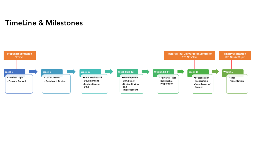
| − | ==Milestones== | + | ==Roles & Milestones== |
| + | [[File:Cupid Roles.png]] | ||
[[File:Timeline.png|1000px]] | [[File:Timeline.png|1000px]] | ||
Revision as of 13:06, 9 October 2016
Contents
Problem and Motivation
Low marriage rate and increasing divorce rate has been prominent issues in the developed world. One of the reasons for causing these issues is the wrong selection of marriage partner. Some couples only know that they don’t suit each other after marriage. This creates social issues like increaing divorce rate and domestic violence. Therefore, choosing the correct marriage partner is a prompt need for the young adults nowadays. In order to increase the successful matching rate for couples and make sure people can get the most satisfied partners, there is a need to understand these partner-seeking people’s characterstics, demographics, habits and lifestyle informations, etc. From the insight brought by the data, we could suggest the factors which contribute to successful and rapid matching and as a result help the partner-seekers.
Objective
The objective of the project is to:
- Understand the demographics of drivers
- Distribution of age of drivers.
- Understand the demographics of casualties
- Distribution of age of casualties.
- Distribution of severity of casualties.
- Distribution of type of casualties.
- Examine the underlying factors which contributes to accidents. The following are some factors, but not limited to:
- Temporal patterns: Accident records based on time.
- Weather conditions: Which type of weather conditions would cause more accidents?
- Road conditions: Which type of road conditions would cause more accidents?
- Location: Which city has the most accidents?
- Develop appropriate interactive visualisation to allow discovery of insights from multiple dimensions from the dataset.
Data
In this project, our team will be focusing on 2015 road safety data. The data is obtained from data.gov.uk (https://data.gov.uk/dataset/road-accidents-safety-data). It contains only personal injury accidents on public roads that are reported to the police and recorded using the UK STATS19 accident reporting form. It consists a total of 3 datasets that provide information about the accidents, the types of vehicles involved and the demographics of the casualties. Most of the data attributes are coded and re-coding would be done with the lookup tables provided by data.gov.uk.
The following data attributes are used in this project:
- Accident Dataset [Accidents_2015.csv]
- Accident_Index [Accident No.]
- Longitude
- Latitude
- Day_of_Week
- Time
- Local_Authority_(District) [City Name]
- Weather_Conditions
- Road_Surface_Conditions
- Vehicles Dataset [Vehicles_2015.csv]
- Accident_Index [Accident No.]
- Vehicle_Reference [Vehicle No.]
- Age_of_Driver
- Casualties Dataset [Casualties_2015.csv]
- Accident_Index [Accident No.]
- Vehicle_Reference [Vehicle No.]
- Casualty_Reference [Casualty No.]
- Casualty_Class [Driver/Rider, Passenger or Pedestrian]
- Age_of_Casualty
- Casualty_Severity
Research Visualisation
| Visualisations | Comments |
|---|---|
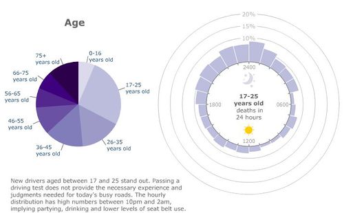
(http://news.bbc.co.uk/2/hi/in_depth/uk/2009/crash/8414354.stm)
| |
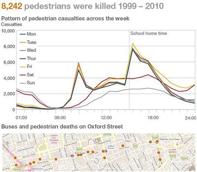
(http://www.bbc.co.uk/news/uk-15975564)
|
Tools
Following tools are expected to be utilized through this project:
- Tableau DeskTop 10
- JMP Pro
- Javascript
- D3.js
- JQuery
- Brackets
- Github
- Excel
Technical Challenges
| Technical Challenges | Action Plan |
|---|---|
| |
| |
|


