Difference between revisions of "Staying Vigilant, Confronting Terrorism: Proposal"
Wx.tan.2013 (talk | contribs) |
Wx.tan.2013 (talk | contribs) |
||
| Line 70: | Line 70: | ||
<br/><div style="background: #364558; padding: 15px; font-weight: bold; line-height: 0.3em; text-indent: 15px;letter-spacing:-0.08em;font-size:20px"><font color=#fbfcfd face="Century Gothic">ADDRESSING KEY TECHNICAL CHALLENGES</font></div> | <br/><div style="background: #364558; padding: 15px; font-weight: bold; line-height: 0.3em; text-indent: 15px;letter-spacing:-0.08em;font-size:20px"><font color=#fbfcfd face="Century Gothic">ADDRESSING KEY TECHNICAL CHALLENGES</font></div> | ||
| − | + | The following are some of the key technical challenges that we may face throughout the course of the project: | |
| + | {| class="wikitable" style="background-color:#FFFFFF;" width="100%" | ||
| + | |- | ||
| + | ! style="font-weight: bold;background: #536a87;color:#fbfcfd;width: 50%;" | Related Works | ||
| + | ! style="font-weight: bold;background: #536a87;color:#fbfcfd;" | What We Can Learn | ||
| + | |- | ||
| + | | Example || Example | ||
| + | |- | ||
| + | | Example || Example | ||
| + | |- | ||
| + | | Example || Example | ||
| + | |} | ||
<br/><div style="background: #364558; padding: 15px; font-weight: bold; line-height: 0.3em; text-indent: 15px;letter-spacing:-0.08em;font-size:20px"><font color=#fbfcfd face="Century Gothic">PROJECT TIMELINE</font></div> | <br/><div style="background: #364558; padding: 15px; font-weight: bold; line-height: 0.3em; text-indent: 15px;letter-spacing:-0.08em;font-size:20px"><font color=#fbfcfd face="Century Gothic">PROJECT TIMELINE</font></div> | ||
Revision as of 11:56, 4 October 2016
The threat of terrorism is growing everyday and many countries, including Singapore, have taken steps to mitigate the risks of terrorism. In the National Day Rally 2016, PM Mr. Lee Hsien Loong mentioned that diplomats and security forces have been doing their job well but despite their efforts, it does not mean that terrorist attacks will not happen in Singapore. The recent attack that attempted to fire a rocket to hit Marina Bay Sands Area from Batam was successfully intervened but this signals to the country that the terrorism threat should not be taken lightly. In response to the growing terrorist threat, the SGSecure Movement was launched to prepare the public in the event of an attack. In recent years, there is a rise in research on terrorist organizations and the activities they have performed, regardless of scale, over the years. However, more still needs to be done to analyze past terrorist activities and gain insights from it easily so that all countries could better prepare for a worst case scenario.
In this project, we are interested to find out and understand the spread of terrorist activities and the behavior of terrorists’ organizations and their attack patterns (e.g. bombing, assassination, shooting) regionally/globally. This allows respective policy makers, government or intelligence agencies to better analyze terrorist organizations and their spread internationally so that they could devise appropriate policies/measures to prevent potential attacks in future.
The final visualization aims to help analysts perform the following:
- Understand the spread of terrorist attacks and its fatalities regionally/globally
- Understand the spread of terrorist organizations and their attack activities regionally/globally
The dataset for analysis will be retrieved from the Global Terrorism Database (https://www.start.umd.edu/gtd/using-gtd/).
Our project will analyze on the following attributes:
- Geographical spread of terrorist attacks
- Type of terrorist attacks (e.g. bombing, assassination, bombing etc.)
- Target of terrorist attacks (e.g. police, embassy etc.)
- Perpetrators of terrorist attacks (e.g. ISIS, Al-Qaeda etc.)
- Weapons used in terrorist attacks (e.g. chemical, fireams etc.)
- Extent of damage in terrorist attacks
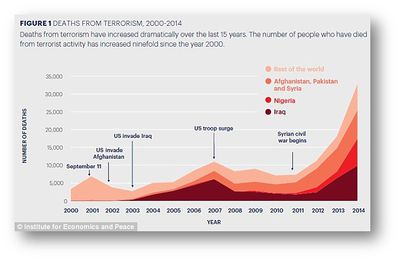
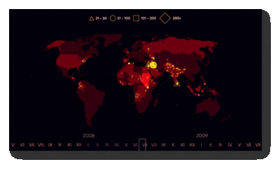
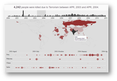
Many visual and data analysts have made use of data collected from the Global Terrorism Database to visualize and understand the extent of terrorist attacks around the world. Some of their works include the following:
| Related Works | What We Can Learn |
|---|---|
|
|
|
| |
|
Our group has proposed the following storyboard to assist analysts in the use of our visual application:
The following are some of the key technical challenges that we may face throughout the course of the project:
| Related Works | What We Can Learn |
|---|---|
| Example | Example |
| Example | Example |
| Example | Example |
The following shows our project timeline for the completion of this project:
Feel free to comment to help us improve our project! (:


