Difference between revisions of "IS428 2016-17 Term1 Assign1 Yang Chengzhen"
Czyang.2013 (talk | contribs) |
Czyang.2013 (talk | contribs) |
||
| Line 7: | Line 7: | ||
==Approaches== | ==Approaches== | ||
| − | <big> | + | <big> '''Data Selection''': The 4 main data set I chose from the REALIS database are:</big> |
# Quarterly private property price index in 2015 | # Quarterly private property price index in 2015 | ||
# Private Residential Property Transactions in 2015 | # Private Residential Property Transactions in 2015 | ||
| Line 13: | Line 13: | ||
# Quarterly availability & vacancy rate by property type | # Quarterly availability & vacancy rate by property type | ||
| − | <big> | + | <big> '''Pre-processing''':</big> |
#Used Excel to add 'quarter' column in 4 quarterly supply files. | #Used Excel to add 'quarter' column in 4 quarterly supply files. | ||
#Used Tableau to join data source and filter null values. | #Used Tableau to join data source and filter null values. | ||
| − | + | ||
| − | + | ==Overall Analysis: Price and Supply== | |
| − | [[File:Quarterly Private Property Price Index (2015).png]] | + | [[File:Quarterly Private Property Price Index (2015).png]]<br> |
Giving the data size being small and with 1 dimension and 1 measurements,I used bar chart to plot the private property price index over quarters in 2015. | Giving the data size being small and with 1 dimension and 1 measurements,I used bar chart to plot the private property price index over quarters in 2015. | ||
| − | + | '''Finding 1 :According to the Private Property Price Index, the price of private properties has shown a decreasing trend over 2015.''' | |
| − | [[File:Quarterly Private Property Supply (2015).png]] | + | [[File:Quarterly Private Property Supply (2015).png]]<br> |
To analyse the supply, we not only need to look at the change in number of projects but also number of units. The bar charts gives an overview of supply trends in 2015. | To analyse the supply, we not only need to look at the change in number of projects but also number of units. The bar charts gives an overview of supply trends in 2015. | ||
| − | + | '''Finding 2: The market supply has also been decreasing over quarters, this is indicated by both number of projects decrease and number of total units decrease.''' | |
| + | ==Regional Analysis== | ||
| + | [[File:Number of Transactions VS Average Unit Price by Region.png ]]<br> | ||
| + | To see the relations between market demand (number of transactions) and price by region, I use the 2 variables as X,Y axis and used the average value as reference line. Thus the space has been split into 4 sections with 'demand-price' patterns 'high-high','high-low','low-low' and 'low-high'. Then we plot the value by regions. | ||
| + | '''Finding 3: Central region has 'high-high' demand and price, while most of the regions fall under ' low-low' sections. This indicates the inbalanced demand and price pattern among regions.''' | ||
==Tools Utilized== | ==Tools Utilized== | ||
*Excel 2013 for data processing | *Excel 2013 for data processing | ||
Revision as of 23:35, 28 August 2016
Contents
Abstract
This project aims to analyze the private residential market in year 2015. The 2 main focus will be price distribution and supply shares analysis based on data provided by Urban Redevelopment Authority. The results may facilitate property policy makers to have a better overview of the market thus alter the policy to coordinate property supply and demand. At the same time the buyers can take it as reference for choosing the properties.
Problem and Motivation
Singapore is a country with limited land supply while the demand for private residential properties has been fairly high. The government has adopted Singapore Property Market Cooling Measures since 2009 to ease the property market. The policy has been modified over the years and market price has been gone up and down. At year 2015, how was the price and supply changing? Is it time to loosen up / ease the policy? How should the measures to be adjusted to better measures and controls the market? For buyers, is it a good period step into the market? We may find the answer through the analysis of property price and supply. Main variables involved are Unit price, region, Monthly number of transactions , private Property Price Index, and quarterly unit supply
Approaches
Data Selection: The 4 main data set I chose from the REALIS database are:
- Quarterly private property price index in 2015
- Private Residential Property Transactions in 2015
- Quarterly Supply for Private Residential Properties
- Quarterly availability & vacancy rate by property type
Pre-processing:
- Used Excel to add 'quarter' column in 4 quarterly supply files.
- Used Tableau to join data source and filter null values.
==Overall Analysis: Price and Supply==
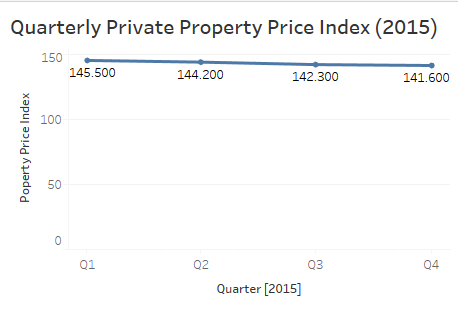
Giving the data size being small and with 1 dimension and 1 measurements,I used bar chart to plot the private property price index over quarters in 2015. Finding 1 :According to the Private Property Price Index, the price of private properties has shown a decreasing trend over 2015.

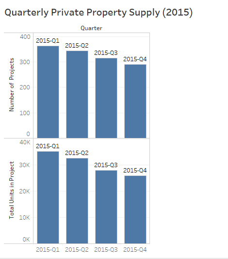
To analyse the supply, we not only need to look at the change in number of projects but also number of units. The bar charts gives an overview of supply trends in 2015.
Finding 2: The market supply has also been decreasing over quarters, this is indicated by both number of projects decrease and number of total units decrease.
Regional Analysis

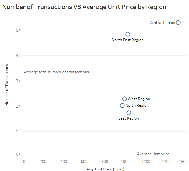
To see the relations between market demand (number of transactions) and price by region, I use the 2 variables as X,Y axis and used the average value as reference line. Thus the space has been split into 4 sections with 'demand-price' patterns 'high-high','high-low','low-low' and 'low-high'. Then we plot the value by regions.
Finding 3: Central region has 'high-high' demand and price, while most of the regions fall under ' low-low' sections. This indicates the inbalanced demand and price pattern among regions.
Tools Utilized
- Excel 2013 for data processing
- Tableau 10.0 for generating graphs
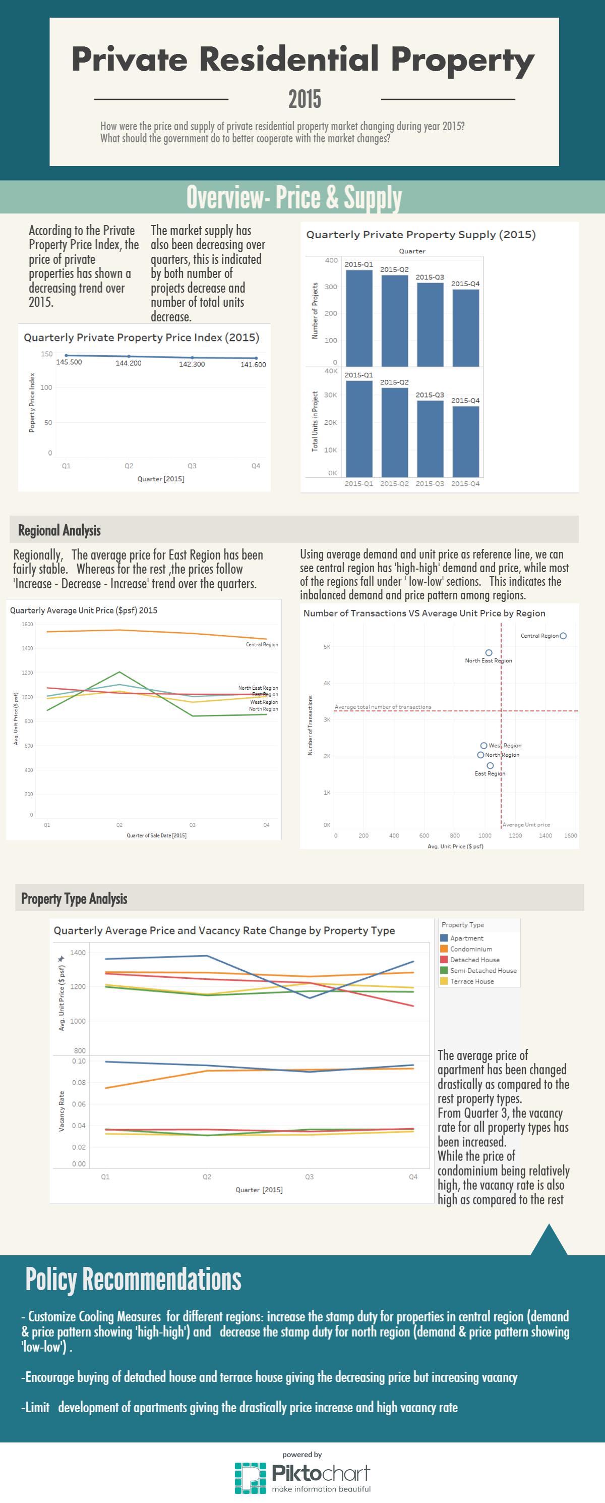
- Piktochart for generating infographics

