Difference between revisions of "Talk:Lesson09"
| (2 intermediate revisions by the same user not shown) | |||
| Line 124: | Line 124: | ||
--Ong Ming Hao | --Ong Ming Hao | ||
| + | |||
| + | ==IBM Word Wave - A variation of text visualization== | ||
| + | Good Day All, | ||
| + | |||
| + | While looking through the internet on different visualizations, I discovered that IBM has developed a technique called "Word Wave" for text visualization. The figure below shows an example of Word Wave implementation. | ||
| + | |||
| + | <br>[[File:WordWave_IBM_ChuaFengRu.jpg|400px]]<br> | ||
| + | |||
| + | The Word Wave allows you to look out for word of importance of the words in the text; the words on the top left hand corner are more important, and the words appearing in the bottom left corner are of lesser importance. Similarly to what you see in the picture, the word wave is most effective, when it is used to compare two different text of the same context. For example, in the picture, you can observe that Coca Cola and Pepsi both embodied different values (e.g., Coca Cola values its vision more, while Pepsi is more concern about business growth and environmental factors). For analysis purpose, we can also add a line to allow readers to better focus on which is important or which is less important. | ||
| + | |||
| + | A more detailed guide in the source. | ||
| + | |||
| + | Source: http://www.ibm.com/developerworks/library/os-txtviz/ | ||
| + | |||
| + | --Chua Feng Ru | ||
Latest revision as of 02:27, 31 October 2016
Contents
- 1 Creating Word Cloud Using Tableau
- 2 Sunburst Diagram for Text Visualizations
- 3 Google Goggles for processing images with text
- 4 Graphic Furnitures in Tableau
- 5 Graph + Text Visualization
- 6 Thoughts on Text Visualization - Arc Diagrams
- 7 HR + Text Analytics
- 8 Thoughts on Text Visualisations
- 9 IBM Word Wave - A variation of text visualization
Creating Word Cloud Using Tableau
Besides Wordle and Many Eyes, it is also possible to create a basic word cloud using Tableau even though word cloud option is not available under the "Show me" tab. This can be done by changing the marks properties in the marks card. For example, if I want to know which occupation has the highest number of injuries, I will drag “Occupation” field to the “Text” card and specify the type of mark to show as “Text”.
Next, I will drag the same occupation column to the “Size” card. Right click on “Occupation” that is on the Size card and change to count instead of dimension.
I can also add some colours to the word cloud by dragging the Occupation column to Colour.
From the above example, I have realised that Tableau has so much more to offer and users are not restricted to the graph templates that are available under the “Show me” tab. By changing various properties in the Marks card, other visualisations such as word cloud and polygon maps can be created.
Sources:
http://kb.tableau.com/articles/howto/creating-a-word-cloud
http://kb.tableau.com/articles/knowledgebase/polygon-shaded-maps?
-Lim Hui Ting
Sunburst Diagram for Text Visualizations
In this lesson, I learnt that there are many ways to visualize text besides simply using tag clouds. While tag clouds help us easily visualize words based on their frequencies, they do not visualize the relationships these words may have with one another.
Besides the other visuals shared by Prof in class, I found another interesting visualization in the article: Information Visualization for Text Analysis, Marti Hearst, Search User Interfaces, Chapter 11 [1].
Similar to a sunburst diagram, visuals like the DocuBurst not only show us the weights (frequencies) of different words, they also display the hierarchical links between different words. Words linked to the text in the centre of the diagram appear as wedges in concentric circles. Size of the wedges reflect the frequency of which the word appears.
-Heng Yi Teng Mabel
Google Goggles for processing images with text
I would like to introduce a free android app developed by Google in 2010 to supplement the learnings in this class and share some comments I have to hopefully start a discussion on text. This app is called Google Goggles, and it is an image recognition mobile app.
While its primary function is to search based on pictures (eg take a photo of a famous landmark and return its information, take a photo of a barcode to return its information), it is pretty slick for any text images such as a book or magazine. It also adds contacts into your phone by scanning business cards.

In this image, the app is used to take a picture of a menu in a different language and it translates the menu for the user

In this image, the app has identified the book and returns the book review on amazon.
Application:
I believe that such an application is a step forward in text analytics and text visualization, where employees can scan hardcopy documents which may include resumes, hardcopy application forms into digital text for processing.
The app can be improved in a few areas as well, in particular of how to scan the text and reveal the 1 key message of that text. Or alternatively if it is a speech or an argument, what is the structure of that speech or story, where is the point, the elaboration, the examples and explanation, where is the climax of the story etc.
While the app is effective for text that has been printed, there are startups and technology being developed right now as to recognize handwritten and barley legible handwriting into text.
Hopefully such apps can help the user to have a starting point in analyzing the most unstructured data type (which is text) which doesn’t come in a convenient text file format, and using this app serves as a starting point.
References:
- https://en.wikipedia.org/wiki/Google_Goggles
- http://www.wordstream.com/google-goggles-app-for-mobile
- https://play.google.com/store/apps/details?id=com.google.android.apps.unveil&hl=en
- http://lifehacker.com/5829946/the-best-image-to-text-app-for-android
-Albert Bingei
Graphic Furnitures in Tableau
I believe that many of us faced difficulty in changing the field label displays of Heatmaps. Tableau does not allow us to change/edit the display directly.

After much time consulting Google, I managed to find some other workarounds instead of directly editing the display of the label.
Alternatives
1) https://community.tableau.com/message/320738
2) http://kb.tableau.com/articles/howto/renaming-dimension-column-row-headers
I hope it will help you in your Mini Assignment 3!
Graph + Text Visualization
Hi everyone, would like to share my two cents on a slight variation of the graph/text visualization. This an article of the Iraq war logs, visualized in the form of a graph/text visualization. Not sure if this falls cleanly under either type but it was interesting to see a story emerge just from one glance: https://blog.overviewdocs.com/2010/12/10/a-full-text-visualization-of-the-iraq-war-logs/
This was a hand-made visualization with the intent to derive some insight from the war logs. The sources of text came from various areas, such as recordings in court, emails, minutes and more. If you look at the bottom right, there is a summary and a legend of how to interpret the visualization. Unfortunately, there a bulk of it belongs to criminal events. I think that in a short span of time, one can unravel the key insights of a corpus quickly when displayed in this manner. If we put any emails or message logs in whatsapp, we can see if there are specific common topics that come about - possibly a theme of interest you and your friends share - thats why you are friends with them in the first place!
I do think it is missing some interactivity, where you could perhaps select a word and have the rest cluster around it just as the examples Professor Kam shown in class. In doing so, one can interact with the data and find common themes - codewords or slang you use perhaps? - Thomas Thio
Thoughts on Text Visualization - Arc Diagrams
Hi everyone, just wanted to share this interesting way of text visualization called Arc Diagrams. I think its pretty interesting because it clearly shows links as well as the strength of the links between words. With an arc diagram, some structure is lost as compared to using other form of visualizations (i.e) Force Atlas, but it helps to identifies any cliques or bridge between words. The visualization uses a classic, Les Miserables and with this example we can see that there are repeated text sequences. Personally, i'm actually quite interested to use the recent US Presidential Election debates transcripts as the source for visualization and see if any interesting pattern or correlation.
Another interesting term came to me over the past few days from another module that I'm taking - Global Megatrends where they discussed about Big Data Analytics and visualization. One thing that came across is the term "Sentiment Analysis" where it seems that despite huge amounts of data from us being captured and recorded everyday, it is not able to record the context or emotions and as such might not be able to accurately depict and capture a true reflection of human nature. So it seems like while we can accurately transcripts speeches, we do not record the emotions reflected for each word spoken and as such even if we do show certain patterns it might not be a correct depiction of the speakers' intent and purpose.
Lastly, i feel that text visualization has very good applications in marketing and advertising. For example, a lot of companies are interested in Search Engine Optimization, where they buy certain key words so that it is associated with their company when a normal user perform a search, increasing network traffic to their website. This is where text visualization is really useful in helping to decide which particular word or phrase is worthwhile investing in, not just based on number of searches alone, but also in connection/relation to other search terms.
In closing, I would also like to leave everyone here with a video from Ted Talks:
https://www.youtube.com/watch?v=3ffF6iPeE3c
This is a short one minute video on every word spoken in all Ted Talks till 2014 (Ted Talks keep transcripts for each and every talk). While you might or might not have attended any Ted Talk before, i thought it might be interesting to see at one glance the most commonly used words and from it make an inference on hot topics today.
-- Bong Jun Hao
HR + Text Analytics
Hi everyone! I came across this article and got inspired by it as I’m interested in working in the HR field. Text analytics can help HR to cut through hiring noise and bias significantly. Especially during the job application period, HR is always overwhelmed by the vast number of job applications. By introducing text analytics, it will definitely help HR to reduce the time consumed to read through thousands of resumes and improve the screening effectiveness. With the time saved to review resumes, now recruiters would be freer to focus on the remaining candidates to find the right fit.
http://www.mckinsey.com/business-functions/organization/our-insights/people-analytics-reveals-three-things-hr-may-be-getting-wrong?cid=other-eml-nsl-mkq-mck-oth-1608
-- Dina Heng Li Gwek
Thoughts on Text Visualisations
Hi everyone, I recently came across a website that list various text visualization for you to gain some insights from. I was surprised at what people could come out with. There were a total of 335 different techniques to visualize text. People could visualize text using Chord Diagrams, Treemap, Force Directed Graphs and even geographical maps. Not just text clouds.
This lesson really opened my eyes on text visualisation. Previously, I thought that text visualizations were only limited to text clouds, and the amount of insights that one is able to get from this is very low. However, I can now see that text visualization is equally important, and the method that you chose to showcase your visualisation is very important. Here are some examples in which text can be visualised.

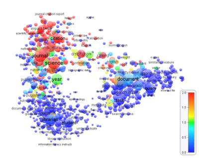
Text Visualisation using Geographical Maps.

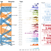
Text Visualisation using Parallet Sets.
--Ong Ming Hao
IBM Word Wave - A variation of text visualization
Good Day All,
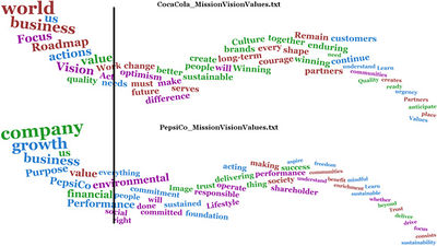
While looking through the internet on different visualizations, I discovered that IBM has developed a technique called "Word Wave" for text visualization. The figure below shows an example of Word Wave implementation.
The Word Wave allows you to look out for word of importance of the words in the text; the words on the top left hand corner are more important, and the words appearing in the bottom left corner are of lesser importance. Similarly to what you see in the picture, the word wave is most effective, when it is used to compare two different text of the same context. For example, in the picture, you can observe that Coca Cola and Pepsi both embodied different values (e.g., Coca Cola values its vision more, while Pepsi is more concern about business growth and environmental factors). For analysis purpose, we can also add a line to allow readers to better focus on which is important or which is less important.
A more detailed guide in the source.
Source: http://www.ibm.com/developerworks/library/os-txtviz/
--Chua Feng Ru


