Difference between revisions of "IS428 2016-17 Term1 Assign1 Margot Marie T Stelleman"
| Line 57: | Line 57: | ||
==If I was the president...== | ==If I was the president...== | ||
| + | |||
| + | 1) The Central region is offering much more units than the others. Rising the number of units in the other region will rise the vacancy which is quite low in the others regions, and will reduce the prices for the Central Region. It could improve the quality of living for the people in the Central region by reducing the numbers of people living there but of course the others regions need to be attractive. Several changes need to be thought and made before, such the transportation; find a way to take the people as faster as possible to their work place such as in they were living in the central area. Or also developed more green places and facilities to sell them a peaceful life and not the rush and the noise of the city center. | ||
| + | |||
| + | 2) The planned and under construction units are falling down. But population will still grow. Government needs to stimulate the construction of units to avoid a break in the vacancy. Vacancy which is as we analyzed it slightly going down in some regions. For example, they can play on the interest rate for a loan to stimulate and encourage people to build houses or still giving some money rewards or help. | ||
| + | |||
| + | 3) Condominiums and apartments are good in busy area to fit a maximum of persons. But in the region more far away of the city center, we could build regular houses which are landed properties. Landed properties are much less than Non-Landed one. The government could promote landed properties to equilibrate the balance between the different types of housing and then it could also be a way develop the other regions not in the center of Singapore to have more units in term of numbers as said in the point 1. | ||
| + | |||
==Inforgraphics== | ==Inforgraphics== | ||
Revision as of 21:23, 28 August 2016
Contents
Abstract
Housing, business for ones, investment for others, but necessity for all. This project gives an analysis and understanding of the private properties supply and their prices during the last year, 2015. A major step to do it is to first determine and understand the problem and next collecting and cleaning, transforming the data required. Then, the trends will be enlightened and easier understood thanks to graphical images. This graphs are designed thanks to Tableau Software. Based on this and information discovered, policy recommendations are imagined and shared for 2016.
Problem and Motivation
According to Singapore statistics, in 1970, 2 013 600 persons were forming the resident population of Singapore. Thirty years later, the next billion was already reached, with 3 273 400 people. Last year in 2015, the forth billion was almost obtained with 3 902 700 billion for Resident Population. It means that the raise has been almost twice faster between 2000-2015 than between 1970-2000.This raise will probably continue and might be more aggressive than ever. All this people must have a roof, that is a necessity for all of us. That is why it is interesting to have a look at the housing situation in Singapore. Private properties supply is here studied. In this project it will be considered as the residential properties only, not commercial and industrial properties because the problem is centralized on the housing problem for the population. And the term supply will refer only to the residential properties available and habitable on the market. But a quick look to the planned and under construction projects is interesting too. Prices of the residential properties will be also considered given that everyone has not the same budget and revenues. All this will be considered for the 2015 year, last whole year with available data. Because population is growing, is the supply also following it? How is the share of the supply by type of housing and also geographically? What type and region were the most expensive during 2015? And have the prices fluctuated a lot? It is important to know the answers to this question to make good decisions about housing, so for personal decisions as well as for policy development.
Data choices and cleaning
Once the area of study and specification of the problem to be cover is well done and understood, the collection of the data can be made. The data collected have been found on REALIS. There are three big categories for real estate: residential, commercial, industrial. The one interesting for the problem here is the Residential one.
Once our category is selected, different areas are proposed such as time series, project, transaction, rental or stock for example. Transaction dimension has been useful to get the data for availability by prices, but also by different region, selected for January 2015 till December 2015. We cannot download all the data, so I’ve been using Data analysis option to be able to do it and also take all the essential information. That means that Number of Unit were the analysis variable, Vertical axis was Unit price range in steps of 100 dollars psm and Horizontal axis was Property range, I also took the data for Planning region. This has be done for Landed – All and also Non-Landed - All only because getting all the property type at the same time we’re not allowed.
What about data necessary for the supply? In section Times Series, the sheets of data relative to availability and vacancy in total and also for each region have been collected. The stock part has been also useful to know the number of units per type but also per region. Data analysis option function has been used to collect it because of the huge amount of data.
Every information necessary collected, for everey single files, Excel has been used to split the only cell where all information was to convert it in several columns. And for every file, the rows not about 2015 of one of her quarter and extra information have been deleted. More modifications hae been made for the files related to transactions. Indeed, for example, the range of "1200(incl) till 1300 (excl)" had one housing in total in his row. But with the price in text, it was impossible to calculate something. Plus it was not continous, every single range of price is not always representend because housing not neccessary has this price. I have than changed it and replace "1200(incl) till 1300 (excl)" by 1200, for example, and fullfill automatically by zero the emply cells from the new rows for which a housing value was not covered. Once all that done, they can finally be used on Tableau Software that has been used for graphical constructions and images.
Where could I live in Singapore?
How to represent the supply share for private properties as clearly understandable as possible? When I read share, I am directly thinking to a pie I could share with family or friends. So Pie chart could be an option but it is actually not the best solution. We want to be clear as possible but it won’t be the case with it. The lecture of a pie chart graph can be messy like we have seen it during class lessons. A big graph for not so much which can be misleading the information we want to enlighten because of bad choices in colors of the pie, labels misplaced or bad perception of ratio we do. Bar chart will be more appropriate. We want to concentrate on thy supply by type or still by region. These are made of different categories; this is why it will fit perfectly to bar chart.
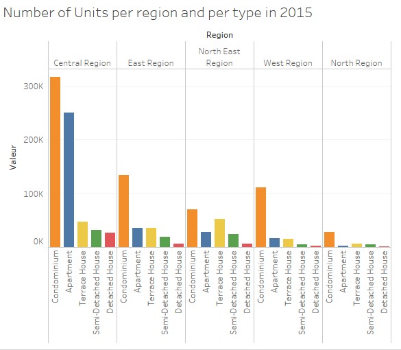
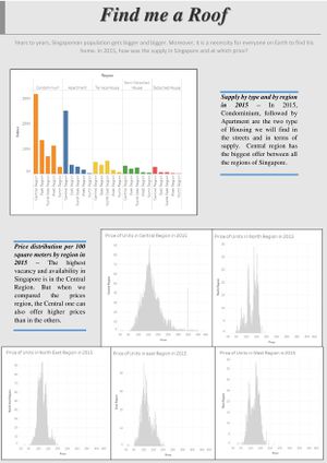
As we can see it in the chart above, in every region, Condominium is the type of housing we will find. It will be almost omnipresent in the West and North regions. While in Central region we can find a lot of apartments and in the North East region it will be Terrace House in adding of Condominiums. For this graphics choice of different colors have been made to see the differences between all the types of housing. And the values have been sorted out to clearly see what types are the most important for each region. In the next graph, it is not on the region we concentrate principally but on the type of housing. Again we are sorting out. And here each type will have a different color to see that we are not talking about the same type for each sub-graphs. We can clearly see that the most important type in term of number is Condominium, next Apartment, Terrace House, Semi-Detached House and finally Detached House. Below, we can see the importance of the Central region, ranking the first in term of number of units for each type except for the Terrace House. They are the most in the North East region, this is explain why apartment were not second in this region in the previous graph.
The next graph shows us how the supply evolves through 2015. Condominium evolves slowly which is strengthening their “leader” position. While the other types are more stable and evolves quite less quick than Condo’s. Again each type is in a different color which allows to remark every type in every quarter and compared the same type easily.
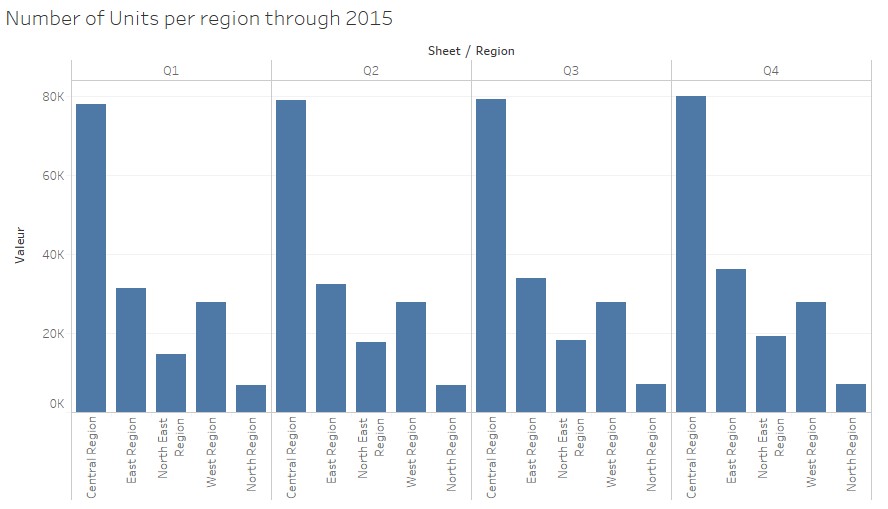
The next graphic has a fail. It should have been colored in the same way of thinking than the previous one. We can see the importance of colors and how it helps. We can figure it out the same results but it is taking much more time and more difficulties to do it. In fact, we can barely compare the numbers for a same region because every region is blue, which is confusing. Anyway we are able to see that every region is in rising. This is more visible for the Central region.
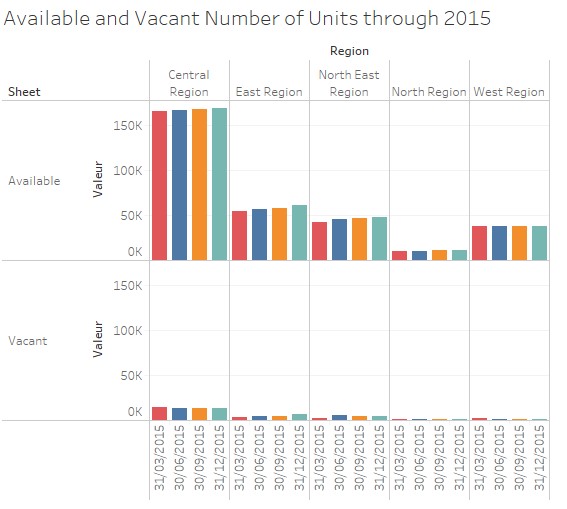
On the next graphic we can see this rising more definitely efficiently and easily, colored, grouped by region. This is a perfect example to prove that designing of a graph is essential. It confirms the growth for the Central region but also for the others, which was not quite obvious on the previous one. Just the West region remains stable. Here again we can see how the Central region is busy. It is because it is the central area of Singapore were people are working. Moreover, this graph goes also about vacancy and we can see she is proportional to the availability. The more the regions offers housing, the more it will vacant places. But through the different quarter vacancy is falling slowly, except for East region.
The graph below presents the situation in an aggregate way. We can still clearly see that availability is rising. But here it is surprising to see that vacancy is rising. So we could make an assumption as followed: because availability grows, vacancy do so. Here again the colors are important making differences between the quarters. And the labels are easy to read because they are horizontal.
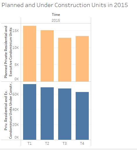
We also need to have attention on the current construction at that time to know how they will influence the supply and the availability in the next years.
Under construction units are falling down. While the planned ones, which are quite inferior to the under construction ones, are also falling down quickly but slightly rising in quarter 4. With the two different colors we can difference that we are not talking about the same variables. After analyzing the supply in 2015 for private residential we can say several things: - Central region is where the most of housing are, specially with condominiums and apartment and the vacancy was falling down slowly in 2015. - Condominium is the most important type of housing. - The new construction might be fewer than in the past.
Is it out of my budget?!
If I was the president...
1) The Central region is offering much more units than the others. Rising the number of units in the other region will rise the vacancy which is quite low in the others regions, and will reduce the prices for the Central Region. It could improve the quality of living for the people in the Central region by reducing the numbers of people living there but of course the others regions need to be attractive. Several changes need to be thought and made before, such the transportation; find a way to take the people as faster as possible to their work place such as in they were living in the central area. Or also developed more green places and facilities to sell them a peaceful life and not the rush and the noise of the city center.
2) The planned and under construction units are falling down. But population will still grow. Government needs to stimulate the construction of units to avoid a break in the vacancy. Vacancy which is as we analyzed it slightly going down in some regions. For example, they can play on the interest rate for a loan to stimulate and encourage people to build houses or still giving some money rewards or help.
3) Condominiums and apartments are good in busy area to fit a maximum of persons. But in the region more far away of the city center, we could build regular houses which are landed properties. Landed properties are much less than Non-Landed one. The government could promote landed properties to equilibrate the balance between the different types of housing and then it could also be a way develop the other regions not in the center of Singapore to have more units in term of numbers as said in the point 1.
Inforgraphics
Click on the image to enlarge and zoom.
