|
|
| (25 intermediate revisions by 2 users not shown) |
| Line 1: |
Line 1: |
| − | __NOTOC__
| + | [[File:Team_Valor_Logo.png|300px|center]] |
| − | {| style="background-color:#000; margin:0px 0px 0px 0px; padding:0px 0px 0px 0px" width="100%"
| + | |
| − | |-
| + | {| style="background-color:#c60000; color:#c60000 padding: 5px 0 0 0;" width="100%" cellspacing="0" cellpadding="0" valign="top" border="0" | |
| − | !style="text-align:center" |[[Image:team valor cover.jpg|960px]]
| + | | style="padding:0.3em; font-family:Segoe UI; font-size:120%; border-bottom:2px solid #c60000; border-top:2px solid #c60000; border-left:2px solid #c60000; text-align:center;" width="19%" | |
| − | |}
| + | |
| − | {| <!-- table start, define style here --> | style="background-color:#000; padding: 0 0 0 0;" width="100%" cellspacing="0px" cellpadding="4px" border="0" | + | [[Project_Groups|<font color="#FFFFFF"><B>HOME</B></font>]] |
| − | |-<!-- table row--> | + | | style="border-bottom:2px solid #c60000; border-top:2px solid #c60000; background:#c60000;" width="1%" | |
| − | ! style="background: #f77307; color: #f77307; text-align: center; border-bottom:solid #fff; border-top:solid #fff; font-face:Century Gothic; color:#FFF"<!-- define the style here -->|<!-- table data td -->[[BoGeo_ProjectDetails|<span style="font-variant:small-caps;font-size:1.5em;font-weight:bold;color:#FFF;padding-left:24px">Project Details</span>]]<!--it would be appreciated if you could drop a line of credit to my work when you reference from it!-->
| + | | style="padding:0.3em; font-family:Segoe UI; font-size:120%; border-bottom:2px solid #c60000; border-top:2px solid #c60000; background:#e15757; text-align:center;" width="19%" | |
| − | ! style="background: #f77307; color: #f77307; text-align: center; border-bottom:solid #fff; border-top:solid #fff; font-face:Century Gothic; color:#FFF"<!-- define the style here -->|<!-- table data td -->[[BoGeo_ProjectPoster|<span style="font-variant:small-caps;font-size:1.5em;font-weight:bold;color:#FFF;padding-left:24px">Project Poster</span>]]
| + | |
| − | ! style="background: #f77307; color: #f77307; text-align: center; border-bottom:solid #fff; border-top:solid #fff; font-face:Century Gothic; color:#FFF"<!-- define the style here -->|[http://ultimaxslc.github.io/BOICHU|<span style="font-variant:small-caps;font-size:1.5em;font-weight:bold;color:#FFF">Project Application</span>]
| + | [[IS428_2016_17T1_Team_Valor|<font color="#FFFFFF"><B>PROPOSAL</B></font>]] |
| − | ! style="background: #f77307; color: #f77307; text-align: center; border-bottom:solid #fff; border-top:solid #fff; font-face:Century Gothic; color:#FFF"<!-- define the style here -->|[[Media:BoichuReport.pdf|<span style="font-variant:small-caps;font-size:1.5em;font-weight:bold;color:#FFF">Research Paper</span>]]
| + | | style="border-bottom:2px solid #c60000; border-top:2px solid #c60000; background:#c60000;" width="1%" | |
| | + | | style="padding:0.3em; font-family:Segoe UI; font-size:120%; border-bottom:2px solid #c60000; border-top:2px solid #c60000; background:#c60000; text-align:center;" width="19%" | |
| | + | |
| | + | [[IS428_2016_17T1_Team_Valor_Poster|<font color="#FFFFFF"><B>POSTER</B></font>]] |
| | + | | style="border-bottom:2px solid #c60000; border-top:2px solid #c60000; background:#c60000;" width="1%" | |
| | + | | style="padding:0.3em; font-family:Segoe UI; font-size:120%; border-bottom:2px solid #c60000; border-top:2px solid #c60000; background:#c60000; text-align:center;" width="19%" | |
| | + | |
| | + | [[IS428_2016_17T1_Team_Valor_Application|<font color="#FFFFFF"><B>APPLICATION</B></font>]] |
| | + | | style="border-bottom:2px solid #c60000; border-top:2px solid #c60000; background:#c60000;" width="1%" | |
| | + | | style="padding:0.3em; font-family:Segoe UI; font-size:120%; border-bottom:2px solid #c60000; border-top:2px solid #c60000; background:#c60000; text-align:center;" width="19%" | |
| | + | |
| | + | [[IS428_2016_17T1_Team_Valor_Report|<font color="#FFFFFF"><B>RESEARCH PAPER</B></font>]] |
| | + | | style="border-bottom:2px solid #c60000; border-top:2px solid #c60000; background:#c60000;" width="1%" | |
| | + | | style="padding:0.3em; font-family:Segoe UI; font-size:120%; border-bottom:2px solid #c60000; border-top:2px solid #c60000; background:#c60000; text-align:center;" width="25%" | |
| | |} | | |} |
| | + | <BR> |
| | + | |
| | + | ==Description of the Problem and Motivation== |
| | + | |
| | + | Recent president candidate of the US, Mr Donald Trump thinks that climate change is a hoax. That is really worrying, especially when current polls are showing that he is having a real chance in winning the election. Our team seeks to validate the climate change's truthfulness by exploring and visualizing ocean, land and weather data. Thus, we hope through this project, we settle the fact once and for all. Moreover, this serves as a tool to raise the awareness and understanding of our mother Earth's health status. How the climate has changed over time, which stage are we in and how many years does Singapore has left to stay above the sea level. |
| | + | |
| | + | ==Related Work== |
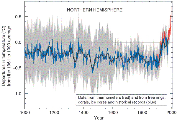
| | + | Berkeley Earth is a non-profit organization created by Professor Richard Muller, Prof Physics, UCBerkeley that focuses on researching about global warming. Some of their graphic works is as following: |
| | + | |
| | + | [[File:Loc project be1.png|700px|center]] |
| | + | |
| | + | Annual Average Global Temperatures |
| | + | |
| | + | [[File:Loc project be2.png|700px|center]] |
| | + | |
| | + | Series Comparison. Anomalies of the global temperature index of provided by several groups is depicted for the 1980 to present time period. |
| | + | |
| | + | [[File:Loc project be3.png|700px|center]] |
| | + | |
| | + | Comparison of the baseline method with the alternative method. |
| | + | |
| | + | Climate Scientist Ed Hawkins at University of Reading has a revolutionary approach on plotting graph. By putting monthly averages on a circular graph, combining with animations, he is able to clearly show the changes in climate deviation from the global average within the 1850-1900 time period. |
| | + | [[File:Loc project be4.gif|700px|center]] |
| | + | |
| | + | Animation depicting changes in climate over a long period of time. |
| | + | |
| | + | [[File:Loc project be5.jpg|700px|center]] |
| | + | |
| | + | Line graph comparing global temperature change over time. |
| | + | |
| | + | These graphics depict the change over a long period of time. However, as static, they don't converse the imagination of change and require experts to understand and read these charts. |
| | + | Our team strikes to identify the climate change issues and translate them into interactive analytics graphs and charts for a clearer understanding of the issue. This is so that even a layman can right away tell how the climate has change over time and where the Earth is heading towards. |
| | + | |
| | + | ==Technical Challenges== |
| | + | We are in the process of gathering data and identifying which data sources are important. The Berkeley Earth organization used Matlab to analyze the data. We might not use the same approach. Instead, we use Tableau and JMP to first explore the data and see patterns in it. Only then, we might consider R or Python t assist us with the analysis of data. |
| | + | |
| | + | |
| | + | D3.js is a powerful tool. However, to create innovative products from it, it requires users not only the understanding of the code but also how DOM manipulation works in html. Our team will first try examples and then try to merge them and play around with the settings. We also hope to understand the library more by reading its documentation. |
| | + | |
| | + | ==Project Milestones== |
| | + | Week 8: Project Proposal |
| | | | |
| − | <div style="border-left: #2d2d2d solid 12px; border-right: #2d2d2d solid 12px; border-bottom: #2d2d2d solid 12px; padding: 0px 0px 0px 0px;"><!--limpeh design this, must give credit hor.-->
| + | Week 9: Collect and clean data |
| − | <div style="background: #2d2d2d; font-weight: padding: 18px 18px 8px 8px;line-height: 1.8em;letter-spacing:-0.1em;font-size:2em; font-family:Verdana;text-transform: uppercase; font-weight:bold"><font color="white"> Project</font> <font color="#f77307">Motivation</font></div>
| |
| − | <div style="background: #2d2d2d;padding: 0 0 14 14 ">
| |
| − | <font color="white" style="font-size:1.2em;">
| |
| − | <p>The problem everyone faces in purchasing a new property is the multitude of factors that influence our decision. The most common means to compare property choices on the layman level would be to input the various property choices and their attributes onto a spreadsheet. Additionally, there are also several externalities that are subtly preferred e.g. preferred close proximity to supermarket or religious places of worship.</p>
| |
| − | <p>However, considering the time, money and effort invested in procuring a place they can call home, we believe that home buyers should be given the opportunity to carry out a more thorough analysis on their choices. Owing to the spatial nature of this decision-making process, our web application <i><b>BOICHU</b></i>, aims to provide users a better visualization of amenities surrounding their property choices. In order to help decision-makers make more informed decisions, our group has developed an application that allows them to do so with the reference to both spatial and non-spatial data. With regards to this unique integration, we have incorporated the usage of Analytic Hierarchy Process (AHP) where they can prioritize the importance of different criterions.</p>
| |
| − | <div style="text-align:right; padding-right:8px; padding-bottom:8px;">Go to [[BOGEO Update Archive|<span style="color:#f77307;">''Archive''</span>]]</div>
| |
| − | </font>
| |
| − | </div>
| |
| − | </div>
| |
| | | | |
| − | <div style="border-left: #2d2d2d solid 12px; border-right: #2d2d2d solid 12px; border-bottom: #2d2d2d solid 12px; padding: 0px 0px 0px 0px;"><!--limpeh design this, must give credit hor.-->
| + | Week 10: Perform exploration of data and patterns |
| − | <div style="background: #2d2d2d; font-weight: padding: 18px 18px 8px 8px;line-height: 1.8em;letter-spacing:-0.1em;font-size:2em; font-family:Verdana;text-transform: uppercase; font-weight:bold"><font color="white"> Related</font> <font color="#f77307">Work</font></div>
| |
| − | <div style="background: #2d2d2d;padding: 0 0 14 14 ">
| |
| − | <font color="white" style="font-size:1.2em;">
| |
| − | <p style="padding-top:6px;"><i>'''Purpose-Built Offices part of property investment portfolio'''</i></p>
| |
| − | <p>With increased interest in purpose-built offices in Malaysia, investors identify the need to leverage on geospatial tools to make better value judgments in investments. In the context of PBOs, properties situated within the Kuala Lumpur Golden Triangle (KLGT) have higher rental values. In the study conducted, five purpose-built offices (PBO) were selected for analysis and primary data was gathered via a questionnaire for the building occupants and secondary data from Geographic Information Systems (GIS) analysis. The first part of the study required survey respondents to prioritize the importance of individual locational characteristics that affect their choice of a PBO. After which, network analysis (to determine distance) is applied to the dataset in order to assign scores for each locational characteristic for each PBO. With the weightages derived from part one multiplied to the scores from part two, a final result was returned for each PBO, with the highest score (termed 'Locational Quality Index') indicating the most suitable PBO for investments.</p><hr noshade/>
| |
| − | <p><i>'''Tsunami-prone Area Categorization'''</i></p>
| |
| − | <p>Owing to the fact that Japan in located near the Pacific of Ring of Fire, this endevaour to conduct pre-planning response and post-disaster recovery procedures in the Ofunato City of Japan focuses on the usage of GIS and AHP. The spatial analysis included the study of factors (also known as criterions in AHP) affecting a grid’s vulnerability and they are land elevation, slope, coastline distance, vegetation density. With the gathered data, the investigators then proceed to apply AHP to prioritize the influence that each of these criterions have in determining the overall vulnerability of a grid, which returns a weightage for each criterion. The derived weighted overlay is then applied to the spatial data (of the five criterions) to generate an overall score which indicates the vulnerability of that respective grid, therein serving as a basis for the formulation of recovery procedures specific to that grid. </p><hr noshade/>
| |
| − | <p><i>'''GIS-based Land Suitability Analysis Using AHP for Public Parks Planning in Larkana City'''</i></p>
| |
| − | <p>The planning of public parks in Larkana City of Pakistan was carried out by integrating a Geographic Information System (GIS) alongside the use of the Analytic Hierarchy Process framework to evaluate multiple criteria. Specifically, the decision support system software was that of ExpertChoice, which was used to determine the weights based on three alternative scenarios — land availability, land value and population density. These three scenarios were performed in raster format and analyzed in ArcGIS, a popular GIS software. The three scenarios were then combined to determine the potential land space that best fit the criteria involved in the decision-making process. This particular case in point highlights the tedium involved in integrating AHP and GIS into the decision making process — they exist as separate applications and the information from one has to be ported to the other by manual means, therein underscoring the prevalent silo-ed nature of such applications.</p>
| |
| − | </font>
| |
| − | </div>
| |
| − | </div>
| |
| | | | |
| − | <div style="border-left: #2d2d2d solid 12px; border-right: #2d2d2d solid 12px; border-bottom: #2d2d2d solid 12px; padding: 0px 0px 0px 0px;"><!--limpeh design this, must give credit hor.-->
| + | Week 11: First prototype of the analytics site |
| − | <div style="background: #2d2d2d; font-weight: padding: 18px 18px 8px 8px;line-height: 1.8em;letter-spacing:-0.1em;font-size:2em; font-family:Verdana;text-transform: uppercase; font-weight:bold"><font color="white"> Data </font> <font color="#f77307">Preparation</font></div>
| |
| − | <div style="background: #2d2d2d;padding: 0 0 14 14 ">
| |
| − | <font color="white" style="font-size:1.2em;">
| |
| − | <p>
| |
| − | # Data was crawled from the Singapore Sports Council site prior to its revamp, and the [http://www.singhealth.com.sg/PatientCare/GP/Pages/Home.aspx <span style="color:#f77307">SingHealth</span>] site to obtain the addresses of the stadiums and GP clinics respectively using [http://scrapy.org <span style="color:#f77307">scrapy</span>].
| |
| − | # Subsequently, the geocoding of these landmarks were done using by means of a node.js [http://wiki.smu.edu.sg/1314T2is415/IS415_2013-14_Term2_Assign1_Sim_Li_Chien <span style="color:#f77307">geocoder</span>].
| |
| − | # The geocoded locations were then loaded into QGIS and thereafter saved as GeoJSON for use with the leaflet libraries.
| |
| − | </p>
| |
| − | </font>
| |
| − | </div>
| |
| − | </div>
| |
| | | | |
| − | <div style="border-left: #2d2d2d solid 12px; border-right: #2d2d2d solid 12px; border-bottom: #2d2d2d solid 12px; padding: 0px 0px 0px 0px;"><!--limpeh design this, must give credit hor.-->
| + | Week 12: One innovative feature |
| − | <div style="background: #2d2d2d; font-weight: padding: 18px 18px 8px 8px;line-height: 1.8em;letter-spacing:-0.1em;font-size:2em; font-family:Verdana;text-transform: uppercase; font-weight:bold"><font color="white"> AHP </font> <font color="#f77307">Implementation</font></div>
| |
| − | <div style="background: #2d2d2d;padding: 0 0 14 14 ">
| |
| − | <font color="white" style="font-size:1.2em;">
| |
| − | <p>There are only a handful of applications which incorporate the analysis of spatial and non-spatial data. Geospatial Analytics has been a very common and handy tool when it comes to evaluating a selected location, but is limited to only spatial data. However, when it comes to assessing locational characteristics, we firmly believe that non-spatial characteristics such as land parcel valuation or transaction prices should also be taken into consideration. Hence, in order to allow for better geographical analysis, our group is convinced that the incorporation of Geospatial Analytics and AHP will prove to be insightful. </p>
| |
| − | <p>Devised some 30 years ago, Analytic Hierarchy Process (AHP) was introduced as a multi-criterion decision making tool. It has since been implemented in various contexts, from deciding which primary school to send children to, to procurement and strategic sourcing in organisations. AHP captures its user's consideration for multiple criterions in decision making, and returns a priority index (also known as priority weights) ranking the importance of each criterion to the user. Based on the generated weights for each criterion, the user will proceed to compare his or her choices against one another in terms of each criterion. Similarly, a priority index is generated but this time round, it shows the ranking of choices in terms of which criterions the user preferred best. </p>
| |
| − | <p>Taking it to the next level, AHP can also be used with multiple inputs from different users. There are various instances where decisions involve more than just one stakeholder. For example, choosing a location to set up a new school; stakeholders involved are such as SLA (who plans exactly the purpose for each state-owned land parcel), the potential school board, NEA (preservation of nature) etc. Also, in the context of our application, buying a new home is very commonly a decision made between two or more parties.</p>
| |
| − | <div style="text-align:right; padding-right:8px; padding-bottom:8px; color:#fff;">Go to [[AHP Implementation Details|<span style="color:#f77307;">''AHP Implementation Details'' </span>]]</div>
| |
| − | </font>
| |
| − | </div>
| |
| − | </div>
| |
| | | | |
| − | <div style="border-left: #2d2d2d solid 12px; border-right: #2d2d2d solid 12px; border-bottom: #2d2d2d solid 12px; padding: 0px 0px 0px 0px;"><!--limpeh design this, must give credit hor.-->
| + | week 13: Debug and finish the site, create poster |
| − | <div style="background: #2d2d2d; font-weight: padding: 18px 18px 8px 8px;line-height: 1.8em;letter-spacing:-0.1em;font-size:2em; font-family:Verdana;text-transform: uppercase; font-weight:bold"><font color="white"> Application</font> <font color="#f77307">Walkthrough</font></div>
| |
| − | <div style="background: #2d2d2d;padding: 0 0 14 14">
| |
| − | <font color="white" style="font-size:1.2em;">
| |
| − | <center>
| |
| − | <p style="padding-top:12px">
| |
| − | [[Image:App1.png|border|400px]][[Image:App2.png|border|400px]][[Image:App3.png|border|400px]]
| |
| − | </p>
| |
| − | <p>
| |
| − | [[Image:App4.png|border|400px]][[Image:App5.png|border|400px]]
| |
| − | </p>
| |
| − | <p>
| |
| − | Users can toggle through the different thematic maps we have available on <i><b>BOICHU</b></i> to get a better sense of the distribution of amenities and of the property market.
| |
| − | </p>
| |
| − | <hr noshade/>
| |
| − | <p>
| |
| − | {| class="none" style="text-align:center; width: 100%" |+
| |
| − | |-
| |
| − | ! width="33%" style="padding:4px 4px 4px 4px " |<b>THREE</b>
| |
| − | [[Image:App6.png|border|250px]]<br/>
| |
| − | <font style="font-weight:normal; font-style:italic">Users can input up to three of the properties they're interested in, together with the selling price and floor area of each respective choice.</font>
| |
| − | ! width="33%" style="padding:4px 4px 4px 4px " |<b>TWO</b>
| |
| − | [[Image:Ss18.png|border|250px]]<br/>
| |
| − | <font style="font-weight:normal; font-style:italic">Each user will then have to indicate how important each criterion is compared to another, in affecting their decision to buy a particular property.</font>
| |
| − | ! width="33%" style="padding:4px 4px 4px 4px " |<b>ONE</b>
| |
| − | [[Image:Ss17.png|border|250px]]<br/>
| |
| − | <font style="font-weight:normal; font-style:italic">Taking the preferences of both individuals, a final recommendation is made!</font>
| |
| − | |}
| |
| − | </p>
| |
| − | </center>
| |
| − | </font>
| |
| − | </div>
| |
| − | </div>
| |
| | | | |
| − | <div style="border-left: #2d2d2d solid 12px; border-right: #2d2d2d solid 12px; border-bottom: #2d2d2d solid 12px; padding: 0px 0px 0px 0px;"><!--limpeh design this, must give credit hor.-->
| + | week 14: User guide and research paper |
| − | <div style="background: #2d2d2d; font-weight: padding: 18px 18px 8px 8px;line-height: 1.8em;letter-spacing:-0.1em;font-size:2em; font-family:Verdana;text-transform: uppercase; font-weight:bold"><font color="white"> AHP </font> <font color="#f77307">Applicability</font></div>
| |
| − | <div style="background: #2d2d2d;padding: 0 0 14 14 ">
| |
| − | <font color="white" style="font-size:1.2em;">
| |
| − | <p>AHP begets the active participation of decision makers in developing a consensus, and provides a rational basis for decision making (Estoque, 2012). The general idea about decision making revolved around putting ideas and concerns on a spreadsheet canvas, but the idea of attaching weights to the concerns was never sufficiently credible until a formalized process in the form of AHP came about. As depicted above, both spatial variables and non-spatial variables can be viable inputs into AHP to yield an objective prescription. That being said, AHP is a means and not an end; it enables an environment to see decisions and justifications with clarity owing to the quantitative nature of the inputs. </p>
| |
| − | </font>
| |
| − | </div>
| |
| − | </div>
| |
| | | | |
| − | <hr noshade/>
| + | week 15: Prepare for Poster day |
| − | == Comments ==
| |
| − | '''Feedback from Prof. Kam'''<br/>
| |
| − | The research paper should have a section to discuss AHP method. <br/>
| |
| − | --[[User:Tskam|Tskam]] ([[User talk:Tskam|talk]]) 10:36, 13 April 2014 (SGT)<br/>
| |
| − | Hi Prof! We have addressed that under "Methods" in our research paper :) <br/>
| |
| − | --[[User:lichien.sim.2010|Max Sim]] ([[User talk:lichien.sim.2010|talk]]) 15:37, 13 April 2014 (SGT)<br/>
| |
Description of the Problem and Motivation
Recent president candidate of the US, Mr Donald Trump thinks that climate change is a hoax. That is really worrying, especially when current polls are showing that he is having a real chance in winning the election. Our team seeks to validate the climate change's truthfulness by exploring and visualizing ocean, land and weather data. Thus, we hope through this project, we settle the fact once and for all. Moreover, this serves as a tool to raise the awareness and understanding of our mother Earth's health status. How the climate has changed over time, which stage are we in and how many years does Singapore has left to stay above the sea level.
Related Work
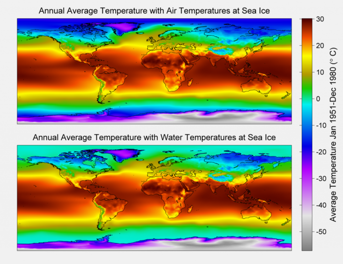
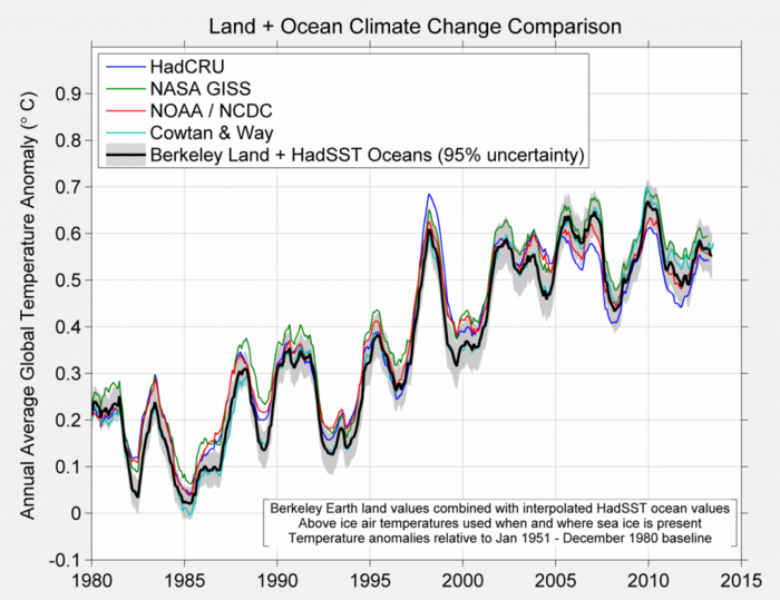
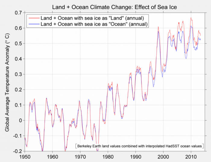
Berkeley Earth is a non-profit organization created by Professor Richard Muller, Prof Physics, UCBerkeley that focuses on researching about global warming. Some of their graphic works is as following:
Annual Average Global Temperatures
Series Comparison. Anomalies of the global temperature index of provided by several groups is depicted for the 1980 to present time period.
Comparison of the baseline method with the alternative method.
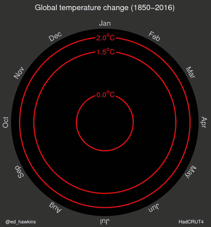
Climate Scientist Ed Hawkins at University of Reading has a revolutionary approach on plotting graph. By putting monthly averages on a circular graph, combining with animations, he is able to clearly show the changes in climate deviation from the global average within the 1850-1900 time period.
Animation depicting changes in climate over a long period of time.
Line graph comparing global temperature change over time.
These graphics depict the change over a long period of time. However, as static, they don't converse the imagination of change and require experts to understand and read these charts.
Our team strikes to identify the climate change issues and translate them into interactive analytics graphs and charts for a clearer understanding of the issue. This is so that even a layman can right away tell how the climate has change over time and where the Earth is heading towards.
Technical Challenges
We are in the process of gathering data and identifying which data sources are important. The Berkeley Earth organization used Matlab to analyze the data. We might not use the same approach. Instead, we use Tableau and JMP to first explore the data and see patterns in it. Only then, we might consider R or Python t assist us with the analysis of data.
D3.js is a powerful tool. However, to create innovative products from it, it requires users not only the understanding of the code but also how DOM manipulation works in html. Our team will first try examples and then try to merge them and play around with the settings. We also hope to understand the library more by reading its documentation.
Project Milestones
Week 8: Project Proposal
Week 9: Collect and clean data
Week 10: Perform exploration of data and patterns
Week 11: First prototype of the analytics site
Week 12: One innovative feature
week 13: Debug and finish the site, create poster
week 14: User guide and research paper
week 15: Prepare for Poster day

