Difference between revisions of "TEN Project Proposal"
| (39 intermediate revisions by 3 users not shown) | |||
| Line 1: | Line 1: | ||
| + | [https://wiki.smu.edu.sg/1617t1IS428g1/Project_Groups Back to Project Group] | ||
{| style="background-color:#FFFFFF; color:#000000 padding: 5px 0 0 0;" width="100%" cellspacing="0" cellpadding="0" valign="top" border="0" | | {| style="background-color:#FFFFFF; color:#000000 padding: 5px 0 0 0;" width="100%" cellspacing="0" cellpadding="0" valign="top" border="0" | | ||
|style="font-size:100%; text-align:center; border-left:1px solid #ffffff; border-right:1px solid #ffffff;background-color:#203470; padding:12px;" width="25%" |[[TEN Project Proposal| <font color="#FFF"><b>PROJECT DETAILS</b></font>]] | |style="font-size:100%; text-align:center; border-left:1px solid #ffffff; border-right:1px solid #ffffff;background-color:#203470; padding:12px;" width="25%" |[[TEN Project Proposal| <font color="#FFF"><b>PROJECT DETAILS</b></font>]] | ||
| Line 5: | Line 6: | ||
|style="font-size:100%; text-align:center;border-left:1px solid #ffffff; border-right:1px solid #ffffff; background-color:#5478E4; " width="25%" |[[TEN Report |<font color="#ffffff"><b>REPORT</b></font>]] | |style="font-size:100%; text-align:center;border-left:1px solid #ffffff; border-right:1px solid #ffffff; background-color:#5478E4; " width="25%" |[[TEN Report |<font color="#ffffff"><b>REPORT</b></font>]] | ||
|} | |} | ||
| + | <br> | ||
| + | <div style="background: #dce6f9; line-height: 0.3em; font-family:Century Gothic; border-left: #003464 solid 15px;"><div style="border-left: #FFFFFF solid 5px; padding:15px;font-size:15px;"><font color= "#000000"><strong>Problem & Motivation</strong></font></div></div> | ||
| + | Forecasting time series data requires technical knowledge and specialised software, making it difficult to do for most people. Even for those with the required resources, completing the entire forecasting process requires many complicated steps to be done manually, making it a tedious process. This problem is exacerbated when forecasting for different datasets is required and the entire process is repeated multiple times. Therefore we would like to create a web application for business and government agencies to be able to assist these organisations in predicting the future performance of their operations by simplify the process. | ||
| + | <br> | ||
| + | <div style="background: #dce6f9; line-height: 0.3em; font-family:Century Gothic; border-left: #003464 solid 15px;"><div style="border-left: #FFFFFF solid 5px; padding:15px;font-size:15px;"><font color= "#000000"><strong>Approach</strong></font></div></div> | ||
| + | The application aims to provide users with the following capabilities:<br><br> | ||
| + | <b>1. To be able to allow users to select their own data for analysis</b><br> | ||
| + | This will be achieved by dynamically generating the filters based on the columns in the dataset. Taking the Singapore Tourism data as an example, users will be able to filter by Country and Date.<br><br> | ||
| − | + | <b>2. To allow users to provide inputs for exploring and understanding their data through the visualisations</b><br> | |
| − | + | During the data discovery and exploration of the time series data, the exploration will be made as realistic as possible. For example, correlogram includes specifying of lags/periods, hence we will give the user the autonomy to explore the data by specifying their own input value.<br><br> | |
| − | + | <b>3. To allow users to generate forecasts quickly and easily</b><br> | |
| + | This will be achieved by providing selections and inputs for the users to generate forecasts of different methods.<br><br> | ||
| − | + | <b>4. To allow users to compare the performance of the generated forecasting results</b><br> | |
| + | This will be achieved by providing various forecasting methods and the results of each forecasting methods such that users can estimate the accuracy of the models. | ||
| − | + | <br> | |
| − | |||
| − | === | + | <div style="background: #dce6f9; line-height: 0.3em; font-family:Century Gothic; border-left: #003464 solid 15px;"><div style="border-left: #FFFFFF solid 5px; padding:15px;font-size:15px;"><font color= "#000000"><strong>Related Works</strong></font></div></div> |
| − | + | To better understand forecasting models and time series, our team has looked into the forecasting functions in JMP Pro and related applications that were built with R. This is to understand the visulisations that we should use and terms and models used in forecasting.<br><br> | |
| + | <b>JMP Pro</b><br> | ||
| + | Looking at how forecasting is done in JMP:<br> | ||
| + | - Forecasting in JMP includes the following default visualisations: Time series, Autocorrelation and Partial Autocorrelation<br> | ||
| + | [[File: VASS2.png |800px]]<br><br> | ||
| + | - Users can specify lags for autocorrelation<br> | ||
| + | [[File: VASS1.png |800px]]<br><br> | ||
| + | - Using the ARIMA forecasting, the user can specify 3 parameters and generate different combinations<br> | ||
| + | [[File: VASS3.png |800px]][[File: VASS4.png |800px]]<br><br> | ||
| + | - Remove linear trend with decomposition and differencing<br><br> | ||
| + | [[File: VASS5.png |800px]]<br><br> | ||
| + | <b>SHOW ME SHINY - GALLERY OF R WEB APPS: Time Series</b><br> | ||
| + | The app developer has shown various forecasting models and is also developed with ShinyR: <br><br> | ||
| + | [[File: TEN2.png |800px]]<br><br> | ||
| + | <b>ARIMA model analysis</b><br> | ||
| + | The link to the app is broken however we are able to access the code and screenshot. We can make use of the inputs parameters as shown in the screenshot and make our web app flexible as well.<br><br> | ||
| + | [[File: TEN1.PNG |800px]]<br><br> | ||
| + | <b>Time series forecasting</b><br> | ||
| + | Regression Method, Neural Network, ARIMA Method<br><br> | ||
| − | + | Our team feels that it will be helpful in our development since it is also developed with ShinyR, we could reference if we are unsure of the functions to be used. Also the visualisation is useful in helping us to explore and hence we know what to visualise. <br><br> | |
| − | |||
| − | |||
| − | === | + | |
| − | + | <div style="background: #dce6f9; line-height: 0.3em; font-family:Century Gothic; border-left: #003464 solid 15px;"><div style="border-left: #FFFFFF solid 5px; padding:15px;font-size:15px;"><font color= "#000000"><strong>References</strong></font></div></div> | |
| + | <b>Related Works</b><br> | ||
| + | 1. SHOW ME SHINY - GALLERY OF R WEB APPS: [http://www.showmeshiny.com/category/stats/time-series/ Time Series] | ||
<br><br> | <br><br> | ||
| − | == | + | <b>Data sources</b><br> |
| + | 1. CEIC: [https://www.ceicdata.com/en/ Data on Visitor arrivals, Revenue and Expenditure]<br> | ||
| + | 2. Singapore Tourism Board (STB): Data on [https://www.stb.gov.sg/statistics-and-market-insights/Pages/statistics-Hotel-Statistics.aspx/ Hotel statistics] and [https://www.stb.gov.sg/statistics-and-market-insights/Pages/statistics-Quarterly-Tourism-Performance-Report.aspx/ Tourism sector performance] <br><br> | ||
| + | |||
| + | <div style="background: #dce6f9; line-height: 0.3em; font-family:Century Gothic; border-left: #003464 solid 15px;"><div style="border-left: #FFFFFF solid 5px; padding:15px;font-size:15px;"><font color= "#000000"><strong>Key Challenges</strong></font></div></div> | ||
| + | <b>ShinyR</b><br> | ||
| + | In order to leverage on the various forecasting models that is available in R and its libraries, our group will be be using ShinyR to develop our web application. ShinyR also provides the platform to create a dashboard.However, our team forsee the learning of R to be a major challenge as none of us has build a web application with ShinyR, and based on intital research, the R syntax is also quite different.<br><br> | ||
| − | + | <b>Forecasting Model & Visualisations</b><br> | |
| − | + | As our group is working on providing a platform for forecasting, we needed to understand the various methods that are available and the visualisations that will be useful for the users to identify the hidden patterns in their data. | |
| − | |||
| − | |||
| − | == | + | <br> |
| − | + | <div style="background: #dce6f9; line-height: 0.3em; font-family:Century Gothic; border-left: #003464 solid 15px;"><div style="border-left: #FFFFFF solid 5px; padding:15px;font-size:15px;"><font color= "#000000"><strong>Milestones</strong></font></div></div> | |
| − | + | [[File: TEN-Milestones.png |800px]] | |
| + | |||
| + | <br> | ||
| + | <div style="background: #dce6f9; line-height: 0.3em; font-family:Century Gothic; border-left: #003464 solid 15px;"><div style="border-left: #FFFFFF solid 5px; padding:15px;font-size:15px;"><font color= "#000000"><strong>Future Work</strong></font></div></div> | ||
| + | <b> 1. Comparing multiple forecasting methods & finding the best</b><br> | ||
| + | Our application will only be showing the results of forecasting for users to evaluate the accuracy of each. However, it will be better if the application could compare and recommend the best, such that users with no prior knowledge of forecasting can easily understand the results.<br><br> | ||
| + | |||
| + | <b> 2. Forecasting of stream data</b><br> | ||
| + | Our application can work towards forcasting live data source. This would eliminated the need for users to upload their own data manually.<br><br> | ||
| + | |||
| + | <b> 3. Allowing wider range of data formats</b><br> | ||
| + | Our application will only allow the reading of csv data file. With a wider range of formats, it will be more flexible for the user. | ||
| + | |||
| + | <br> | ||
| + | <div style="background: #dce6f9; line-height: 0.3em; font-family:Century Gothic; border-left: #003464 solid 15px;"><div style="border-left: #FFFFFF solid 5px; padding:15px;font-size:15px;"><font color= "#000000"><strong>Thought Process</strong></font></div></div> | ||
| − | + | [[File: TEN4.jpg |800px]]<br><br> | |
| − | + | <b>First Tab: Dynamic Filters</b> | |
| + | Filters should be dynamically generated from the data source as user inputs/filters.<br><br> | ||
| − | + | [[File: TEN3.jpg |800px]]<br><br> | |
| + | <b>First Tab: Time series & Correlogram</b><br> | ||
| + | To allow users to do the exploration first before moving to the next tab which is applying forecasting models. The visualisations will include time series graph to look at the trend for the past periods and correlogram to understand the correlation between the lags/periods. We want to allow users to explore the data by smoothing the linear trend with decomposition and differencing with different differences. As for the correlogram, it should allow users to specify the number of lags/periods that they would like to see.<br><br> | ||
| − | + | [[File: TEN6.jpg |800px]]<br><br> | |
| + | <b>Second Tab: Forecasting Models & Results</b><br> | ||
| + | After the data exploration in the first tab, users are now ready to perform forecasting with the models provided. Similarly, we want to give users the autonomy to select different models and inputs. We would also provide the results for users to evaluate the accurracy of the model. | ||
| − | ==Comments | + | <br> |
| + | <div style="background: #dce6f9; line-height: 0.3em; font-family:Century Gothic; border-left: #003464 solid 15px;"><div style="border-left: #FFFFFF solid 5px; padding:15px;font-size:15px;"><font color= "#000000"><strong>Comments</strong></font></div></div> | ||
| + | <br><br> | ||
Latest revision as of 06:44, 28 November 2016
| PROJECT DETAILS | PROJECT POSTER | PROJECT APPLICATION | REPORT |
Forecasting time series data requires technical knowledge and specialised software, making it difficult to do for most people. Even for those with the required resources, completing the entire forecasting process requires many complicated steps to be done manually, making it a tedious process. This problem is exacerbated when forecasting for different datasets is required and the entire process is repeated multiple times. Therefore we would like to create a web application for business and government agencies to be able to assist these organisations in predicting the future performance of their operations by simplify the process.
The application aims to provide users with the following capabilities:
1. To be able to allow users to select their own data for analysis
This will be achieved by dynamically generating the filters based on the columns in the dataset. Taking the Singapore Tourism data as an example, users will be able to filter by Country and Date.
2. To allow users to provide inputs for exploring and understanding their data through the visualisations
During the data discovery and exploration of the time series data, the exploration will be made as realistic as possible. For example, correlogram includes specifying of lags/periods, hence we will give the user the autonomy to explore the data by specifying their own input value.
3. To allow users to generate forecasts quickly and easily
This will be achieved by providing selections and inputs for the users to generate forecasts of different methods.
4. To allow users to compare the performance of the generated forecasting results
This will be achieved by providing various forecasting methods and the results of each forecasting methods such that users can estimate the accuracy of the models.
To better understand forecasting models and time series, our team has looked into the forecasting functions in JMP Pro and related applications that were built with R. This is to understand the visulisations that we should use and terms and models used in forecasting.
JMP Pro
Looking at how forecasting is done in JMP:
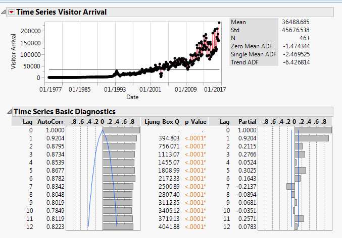
- Forecasting in JMP includes the following default visualisations: Time series, Autocorrelation and Partial Autocorrelation
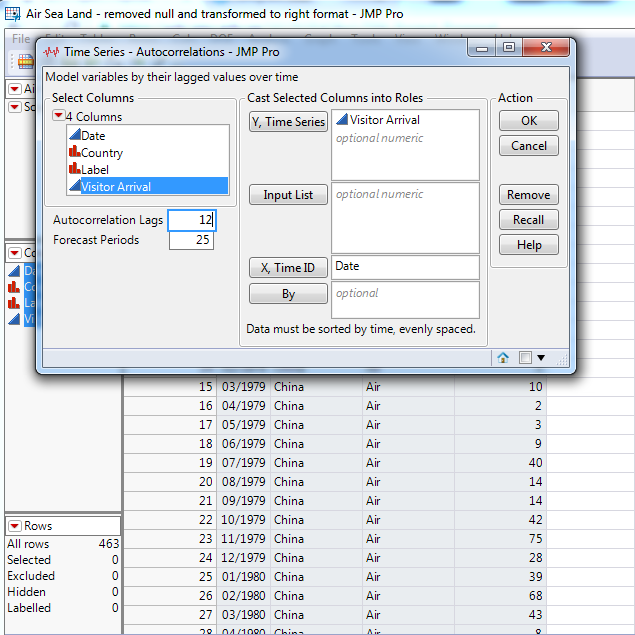
- Users can specify lags for autocorrelation
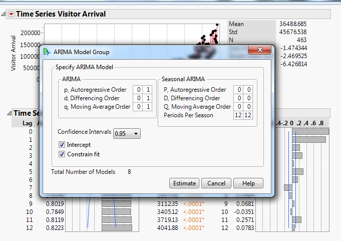
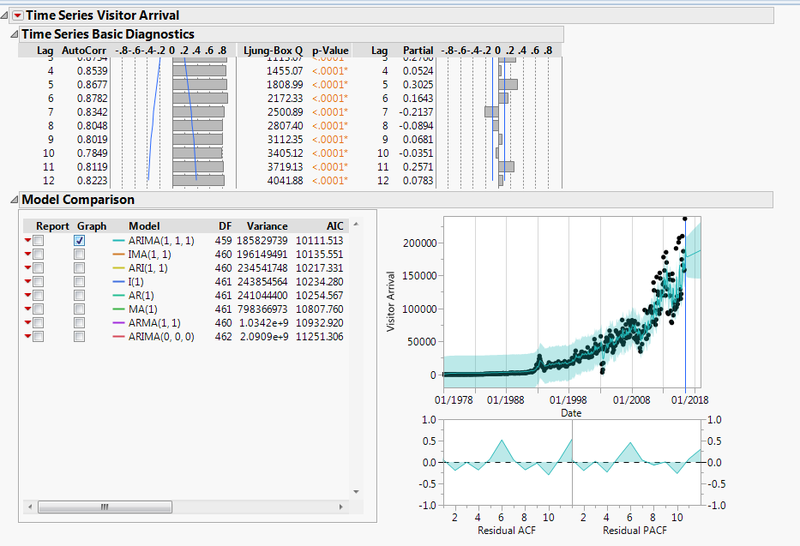
- Using the ARIMA forecasting, the user can specify 3 parameters and generate different combinations
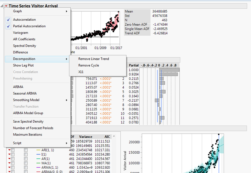
- Remove linear trend with decomposition and differencing
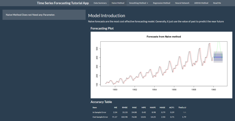
SHOW ME SHINY - GALLERY OF R WEB APPS: Time Series
The app developer has shown various forecasting models and is also developed with ShinyR:
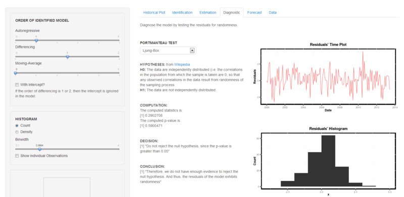
ARIMA model analysis
The link to the app is broken however we are able to access the code and screenshot. We can make use of the inputs parameters as shown in the screenshot and make our web app flexible as well.
Time series forecasting
Regression Method, Neural Network, ARIMA Method
Our team feels that it will be helpful in our development since it is also developed with ShinyR, we could reference if we are unsure of the functions to be used. Also the visualisation is useful in helping us to explore and hence we know what to visualise.
Related Works
1. SHOW ME SHINY - GALLERY OF R WEB APPS: Time Series
Data sources
1. CEIC: Data on Visitor arrivals, Revenue and Expenditure
2. Singapore Tourism Board (STB): Data on Hotel statistics and Tourism sector performance
ShinyR
In order to leverage on the various forecasting models that is available in R and its libraries, our group will be be using ShinyR to develop our web application. ShinyR also provides the platform to create a dashboard.However, our team forsee the learning of R to be a major challenge as none of us has build a web application with ShinyR, and based on intital research, the R syntax is also quite different.
Forecasting Model & Visualisations
As our group is working on providing a platform for forecasting, we needed to understand the various methods that are available and the visualisations that will be useful for the users to identify the hidden patterns in their data.
1. Comparing multiple forecasting methods & finding the best
Our application will only be showing the results of forecasting for users to evaluate the accuracy of each. However, it will be better if the application could compare and recommend the best, such that users with no prior knowledge of forecasting can easily understand the results.
2. Forecasting of stream data
Our application can work towards forcasting live data source. This would eliminated the need for users to upload their own data manually.
3. Allowing wider range of data formats
Our application will only allow the reading of csv data file. With a wider range of formats, it will be more flexible for the user.
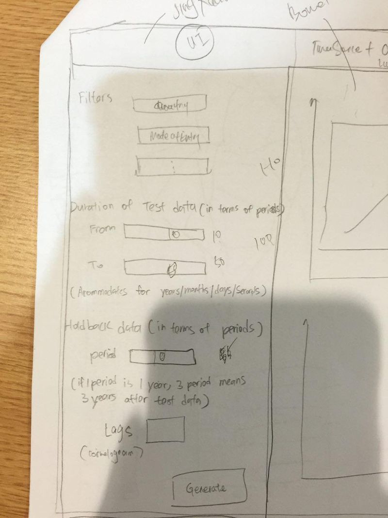
First Tab: Dynamic Filters
Filters should be dynamically generated from the data source as user inputs/filters.
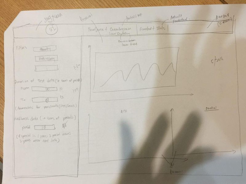
First Tab: Time series & Correlogram
To allow users to do the exploration first before moving to the next tab which is applying forecasting models. The visualisations will include time series graph to look at the trend for the past periods and correlogram to understand the correlation between the lags/periods. We want to allow users to explore the data by smoothing the linear trend with decomposition and differencing with different differences. As for the correlogram, it should allow users to specify the number of lags/periods that they would like to see.
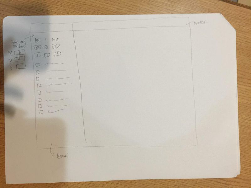
Second Tab: Forecasting Models & Results
After the data exploration in the first tab, users are now ready to perform forecasting with the models provided. Similarly, we want to give users the autonomy to select different models and inputs. We would also provide the results for users to evaluate the accurracy of the model.
