Difference between revisions of "Slamdunkers Proposal"
Yktan.2013 (talk | contribs) |
|||
| Line 39: | Line 39: | ||
<br /> | <br /> | ||
In this project, we aim to provide a visualisation for scouts to perform the following: | In this project, we aim to provide a visualisation for scouts to perform the following: | ||
| − | * | + | * Overview of basketball season performance as a whole |
| − | * | + | * Compare stats between different players |
| − | * | + | * Evaluate player's strengths and weaknesses |
| − | |||
<br /> | <br /> | ||
Revision as of 19:38, 29 October 2016
The National Basketball Association (NBA) is the pre-eminent men's professional basketball league in North America, and is widely considered to be the premier men's professional basketball league in the world. It is considered to be one of the four major sports in the United States and Canada. According to an article by Business Insider, NBA is the highest-paying league in the world. Numerous star players such as Kobe Bryant, Lebron James and Kevin Durant are among the world’s highest-paid sportsmen listed by Forbes in 2016.
In attempt to win the championship each season, NBA teams often scout top performing players to join them. These scouts often sit in the games to monitor and evaluate players’ performances, skills and techniques. Putting all these information together, they get an overview of all the players capabilities and their standing against other players.
With the rise in data and technology, there becomes a new way for scouts to evaluate players. They can leverage on this new data to get a more detailed understanding of players’ performances. For example, they would be able to know from what distance is the player most comfortable shooting from. These new insights can offer scouts a more accurate assessment on the players.
In this project, we aim to provide a visualisation for scouts to perform the following:
- Overview of basketball season performance as a whole
- Compare stats between different players
- Evaluate player's strengths and weaknesses
Our selected dataset is downloaded from Kaggle. The original data is extracted from the NBA of ESPN by using the REST API. The data is based on the NBA 2015-16 season.
The rationale for the range of data used for our analysis are as follow:
- The data contains 128069 records of shots made in the season. With the detailed information, it allows us to carry out more accurate analysis based on each shot.
- The attributes is based on the statistics of the players and games. It enables us to find out how each player performed in different periods of the game.
The table shows the data dictionary of the dataset.
| Label | Description |
|---|---|
| Game ID | Identification number of each game |
| Date | Date of game |
| Player Team | Player's team |
| Opponent Team | Opponent team |
| Home/Away | If player's team is on home ground |
| Win/Lose | If player's team win or lose |
| Game Score Difference | Difference in total game score |
| Shot Number | N-th shot made by the player |
| Period | Period of the game when the shot was made |
| Game Clock | Game time when the shot was made |
| Shot Clock | Shot time when the shot was made |
| Dribbles | Number of times the player dribbled before the shot was made |
| Touch Time | Total time held by the player before the shot was made |
| Shot Distance | Distance from the basket when the shot was made |
| Point Type | If shot attempt is 2 or 3 points |
| Shot Result | Result of the shot |
| Closest Defender | Name of the closest opponent defender |
| Distance from Closest Defender | Distance between player and the closest opponent defender when the shot was made |
| Field Goal Made | If a goal was made |
| Points | Points earned by the player's shot |
| Player Name | Name of the player who made the shot |
| Visualization | Description |
|---|---|
|
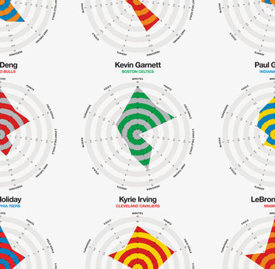
Viewing player's strengths In our survey, we find that the radar chart is a popular method in plotting the relative strength of a player. An example is shown in the diagram. The more highlighted area a player has, the more “strength” the player has. This would be a useful visualization for our purpose. | |
|
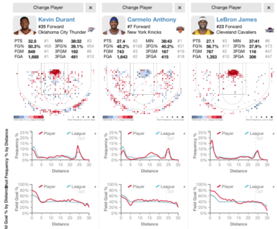
Player shot accuracy over distance Small multiples method is used to plot the player’s shot accuracy over distance. In this case, the line graph helps to show the trend and highlights the peaks where the player does well. | |
|
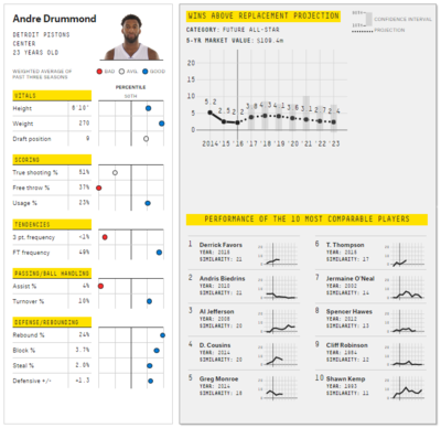
Player statistics by percentile and future value projection The use of percentile helps to show where the player stands when measured against other players. This allows viewer to get a better gauge of the player’s standing. |
Our approach is to first consider the questions that a scout would ask when scouting for players. These questions include:
- Who are the good shooters?
- What is the most comfortable distance player can shoot from and get a goal? (distribution? precision?)
- Who are the good blockers?
Afterwards, depending on what kind of game tactics that the coach would want to employ, he may consider other questions.
- Is player’s performance consistent during the whole game?
- When does player performance peak?
- Is there a difference in player’s performance when playing on home or away ground? What are the differences?
With these questions, we shall perform some data exploration to get some insights to these questions.
Unfamiliar with visualization softwares
- Start creating visualizations early
- Look up online resources
The steep learning curve of D3.js
- Start early
- Work with tutorials and examples
Motivation
- NBA is the highest-paying league in the world. [1]
- The world’s highest paid athletes [2]
- NBA player salaries [3]
Dataset
| Member | Job scope |
|---|---|
| Alson TAN Yong Kiong aka SlamDunker 1 |
|
| Arnold LEE Wai Tong aka SlamDunker 2 |
|
| LIM Lai Ho aka SlamDunker 3 |
|
Feedback and comments in this area!
