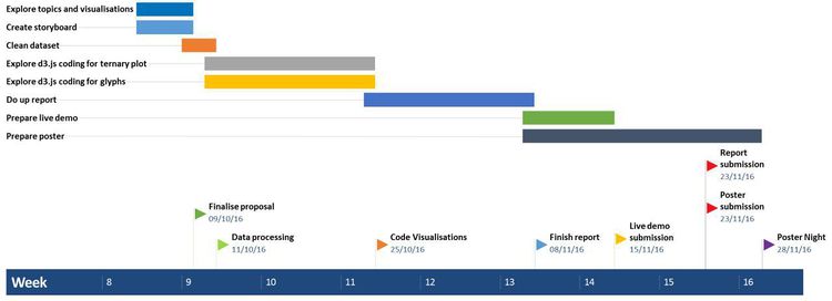
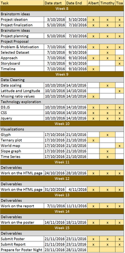
Difference between revisions of "CATalytics"
Albertb.2013 (talk | contribs) |
|||
| (27 intermediate revisions by 3 users not shown) | |||
| Line 3: | Line 3: | ||
{| style="background-color:#f3e180; color:#f3e180 padding: 5px 0 0 0;" width="100%" cellspacing="0" cellpadding="0" valign="top" border="0" | | {| style="background-color:#f3e180; color:#f3e180 padding: 5px 0 0 0;" width="100%" cellspacing="0" cellpadding="0" valign="top" border="0" | | ||
| − | | style="padding:0.3em; font-family:Segoe UI; font-size:120%; border-bottom:2px solid #f3e180; border-top:2px solid #f3e180; border-left:2px solid #f3e180; background:#614333; text-align:center;" width=" | + | | style="padding:0.3em; font-family:Segoe UI; font-size:120%; border-bottom:2px solid #f3e180; border-top:2px solid #f3e180; border-left:2px solid #f3e180; text-align:center;" width="19%" | |
| + | |||
| + | [[Project_Groups|<font color="#FFFFFF"><B>HOME</B></font>]] | ||
| + | | style="border-bottom:2px solid #f3e180; border-top:2px solid #f3e180; background:#f3e180;" width="1%" | | ||
| + | | style="padding:0.3em; font-family:Segoe UI; font-size:120%; border-bottom:2px solid #f3e180; border-top:2px solid #f3e180; background:#614333; text-align:center;" width="19%" | | ||
| + | |||
[[CATalytics|<font color="#FFFFFF"><B>PROPOSAL</B></font>]] | [[CATalytics|<font color="#FFFFFF"><B>PROPOSAL</B></font>]] | ||
| style="border-bottom:2px solid #f3e180; border-top:2px solid #f3e180; background:#f3e180;" width="1%" | | | style="border-bottom:2px solid #f3e180; border-top:2px solid #f3e180; background:#f3e180;" width="1%" | | ||
| − | | style="padding:0.3em; font-family:Segoe UI; font-size:120%; border-bottom:2px solid #f3e180; border-top:2px solid #f3e180; background:#f3e180; text-align:center;" width=" | + | | style="padding:0.3em; font-family:Segoe UI; font-size:120%; border-bottom:2px solid #f3e180; border-top:2px solid #f3e180; background:#f3e180; text-align:center;" width="19%" | |
| + | |||
[[CATalytics_Poster|<font color="#FFFFFF"><B>POSTER</B></font>]] | [[CATalytics_Poster|<font color="#FFFFFF"><B>POSTER</B></font>]] | ||
| style="border-bottom:2px solid #f3e180; border-top:2px solid #f3e180; background:#f3e180;" width="1%" | | | style="border-bottom:2px solid #f3e180; border-top:2px solid #f3e180; background:#f3e180;" width="1%" | | ||
| − | | style="padding:0.3em; font-family:Segoe UI; font-size:120%; border-bottom:2px solid #f3e180; border-top:2px solid #f3e180; background:#f3e180; text-align:center;" width=" | + | | style="padding:0.3em; font-family:Segoe UI; font-size:120%; border-bottom:2px solid #f3e180; border-top:2px solid #f3e180; background:#f3e180; text-align:center;" width="19%" | |
| + | |||
[[CATalytics_Application|<font color="#FFFFFF"><B>APPLICATION</B></font>]] | [[CATalytics_Application|<font color="#FFFFFF"><B>APPLICATION</B></font>]] | ||
| style="border-bottom:2px solid #f3e180; border-top:2px solid #f3e180; background:#f3e180;" width="1%" | | | style="border-bottom:2px solid #f3e180; border-top:2px solid #f3e180; background:#f3e180;" width="1%" | | ||
| − | | style="padding:0.3em; font-family:Segoe UI; font-size:120%; border-bottom:2px solid #f3e180; border-top:2px solid #f3e180; background:#f3e180; text-align:center;" width=" | + | | style="padding:0.3em; font-family:Segoe UI; font-size:120%; border-bottom:2px solid #f3e180; border-top:2px solid #f3e180; background:#f3e180; text-align:center;" width="19%" | |
| + | |||
[[CATalytics_Research Paper|<font color="#FFFFFF"><B>RESEARCH PAPER</B></font>]] | [[CATalytics_Research Paper|<font color="#FFFFFF"><B>RESEARCH PAPER</B></font>]] | ||
| style="border-bottom:2px solid #f3e180; border-top:2px solid #f3e180; background:#f3e180;" width="1%" | | | style="border-bottom:2px solid #f3e180; border-top:2px solid #f3e180; background:#f3e180;" width="1%" | | ||
| Line 21: | Line 29: | ||
<div style="background:#f3e180; padding: 5px; font-weight: bold; line-height: 1em; text-indent: 15px; border-left: #614333 solid 32px; font-size: 20px"><font color="#614333">PROBLEM</font><font color="#FFFFFF"> &</font> <font color="#614333"> MOTIVATION</font></div> | <div style="background:#f3e180; padding: 5px; font-weight: bold; line-height: 1em; text-indent: 15px; border-left: #614333 solid 32px; font-size: 20px"><font color="#614333">PROBLEM</font><font color="#FFFFFF"> &</font> <font color="#614333"> MOTIVATION</font></div> | ||
| − | According to a survey of more than 14,000 international students in Australia and the UK, 77% of students listed both university and subject rankings as “very important” when deciding a place to study. As such, given the importance of these rankings in decision-making, we were inclined to provide an interactive outlet to aid students in their decision-making process. | + | According to a [https://www.timeshighereducation.com/world-university-rankings/news/university-rankings-most-important-factor-for-international-students/ survey] of more than 14,000 international students in Australia and the UK, 77% of students listed both university and subject rankings as “very important” when deciding a place to study. As such, given the importance of these rankings in decision-making, we were inclined to provide an interactive outlet to aid students in their decision-making process. |
<BR> | <BR> | ||
| Line 110: | Line 118: | ||
After referencing to multiple previous works that display university rankings, we decided to focus only on [https://www.timeshighereducation.com/world-university-rankings The Times Higher Education World University Rankings] | After referencing to multiple previous works that display university rankings, we decided to focus only on [https://www.timeshighereducation.com/world-university-rankings The Times Higher Education World University Rankings] | ||
| − | The rationale is that the dataset provided is robust enough to tell a good story, and that we cannot feasibly combine data from multiple sources. Our | + | The rationale is that the dataset provided is robust enough to tell a good story, and that we cannot feasibly combine data from multiple sources without having missing or irrelevant values. Our research highlighted existing visualisations of university rankings as shown below. These serve as references to our project so that we are aware of what visualisations are already being used for similar datasets. |
* [http://www.shanghairanking.com/ Academic Ranking of World Universities] | * [http://www.shanghairanking.com/ Academic Ranking of World Universities] | ||
* [http://cwur.org/ Center for World University Rankings] | * [http://cwur.org/ Center for World University Rankings] | ||
| + | {| class="wikitable" | ||
| + | |- | ||
| + | | [[File:TableRank.png|400px|center]] || <b>1) [https://www.timeshighereducation.com/world-university-rankings/2016/world-ranking#!/page/0/length/25/country/0/sort_by/rank_label/sort_order/asc World University Rankings 2015-2016]</b> | ||
| − | + | We started with the web app provided by the official Times Higher Education website itself to see what how they visualized their own dataset. We realised they provided good filtering systems, intuitive drill down/up processes and efficient sorting systems. However, the app was found to be too tabular which could potentially miss out underlying patterns a proper visualization could show. In addition, there were limited ways we could compare between universities of our choices. Thus, we decided that this reference could be used as a baseline to help us understand which filtering categories are important. | |
| − | + | |- | |
| + | |[[File:Parallelcoord.png|400px|center]] || <b>2) [http://www.caleydo.org/publications/2013_infovis_lineup/ Caleydo LineUp: Visual Analysis of Multi-Attribute Rankings]</b> | ||
| + | Next, we wanted to value add to an existing visualisation for university rankings and its factors. In this reference, the user utilizes bar charts and parallel coordinates to show how each key indicators relate to one another. Though it is already informative, we wanted to find an alternative way to not only showcase different types of comparisons between universities within a year but also attempt to form a visualization that could compare universities across the years. | ||
| + | |- | ||
| + | | [[File:Correlogram.PNG|400px|center]]<br>[[File:Scatterplot.PNG|400px|center]] || <b>3) [https://www.kaggle.com/pozdniakov/d/mylesoneill/world-university-rankings/which-universities-do-good-science/notebook Which universities do good science?]</b> | ||
| − | + | This work from Kaggle itself shows us the benchmark and inspiration for which variables are used to compare and gain insights from. The work features mostly scatterplots linked to a correlogram. The correlogram shows the proportion of the dataset which linearly correlates with each other based on specific 2 variables. Specific scatterplots, which are linked from this correlogram, are selected to be further analysed. Through this, we decided to create a similar multi-variate approach to visualise the data through the use of glyphs and ternary plots. | |
| − | + | |- | |
| + | | [[File:Slope.png|400px|center]] || <b> 4) [http://www.edwardtufte.com/bboard/q-and-a-fetch-msg?msg_id=0000Jr Slope Graph]</b> | ||
| + | A slope graph enables us to see how each performance metric of a certain university changes relative to the rest of universities. In this example, the change in relative survival rates over the years has inspired us to do something along the same lines as this. | ||
| + | |} | ||
| − | <b> | + | Referencing from these visualisations, we decided to employ different visualisation techniques. We have explained the rationale below. |
| − | + | {| class="wikitable" | |
| − | + | |- | |
| − | < | + | | [[File:Glyph.PNG|400px|center]] || <b>[http://bl.ocks.org/nbremer/6506614 Spider Chart (Glyph)]</b> |
| + | * Glyphs can handle multiple variables. In our dataset, we have pin-pointed 5 main performance indicators which affect the university rankings. | ||
| + | * Glyphs also allow layering of data for comparison, either across years or among different schools. | ||
| + | * The larger the area plotted in a glyph, the higher the different performance indicators as well as the ranking of the selected school. Hence, at a glance, we can observe which schools are ranked higher than the other. | ||
| + | * Glyphs also allow us to pinpoint which performance indicators of a specific school are more highly ranked. | ||
| + | |- | ||
| + | | [[File:TernaryPlot.PNG|400px|center]] || <b>[https://plot.ly/javascript/ternary-plots/ Ternary Plot]</b> | ||
| + | * Ternary plots allow us to observe the correlation of 3 variables - M/F ratio, Student/Teacher ratio and Local/International student ratio. This allows us to observe the movement in trend across years of specific schools through the movement of data points within a ternary chart. | ||
| + | * From this chart, we can also observe how important one ratio is over another, and how this affects the ranking of the specific school. | ||
| + | |- | ||
| + | | [[File:D3js_map.PNG|400px|center]] || <b>[http://bl.ocks.org/d3noob/5193723 World Map (with zoom/pan capabilities)]</b> | ||
| + | * A zoomable map allows us to focus on certain countries or regions where schools on the university ranking are located | ||
| + | * For more information on the school, users can click the pins on the map to be brought to a Google search of the school | ||
| + | |- | ||
| + | |[[File:Parallelcoordeg.jpg|400px|center]] || <b>[http://www.caleydo.org/publications/2013_infovis_lineup/ Caleydo LineUp: Visual Analysis of Multi-Attribute Rankings]</b> | ||
| + | * Parallel coordinates is a great way to show how ranks of school changes over the years | ||
| + | * We also decided to use it as a base filter that links to all other visuals | ||
| + | * One can select which universities & year via the parallel coordinate plot, hit a "run" button, and see the selected results displayed on our map, glyph and ternary plots for comparison purposes and further insights. | ||
| + | |- | ||
| + | |[[File:Slope.png|400px|center]] || <b> [http://www.edwardtufte.com/bboard/q-and-a-fetch-msg?msg_id=0000Jr: Slope Graph]</b> | ||
| + | * A slope graph enables us to see how each performance metric of a certain university changes relative to the rest of universities each year. | ||
| + | * It enables the user to compare across the chosen universities and years, the relative positions of their individual performance metrics relative to all other universities | ||
| + | |} | ||
<div style="background:#f3e180; padding: 5px; font-weight: bold; line-height: 1em; text-indent: 15px; border-left: #614333 solid 32px; font-size: 20px"><font color="#614333">STORYBOARD</font></div> | <div style="background:#f3e180; padding: 5px; font-weight: bold; line-height: 1em; text-indent: 15px; border-left: #614333 solid 32px; font-size: 20px"><font color="#614333">STORYBOARD</font></div> | ||
| Line 138: | Line 178: | ||
! Screen !! Description | ! Screen !! Description | ||
|- | |- | ||
| − | | [[File:Storyboard_-_Page_1.jpg|400px|center]] || <b>Screen 1 - Analysing a single university/multiple universities according to performance indicator</b><br>The first button " | + | | [[File:Storyboard_-_Page_1.jpg|400px|center]]<br>[[File:Storyboard_v2_-_Page_3.jpg|400px|center]]|| <b>Screen 1 - Analysing a single university/multiple universities according to performance indicator</b><br>The first button "Rank & Performance Indicator" will bring users to this page.<br> |
| − | * Users will | + | * The default page will be an empty map (purple box), an glyph skeleton (blue) and all the universities ranked by ranking (red box). |
| − | * | + | * Users will choose 1 or more universities, then select the years of ranking. Users will then press the "Run" button on the right. |
| − | * If a single | + | * In this tab (Glyph tab), the respective glyphs for the selection will appear. The star glyph will show the respective positions of the performance indicators, with overlapping graphs showing either the performance indicators of a single university across years, or the performance indicators across universities in one year. |
| − | + | * The user can hover over the legend of the glyph to display a slope graph for further information about each university and their performance indicators. This slope graph displays the relationship between the university’s rank and their 5 performance indicators per university per year. | |
| + | * The values displayed on the slope graph shows the rank values of the individual performance indicators relative to the dataset. They are ordinal unique variables which shows the performance indicator components to explain how the university achieves a certain rank | ||
| + | * Data points on the map will appear, with the universities' corresponding location. If users hover their mouse over a single datapoint on the map, a tooltip pop-up will appear showing the rank, country and number of students and international students of the university. The female-male ratio and the staff-student ratio will be shown as bar graphs. | ||
|- | |- | ||
| [[File:Storyboard_-_Page_2.jpg|400px|center]] || <b>Screen 2 - Analysing the trend of university make-up through the years</b><br> | | [[File:Storyboard_-_Page_2.jpg|400px|center]] || <b>Screen 2 - Analysing the trend of university make-up through the years</b><br> | ||
The second button "Trend" will bring users to this page.<br> | The second button "Trend" will bring users to this page.<br> | ||
| − | * | + | * From their previous selection, the respective data points will appear in the ternary plot. |
| − | + | * Years will be differentiated by the shape of the datapoint. Different universities will be differentiated by different colours of the datapoint. | |
| − | |||
| − | |||
| − | |||
| − | |||
| − | |||
| − | |||
| − | |||
| − | |||
| − | * | ||
| − | |||
|} | |} | ||
<div style="background:#f3e180; padding: 5px; font-weight: bold; line-height: 1em; text-indent: 15px; border-left: #614333 solid 32px; font-size: 20px"><font color="#614333">TIMELINE</font></div> | <div style="background:#f3e180; padding: 5px; font-weight: bold; line-height: 1em; text-indent: 15px; border-left: #614333 solid 32px; font-size: 20px"><font color="#614333">TIMELINE</font></div> | ||
<br> | <br> | ||
| − | [[File:CATALYTICS_Timeline.jpg| | + | |
| + | [[File:CATALYTICS_Timeline.jpg|750px|center]] | ||
| + | <br> | ||
| + | [[File:Catalytics_va_timetable.jpg|250px|center]] | ||
| + | <br> | ||
<div style="background:#f3e180; padding: 5px; font-weight: bold; line-height: 1em; text-indent: 15px; border-left: #614333 solid 32px; font-size: 20px"><font color="#614333">REFERENCES</font></div> | <div style="background:#f3e180; padding: 5px; font-weight: bold; line-height: 1em; text-indent: 15px; border-left: #614333 solid 32px; font-size: 20px"><font color="#614333">REFERENCES</font></div> | ||
<b>Visuals html code examples</b> | <b>Visuals html code examples</b> | ||
* [https://plot.ly/javascript/ternary-plots/ Ternary plot example html code] | * [https://plot.ly/javascript/ternary-plots/ Ternary plot example html code] | ||
| − | * [http://bl.ocks.org/nbremer/6506614 D3.js | + | * [http://bl.ocks.org/nbremer/6506614 D3.js Radar chart and spider chart example html code] |
| − | * [https://graves.cl/radar-chart-d3/ D3.js | + | * [https://graves.cl/radar-chart-d3/ D3.js Radar chart example html code] |
| + | * [http://bl.ocks.org/d3noob/5193723 D3.js World map with zoom / pan and cities code] | ||
<b>Problem and motivation survey statistics</b> | <b>Problem and motivation survey statistics</b> | ||
| Line 185: | Line 222: | ||
2. Cornelia Tisandinia LARASATI <BR> | 2. Cornelia Tisandinia LARASATI <BR> | ||
3. Timothy TAN Swee Guang <BR> | 3. Timothy TAN Swee Guang <BR> | ||
| + | <br> | ||
<div style="background:#f3e180; padding: 5px; font-weight: bold; line-height: 1em; text-indent: 15px; border-left: #614333 solid 32px; font-size: 20px"><font color="#614333">COMMENTS</font><font color="#FFFFFF"> AND/OR </font><font color="#614333">FEEDBACK</font><font color="#FFFFFF">?</font></div> | <div style="background:#f3e180; padding: 5px; font-weight: bold; line-height: 1em; text-indent: 15px; border-left: #614333 solid 32px; font-size: 20px"><font color="#614333">COMMENTS</font><font color="#FFFFFF"> AND/OR </font><font color="#614333">FEEDBACK</font><font color="#FFFFFF">?</font></div> | ||
Latest revision as of 13:01, 28 October 2016
According to a survey of more than 14,000 international students in Australia and the UK, 77% of students listed both university and subject rankings as “very important” when deciding a place to study. As such, given the importance of these rankings in decision-making, we were inclined to provide an interactive outlet to aid students in their decision-making process.
In addition, most rankings systems online are in a tabular format. This makes it difficult for anyone to truly visualize the information being displayed and how various factors interact with each other. Thus, our team aims to create a dynamic visual that not only provides interactivity between factors but also reveal hidden patterns of associations that tabular formats might miss out.
Who can use our visual?
- Pre-university selection for students
- University students planning to go for exchange
What can be derived from our visual?
- Effect of factors on ranking of university
- Location of universities
- Trends of school make-up
- Overall ranking of universities
- Multi-Comparisons between universities based on factors
Our project will be based on the Times Higher Education World University Rankings. (Extracted from: https://www.kaggle.com/mylesoneill/world-university-rankings)
Our project will analyze the following attributes from the dataset:
| Label | Description |
|---|---|
| world_rank | world rank for the university. Contains rank ranges and equal ranks (eg. =94 and 201-250) |
| university_name | name of university |
| country | country of each university |
| teaching | university score for teaching (the learning environment) |
| international | university score international outlook (staff, students, research) |
| research | university score for research (volume, income and reputation |
| citations | university score for citations (research influence) |
| income | university score for industry income (knowledge transfer) |
| total_score | total score for university, used to determine rank |
| num_students | number of students at the university |
| student_staff_ratio | number of students divided by number of staff |
| international_students | percentage of students who are international |
| female_male_ratio | female student to Male student ratio |
| year | year of the ranking (2011 to 2016 included) |
Performance indicators were grouped into five areas:
| Performance Indicator | Description |
|---|---|
| Teaching | The learning environment |
| Research | Volume, income and reputation |
| Citations | Research influence |
| International outlook | Staff, students and research |
| Industry income | Knowledge transfer |
Note: Universities were excluded from the rankings if (i) they do not teach undergraduates or (ii) research output amounted to fewer than 200 articles per year over a five year period (2010 to 2014).
Breakdown of Performance Indicators
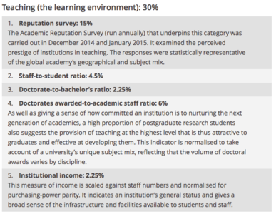

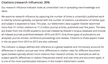
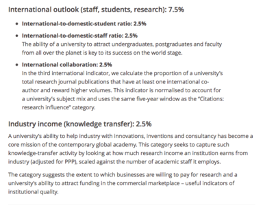
Source: https://www.timeshighereducation.com/news/ranking-methodology-2016
After referencing to multiple previous works that display university rankings, we decided to focus only on The Times Higher Education World University Rankings The rationale is that the dataset provided is robust enough to tell a good story, and that we cannot feasibly combine data from multiple sources without having missing or irrelevant values. Our research highlighted existing visualisations of university rankings as shown below. These serve as references to our project so that we are aware of what visualisations are already being used for similar datasets.
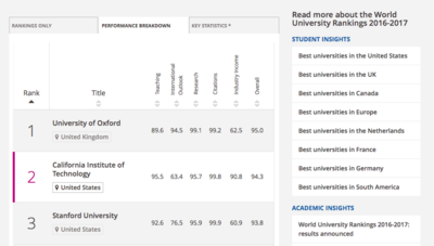
| 1) World University Rankings 2015-2016
We started with the web app provided by the official Times Higher Education website itself to see what how they visualized their own dataset. We realised they provided good filtering systems, intuitive drill down/up processes and efficient sorting systems. However, the app was found to be too tabular which could potentially miss out underlying patterns a proper visualization could show. In addition, there were limited ways we could compare between universities of our choices. Thus, we decided that this reference could be used as a baseline to help us understand which filtering categories are important. | |
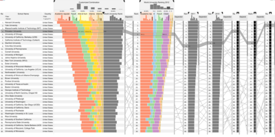
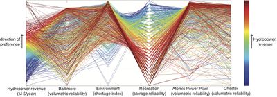
| 2) Caleydo LineUp: Visual Analysis of Multi-Attribute Rankings
Next, we wanted to value add to an existing visualisation for university rankings and its factors. In this reference, the user utilizes bar charts and parallel coordinates to show how each key indicators relate to one another. Though it is already informative, we wanted to find an alternative way to not only showcase different types of comparisons between universities within a year but also attempt to form a visualization that could compare universities across the years. | |
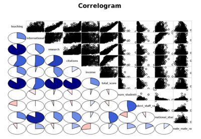
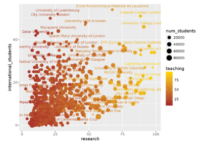
| 3) Which universities do good science?
This work from Kaggle itself shows us the benchmark and inspiration for which variables are used to compare and gain insights from. The work features mostly scatterplots linked to a correlogram. The correlogram shows the proportion of the dataset which linearly correlates with each other based on specific 2 variables. Specific scatterplots, which are linked from this correlogram, are selected to be further analysed. Through this, we decided to create a similar multi-variate approach to visualise the data through the use of glyphs and ternary plots. | |
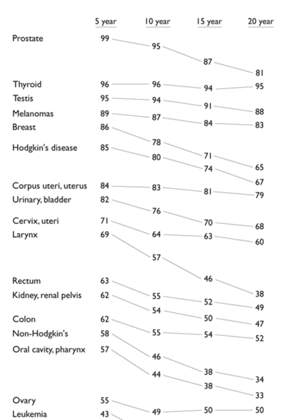
| 4) Slope Graph
A slope graph enables us to see how each performance metric of a certain university changes relative to the rest of universities. In this example, the change in relative survival rates over the years has inspired us to do something along the same lines as this. |
Referencing from these visualisations, we decided to employ different visualisation techniques. We have explained the rationale below.
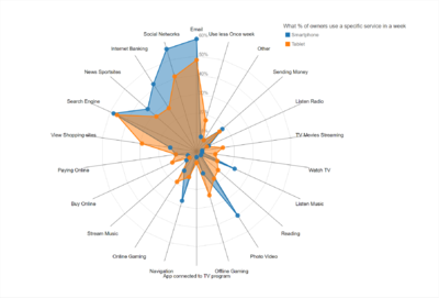
Spider Chart (Glyph)
| |
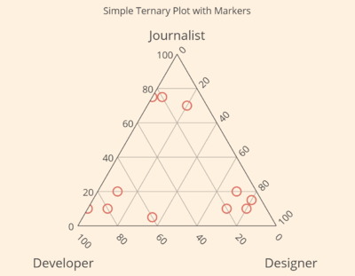
Ternary Plot
| |
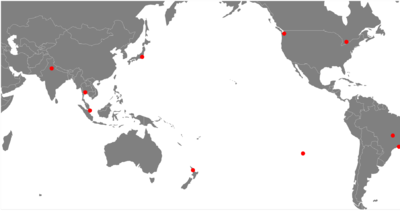
World Map (with zoom/pan capabilities)
| |
Caleydo LineUp: Visual Analysis of Multi-Attribute Rankings
| |
Slope Graph
|
The pictures below serve as a mock-up to the proposed application.
| Screen | Description |
|---|---|
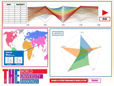
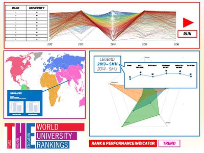
| Screen 1 - Analysing a single university/multiple universities according to performance indicator The first button "Rank & Performance Indicator" will bring users to this page.
| |
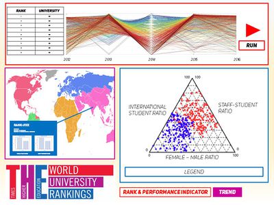
| Screen 2 - Analysing the trend of university make-up through the years The second button "Trend" will bring users to this page.
|
Visuals html code examples
- Ternary plot example html code
- D3.js Radar chart and spider chart example html code
- D3.js Radar chart example html code
- D3.js World map with zoom / pan and cities code
Problem and motivation survey statistics
- University Rankings: Most Important Factor for International Students
- Times Higher Education World University Rankings
Dataset
GROUP 12
1. Albert BINGEI
2. Cornelia Tisandinia LARASATI
3. Timothy TAN Swee Guang

