Difference between revisions of "IS428 2016-17 Term1 Assign3 Yang Chengzhen"
Czyang.2013 (talk | contribs) |
Czyang.2013 (talk | contribs) |
||
| Line 27: | Line 27: | ||
The left graph shows number of people in each zone over times (Aggregated data from fix & Mobile Sensors). | The left graph shows number of people in each zone over times (Aggregated data from fix & Mobile Sensors). | ||
The right graph shows the position of employees at different time (mobile sensor data only). Size represent number of employees at the point, color represents morning/afternoon.<br> | The right graph shows the position of employees at different time (mobile sensor data only). Size represent number of employees at the point, color represents morning/afternoon.<br> | ||
| − | [[File:Floor-zone analysis-F1.png| | + | [[File:Floor-zone analysis-F1.png|800x650px]][[File:Floor-zone analysis-F2.png|800x650px]][[File:Floor-zone analysis-F3.png|800x650px]] |
==Notable pattern in Building data== | ==Notable pattern in Building data== | ||
Revision as of 22:16, 22 October 2016
Contents
Description
After the successful resolution of the 2014 kidnapping at GAStech’s Abila, Kronos office, GAStech officials determined that Abila offices needed a significant upgrade. At the end of 2015, the growing company moved into a new, state-of-the-art three-story building near their previous location. Even though the employee morale rose somewhat with the excitement of the new building, there are still a few disgruntled employees in the company.
This project aims to identify the patterns and problems arose after moving to the new office building for GASTech. This is achieved by using GASTech operational data sets, including:
- Proximity sensor data for each of the prox zone regions
- Proximity sensor data from Rosie the mobile robot
- HVAC sensor readings and status information from each of the building’s HVAC zones
- Hazium readings from four sensors
Data Preparation
Create HH:MM:SS Field from timestamp
To analyse the moving pattern over each day, we need to extract time from the date since tableau does not support auto extract well.

Convert Server room to the corresponding Zone
For ProxoutMC2.csv, there are 29 records with zone name "Server Room" instead of a numeric number of majority. After checking the floor map, I found server room belongs to Floor3 Zone4, so I converted these values as following:

Covert X Y in proxMobileOut-MC2.csv to corresponding Zone
For Mobile Prox data, the position of the point is indicated by X,Y , while for fixed prox data, the position is indicated by zone. In order to analyse the movement together, we need to align the 2 data sets.
I used tableau to create calculated field to convert X,Y to the corresponding zones:

Data Visualization and Findings
Patterns of Employees by Prox Card Data
Floor-Zone Analysis
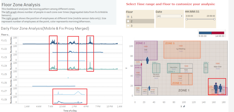
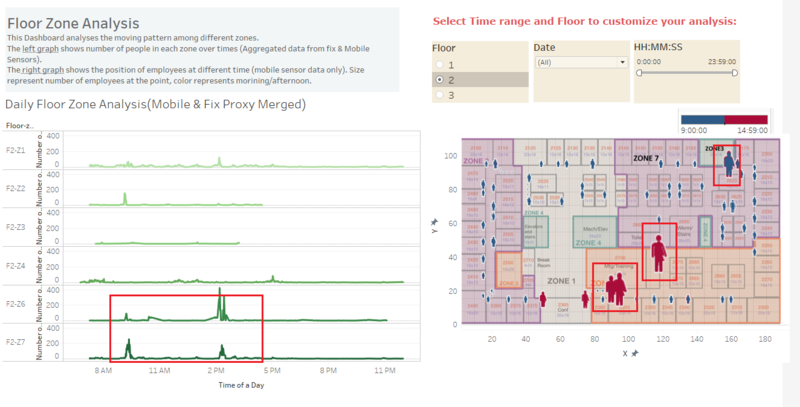
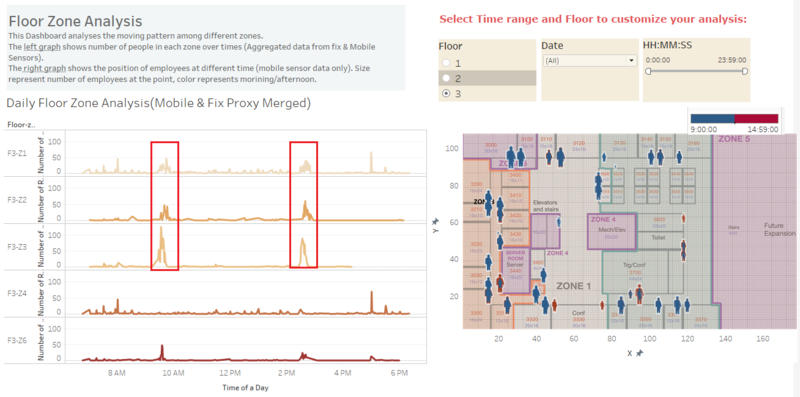
This Dashboard analyses the moving pattern of employees among different floor zones.
The left graph shows number of people in each zone over times (Aggregated data from fix & Mobile Sensors).
The right graph shows the position of employees at different time (mobile sensor data only). Size represent number of employees at the point, color represents morning/afternoon.


