Difference between revisions of "IS428 2016 17T1 Team Valor"
| Line 22: | Line 22: | ||
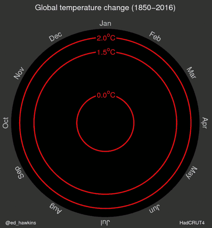
Animation depicting changes in climate over a long period of time. | Animation depicting changes in climate over a long period of time. | ||
| − | [[File:Loc project be5. | + | [[File:Loc project be5.jpg|700px|center]] |
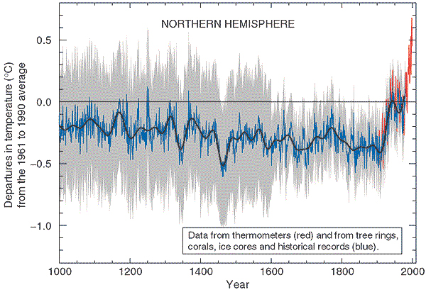
Line graph comparing global temperature change over time. | Line graph comparing global temperature change over time. | ||
Revision as of 17:48, 10 October 2016
Contents
Description of the Problem and Motivation
Recent president candidate of the US, Mr Donald Trump thinks that climate change is a hoax. That is really worrying, especially when current polls are showing that he is having a real chance in winning the election. Our team seeks to validate the climate change's truthfulness by exploring and visualizing ocean, land and weather data. Thus, we hope through this project, we settle the fact once and for all. Moreover, this serves as a tool to raise the awareness and understanding of our mother Earth's health status. How the climate has changed over time, which stage are we in and how many years does Singapore has left to stay above the sea level.
Related Work
Berkeley Earth is a non-profit organization created by Professor Richard Muller, Prof Physics, UCBerkeley that focuses on researching about global warming. Some of their graphic works is as following:
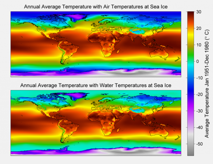
Annual Average Global Temperatures
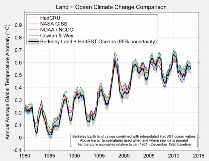
Series Comparison. Anomalies of the global temperature index of provided by several groups is depicted for the 1980 to present time period.
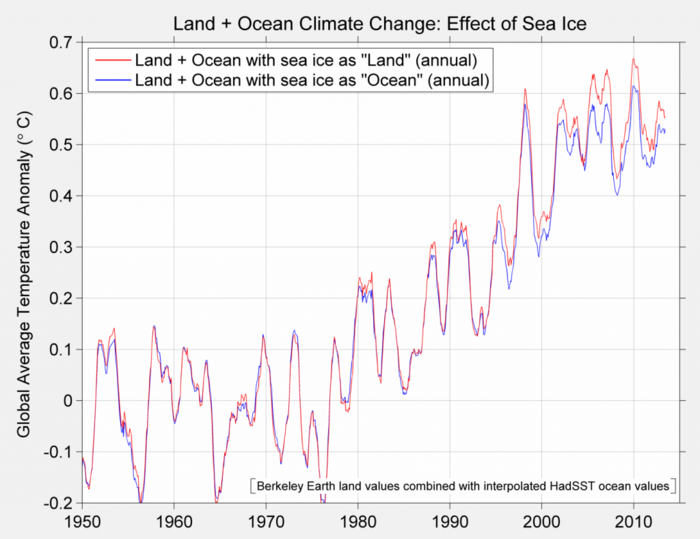
Comparison of the baseline method with the alternative method.
Animation depicting changes in climate over a long period of time.
Line graph comparing global temperature change over time.
These graphics depict the change over a long period of time. However, as static, they don't converse the imagination of change and require experts to understand and read these charts. Our team strikes to identify the climate change issues and translate them into interactive analytics graphs and charts for a clearer understanding of the issue. This is so that even a layman can right away tell how the climate has change over time and where the Earth is heading towards.
Technical Challenges
We are in the process of gathering data and identifying which data sources are important. The Berkeley Earth organization used Matlab to analyze the data. We might not use the same approach. Instead, we use Tableau and JMP to first explore the data and see patterns in it. Only then, we might consider R or Python t assist us with the analysis of data.
D3.js is a powerful tool. However, to create innovative products from it, it requires users not only the understanding of the code but also how DOM manipulation works in html. Our team will first try examples and then try to merge them and play around with the settings. We also hope to understand the library more by reading its documentation.
Project Milestones
Week 8: Project Proposal
Week 9: Collect and clean data
Week 10: Perform exploration of data and patterns
Week 11: First prototype of the analytics site
Week 12: One innovative feature
week 13: Debug and finish the site, create poster
week 14: User guide and research paper
week 15: Prepare for Poster day
