Difference between revisions of "Air Traffic Visualisers"
| (4 intermediate revisions by the same user not shown) | |||
| Line 32: | Line 32: | ||
In this project, our team intend to make use of data visualisation techniques to help correlate between airplane crashes and the fall in number of passengers travelling within the United States. We intend to answer various questions such as, the impact of an airplane crash that occurred in US compared to an airplane crash that occurred outside of the US and other questions such as what should companies do when such an incident happened. | In this project, our team intend to make use of data visualisation techniques to help correlate between airplane crashes and the fall in number of passengers travelling within the United States. We intend to answer various questions such as, the impact of an airplane crash that occurred in US compared to an airplane crash that occurred outside of the US and other questions such as what should companies do when such an incident happened. | ||
| − | |||
| − | |||
| − | |||
| − | |||
<div style="background: #346ec4; padding: 15px; font-weight: bold; line-height: 0.3em; text-indent: 15px; font-size: 20px;margin-top:25px"><font color=#FFFFFF>Project Motivation</font></div> | <div style="background: #346ec4; padding: 15px; font-weight: bold; line-height: 0.3em; text-indent: 15px; font-size: 20px;margin-top:25px"><font color=#FFFFFF>Project Motivation</font></div> | ||
| Line 42: | Line 38: | ||
Consequently, we’d like to find out when such event happens, how much do they affect the airline industry, if at all? This would be helpful for airlines to make better decisions in terms of resource allocations when such events happen. | Consequently, we’d like to find out when such event happens, how much do they affect the airline industry, if at all? This would be helpful for airlines to make better decisions in terms of resource allocations when such events happen. | ||
| + | <div style="background: #346ec4; padding: 15px; font-weight: bold; line-height: 0.3em; text-indent: 15px; font-size: 20px;margin-top:25px"><font color=#FFFFFF>Deliverables and Target Audience</font></div> | ||
| + | We aim to deliver a highly interactive web application that allows someone to easily navigate between a large amount of time-series data and geographical data. | ||
| − | + | Our intended audience is: | |
| + | #Airline carriers since they would get some insight as to how to better price their tickets and allocate resources | ||
| + | #Airport operators to better allocate resources after a crash | ||
| + | #Casual passengers since they would get an idea of the general public’s response and get a better estimate of the outcome of a crash | ||
| Line 51: | Line 52: | ||
*Find out if international flights or domestic flight crashes has a greater effect on the confidence of flights | *Find out if international flights or domestic flight crashes has a greater effect on the confidence of flights | ||
*Other unlikely relationships between airplane crashes and domestic flights taken in US | *Other unlikely relationships between airplane crashes and domestic flights taken in US | ||
| − | |||
| − | |||
| − | |||
<div style="background: #346ec4; padding: 15px; font-weight: bold; line-height: 0.3em; text-indent: 15px; font-size: 20px;margin-top:25px"><font color=#FFFFFF>Dataset</font></div> | <div style="background: #346ec4; padding: 15px; font-weight: bold; line-height: 0.3em; text-indent: 15px; font-size: 20px;margin-top:25px"><font color=#FFFFFF>Dataset</font></div> | ||
| Line 62: | Line 60: | ||
#Airline Crashes - List of airplane crashes happening throughout the world. Retrieved via http://www.planecrashinfo.com/database.htm. | #Airline Crashes - List of airplane crashes happening throughout the world. Retrieved via http://www.planecrashinfo.com/database.htm. | ||
| + | Below are the list of Table Header name, description and an example for each table. | ||
| + | <b>1. Airline Codes</b> | ||
| + | {| class="wikitable" | ||
| + | |- | ||
| + | ! Name | ||
| + | ! Description | ||
| + | ! Example | ||
| + | |- | ||
| + | | Airline Company Name | ||
| + | | The name of the airline company | ||
| + | | Singapore Airlines | ||
| + | |- | ||
| + | | IATA Airline Code | ||
| + | | 2 letter codes given by IATA to uniquely identify an airline company | ||
| + | | SQ | ||
| + | |- | ||
| + | | ICAO Airline Designators | ||
| + | | 3 Letter Codes given by ICAO to uniquely identify an airline comapny | ||
| + | | SIA | ||
| + | |} | ||
| + | |||
| + | <b>2. Airport Locations</b> | ||
| + | {| class="wikitable" | ||
| + | |- | ||
| + | ! Name | ||
| + | ! Description | ||
| + | ! Example | ||
| + | |- | ||
| + | | Name | ||
| + | | The name of the airport | ||
| + | | John F Kennedy International Airport | ||
| + | |- | ||
| + | | latitude_deg | ||
| + | | The Latitude of the Airport in decimal degrees, usually to six significant digits. Negative is South, positive is North. | ||
| + | | 40.63980103 | ||
| + | |- | ||
| + | | longitude_deg | ||
| + | | The Longitude of the Airport in decimal degrees, usually to six significant digits. Negative is West, positive is East. | ||
| + | | -73.77890015 | ||
| + | |- | ||
| + | | municipality | ||
| + | | The state where the airport resides in. | ||
| + | | New York | ||
| + | |- | ||
| + | | iata_code | ||
| + | | The 3 letter unique identifier for an airport. | ||
| + | | JFK | ||
| + | |} | ||
| + | |||
| + | <b>Domestic US flights Data</b> | ||
| + | {| class="wikitable" | ||
| + | |- | ||
| + | ! Name | ||
| + | ! Description | ||
| + | ! Example | ||
| + | |- | ||
| + | | Year | ||
| + | | Year of the data | ||
| + | | 2014 | ||
| + | |- | ||
| + | | Quarter | ||
| + | | Quarter of the data | ||
| + | | 2 | ||
| + | |- | ||
| + | | City1 | ||
| + | | Descriptive Label for place of departure | ||
| + | | Los Angeles, CA (Metropolitan Area) | ||
| + | |- | ||
| + | | City2 | ||
| + | | Descriptive Label for place of arrival | ||
| + | | San Francisco, CA (Metropolitan Area) | ||
| + | |- | ||
| + | | Passengers | ||
| + | | Market Passenger Per Day | ||
| + | | 21,378 | ||
| + | |} | ||
| + | |||
| + | <b>Airline Crashes</b> | ||
| + | {| class="wikitable" | ||
| + | |- | ||
| + | ! Name | ||
| + | ! Description | ||
| + | ! Example | ||
| + | |- | ||
| + | | Date | ||
| + | | The date which the incident occured | ||
| + | | 2/3/2005 | ||
| + | |- | ||
| + | | plane_type | ||
| + | | The type of plane flying | ||
| + | | Boeing 747-131 | ||
| + | |- | ||
| + | | country | ||
| + | | The country where the incident occured | ||
| + | | China | ||
| + | |- | ||
| + | | airline | ||
| + | | The airline which resulted the accident occured | ||
| + | | Southwest Air | ||
| + | |- | ||
| + | | fat | ||
| + | | The number of Fatalities from the crash | ||
| + | | 4 | ||
| + | |- | ||
| + | | phase | ||
| + | | Which phase the airplane was. (approach, initial_climb, etc.) | ||
| + | | en_route | ||
| + | |- | ||
| + | | meta | ||
| + | | The main category of the cause of the crash (weather, human_error, criminal) | ||
| + | | Weather | ||
| + | |- | ||
| + | | cause | ||
| + | | The cause of the crash | ||
| + | | bad weather | ||
| + | |} | ||
<div style="background: #346ec4; padding: 15px; font-weight: bold; line-height: 0.3em; text-indent: 15px; font-size: 20px;margin-top:25px"><font color=#FFFFFF>Exploration of Visualisation Methods</font></div> | <div style="background: #346ec4; padding: 15px; font-weight: bold; line-height: 0.3em; text-indent: 15px; font-size: 20px;margin-top:25px"><font color=#FFFFFF>Exploration of Visualisation Methods</font></div> | ||
| + | <b>Chord Diagram</b><br> | ||
| + | Chord Diagrams are a graphical method of displaying inter-relationships between data in a matrix. In this graphical method, the data is arranged in a circle where it will show the relationships between the various points. We believe that using a chord diagram would be effective as we would be able to visualise the number of passengers travelling between the various states. We would be using D3.js's [https://bost.ocks.org/mike/uberdata/ Chord diagram], since it is both easy to implement and is interactive at the same time. <br><br> | ||
| + | [[File:ATV_ChordDiagram.png|600px|center]] | ||
| + | |||
| + | <b>Brick Map</b><br> | ||
| + | Brick Maps are maps that use bricks to give visualise the absolute amount of people in a geospatial space. We chose to use brick map, because it would give an overview of the number of passengers travelling from each state, and also because it is challenging, as stated from the prof. In order to build this, we would have to build our own libraries, since there is no brick map in any library. | ||
| + | [[File:ATV_Brickmap.png|600px|center]] | ||
| + | |||
| + | <b>Cross Filter</b><br> | ||
| + | [http://square.github.io/crossfilter/ Cross filter] is a library that is flexible and allows for people to select a range of dates easily. Since we have to visualise time-based data over 15 years. we intend to make it as flexible and easy to use for all users. | ||
| + | [[File:ATV_Crossfilter.png|600px|center]] | ||
<div style="background: #346ec4; padding: 15px; font-weight: bold; line-height: 0.3em; text-indent: 15px; font-size: 20px;margin-top:25px"><font color=#FFFFFF>Proposal of StoryBoard</font></div> | <div style="background: #346ec4; padding: 15px; font-weight: bold; line-height: 0.3em; text-indent: 15px; font-size: 20px;margin-top:25px"><font color=#FFFFFF>Proposal of StoryBoard</font></div> | ||
| + | Our Group has decided on the below storyboard in order to make it clear for users to have an overview of the flight data, airplane crashes, have a comparison between 2 dates, and any details that they would like to have. | ||
| + | [[File:ATV_Storyboard.jpg|800px|center]] | ||
| + | |||
<div style="background: #346ec4; padding: 15px; font-weight: bold; line-height: 0.3em; text-indent: 15px; font-size: 20px;margin-top:25px"><font color=#FFFFFF>Technical Challenges</font></div> | <div style="background: #346ec4; padding: 15px; font-weight: bold; line-height: 0.3em; text-indent: 15px; font-size: 20px;margin-top:25px"><font color=#FFFFFF>Technical Challenges</font></div> | ||
| + | {| class="wikitable" | ||
| + | |- | ||
| + | ! Technical Challenges | ||
| + | ! Mitigation Plan | ||
| + | |- | ||
| + | | Lack of Javascript/d3.js Competence | ||
| + | | | ||
| + | #Peer learning | ||
| + | #Consult Professor Prakash | ||
| + | #View online Tutorials | ||
| + | |- | ||
| + | | Acquiring Data, Data Cleaning | ||
| + | | | ||
| + | #Work closely to clean and analyse all data sources | ||
| + | |- | ||
| + | | Creation of Brick Map overlay | ||
| + | | | ||
| + | #Start Early | ||
| + | # Using references from other d3.js libraries | ||
| + | |} | ||
<div style="background: #346ec4; padding: 15px; font-weight: bold; line-height: 0.3em; text-indent: 15px; font-size: 20px;margin-top:25px"><font color=#FFFFFF>Project Timeline</font></div> | <div style="background: #346ec4; padding: 15px; font-weight: bold; line-height: 0.3em; text-indent: 15px; font-size: 20px;margin-top:25px"><font color=#FFFFFF>Project Timeline</font></div> | ||
| Line 81: | Line 229: | ||
* Adobe Photoshop (Prototyping storyboard and Wiki Illustrations) | * Adobe Photoshop (Prototyping storyboard and Wiki Illustrations) | ||
* D3.js (one of the library used to visualise the data) | * D3.js (one of the library used to visualise the data) | ||
| − | |||
| − | |||
<!--Body End--> | <!--Body End--> | ||
Latest revision as of 22:54, 8 October 2016
The airplane industry is a very volatile industry. Various events can occur that would lead to the whole airline industry to go into a downward spiral. Clear examples of this events are the September 11 Terrorist Attacks and the 2009 Financial Crisis. However, how much of airline industry is affected due to commercial airplane crashes, and how badly does it affect the number of passengers travelling within the United States.
In this project, our team intend to make use of data visualisation techniques to help correlate between airplane crashes and the fall in number of passengers travelling within the United States. We intend to answer various questions such as, the impact of an airplane crash that occurred in US compared to an airplane crash that occurred outside of the US and other questions such as what should companies do when such an incident happened.
It is difficult to predict the effect of ‘black swan’ events and how they would affect the airline industry. In the airline industry, crashes are becoming less frequent due to increase in airline safety standards and improving technology. As such, airline crashes tend to be black swan events that are almost unpredictable.
Consequently, we’d like to find out when such event happens, how much do they affect the airline industry, if at all? This would be helpful for airlines to make better decisions in terms of resource allocations when such events happen.
We aim to deliver a highly interactive web application that allows someone to easily navigate between a large amount of time-series data and geographical data.
Our intended audience is:
- Airline carriers since they would get some insight as to how to better price their tickets and allocate resources
- Airport operators to better allocate resources after a crash
- Casual passengers since they would get an idea of the general public’s response and get a better estimate of the outcome of a crash
In this project, we will be focusing on the following:
- Identify the trend between plane crashes and the number of passengers travelling within the US over the past 15 years
- Find out if international flights or domestic flight crashes has a greater effect on the confidence of flights
- Other unlikely relationships between airplane crashes and domestic flights taken in US
For this visualisation we need a few datasets.
- Airline Codes - List of airlines IATA and ICAO codes. Retrieved using Import IO viahttp://www.flugzeuginfo.net/table_airlinecodes_airline_en.php.
- Airport Locations - List of Longitude and Latitude points of all the airports. (We just need United States) Retrieved from Open Flights.org via http://openflights.org/data.html.
- Domestic US flights Data - List of number of passengers travelling within US. Retrieved from US Department of Transportation via https://www.transportation.gov/policy/aviation-policy/domestic-airline-consumer-airfare-report.
- Airline Crashes - List of airplane crashes happening throughout the world. Retrieved via http://www.planecrashinfo.com/database.htm.
Below are the list of Table Header name, description and an example for each table.
1. Airline Codes
| Name | Description | Example |
|---|---|---|
| Airline Company Name | The name of the airline company | Singapore Airlines |
| IATA Airline Code | 2 letter codes given by IATA to uniquely identify an airline company | SQ |
| ICAO Airline Designators | 3 Letter Codes given by ICAO to uniquely identify an airline comapny | SIA |
2. Airport Locations
| Name | Description | Example |
|---|---|---|
| Name | The name of the airport | John F Kennedy International Airport |
| latitude_deg | The Latitude of the Airport in decimal degrees, usually to six significant digits. Negative is South, positive is North. | 40.63980103 |
| longitude_deg | The Longitude of the Airport in decimal degrees, usually to six significant digits. Negative is West, positive is East. | -73.77890015 |
| municipality | The state where the airport resides in. | New York |
| iata_code | The 3 letter unique identifier for an airport. | JFK |
Domestic US flights Data
| Name | Description | Example |
|---|---|---|
| Year | Year of the data | 2014 |
| Quarter | Quarter of the data | 2 |
| City1 | Descriptive Label for place of departure | Los Angeles, CA (Metropolitan Area) |
| City2 | Descriptive Label for place of arrival | San Francisco, CA (Metropolitan Area) |
| Passengers | Market Passenger Per Day | 21,378 |
Airline Crashes
| Name | Description | Example |
|---|---|---|
| Date | The date which the incident occured | 2/3/2005 |
| plane_type | The type of plane flying | Boeing 747-131 |
| country | The country where the incident occured | China |
| airline | The airline which resulted the accident occured | Southwest Air |
| fat | The number of Fatalities from the crash | 4 |
| phase | Which phase the airplane was. (approach, initial_climb, etc.) | en_route |
| meta | The main category of the cause of the crash (weather, human_error, criminal) | Weather |
| cause | The cause of the crash | bad weather |
Chord Diagram
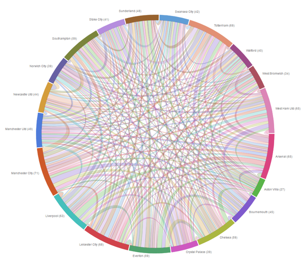
Chord Diagrams are a graphical method of displaying inter-relationships between data in a matrix. In this graphical method, the data is arranged in a circle where it will show the relationships between the various points. We believe that using a chord diagram would be effective as we would be able to visualise the number of passengers travelling between the various states. We would be using D3.js's Chord diagram, since it is both easy to implement and is interactive at the same time.
Brick Map
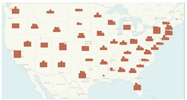
Brick Maps are maps that use bricks to give visualise the absolute amount of people in a geospatial space. We chose to use brick map, because it would give an overview of the number of passengers travelling from each state, and also because it is challenging, as stated from the prof. In order to build this, we would have to build our own libraries, since there is no brick map in any library.
Cross Filter
Cross filter is a library that is flexible and allows for people to select a range of dates easily. Since we have to visualise time-based data over 15 years. we intend to make it as flexible and easy to use for all users.
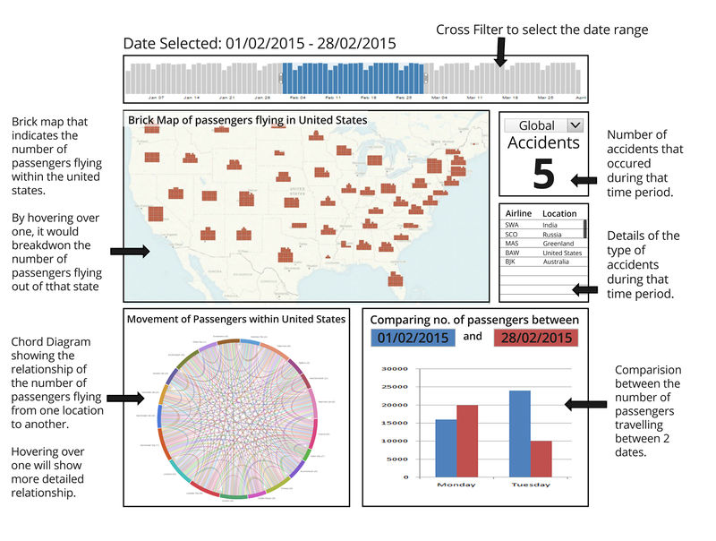
Our Group has decided on the below storyboard in order to make it clear for users to have an overview of the flight data, airplane crashes, have a comparison between 2 dates, and any details that they would like to have.
| Technical Challenges | Mitigation Plan |
|---|---|
| Lack of Javascript/d3.js Competence |
|
| Acquiring Data, Data Cleaning |
|
| Creation of Brick Map overlay |
|
Our team has decided to focus on these few tools and libraries in order to showcase our product.
- Brackets (IDE)
- Github (for version control and Github Pages)
- Microsoft Excel (Data Cleaning)
- Adobe Photoshop (Prototyping storyboard and Wiki Illustrations)
- D3.js (one of the library used to visualise the data)
