Difference between revisions of "Forensic Ninja"
| Line 108: | Line 108: | ||
# KPMG International. (2016). Global profiles of the fraudster: Technology enables and weak controls fuel the fraud. Retrieved from [https://assets.kpmg.com/content/dam/kpmg/pdf/2016/05/profiles-of-the-fraudster.pdf here] | # KPMG International. (2016). Global profiles of the fraudster: Technology enables and weak controls fuel the fraud. Retrieved from [https://assets.kpmg.com/content/dam/kpmg/pdf/2016/05/profiles-of-the-fraudster.pdf here] | ||
# Lanza, R. B. (2016, March). Blazing a trail for the Benford' s Law of words, part 1. Retrieved from [http://www.fraud-magazine.com/article.aspx?id=4294991850 here] | # Lanza, R. B. (2016, March). Blazing a trail for the Benford' s Law of words, part 1. Retrieved from [http://www.fraud-magazine.com/article.aspx?id=4294991850 here] | ||
| − | |||
| − | |||
| − | |||
</div> | </div> | ||
Revision as of 13:58, 7 October 2016
Contents
Problem and Motivation
Benford’s Law has been widely used by forensic data analysts to detect anomalies or possible fraudulent activities in an organisation. However, in the world of information, majority of the data are textual fields. For example, in an accounts payable, 70% of the data are textual data whereas only 10% of the data are numerical fields (Lanza, 2016).
Furthermore, fraudsters tend to work in groups rather than relying on their own. In 2015, 62 percent of fraudsters colluded with others(KPMG International, 2016). As 74 percent of the fraud is perpetrated by internal staff or a collusion between internal staff and external parties (KPMG International, 2016), this highlights the need for complex tools for fraud examiners to not only analyse available textual data of the firm but also visualise the interactivity among employees of an organisation.
As email is one of the preferred modes of business communication in an organisation, analysing emails can help to uncover any potential red flags in the organisation structure or culture. By using GAStech organisation email exchanges as a case study, we seek to analyse the connectivity and frequently discussed topics among employees of an organisation.
Objectives
In this project, we seek to build an interactive visualisation application that helps users to analyse connectivity and frequently discussed topics among employees of an organisation. This allows users to better visualise the organisation structure and interactivity among the employees that might suggest potential wrongdoings.
By using GAStech organisation email exchanges as a case study, the application aims to help users the following:
- Understand GAStech organisational structure
- Analyse frequently discussed topics among GAStech employees
Data Source
The dataset that will be used in this project can be retrieved from VAST Challenge 2014.
Link to Dataset.
It mainly consists of GAStech employee records and email headers from two weeks of internal GAStech company email.
References to Related Work
| Screenshots | What can we learn |
|
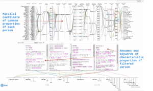
Parallel Coordinates of Employee Characteristics |
|
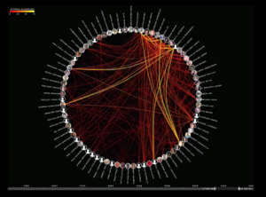
Visualization of social network formed from 60,000 emails from personal archive Source:Link |
|
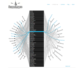
Thinkers’ perspectives with regards to topics discussed Source:Link |
|
Storyboard
Key Technical Challenges
Firstly, one of the key technical challenge is that we will be working on two datasets, namely Employee Records and Email Headers. This is because there will need to be a connection created between the two databases, so it can be used effectively and simultaneously. A possible solution to this would be to link the two databases by using the Email address information that is both available in the two databases.
Another key technical challenge would be to publish our Visualisations using D3.JS. To link the databases, there would be a form of javascript coding involved using the D3 library. Our group has started learning the programming language and library recently, and there is a steep learning curve. To bridge the gap between the expectations of the project and our programming ability, we will be looking into the code of published D3 Visualizations, and learn best practices from these visualisations. This is so to better understand the logic of the code and be able to use it to make our visualisations more interactive and powerful to the end user.
Project Schedule
References
Our Team
Group 13
1. Lim Hui Ting
2. Jonathan Eduard Chua Lim


