Difference between revisions of "IS428 2016-17 Term1 Assign2 Wang Jingxuan"
Jx.wang.2013 (talk | contribs) |
Jx.wang.2013 (talk | contribs) |
||
| Line 26: | Line 26: | ||
[[file:worked.png]]<br> | [[file:worked.png]]<br> | ||
[[file:Agedistribution.png]]<br> | [[file:Agedistribution.png]]<br> | ||
| + | From the above graphs, we realized that most of the injured workers are quite young, the victims' age distribution is quite skewed and its interquartile range is between 28 and 48. And from the graph of worked months, we noticed that | ||
| + | <br> | ||
<b>Q2. Are there patterns of injury time</b><br> | <b>Q2. Are there patterns of injury time</b><br> | ||
[[file:AccidentTime.png]]<br> | [[file:AccidentTime.png]]<br> | ||
Revision as of 01:32, 26 September 2016
Contents
Abstract
Workplace Safety and Health (WSH) includes legal requirements, certification and registration, monitoring and surveillance, accident reporting and work injury compensation. We understand that certain types of work may have higher chance of getting injured, and some injures are due to bad management and overtime. So based on data given by Workplace Safety and Health(WSH), we want to explore the patterns of work-related injuries.
Data Visualisation System Design Process
1. Identify a theme of interest
Safety has always been a great concern to Workplace Safety and Health (WSH) and it has always been trying to reduce work-related injury. A work-related accident is any unintended event that occurs in the course of work (excluding domestic work) that leads to an injury or condition. Based on injury data given by Workplace Safety and Health (WSH) We try to identify patterns of injuries types, victims' characteristics, and injury time.
2. Define questions for investigation
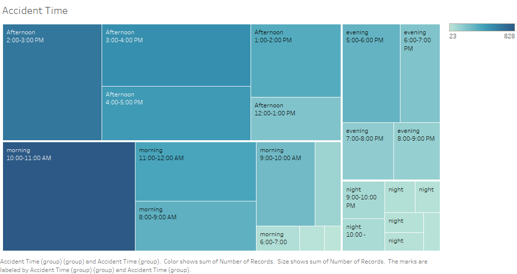
Are there patterns in accident occurring time?
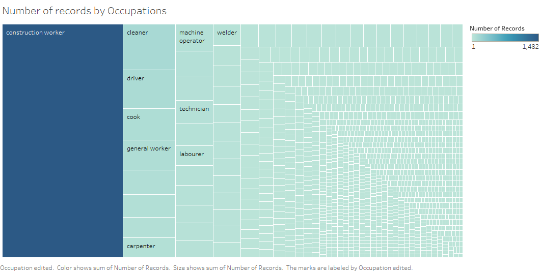
What are the industries/occupation that accidents occur frequently?
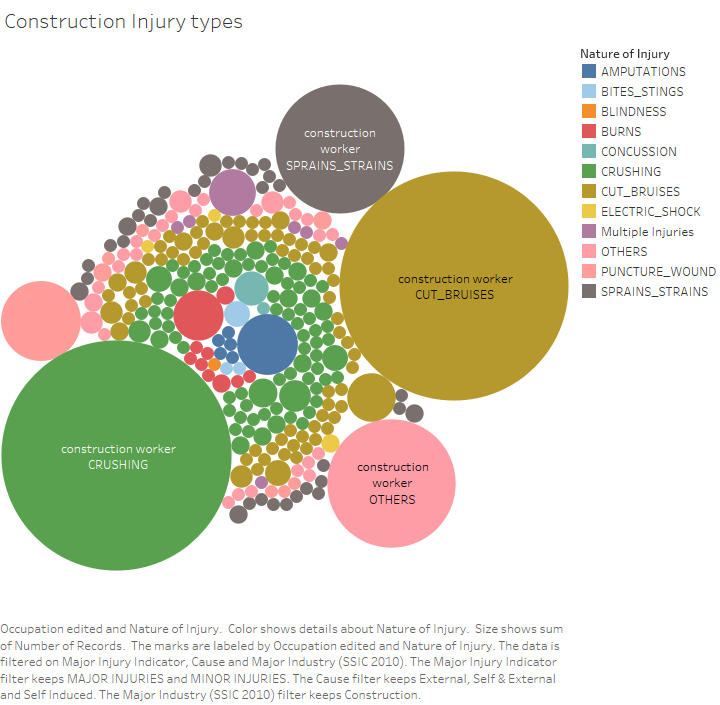
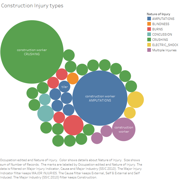
Are there and what are the patterns of injuries types?
Are there and what are the patterns of victims?
3. Find appropriate data attributes
Among all only 26 columns are chosen, and they are shown in the graph.
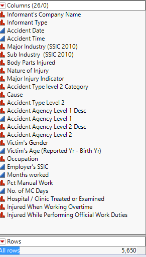
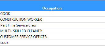
Then we realize for the occupation column, there are duplicates, and the only difference is uppercase and lowercase. As graph shown
'cook' is the same as 'COOK'.
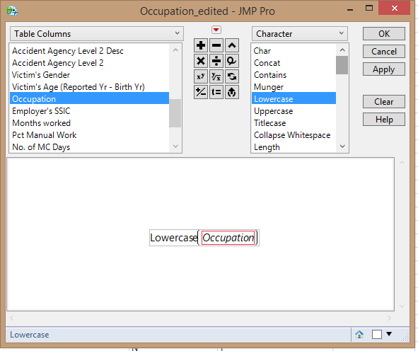
So I used JMP Pro lowercase function lowercase the occupation column as the graph shown.
And the missing values are insiginificant.

Analysis
Q1. Is there a relationship between the experience of employees and workplace injury?
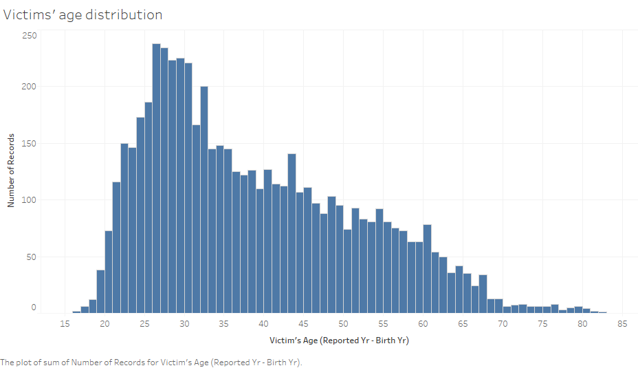

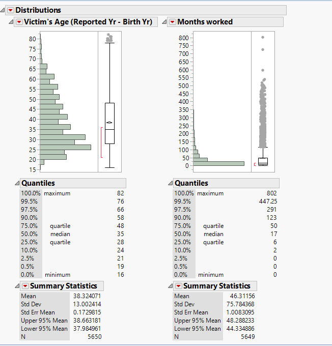
From the above graphs, we realized that most of the injured workers are quite young, the victims' age distribution is quite skewed and its interquartile range is between 28 and 48. And from the graph of worked months, we noticed that
Q2. Are there patterns of injury time
Q3. Are there Patterns of injury types
Interactive Dashboard Visualisation
The interactive dashboard visualisation can be found here
Tools Utilized
- JMP PRO 12
- Microsoft Excel
- Tableau 10.0