Difference between revisions of "IS428 2016-17 Term1 Assign2 Rachel Tay"
| (2 intermediate revisions by the same user not shown) | |||
| Line 1: | Line 1: | ||
==Theme of Interest== | ==Theme of Interest== | ||
| − | + | With advances in technology and changes in landscapes, many new research tools have henceforth became available that has been developed to support scholarly communication in all phases of the research workflow. A survey was then created in hopes that its findings can bridge this gap in information. Only with research are people able to establish facts and attain new conclusions. This hence reinforces the importance of research and the platforms that allow for the existence and spread of research. With this dataset, the assignment hence aims to figure out the factors that affect the respondents' choice of the innovation research tools. | |
==Formulation of Questions for Investigation== | ==Formulation of Questions for Investigation== | ||
| − | + | As stated in the section above, the initial question was "What are the factors that determine the respondents’ choice of research tools?" | |
| − | Given that there are too many different variables provided in the survey, | + | Given that there are too many different variables provided in the survey, the topic was narrowed down to only consider the attributes of the users. At this point, my question is "How do the attributes of the users affect the respondents' choice of research tools?". |
| − | When taking into account that different users have different requirements when performing different research activities, the question was tweaked to that of the following: "How do the attributes of the users affect respondents' choice of research tools when performing each of the research activities?" | + | When taking into account that different users have different requirements when performing different research activities, the question was tweaked to that of the following: "How do the attributes of the users affect respondents' choice of research tools when performing each of the research activities?". |
==The Dataset== | ==The Dataset== | ||
=== Distribution of Respondents === | === Distribution of Respondents === | ||
| − | + | [[File:Racheldemo1.png]] | |
| − | On top of these, I also took interest in the first year of publication section. This piece of information was collected on the basis that it represented the respondents’ career stage. There was a fairly even distribution of respondents across the various career stages. | + | This picture was adapted from Kramer B and Bosman J 2016 [version 1; referees: awaiting peer review] F1000Research 2016, 5:692 (doi: 10.12688/f1000research.8414.1). |
| + | |||
| + | The attributes of the users that I am interested in and are provided are, specifically, their roles and disciplines. An overview of the demographics of the respondents can be observed from the picture above. A large bulk of the respondents were from Social Science and Economics, with the other disciplines well represented except Law. As for the research roles, a large bulk are from inside academia. Since different roles and disciplines have different requirements, there is the possibility that they might have different preferences over the tools that they utilize more often. Therefore, these 2 attributes were pinned down for investigation. | ||
| + | |||
| + | On top of these, I also took interest in the first year of publication section. This piece of information was collected on the basis that it represented the respondents’ career stage. There was a fairly even distribution of respondents across the various career stages. At different stages of their career, the respondents have different experiences and exposure level to different tools, this is definitely a factor to take into account when considering the factors that determine the choice of tools. | ||
=== Limitations of Dataset === | === Limitations of Dataset === | ||
| Line 25: | Line 29: | ||
Using the Column Viewer functionality in JMP, I viewed the summary statistics and properties of all the remaining columns. The resultant information table was then sorted according to N categories. | Using the Column Viewer functionality in JMP, I viewed the summary statistics and properties of all the remaining columns. The resultant information table was then sorted according to N categories. | ||
| − | + | [[File:Racheldata1.png]] | |
Through this step, I found out the columns then I can group together and categorise under one singular column. There are 2 separate relevant categories: "Discipline" and "Tools". The columns can be consolidated under their respective categories using the "Stack" function in JMP. | Through this step, I found out the columns then I can group together and categorise under one singular column. There are 2 separate relevant categories: "Discipline" and "Tools". The columns can be consolidated under their respective categories using the "Stack" function in JMP. | ||
| Line 33: | Line 37: | ||
The following stacking illustrations will only show the steps to grouping the relevant columns under "Discipline" category. The picture below shows the inputs of the Stack Window. | The following stacking illustrations will only show the steps to grouping the relevant columns under "Discipline" category. The picture below shows the inputs of the Stack Window. | ||
| − | + | [[File:Racheldata2.png]] | |
After stacking, the data from all 7 columns will then be consolidated into only 2. From this table, you can obviously see each respondent and the disciplines they are in. Given that each respondent can be in multiple disciplines, the respondent ID may repeat. | After stacking, the data from all 7 columns will then be consolidated into only 2. From this table, you can obviously see each respondent and the disciplines they are in. Given that each respondent can be in multiple disciplines, the respondent ID may repeat. | ||
| Line 39: | Line 43: | ||
From this table, one can also tell that there are many null values in the Data column; all of which are meaningless and to be deleted. I go to the Data Filter tab and add Data as my column of interest and delete all of the rows that are then selected. | From this table, one can also tell that there are many null values in the Data column; all of which are meaningless and to be deleted. I go to the Data Filter tab and add Data as my column of interest and delete all of the rows that are then selected. | ||
| − | + | [[File:Racheldata3.png]] | |
After doing the same steps for the "Tools" column, the only other relevant information that are missing are the research functions of the tools and its respective research activities. Going through the 567,166 rows of data and inputting the relevant information individually is too tedious and time-consuming. Hence, I have decided to use the information provided in the “survey_cleaned_variable_list.csv” document. To do this, I need 2 new columns inside this document. | After doing the same steps for the "Tools" column, the only other relevant information that are missing are the research functions of the tools and its respective research activities. Going through the 567,166 rows of data and inputting the relevant information individually is too tedious and time-consuming. Hence, I have decided to use the information provided in the “survey_cleaned_variable_list.csv” document. To do this, I need 2 new columns inside this document. | ||
| − | + | [[File:Racheldata4.png]] | |
For research function, I referred to the survey questions to determine the specific function the tools are used for. For research activity, I referred to the following website (http://dashboard101innovations.silk.co/page/Research-activities) and the function column inputs to determine the specific activity that the function of the tools fall under. With these information, I filled down the relationship of each variable name (tools) to their functions and respective activity. | For research function, I referred to the survey questions to determine the specific function the tools are used for. For research activity, I referred to the following website (http://dashboard101innovations.silk.co/page/Research-activities) and the function column inputs to determine the specific activity that the function of the tools fall under. With these information, I filled down the relationship of each variable name (tools) to their functions and respective activity. | ||
| Line 51: | Line 55: | ||
Once completed, the 2 data tables should be joined by matching the tools column. | Once completed, the 2 data tables should be joined by matching the tools column. | ||
| − | + | [[File:Racheldata5.png]] | |
With this, the final data table is ready for use. | With this, the final data table is ready for use. | ||
==Constructing the Visualization== | ==Constructing the Visualization== | ||
| − | Given that most of the data I have are categorical | + | Given that most of the data I have are categorical, parallel sets was a tool considered when attempting to answer the ultimate question. In my first plot, 4 variables were selected, namely, role, discipline, first publication year and research activity. |
| + | |||
| + | [[File:Rachelparallel1.png]] | ||
| − | + | There are a few trends that can be derived from the chart. One such example is that, regardless of roles, disciplines and career stage, the ranking of the tools used for a research function or activity is the same. An additional trend could be that regardless of the discipline or role that the respondents are involved with, they generally invest a consistent amount into each of the research activities. | |
| − | + | However, absolute comparison is tedious given the large number of variables involved in this chart. With the large number of variables, each line is spilt into more portions, the shaded band emitted from each segment and the differences between each then become harder to determine. As such, I have decided to turn to Tableau to create this final visualization. | |
| − | + | ==The Final Visualization== | |
| + | [[File:Rachelfinal1.png]] | ||
| − | + | This is a only the first page of the final visualization. The interactive and full version can be found in this link provided: https://public.tableau.com/views/IS428Assignment2/Story1?:embed=y&:display_count=yes | |
| − | |||
| − | + | This visualization aimed to answer the following question: "How do the attributes of the users affect the tools and sites they utilize during their research process?" | |
| − | |||
| − | + | The variables used to define user attributes include their roles, disciplines and career stages. The research process is documented through the research activities. The final visualization is formatted as a story where each caption at the top would put across my point while allowing users to interact with the same data and find out other trends that might be of interest and relevance. At the side, filters are provided for the third user attribute that is not included in the chart. The highlighting functions are also made available at the side in order to allow easy comparison and referencing by the users. | |
| − | + | ==Conclusion== | |
| + | Generally, discovery tools are most utilized while assessment tools are least utilized across the disciplines. Respondents in Social Science & Economics discipline generally have a higher utilization of tools across all research activities as compared to the respondents from other disciplines. There is the trend that for professors/ associate professors/ assistant professors, the least experienced are not utilizing as much of the more traditional tools for their activities as compared to those more experienced. However, this trend is inversed when analyzing PhD students and Postdoc. The professors' choice of tools utilized differs at different career stages. An example would be Acrobat where it is vastly popular with the more experienced professors but only along the average line when it comes to the amateurs. | ||
| + | |||
| + | One line conclusion: Professors from the Social Science and Economics discipline with the oldest first publication year uses the most tools when discovering. | ||
Latest revision as of 22:46, 25 September 2016
Contents
Theme of Interest
With advances in technology and changes in landscapes, many new research tools have henceforth became available that has been developed to support scholarly communication in all phases of the research workflow. A survey was then created in hopes that its findings can bridge this gap in information. Only with research are people able to establish facts and attain new conclusions. This hence reinforces the importance of research and the platforms that allow for the existence and spread of research. With this dataset, the assignment hence aims to figure out the factors that affect the respondents' choice of the innovation research tools.
Formulation of Questions for Investigation
As stated in the section above, the initial question was "What are the factors that determine the respondents’ choice of research tools?"
Given that there are too many different variables provided in the survey, the topic was narrowed down to only consider the attributes of the users. At this point, my question is "How do the attributes of the users affect the respondents' choice of research tools?".
When taking into account that different users have different requirements when performing different research activities, the question was tweaked to that of the following: "How do the attributes of the users affect respondents' choice of research tools when performing each of the research activities?".
The Dataset
Distribution of Respondents
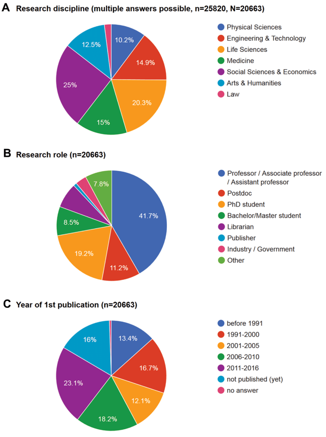
This picture was adapted from Kramer B and Bosman J 2016 [version 1; referees: awaiting peer review] F1000Research 2016, 5:692 (doi: 10.12688/f1000research.8414.1).
The attributes of the users that I am interested in and are provided are, specifically, their roles and disciplines. An overview of the demographics of the respondents can be observed from the picture above. A large bulk of the respondents were from Social Science and Economics, with the other disciplines well represented except Law. As for the research roles, a large bulk are from inside academia. Since different roles and disciplines have different requirements, there is the possibility that they might have different preferences over the tools that they utilize more often. Therefore, these 2 attributes were pinned down for investigation.
On top of these, I also took interest in the first year of publication section. This piece of information was collected on the basis that it represented the respondents’ career stage. There was a fairly even distribution of respondents across the various career stages. At different stages of their career, the respondents have different experiences and exposure level to different tools, this is definitely a factor to take into account when considering the factors that determine the choice of tools.
Limitations of Dataset
There is a relatively unfair mix of respondents when it comes to comparing the research role field where 41.7% of the respondents are either professors, associate professors or assistant professors and lacking in respondents from the roles of publisher and industry/ government. This could lead to observed and expected biases should there be comparisons across the different research roles.
Dataset Transformation and Rearrangement Process
JMP was utilized throughout this whole process.
Having already determined the details of the data that I require, like the respondents' roles and disciplines, for example, I delete the irrelevant columns to avoid confusion and potential mistakes.
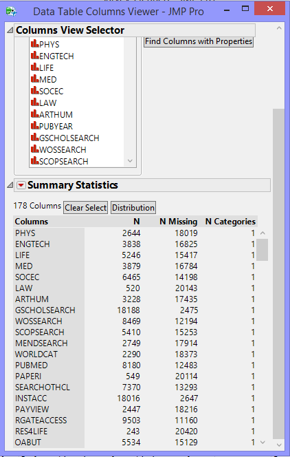
Using the Column Viewer functionality in JMP, I viewed the summary statistics and properties of all the remaining columns. The resultant information table was then sorted according to N categories.
Through this step, I found out the columns then I can group together and categorise under one singular column. There are 2 separate relevant categories: "Discipline" and "Tools". The columns can be consolidated under their respective categories using the "Stack" function in JMP.
With this step, I also discovered that the columns that has too high a value under "N categories" and "N Missing". These columns include survey questions that allows for user input answers. In order to keep the data consistent, I chose to just represent them under the "Others" group.
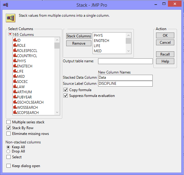
The following stacking illustrations will only show the steps to grouping the relevant columns under "Discipline" category. The picture below shows the inputs of the Stack Window.
After stacking, the data from all 7 columns will then be consolidated into only 2. From this table, you can obviously see each respondent and the disciplines they are in. Given that each respondent can be in multiple disciplines, the respondent ID may repeat.
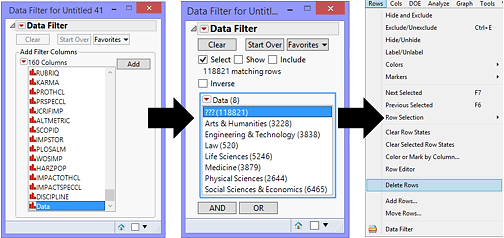
From this table, one can also tell that there are many null values in the Data column; all of which are meaningless and to be deleted. I go to the Data Filter tab and add Data as my column of interest and delete all of the rows that are then selected.
After doing the same steps for the "Tools" column, the only other relevant information that are missing are the research functions of the tools and its respective research activities. Going through the 567,166 rows of data and inputting the relevant information individually is too tedious and time-consuming. Hence, I have decided to use the information provided in the “survey_cleaned_variable_list.csv” document. To do this, I need 2 new columns inside this document.
For research function, I referred to the survey questions to determine the specific function the tools are used for. For research activity, I referred to the following website (http://dashboard101innovations.silk.co/page/Research-activities) and the function column inputs to determine the specific activity that the function of the tools fall under. With these information, I filled down the relationship of each variable name (tools) to their functions and respective activity.
The irrelevant columns, namely the column references, survey question numbers, input type and if multiple questions are allowed, were then deleted.
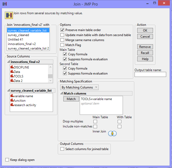
Once completed, the 2 data tables should be joined by matching the tools column.
With this, the final data table is ready for use.
Constructing the Visualization
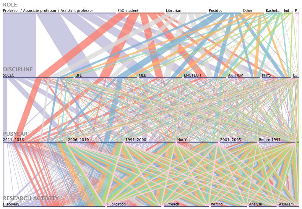
Given that most of the data I have are categorical, parallel sets was a tool considered when attempting to answer the ultimate question. In my first plot, 4 variables were selected, namely, role, discipline, first publication year and research activity.
There are a few trends that can be derived from the chart. One such example is that, regardless of roles, disciplines and career stage, the ranking of the tools used for a research function or activity is the same. An additional trend could be that regardless of the discipline or role that the respondents are involved with, they generally invest a consistent amount into each of the research activities.
However, absolute comparison is tedious given the large number of variables involved in this chart. With the large number of variables, each line is spilt into more portions, the shaded band emitted from each segment and the differences between each then become harder to determine. As such, I have decided to turn to Tableau to create this final visualization.
The Final Visualization
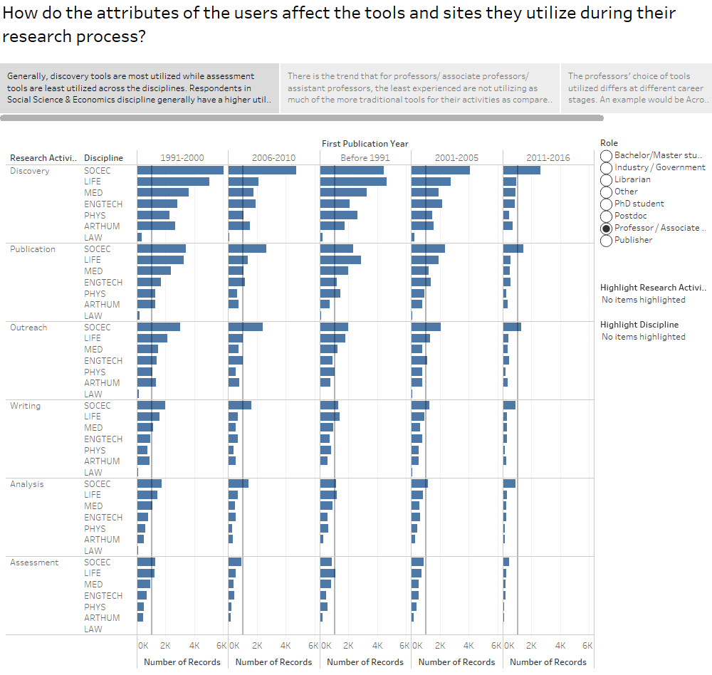
This is a only the first page of the final visualization. The interactive and full version can be found in this link provided: https://public.tableau.com/views/IS428Assignment2/Story1?:embed=y&:display_count=yes
This visualization aimed to answer the following question: "How do the attributes of the users affect the tools and sites they utilize during their research process?"
The variables used to define user attributes include their roles, disciplines and career stages. The research process is documented through the research activities. The final visualization is formatted as a story where each caption at the top would put across my point while allowing users to interact with the same data and find out other trends that might be of interest and relevance. At the side, filters are provided for the third user attribute that is not included in the chart. The highlighting functions are also made available at the side in order to allow easy comparison and referencing by the users.
Conclusion
Generally, discovery tools are most utilized while assessment tools are least utilized across the disciplines. Respondents in Social Science & Economics discipline generally have a higher utilization of tools across all research activities as compared to the respondents from other disciplines. There is the trend that for professors/ associate professors/ assistant professors, the least experienced are not utilizing as much of the more traditional tools for their activities as compared to those more experienced. However, this trend is inversed when analyzing PhD students and Postdoc. The professors' choice of tools utilized differs at different career stages. An example would be Acrobat where it is vastly popular with the more experienced professors but only along the average line when it comes to the amateurs.
One line conclusion: Professors from the Social Science and Economics discipline with the oldest first publication year uses the most tools when discovering.
