Difference between revisions of "IS428 2016-17 Term1 Assign2 Liang Bing"
| (7 intermediate revisions by the same user not shown) | |||
| Line 10: | Line 10: | ||
# Is there a relationship between occupation and their injury type? | # Is there a relationship between occupation and their injury type? | ||
# What is the relationship between gender and their injury type? | # What is the relationship between gender and their injury type? | ||
| − | # What age sees the most number of workplace injured victims? | + | # What age group sees the most number of workplace injured victims? |
== Understanding the Data == | == Understanding the Data == | ||
| Line 94: | Line 94: | ||
The graph clearly illustrate the relationship among the three attributes. It can be seen that most of the workplace injury victims are male workers, they incur mostly cut bruises and crushing and most of these injury victims are construction workers. It hence helped with the report to determine that gender should be considered as a factor for workplace injury. Also, gender and the worker's occupations should be related when consider the characteristics of the injury group. | The graph clearly illustrate the relationship among the three attributes. It can be seen that most of the workplace injury victims are male workers, they incur mostly cut bruises and crushing and most of these injury victims are construction workers. It hence helped with the report to determine that gender should be considered as a factor for workplace injury. Also, gender and the worker's occupations should be related when consider the characteristics of the injury group. | ||
| − | ===Visualization 3 : What age group sees the most number of workplace injured victims | + | ===Visualization 3 : What age group sees the most number of workplace injured victims === |
After exploring the relationship among the victims' gender types, occupations and their nature of injury, there is one more character for the victims can be explored - their age. This question tries to explore the share of victims count in each age groups and find out the age group which has the higher risk of workplace injury. In this section, the age of the victims will be divided into following age groups: Under 25, 25 - 34, 35 - 44, 45 - 54, 55 - 64, 65 and older.[http://www.bls.gov/opub/mlr/1988/07/art2full.pdf]. I will use Bar Chart in Tableau for the data visualization. | After exploring the relationship among the victims' gender types, occupations and their nature of injury, there is one more character for the victims can be explored - their age. This question tries to explore the share of victims count in each age groups and find out the age group which has the higher risk of workplace injury. In this section, the age of the victims will be divided into following age groups: Under 25, 25 - 34, 35 - 44, 45 - 54, 55 - 64, 65 and older.[http://www.bls.gov/opub/mlr/1988/07/art2full.pdf]. I will use Bar Chart in Tableau for the data visualization. | ||
| Line 107: | Line 107: | ||
== Interactive Data Visualization == | == Interactive Data Visualization == | ||
| + | The dashboard in tableau can combine the worksheets created in the above data visualization steps to form a interactive data presentation. By dragging the "Nature of Injury by Gender and by Occupations" graph and the "Distribution of Victims in Different Age Groups" into the new dashboard, the job is half-way done. The next step is to link the two graph together to make the dashboard more interactive and responsive. This is done by activate the "Distribution of Victims in Different Age Groups" graph's "use as filter" function: <br> | ||
| + | [[File:Wid lb ass2 dashboardfilter2.png|200px|center]]<br> | ||
| − | + | The interactive dashboard aids to the report's focus by illustrate more comprehensive and complete view of the relationships between 4 attributes. It also answered all the questions along the way of data exploring. There is clear relationship between the victim's occupation and his/her injury type. Some jobs such as construction works naturally have higher risk of getting cut bruises and crushing. The gender requirement for this kind of job results in male workers getting higher risk of getting workplace injury than the female workers. Also, most of the employees of these high risk occupations are younger people, this results in high workplace injury risk in age group 25 - 34. | |
| − | |||
| + | A screenshot of the Tableau Public Dashboard is shown below:<br> | ||
| + | [[File:Wid lb ass2 dashboardsc.png|600px|center]]<br> | ||
| − | + | Here is the [https://public.tableau.com/profile/publish/VA_Assignment2_s1/Story1#!/publish-confirm link] to the Tableau Public Interactive Data Visualization Dashboard. | |
== Tools == | == Tools == | ||
| Line 133: | Line 136: | ||
<br> | <br> | ||
[http://www.mom.gov.sg/workplace-safety-and-health/wsh-reports-and-statistics Ministry of Manpower - WSH Reports and statistics] | [http://www.mom.gov.sg/workplace-safety-and-health/wsh-reports-and-statistics Ministry of Manpower - WSH Reports and statistics] | ||
| + | <br> | ||
| + | [http://nwscholasticpress.org/2012/09/30/follow-these-simple-techniques-to-write-the-perfect-caption-every-time-to-intrigue-inform-readers-2/ How to wirte a Caption] | ||
Latest revision as of 17:35, 25 September 2016
Contents
Abstract
In order to put Singapore's workplace safety and health (WSH) performance on par with the world's leading countries, The Workplace Safety and Health (WSH) Institute is established to collaborate with Ministry of Manpower to work on researching, as well as data collecting and analyzing to understand the current and emerging work environment in Singapore, and use the knowledge discovered to develop solutions for improving WSH practices. One of the field of concern is the workplace injury. This report will utilize the workplace injury data provided by WSHI to explore insights which could help find trends and understand the workplace injury situation in 2014.
Theme of Interest
Workplace injury has always been a concern of WSH. Workplace injury can be seen as the accidents happen to workers in their working environment. Some job s are naturally more dangerous than the normal office jobs. Also, certain group of people will have higher chance to get injured during work compare to others. Therefore, finding out the victims' characteristics which has high probability to have injured incidents is very important for WSHI and stakeholders to understand the risk in their workplace and improve their management accordingly. This hence is the main focus of this report.
Questions for Investigation
The following are the questions help to guide through the data exploration process to determine the characteristics of workplace injury victims that should concern about:
- Is there a relationship between occupation and their injury type?
- What is the relationship between gender and their injury type?
- What age group sees the most number of workplace injured victims?
Understanding the Data
Data Attributes
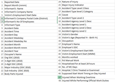
There are a total of 5650 rows of data with 48 attributes(Columns)per row.
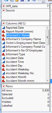
The figure below shows all the 48 attributes provided in the WID excel file:
Data Selection & Preparation
Not all of the 48 data attributes are useful in providing information needed by this report. For example, the informant's information and employer's information are not the main concern of this report:
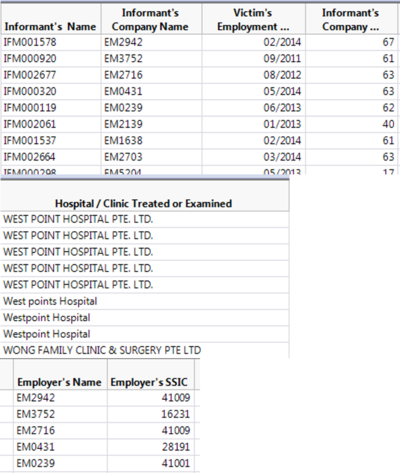
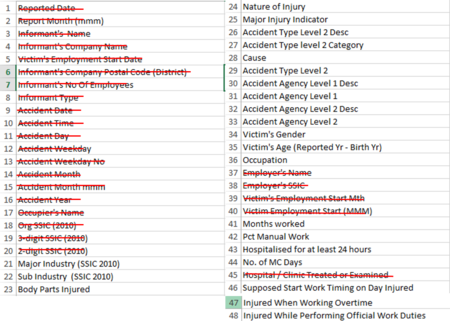
After using JMP and Microsoft Excel to examine all the data attributes, irrelevant columns are removed and the rest are the data attributes which could add value to the report analysis.
Below are the data attributes remained:
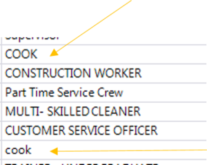
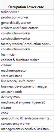
After pruning the irrelevant data, some of the nominal data should be standardized in terms of the letter cases. For example, for the Occupation Column, the same word "cook" is recorded in both upper case"COOK" and lower case "cook". The standardization process uses JMP's formula function:
1. Create a new column called "Occupation Lower Case", right click on the column header to find the formula tab:
2. Drag the Occupation attribute from Table Columns into the workspace , and then select Lower Cases function from the Character option, click "ok":
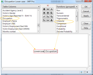
3. The new column "Occupation Lower Case" is created:
Moreover, there are typos in the Occupation column which resulted in meaningless occupation categories being created.
e.g. the "cleaner" typo.
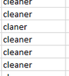
Also, the non-standardized occupation words have resulted in missing count of same kind of occupations.
e.g. the "assembler" & "assemblers" means the same occupation obviously.

I have exported the pruned data as excel file from JMP to filter through and clean these data with typo and minor differences.
After few rounds of filtering and fixing, the data is read for use.
Data Exploration and Findings
Visualization 1 : Is there a relationship between occupation and their injury type
To answer this question, I would like to look into the share for the occupations in each nature of injury. There are two attributes involved in this question: the nature of injury and the occupations. To find out the share for 1000+ occupations in each of the nature of injury, both of the Tree Map in Tableau and Mosaic Graph in JMP are suitable for illustrating the share pattern for this huge amount of attribute values.
Tree Map in Tableau:
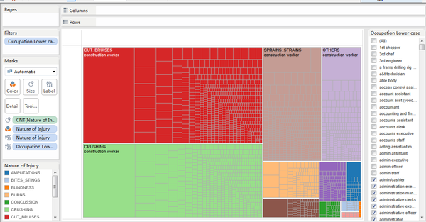
Firstly create create a measure by dragging the "nature of injury" attribute to the size tab, select count as the measure. Drag "nature of injury" to the color and label tab follow by dragging the "occupation lower case" to the label tab and to the Filters Card. Select Tree Map from the Show Me Card, the Tree Map showing each nature of injury in different colors with different sizes of boxes representing number of victims in various occupations is drawn.
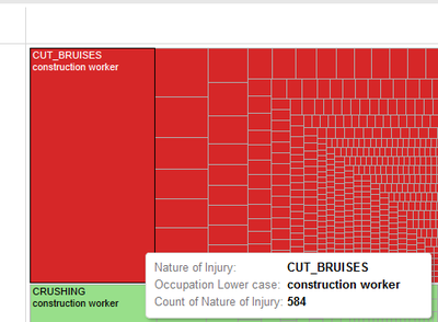
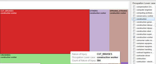
In this graph, the size of the color boxes clearly reflects the number of victims for each type of injury. The size of boxes in each color boxes represents the share of victim counts for different occupations. The larger the size, the more victims in this job is getting that kind of injury. When hovering the mouse on each box, the nature of injury. the occupation type and total number of victim for the box will be shown.
Moreover, the filter by the right side allows the graph to be interactive. When there is a need to view the condition for certain occupation only, one can just check that occupation and remove the ticks on the others.
Mosaic Graph in JMP:
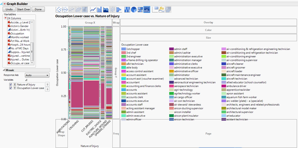
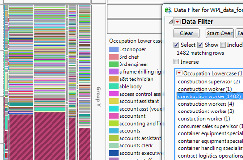
The graph is constructed by dragging the "nature of injury" to the X-axis and "occupation lower case" to the Y-axis, followed by choosing the mosaic tab from the graph menu. Similar to the Tree Map drawn above, the size of the boxes represents the count of victims. The minor difference is that in this mosaic graph, the width of the pillar represents the share of number of victims for different injury type while the height of the pillar represents the share of number of victims with that particular job. In a nutshell, in the Tree Map, area is always the indicator for number of victims while in the Mosaic graph, width and height of the boxes are used to represent number of victims for the two variables. The colors represents different occupations.
The Mosaic graph in JMP can also employ the interactive graph presentation by set up a "occupation lower case" data filter. By clicking on different occupations, the area of that occupation can be shaded on the graph. By hovering the mouse on different boxes, the occupation, type of injury and the count of victims for that box will all be shown.
Analysis: Both graphs have shown clear pattern of share of the victims with various occupations in different kinds of injuries. It can be easily told that which nature of injury has most number of victims, i.e. Cut Bruises is the one which happened most frequently while crushing injuries also needs more attention. Moreover, the occupation which occupies large portion of each nature of injury can be identified easily, i.e. the construction workers. Therefore, one's occupation has clear relationship with their injury rate and nature of injury.
Visualization 2 : What is the relationship between gender and their injury type
The question wanted to explore the share of injury type for different genders. In order to do so, the "Victim's Gender" and the "Nature of Injury" attributes are being used. The highlight table graph in Tableau is a way of illustrating the share of injury type for different genders.
Highlight Table in Tableau:
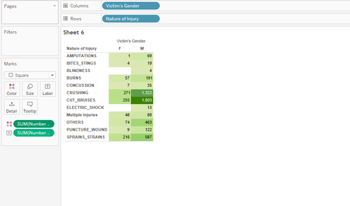
The graph uses "Victim's Gender" as the column attribute and "Nature of Injury" as the row attribute. The number of records (which is the number of victims) is dragged to the color tab and the label tab in Marks card for showing the density of victims for each gender and for their type of injuries.
The graph is shown below:
In the graph, each box represents the number of victims with that gender and the particular injury type. The darker the color of the box, the more victims. It can be seen clearly from the graph the most severe injury types for both gender are cut bruises, crushing and sprains strains. It can also tell that the male workers incur more injuries than the female workers.
The reason for more male workers incur workplace injury than the female workers could be the occupations they are taking. By using Tableau packed bubble chart, the relationship between gender and their occupation type could be clearly illustrated.
Packed Bubble Chart in Tableau:
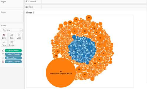
The graph is drawn using number of records (which is the number of victims) as the size of the bubble, and the "Victim's Gender" as the color differentiator. The graph is shown below:
It can be seen from the graph that most of the male workplace injury victims are construction workers, this could be the hint that victim's gender, their occupation and their nature of injury are inter-related. To illustrate this multivariate data pattern, Tree Map is used again.
Tree Map in Tableau:
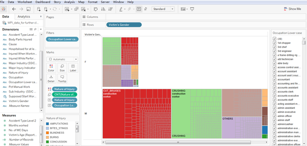
The Tree Map in visualization 1 can be reused here. It already contained the relationship between the victim's occupation and their nature of injury, it only left with the victim's gender. The victim's gender is placed at the row column to construct the graph below:
Analysis: The graph clearly illustrate the relationship among the three attributes. It can be seen that most of the workplace injury victims are male workers, they incur mostly cut bruises and crushing and most of these injury victims are construction workers. It hence helped with the report to determine that gender should be considered as a factor for workplace injury. Also, gender and the worker's occupations should be related when consider the characteristics of the injury group.
Visualization 3 : What age group sees the most number of workplace injured victims
After exploring the relationship among the victims' gender types, occupations and their nature of injury, there is one more character for the victims can be explored - their age. This question tries to explore the share of victims count in each age groups and find out the age group which has the higher risk of workplace injury. In this section, the age of the victims will be divided into following age groups: Under 25, 25 - 34, 35 - 44, 45 - 54, 55 - 64, 65 and older.[1]. I will use Bar Chart in Tableau for the data visualization.
Bar Chart in Tableau:
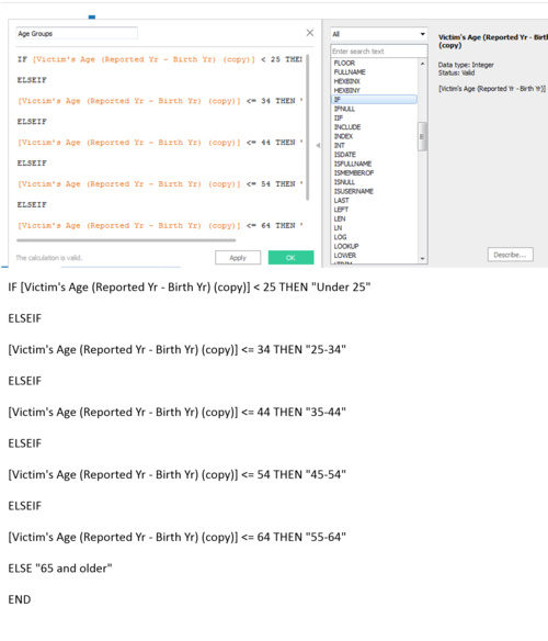
To divide the age group, I use the calculate field function of the "Victim's Age(Reported Yr - Birth Yr)" attribute. Here is the formula keyed in for generating the age groups:
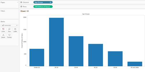
The graph is constructed using the newly created "Age Group" attribute as the column attribute and the count of the victims as the row attribute.The bar graph is shown below:
The graph clearly shows the distribution of victims for each age group. It appears that job risks are greater for the young workers. Reason behind this could again be the jobs these workers are taken. This time, the Dashboard in Tableau will be used to combine the age vs. count of victim graph and the gender & occupation vs. nature of injury graph to have better understanding of the whole story.
Interactive Data Visualization
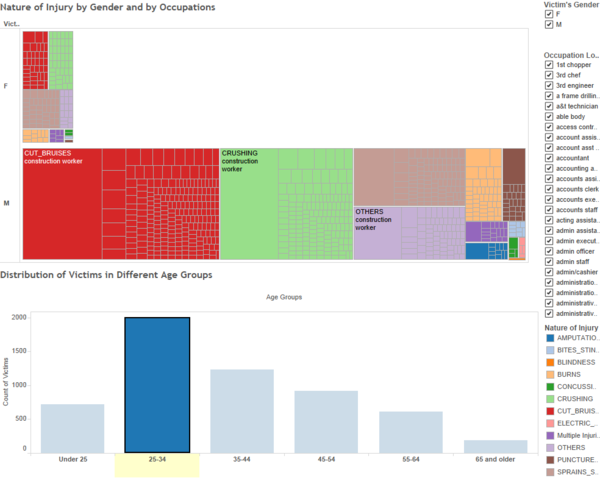
The dashboard in tableau can combine the worksheets created in the above data visualization steps to form a interactive data presentation. By dragging the "Nature of Injury by Gender and by Occupations" graph and the "Distribution of Victims in Different Age Groups" into the new dashboard, the job is half-way done. The next step is to link the two graph together to make the dashboard more interactive and responsive. This is done by activate the "Distribution of Victims in Different Age Groups" graph's "use as filter" function:
The interactive dashboard aids to the report's focus by illustrate more comprehensive and complete view of the relationships between 4 attributes. It also answered all the questions along the way of data exploring. There is clear relationship between the victim's occupation and his/her injury type. Some jobs such as construction works naturally have higher risk of getting cut bruises and crushing. The gender requirement for this kind of job results in male workers getting higher risk of getting workplace injury than the female workers. Also, most of the employees of these high risk occupations are younger people, this results in high workplace injury risk in age group 25 - 34.
A screenshot of the Tableau Public Dashboard is shown below:
Here is the link to the Tableau Public Interactive Data Visualization Dashboard.
Tools
| Tool | Pros | Cons |
| Excel | Very powerful in analyzing and manipulating data at the first stage. | Not really helpful in terms of data visualization. |
| JMP | Very Useful for analyzing and manipulating data at the data table stage. It has very useful graphs like the Mosaic graph and Ternary Plot for data visualization and analysis | In terms of user-friendly and building interactive graph, JMP is not as good as Tableau. |
| Tableau Public | Very clean and user-friendly interface. Constructing charts is relatively easy. Very easy in creating interactive data visualization charts and dashboards. | Not as good as excel and JMP in manipulating the raw data. |
References
The relation of age to workplace injuries
WSH Institute Official Website
Ministry of Manpower - WSH Reports and statistics
How to wirte a Caption
