Difference between revisions of "IS428 2016-17 Term1 Assign2 Teo Hui Min"
| Line 43: | Line 43: | ||
==Summary statistics== | ==Summary statistics== | ||
| − | [[File: | + | [[File:hm2_21.png | 600px]] <br> |
A summary of the number of victims by gender and major industry is presented to the users to give them a brief understanding of the workplace injury. <br><br> | A summary of the number of victims by gender and major industry is presented to the users to give them a brief understanding of the workplace injury. <br><br> | ||
==Global filters== | ==Global filters== | ||
Revision as of 20:26, 23 September 2016
Contents
Theme & Questions
The theme for this assignment is to look into the workplace injuries of 3 industries (Manufacturing, Construction & Others) in year 2014. Through the data discovery, it aims to answer the following questions:
1. Are less experienced employees more prone to workplace injury? Does age plays a part too?
2. What are the most common type of accident and injuries in each industry and how serious are the injuries?
3. Which are the top 3 companies that has the highest number of victims?
Data Exploration
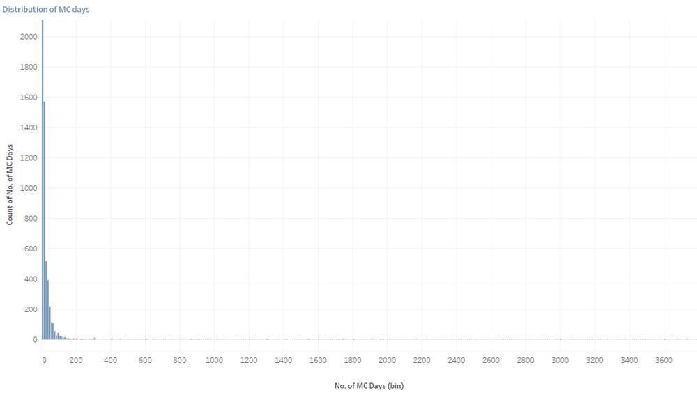
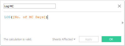
During the data exploration, it was discovered that some of the variables are skewed. One of the variables is ‘No. of MC days’, hence it was transformed by taking ‘LOG’.
However the range for this variable is 1 to 3600 days which actually does not make sense.
According to the MOM website, the maximum paid hospitalisation leave is only 60 days. Thus there may be a case of human error in the data entry. However the number of MC that employees are entitled varies, thus these anomalies are not being removed from the data. A filter will be implemented to allow users to have the autonomy to decide the range of MC days.
Visualisation
Q1: Are less experienced employees more prone to workplace injury? Does age plays a part too?
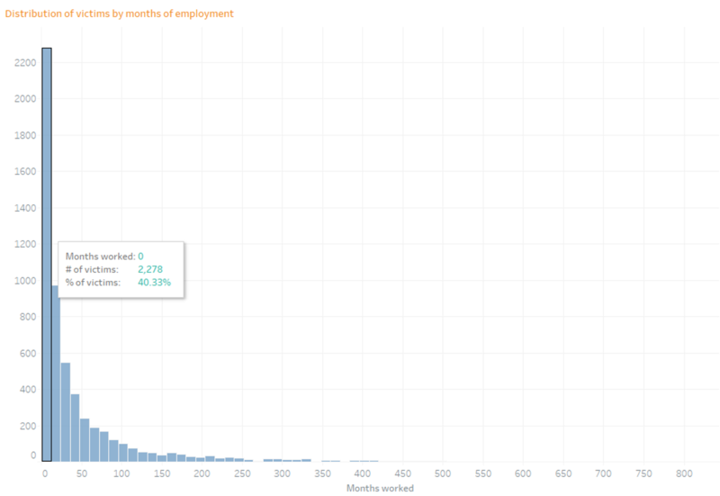
Looking at the above distribution of victims by their months of employment, it is apparent that the data is right skewed, where 40% of victims’ employment is less than 12 months. This means that experience in the workplace environment do play in a part in their injuries, where people who are less experienced are more prone to workplace injury as compared to the more experienced employees.
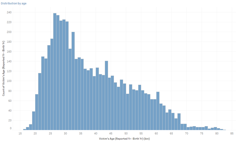
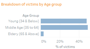
The distribution of victims by age reveals that most of the victims are actually in their mid 20s to mid 30s. The age was further binned to look at the proportion of victims by age group. Elderly (age 65 and above) made up the smallest proportion of victims, which indicates that being old does not mean that they are “clumsier” or less vigilant in the workplace. The younger employees (age 34 and below) actually made up 47% of the proportion of victims, and this may be due to the lack of experience in the workforce.
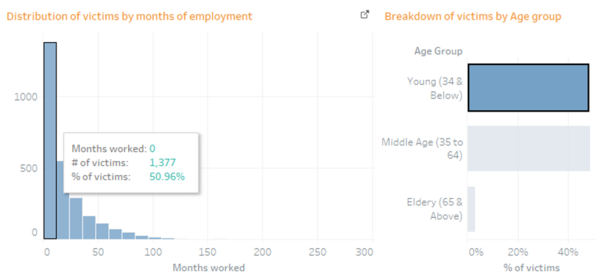
Looking at the months of employment of the younger employees, half of them are actually new to the workplace, with employment less than 1 year.
Q2: What are the most common type of accident and injury in each industry, and how serious are the injuries?
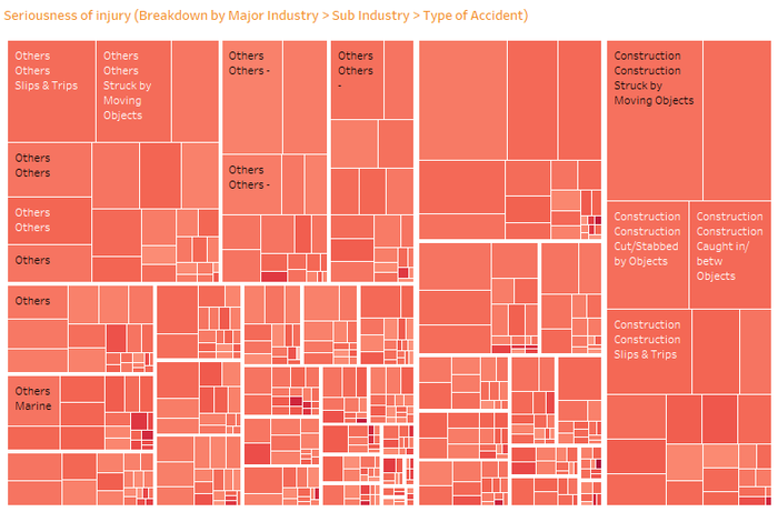
The above visualisation looks at the breakdown of victims by the Major industry (Manufacturing, construction, others), sub industry and the type of accident. The size of the treemap reflects the number of victims, whereas the colour reflects the seriousness of the accident which was determined by the median of the transformed variable, number of MC days (Log(No of MC days)), to account for the skewness of the variable. The purpose of the visualisation is to know the common accidents in the industries and to understand how serious those injuries are, because if there is a high number of victims who actually sustained serious/ major injuries, then there may be a need to look into the workplace safety of that industry or company. For example if majority of the victims’ injuries are caused by the use an equipment, actions could be taken to assess the risk of the equipment or probably ban the use of it.
Through the visualisation, we can understand that the most common accident in the construction industry is being struck by moving object. Although that is the most common accident, the injury sustained is not very severe as seen from the colour intensity.Although there are a few areas with dark shades of red which represents serious injury, there is actually just a small number of victims who are involved.
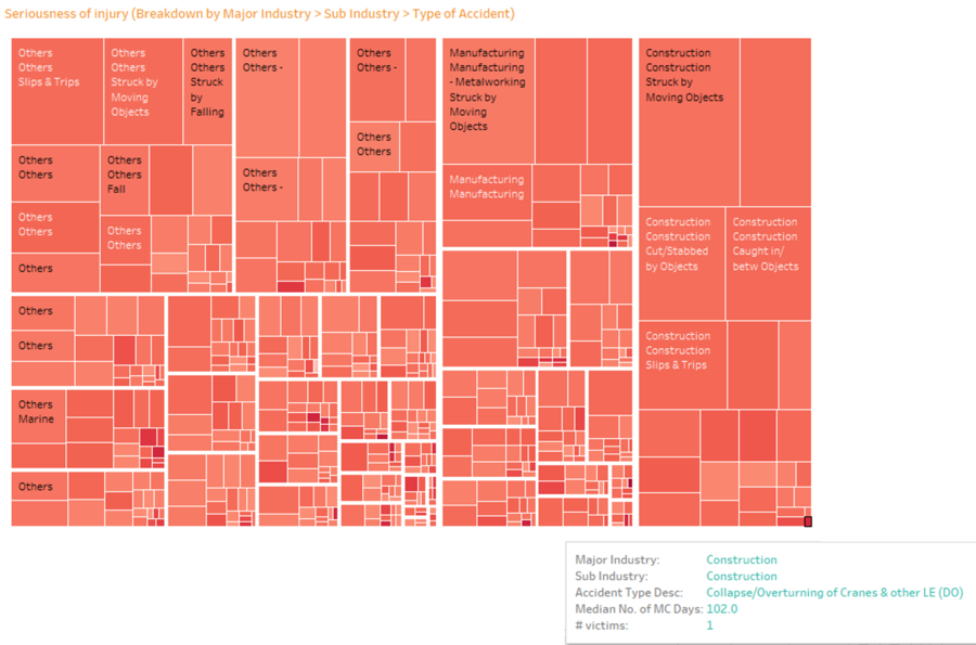
An example could be seen from the above visualisation where there is only 1 victim who is injured from the collapse of cranes in the construction industry, although the severity of the injury is high.
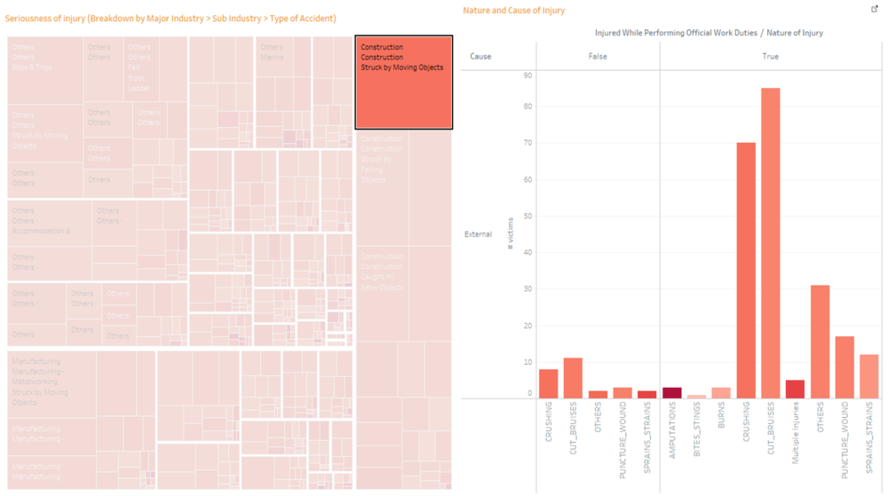
We can also further understand the injuries sustained from the accident, and also the cause of accident, whether its self-induced or external, and if victims are actually injured when performing their official work duties. The colour intensity further shows the seriousness of each injury.
Q3: Which are the top 3 companies that has the highest number of victims?
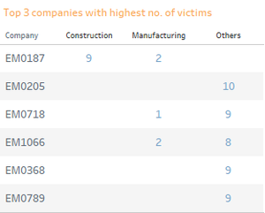
The above table only focus on the top 3 companies with the highest number of victims. Majority of the companies has only 1 or 2 victims, however the above companies are exceptions where there is high number of accidents. Thus, we shall look into these companies to understand the victims and the injuries sustained.
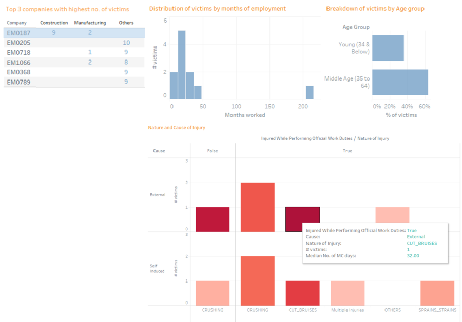
For example, by selecting the company, EM0187, which has the highest number of victims, we can understand that those victims are generally younger. Furthermore the most serious injury is cut bruises, and was given 1 month MC.
Dashboard visualisation
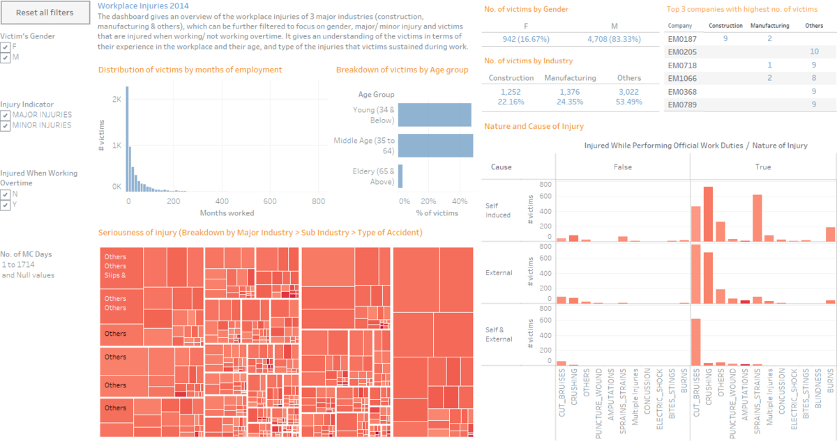
Above is the dashboard visualisation which can also be accessed live from here. (Best viewed in 90% zoom level in browser)
Summary statistics

A summary of the number of victims by gender and major industry is presented to the users to give them a brief understanding of the workplace injury.
Global filters
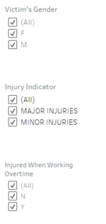
Global filters are implemented in the dashboard to allow users to focus on specific areas, such as a particular gender, major or minor injury and injuries that are sustained when working overtime.
Dashboard interactions
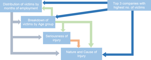
The dashboard also allows for interaction between the individual visualisations and the possible interactions between the visualisations is illustrated above. For example, by clicking on the distribution of victims with less than 12 months of experience will reflect the breakdown of age group of these victims, severity of injuries they sustained and the cause and type of injuries for those victims.
Reset Filter
A click to reset all filters was implemented to revert the visualisation back to the default.
Slider
As mentioned in the section of ‘Data Exploration’, as the number of MC days given varies, the slider allow users to only look at the victims within the range they have specified. However the changes from the slider will only be reflected in the ‘Seriousness of injury’ and ‘Nature and Cause of Injury’ visualisation.
Areas for improvement
Initial question: Is there a correlation between the number of hours worked and the number of accidents.
However after finding out the hour difference between the accident time and supposed start work timing, some of the records resulted in negative values, and this was because the accident time was earlier than the supposed start work time. As only the accident date was provided in the data, there are actually 2 ways to interpret if the accident time was earlier than supposed start work time.
Using the above record as an example, it can be interpreted as:
1. The victim started work earlier at 10 am instead of 8 pm, or
2. The victim has worked from 8pm to the next day 10 am.
Hence, if the date of work was provided, we could have found out the right interpretation and the question can then be answered.