Difference between revisions of "IS428 2016-17 Term1 Assign1 Margot Marie T Stelleman"
(Edited Tools) |
|||
| (14 intermediate revisions by 2 users not shown) | |||
| Line 1: | Line 1: | ||
==Abstract== | ==Abstract== | ||
| − | + | This project aims to look into the trends of the private residential property market in Singapore during 2015. To better understand the market, I would be looking into the supply of private residential properties as well as property prices, with hopes to discover market insights that maybe useful for making policy decisions in 2016. | |
==Problem and Motivation== | ==Problem and Motivation== | ||
| − | + | This project will look at the patterns of the share of private residential property supply in 2015 as well as the distribution of private property price in 2015. From these various insights discovered, this project aims to provide 3 policy recommendations for decision makers implementing policy changes for 2016. | |
==Data choices and cleaning== | ==Data choices and cleaning== | ||
| − | + | For this project, data from the Urban Redevelopment Authority (URA) is used, for the period of 2015. In terms of supply of private residential property, we would be looking at the stock available by both planning region and planning area. Stock in this case is refers to completed units or space, whether occupied or unoccupied, that is available for physical occupation, according to the URA. In addition, property prices would be examined in this project as well. | |
| + | Point to note is that considering Executive Condominiums (ECs) would be examined in this study despite it being a Public-Private hybrid property. The reason for looking into ECs in this project is because in 2015, Prime Minister Lee announced an increase of income ceiling for ECs from $12,000 to $14,000. This housing policy change has allowed more couples and families who earned too much to purchase a Build to Order flat to purchase ECs as an option, as opposed to paying for Private property. Hence, it would be interesting to look into ECs as well. | ||
| − | + | ==Tools== | |
| − | + | To clean up and manipulate the data extracted from URA’s website, Excel is used. Excel is selected as a tool because the raw data extracted is not large in size and does not require much manipulation or advance computation, hence Excel provides sufficiently. Whereas for data visualization, Tableau 10 is used because it is compatible with the data set extracted and it allows for insights to be discovered instantaneous, in a visually appealing and interactive manner. | |
| − | + | ==Is it out of my budget?!== | |
| − | + | [[File:PriceCentralRegion2015.jpg|thumbnail|center]][[File:PriceEastRegion2015.jpg|thumbnail|center]][[File:PriceNorthEastRegion2015.jpg|thumbnail|center]] | |
| + | [[File:PriceNorthRegion2015.jpg|thumbnail|center]][[File:PricesWestRegion2015.jpg|thumbnail|center]] | ||
| − | + | When we look carefully at all the price distribution for each region we can see that most of them the prices are usually between 5000 and 20000 SGD per 100 square meters and with a peak around 10000-15000 SGD. Two regions are not following this. Central region is even more dispersed, 5000 till sometimes almost 45000 SGD per 100 square meters. And the peak is also moving to around 15000 till 20000 SGD. And finally North region is less expensive while units per 100 square meters reaching not the 20000SGD. | |
| − | |||
| − | + | [[File:PriceCondoApt2015.jpg|framed|center]] | |
| − | |||
| − | |||
| + | [[File:Priceofunitslandedandnonlandedin2015.png|framed|center]] | ||
| − | |||
| − | |||
| − | + | Because non-landed are significantly more important in term of numbers of units, I have chosen to concentrate on the price of this type, which is Apartment and condominiums. These two types are quite similar in the prices. Apartment could tent to be more expensive for some of them. There is a peak in the price for apartments before the peak of the prices of the condominiums, but after there is again a peak for the apartments around 16000 SGD. It is quite difficult to say which one is the best deal. | |
| + | This disposition allows us to compare easily the curve of prices. For all the graphs in this section, histograms have been used because they are perfect to represent the distribution of a continuous variable, here the price. | ||
| − | + | We can say after these observations that: | |
| + | *Non-Landed numbers of units is a lot more important than the Landed and can be more expensive. | ||
| + | *Central region is the most important in term of number of units but also the most expensive. | ||
| + | *North region has the lowest numbers of units but also less expensive. | ||
| − | + | ==If I was the president...== | |
| − | |||
| − | |||
| − | |||
| − | |||
| − | |||
| − | |||
| − | |||
| − | |||
| − | + | 1) The Central region is offering much more units than the others. Rising the number of units in the other region will rise the vacancy which is quite low in the others regions, and will reduce the prices for the Central Region. It could improve the quality of living for the people in the Central region by reducing the numbers of people living there but of course the others regions need to be attractive. Several changes need to be thought and made before, such asthe transportation; find a way to take the people as faster as possible to their work place such as if they were living in the central area. Or also developed more green places and facilities to sell them a peaceful life and not the rush and the noise of the city center. | |
| − | + | 2) The planned and under construction units are falling down. But population will still grow. Government needs to stimulate the construction of units to avoid a break in the vacancy. Vacancy which is as we analyzed it slightly going down in some regions. For example, they can play on the interest rate for a loan to stimulate and encourage people to build houses or still giving some money rewards or help. | |
| − | + | 3) Condominiums and apartments are good in busy area to fit a maximum of persons. But in the regions more far away of the city center, we could build regular houses which are landed properties. Landed properties are much less than Non-Landed one. The government could promote landed properties to equilibrate the balance between the different types of housing and then it could also be a way develop the other regions not in the center of Singapore to have more units in term of numbers as said in the point 1. | |
| − | |||
| − | |||
| − | |||
| − | |||
| − | |||
| − | |||
| − | |||
| − | |||
| − | |||
==Inforgraphics== | ==Inforgraphics== | ||
Click on the image to enlarge and zoom. | Click on the image to enlarge and zoom. | ||
| + | Erratum: Condominiums and Apartments are the two types of housing we wil find THE MOST* | ||
[[File:Findmearoof-page-001.jpg|thumbnail|center]] | [[File:Findmearoof-page-001.jpg|thumbnail|center]] | ||
Latest revision as of 01:49, 29 August 2016
Contents
Abstract
This project aims to look into the trends of the private residential property market in Singapore during 2015. To better understand the market, I would be looking into the supply of private residential properties as well as property prices, with hopes to discover market insights that maybe useful for making policy decisions in 2016.
Problem and Motivation
This project will look at the patterns of the share of private residential property supply in 2015 as well as the distribution of private property price in 2015. From these various insights discovered, this project aims to provide 3 policy recommendations for decision makers implementing policy changes for 2016.
Data choices and cleaning
For this project, data from the Urban Redevelopment Authority (URA) is used, for the period of 2015. In terms of supply of private residential property, we would be looking at the stock available by both planning region and planning area. Stock in this case is refers to completed units or space, whether occupied or unoccupied, that is available for physical occupation, according to the URA. In addition, property prices would be examined in this project as well. Point to note is that considering Executive Condominiums (ECs) would be examined in this study despite it being a Public-Private hybrid property. The reason for looking into ECs in this project is because in 2015, Prime Minister Lee announced an increase of income ceiling for ECs from $12,000 to $14,000. This housing policy change has allowed more couples and families who earned too much to purchase a Build to Order flat to purchase ECs as an option, as opposed to paying for Private property. Hence, it would be interesting to look into ECs as well.
Tools
To clean up and manipulate the data extracted from URA’s website, Excel is used. Excel is selected as a tool because the raw data extracted is not large in size and does not require much manipulation or advance computation, hence Excel provides sufficiently. Whereas for data visualization, Tableau 10 is used because it is compatible with the data set extracted and it allows for insights to be discovered instantaneous, in a visually appealing and interactive manner.
Is it out of my budget?!
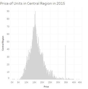
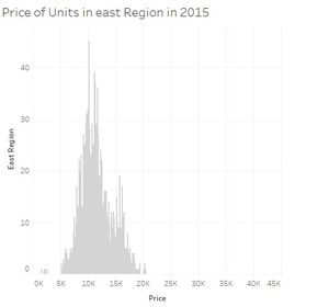
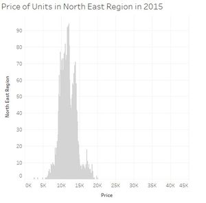
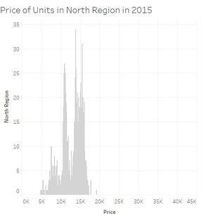
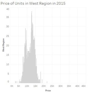
When we look carefully at all the price distribution for each region we can see that most of them the prices are usually between 5000 and 20000 SGD per 100 square meters and with a peak around 10000-15000 SGD. Two regions are not following this. Central region is even more dispersed, 5000 till sometimes almost 45000 SGD per 100 square meters. And the peak is also moving to around 15000 till 20000 SGD. And finally North region is less expensive while units per 100 square meters reaching not the 20000SGD.
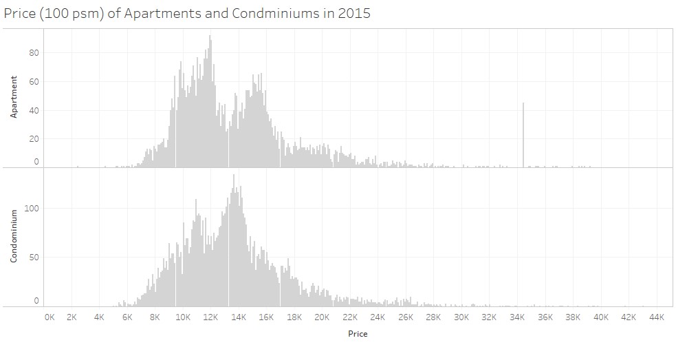
Because non-landed are significantly more important in term of numbers of units, I have chosen to concentrate on the price of this type, which is Apartment and condominiums. These two types are quite similar in the prices. Apartment could tent to be more expensive for some of them. There is a peak in the price for apartments before the peak of the prices of the condominiums, but after there is again a peak for the apartments around 16000 SGD. It is quite difficult to say which one is the best deal.
This disposition allows us to compare easily the curve of prices. For all the graphs in this section, histograms have been used because they are perfect to represent the distribution of a continuous variable, here the price.
We can say after these observations that:
- Non-Landed numbers of units is a lot more important than the Landed and can be more expensive.
- Central region is the most important in term of number of units but also the most expensive.
- North region has the lowest numbers of units but also less expensive.
If I was the president...
1) The Central region is offering much more units than the others. Rising the number of units in the other region will rise the vacancy which is quite low in the others regions, and will reduce the prices for the Central Region. It could improve the quality of living for the people in the Central region by reducing the numbers of people living there but of course the others regions need to be attractive. Several changes need to be thought and made before, such asthe transportation; find a way to take the people as faster as possible to their work place such as if they were living in the central area. Or also developed more green places and facilities to sell them a peaceful life and not the rush and the noise of the city center.
2) The planned and under construction units are falling down. But population will still grow. Government needs to stimulate the construction of units to avoid a break in the vacancy. Vacancy which is as we analyzed it slightly going down in some regions. For example, they can play on the interest rate for a loan to stimulate and encourage people to build houses or still giving some money rewards or help.
3) Condominiums and apartments are good in busy area to fit a maximum of persons. But in the regions more far away of the city center, we could build regular houses which are landed properties. Landed properties are much less than Non-Landed one. The government could promote landed properties to equilibrate the balance between the different types of housing and then it could also be a way develop the other regions not in the center of Singapore to have more units in term of numbers as said in the point 1.
Inforgraphics
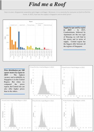
Click on the image to enlarge and zoom. Erratum: Condominiums and Apartments are the two types of housing we wil find THE MOST*
